Google regularly updates the data it provides to developers on Android versions in use, screen sizes and screen densities, and I’ve been diving into this data today for a report I’m working on. In the next few days, Google will update the data again and there will no doubt be the usual flurry of blog posts and news items about Android fragmentation. But I wanted to share some thoughts that occurred to me as I looked through this data that go beyond the usual rhetoric. Some of these are original, some of them likely aren’t.
Firstly, a fairly predictable pattern has emerged in the adoption of the versions of Android, as follows (and as illustrated by the chart below) 1:
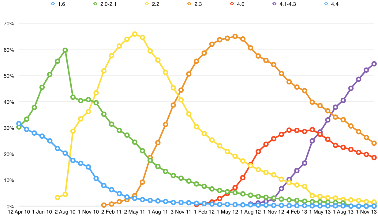
- Major versions (i.e. those grouped together by dessert name) tend to take about 12-18 months from launch to hit their peak, usually at around 60-70% of the base 2.
- By this point, at least one and sometimes two new versions have been released, though recently often only one newer version.
- It is now typical for there to be at most three major versions at over 10% of the base, and on occasion just two. This means that developers can target a large chunk of the base by focusing on just two or three versions.
- Gingerbread represents both an outlier and a legacy which is unlikely to be repeated. It was a major release, installed on many devices which were not capable of supporting any of the subsequent versions, and as a result has had an unusually long lifecycle. Most other versions have dropped well below half their peaks a year later, and represent a very small share two years later. But Gingerbread breaks this pattern, hanging on as the second most used version three years after launch and 18 months after its peak. Both Google and its OEM partners have learned from Gingerbread and once it works its way out of the system the pattern going forward will look quite different.
- Most versions peak and begin to decline about 3-6 months after the next version is released, reflecting the time it still takes most OEMs and carriers to approve a release for distribution to end users.
- There has been little consistency in terms of the times between major releases, in marked contrast to iOS, which has had annual releases (albeit with one or two shifts later in the year) since its inception. Major new named releases have arrived anything from 1 month to 15 months after the previous one, though the range has recently narrowed to around 7-10 months with the exception of the long-awaited KitKat.
Screen sizes and densities
The version data discussed above gets all the attention when Google releases new figures each month, but the other data Google releases at the same time is discussed much less frequently, though it’s also interesting. This data mostly concerns screen sizes and densities. Like the version data, this data is intended to help developers, and as such we have to do some playing around with it to make it useful, but there’s nonetheless some interesting information there 3:
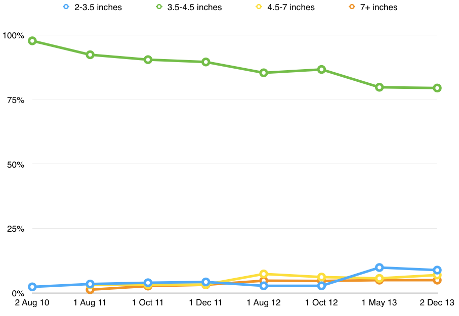
- The “Normal” screen size remains massively dominant, even though it was based originally on the T-Mobile G1, and represents a range of about 3.5-4.5 inches 4. Though it has fallen from 100% in 2009, it still represents around 80% of all Android devices hitting the Play store today. Given that almost all new high-end Android devices today have screen sizes in the high 4 inches range and often 5 inches or larger, this is a useful reminder that these devices are not representative of the Android base as a whole.
- Interestingly, the next most popular category is not larger phones but smaller ones, at around 3.5 inches and under. This category is now at 8-10% of the total, and has fallen only slightly from April (9.8%) to December (8.8%).
- The two larger sizes, Large and Xlarge, represented 12% of the total as of the last figures, a significant increase from earlier years (they represented just over 4% together in 2011).
- The cutoff between the two categories is imprecise, at around 7 inches, but it seems likely that most Large devices are bigger smartphones, including most of the high-end devices such as the Galaxy S 4 and HTC One, while most Xlarge devices are tablets, both in the 7- and 10-inch ranges. Large devices actually represent a bigger chunk of the total – 6.9% – than Xlarge devices (4.9%).
- At just under 5%, tablets also remain a tiny minority of overall official Android devices sold (Kindle Fire tablets are of course excluded from all this). Compare that with Apple, which has generally sold about half as many iPads as iPhones in recent quarters.
The other interesting wrinkle is screen resolution, which is also chopped into rather imprecise broad categories:
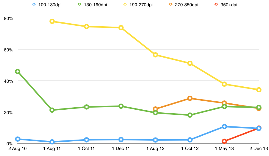
- Two categories have fallen somewhat rapidly over the period shown, namely the medium (130-190dpi) and high (190-270dpi) slices.
- The decline was caused partly by the growth in the awkwardly named xhdpi and xxhdpi categories which have emerged over the past year or so, and which have suddenly risen to 22.3% and 9% respectively, together representing about a third of the total. These devices have displays of over 270 or so pixels per inch, so these are high-quality displays, many of which would qualify as retina or better by Apple’s definitions. [note: this paragraph originally contained a transcription error with regard to the percentages for xhdpi and xxhdpi, which has now been corrected]
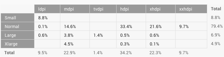
- However, it’s also worth noting that the low dpi category has grown over time, having bumped along at 1 or 2% for a long time, but now rising to 9-11%. This suggests that there is a category of low-density devices which is emerging, which is actually about twice the size of the tablet category, so not insignificant. In the matrix Google provides, we can see clearly that 90% or so of these align with those small screens, so these are likely very low-end Android handsets sold in emerging markets.
- At the same time, it’s interesting to see in that same matrix (see below) that 90% of the tablet-sized devices have only medium density screens of around 130-190dpi. Samsung’s latest 7-inch tablet has a 299dpi screen, and the latest Nexus 7 and Nexus 10 have 323dpi and 300dpi screens respectively, so these high-end, high-density devices are clearly in the minority in the Android tablet installed base, in marked contrast to the smaller devices.
Notes:
- It’s worth noting that the methodology Google uses for all these numbers changed in April 2013, and now reflects only devices actively using the Google Play store, and not all devices as previously. From what I can tell, it hasn’t made an enormous difference, but has slightly increased the representation of newer versions while decreasing or eliminating the representation of older versions. ↩
- Exceptions include Honeycomb, which was always a temporary fix and fork for tablets, resolved later the same year by Ice Cream Sandwich, and Ice Cream Sandwich itself, which never received a point release and was replaced nine months later by the first version of Jelly Bean. ↩
- It’s harder to find historical data here than for the Android versions, as it’s been less reported, so my data is patchier ↩
- Google is frustratingly vague about these categories in its description (see this diagram), but I’ve done my best to interpret its diagrams so as to make sense of them ↩
Pingback: Updated Android version charts | Beyond Devices()