The key to T-Mobile’s growth

T-Mobile reported its earnings this morning, and as usual lately there was a strong component of growth – across subscribers, revenues, and even average revenue per subscriber. I’m going to run through the highlights quickly, but then I’m going to drill down around what drives that growth, and how T-Mobile is able to grow at this rate even as its competitors struggle to do so.

Note: I’ve written extensively about T-Mobile before, and remain skeptical about some of the aspects of its business model and strategy, but this post will focus on the flip side of that: the undeniable growth in its business. In addition, you can find my analysis of other major tech companies’ earnings here, and you can subscribe to the Jackdaw Research Quarterly Decks service if you want to get a full set of charts on the major tech companies and on the US wireless, cable, satellite, and telecoms operators. 

Quick growth review

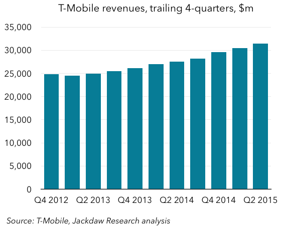
The two charts below show all you really need to know about growth at T-Mobile – from stagnation and decline pre-2013, the company has turned itself around dramatically, growing subscribers at a now fairly steady pace of 15-18% per quarter, and as a result revenues have been growing too.TMO subscriber growthTMO revenues

How does T-Mobile do it?

So, the big question becomes how T-Mobile is able to achieve this, when the other three major US carriers are not able to do so. Verizon’s year on year wireless revenue growth has been around 5-10%, AT&T’s has recently been in the low single digits, and Sprint’s has been negative for several quarters. Subscriber growth at T-Mobile’s two largest competitors – AT&T and Verizon – has been stronger, but largely driven by things other than phones, whereas T-Mobile’s growth has been almost entirely based on the traditional phone business. That’s a liability in some ways, because the base of phones in the US isn’t really growing much anymore, but at the moment T-Mobile is capturing what growth there is, while stealing subscribers from competitors. I’m going to focus mostly on postpaid in most of the analysis below, because that’s where T-Mobile’s growth is largely coming from.

The key to T-Mobile’s growth is the combination of two separate effects: churn (subscriber losses) and gross additions (the new customers a carrier adds). Simply put, the net subscriber additions number that most analysis of the wireless industry focuses on is the net result of these two forces. However, when you just focus on that number it’s easy to miss how these two come together in very different ways for the different carriers. What T-Mobile is doing uniquely well is combining very low churn (subscriber losses) with high gross additions (new customers). Note that T-Mobile and the other carriers typically don’t report their actual postpaid subscriber losses or gross additions directly, but given their churn and net addition numbers we can do a fairly straightforward calculation that gets us there with a reasonable degree of accuracy.

Churn – far lower than in the past, and at smaller scale

Churn is the first aspect of this equation. Briefly, the reported churn number is the average percentage of the subscriber base that leaves the carrier during each month of the quarter. So, if churn is 1%, that means that on average during the quarter 1% of the subscriber base stopped being a customer, and that in turn means that around 3% left during the quarter. The US carriers generally report churn for their two major sets of customers – postpaid and prepaid – because churn rates are very different for these two groups. Prepaid churn is far higher than postpaid, because these customers can more or less come and go as they please, without contracts, device payments, or anything else to make it hard to leave. T-Mobile has very successfully lowered its postpaid churn over the past couple of years, and this is a major component of how it’s turned its growth around:

TMO churnT-Mobile has actually switched from metric to another during the period shown – first reporting total postpaid churn (including devices like tablets and modems) and now reporting phone churn specifically. As you can see, the combined number has fallen from 2.5% in 2012 to 1.3% now. That might not seem a lot – these numbers sound pretty small – but remember that that’s a monthly churn rate, so the quarterly churn is three times as high, and during the course of a year, a 2.5% churn rate means you lose 30% of your customers, whereas a 1.3% churn rate almost halves those losses.

Of course, how many subscribers you actually lose is a factor not just of your churn rate but also the size of your subscriber base. To make it more concrete, let’s look at what’s happened to actual subscriber losses implied by that churn during this time. To put it in context, we’ll compare these losses to Verizon’s, which has typically had the lowest churn rate in the industry at around 1%, but also the largest number of postpaid customers (over three times as many as T-Mobile). The chart below shows the subscriber losses each quarter implied by the company’s respective churn rates and subscriber bases:

Postpaid subscriber losses
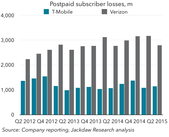
As you can see, each quarter Verizon loses somewhere around 3 million customers, even at its very low 1% churn rate, whereas T-Mobile’s slightly higher churn rate results in much lower losses – just over 1 million most quarters. So, right off the bat, even with a lower churn rate, Verizon has to win three times as many new subscribers as T-Mobile each quarter just to tread water. The combined effects of T-Mobile’s falling churn and its relatively small base give it a significant advantage over AT&T and Verizon (both of which have lower churn but much bigger bases) and Sprint (which has a very similar base but much higher churn).

T-Mobile adds half as many subs as Verizon

The other side, of the puzzle, then, is that these companies have to add enough new subscribers to at least offset the losses, but ideally quite a few more to drive subscriber growth. The chart below shows derived postpaid gross additions for the big four carriers (Sprint hasn’t reported Q2 results yet):Subscriber gross adds
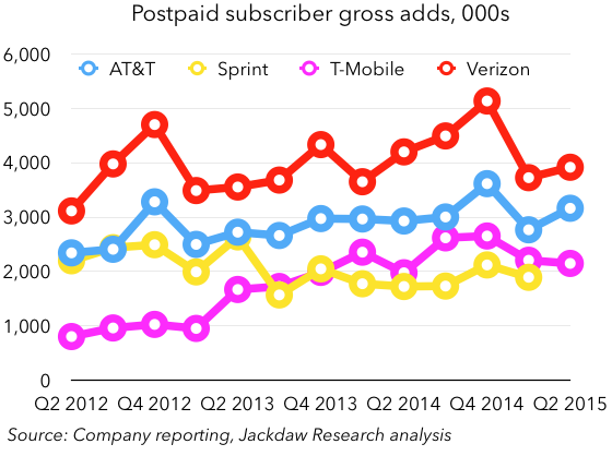
What you can see is that T-Mobile has far from the highest gross additions of the four carriers – in fact, last quarter its gross adds were just barely higher than Sprint’s. Verizon and AT&T both had significantly higher gross additions, driven in part by their far larger bases (many additions are additional lines sold to existing customers at this point) and their far larger marketing spend and to some extent store footprints. In short, T-Mobile isn’t winning more new customers than its major competitors – in fact, it’s in third place and fairly close to Sprint. Verizon actually adds roughly twice as many customers each quarter. The big difference is that low churn combined with its small base size, which combine for a much smaller loss of subscribers each quarter, and allow it a head start on growing subscribers.

Put another way, if T-Mobile had its current churn levels but was the size of AT&T or Verizon, it would currently be in last place rather than first place in net additions. AT&T and Verizon simply can’t grow phone gross additions much faster in the current, highly saturated, US phone market, so they’re pursuing growth where they can find it, which is in tablets and in new categories of connectivity like connected cars, home automation, and machine-to-machine communications. T-Mobile, however, benefits from its smaller scale (which is a liability in other ways) and from its good work in reducing churn rates, to the point that it’s consistently outperforming the other carriers in adding postpaid phone customers.

An increasing challenge

However, the larger T-Mobile gets, the more subscriber losses the same churn rates translate to, and the harder it will have to work to gain new subscribers. You can see from the earlier chart on subscriber losses that despite the progress on churn, losses aren’t falling, but rising. Despite a drop in churn from 1.48% in Q2 last year to 1.32% this year, losses actually rose slightly year on year, because that churn was on a base that had grown by almost five million. This will be an increasing challenge for T-Mobile, which is going to have a bigger hole to fill each quarter with new subscriber additions, even at a time when competitors are competing more aggressively and some of the lowest-hanging fruit for T-Mobile has been plucked.

Thoughts on Facebook’s Q2 2015 earnings

Yesterday, I covered Twitter’s earnings, and today I’m following up with a post on Facebook’s earnings. The two companies are very different – one is a social network that’s first and foremost about connecting with people you know in real life, and the other is a communication platform that’s more about catching up with the news and public figures. The former now has just shy of 1.5 billion monthly users, while the latter seems to be stuck at around 300 million. I’m not going to focus on the direct comparisons here, but you’ll note some stark contrasts as I review some key numbers from Facebook’s results.

The importance of Asia

One of the most striking things to me from Facebook’s earnings is the importance of Asia. Firstly, user growth in Asia over the past year has been accelerating:

MAU growthOther regions picked up a bit this quarter too, including the US & Canada (which is hard to see at this scale on the chart), but the Asian story is far more consistent.

As a result, Asia also contributed in an outsized way to overall MAU growth, along with the “Rest of World” region, which obviously includes Africa as well as Latin America:

MAU percentage splitAsia and Rest of World combined accounted for 82% of the growth, with the US and Canada and Europe making up just 18%. Now, before you start ascribing all this growth to WhatsApp and other platforms that don’t monetize as well, no, those MAU numbers exclude WhatsApp, so this is all for the core Facebook platform. However, Asia is still monetizing at a much lower rate, with just 16% of ad revenues in the quarter, but a third of Facebook’s users. Part of that is because Asian users still engage with Facebook less than their peers in other regions, as measured by the DAU:MAU ratio:

DAU MAU ratioThere are two ways to read that: Asian users continue to find less value in the platform, which is a bad thing, or the number is rising and Asian engagement today is almost where US engagement was five years ago, and will in time rise to similar levels. I’m inclined to believe the latter, though WhatsApp in particular but also things like allowing phone-number-based signup for Messenger are clearly moves to extend Facebook’s Asian base beyond its legacy product.

Mobile *is* Facebook today

It’s not a new story, but mobile clearly *is* Facebook today, as it accounts for more than 100% of its growth as the desktop business declines. As an interesting thought experiment, imagine what might have happened to Facebook had it continued to dither on mobile ads back in 2012 rather than pursuing them aggressively as the IPO forced it to do:

Mobile desktop revenue splitEssentially all of Facebook’s growth in the intervening period has come from mobile, propelling it from a billion dollar a quarter company to a four billion dollar a quarter company in the process, while non-mobile revenue declines. A big part of this is the transition in the way people use Facebook, as illustrated by its three major groups of users:

Active users by deviceAs you can see, mobile-only users just fell short of eclipsing mobile plus computer users as the largest single group by the end of Q2, but chances are they’re the biggest group by now, and the trend here is only going to accelerate. Both groups were about 44% of the total at the end of the quarter. One number Facebook doesn’t share is the split in time between computer and mobile usage for those users who spend time on both. But it did say that in the US Facebook accounts for 1 out of every 5 minutes people spend on smartphones, and that globally users spend 46 minutes per day on average across its properties (excluding WhatsApp). It’s likely that even for many of those multi-platform users, mobile dominates usage, which helps to explain the increasing dominance of mobile advertising.

The new businesses

The only ongoing challenge at Facebook is these new businesses it has acquired or launched which aren’t yet generating revenue in meaningful numbers, while adding significantly to costs (especially in the R&D category). WhatsApp, Oculus, and Facebook’s search product are all generating very little revenue while costing a great deal to build. There’s apparently no urgency about monetizing search or WhatsApp better, while Oculus will ship its first consumer product early next year. But in the meantime R&D spend (which includes salaries for employees that aren’t working on monetized products) is skyrocketing:

R and D spendA big part of that is hiring in R&D – of the 873 net new employees Facebook added in Q2, a majority were apparently in R&D. This, and the general investment in these new areas, is taking Facebook’s non-GAAP margins (which exclude stock based compensation) steadily downwards, though they’re still at fairly healthy levels. With the core business continuing to perform so well, I don’t think there’s any worry about this yet, but it’s something to watch going forward.

Thoughts on Twitter’s Q2 2015 earnings

Twitter is one of the companies I’ve written about most here on Beyond Devices. Some examples from the past year include:

You can see the full set of past posts here. I feel like last quarter’s post in particular sums up a lot of the same themes that came out of this quarter’s earnings call, but there are a few new points I want to make. I also tweeted out some charts earlier which you might find interesting, and the full set of Twitter charts will be in the deck that will go to Jackdaw Research Quarterly Decks subscribers soon.

Jack Dorsey’s audition went well

Given Square’s IPO plans, a lot of people have speculated that Jack Dorsey would be out of the running for the permanent CEO job at Twitter, especially given that the board has signaled it wants a full-time CEO. However, given the opportunity on today’s call to take himself out of the running, Dorsey refused to do so. Instead, he effectively auditioned for the post of permanent CEO during his remarks, and I think he did a fairly good job. Ironically, the market reacted badly, but I think what they’re reacting to is the true state of Twitter, versus the overly-rosy version Dick Costolo had been trying to sell the Street for the past few quarters. I don’t have a transcript yet, so this is all based on my own hastily typed notes, but some of the key things Dorsey talked about that stuck out to me were:

  • Realism about user growth and how poor it is, and how this is unacceptable – Twitter appears to have become stuck at around 300 million users, but it clearly has massive potential to be more than that, and Dorsey seems keen to fulfill that larger potential. Interestingly, there was almost no talk about the “logged out users” that were such a favorite of Costolo’s. Costolo appeared to have largely given up on logged-in user growth, but Dorsey doesn’t seem to have done so.
  • Realism about the product itself and its shortcomings. Dorsey clearly sees a lot of value in the product as it is today (as do I and millions of others) but as I’ve written before, it’s really not a good fit for the users Twitter wants. As Dorsey put it, the product isn’t immediately compelling to the new user and takes a lot of work to become so, which drives the high abandonment rate.
  • A focus on the users of Twitter first and foremost – Costolo often seemed to talk far more about advertisers and building a media company and so on far more than benefiting users, but Dorsey seems more focused on the users, and with the advertising side actually going very well right now, it’s about time someone put the users clearly first again. The key challenge here is to balance the needs of two very different groups of users – the users it has today, and the users it wants to add. Their needs – and the product they want to use – will be very different.
  • Clarity of vision about what Twitter should be – Dorsey’s sentiment was that Twitter should be “as easy as looking out of your window. It should show you what’s most meaningful in the world, first, before anyone else, straight from the source. And keep you informed and updated throughout your day.” That’s actually a great vision of what Twitter is for many people, and what it needs to become for many others, and importantly it’s user centric rather than some vague vision of a media platform. The other side of it was mentioned too – Twitter as a communication platform – “the most powerful microphone in the world.”

Many of the same challenges remain

However, the market reacted to the content of those remarks from Dorsey and from the others on the call, which were frank but also downbeat about the near-term prospects of Twitter. User growth is indeed very bad; engagement remains low, with a DAU/MAU ratio far lower than Facebook’s, even in Twitter’s top markets; there is no immediate prospect of these things changing, although Dorsey has a plan to do so over the medium term. Monetization, meanwhile, was phenomenal again, and drove significant growth in revenues and beating analyst estimates for the quarter. It looks like Q3 will be strong on revenue growth again if the guidance is to be believed. But as I’ve said before, better monetization can only carry you so far as long as user growth is lacking, and getting user growth going again has to be priority number one now that the ad side is ticking over well.

The future of Apple Watch will be more like the iPod’s than the iPhone’s

Note: this is the second post from Aaron Miller, who is now authoring occasional posts on Beyond Devices under the Studying Apple banner. Aaron is on Twitter at @aaronmiller


When Apple announced its earnings this week, they were as reticent as they promised to be about the number of Apple Watches sold. Still, some details did leak out giving us a sense of Watch’s first quarter. (Be sure to read Jan’s post where he estimated sales based on what we know.) Here they are, summarized:

  • The Other category, where they include Apple Watch revenue, grew sequentially by nearly $1 billion.
  • Apple Watch customer satisfaction is higher than for the iPhone and iPad.
  • Apple sold more Watches in its first quarter than in the first quarter of iPhone or iPad sales.

The last detail is probably the most interesting one. Comparing the Apple Watch to the iPhone implies a story about a massive future product, if not necessarily about a current one.

But the Apple Watch is hugely different from the iPhone. In fact, it’s much more like the iPod, a product now relegated to Apple’s history despite the recent updates. With iPhone at the top of everyone’s mind, we’re too quick to forget the iPod story and how similar it might be to the one playing out with the Apple Watch.

An Ecosystem Product

First, and most importantly, the Apple Watch is an ecosystem product. Right now, the Watch only works as an extension of the iPhone. Its upper boundary is the total number of iPhones in the world.

This makes the Watch much more like the iPod than the iPhone. From the time the iPod first launched, it was a product tied to a computer, first to Macs then eventually to Windows computers as well. 1 (Remember the Digital Hub strategy?) Just as the iPod existed to enhance the Personal Computer + iTunes ecosystem, the Watch exists to enhance the iPhone ecosystem. The iPhone, even if tied to iTunes early on, was never merely an ecosystem enhancement—nor designed to be one, like the iPod or Apple Watch have been.

Naturally, we expect the Watch’s reliance on iPhones to change over time. LTE and GPS seem like inevitable Apple Watch additions, for example, as does a Watch-native App Store. With true third-party apps coming soon, reliance on the iPhone will diminish even more. But there’s one limitation that may always tie Apple Watches to iPhones: the screen. Absent new technology to overcome how limiting such a small screen can be, the Watch will continue to be a capable iPhone enhancement more than a standalone product. The iPod’s limitations—most prominently, no native way to get music on it—similarly tied it to computers.

An Unsubsidized Product

The iPhone spent its first year not subsidized in the traditional way by AT&T, reflecting Apple’s intent to turn the mobile market on its head. Clearly this stood in the way of sales, because Apple changed tack just a year later with the iPhone 3G and created a much lower entry price for customers.

There are no carriers to subsidize Apple Watch purchases, and it’s hard to imagine such a subsidy ever materializing. (Perhaps we’ll all have wrist-phones someday, but taking calls on an Apple Watch is a current feature and people aren’t going nuts about it.) Without a subsidy, Apple’s profit margin has to come directly from customer’s wallets instead of indirectly through carriers.

The iPod hoed that row, and did just fine. It did sell less total units than the iPhone and had a slower upgrade cycle, but it was a record-breaking product nevertheless.

A Category-Defining Product

It amazes me how easily people forget what MP3 players looked like before the iPod. They were clunky and difficult to use. They were full of deal-killing trade-offs between physical size, capacity, battery life, and user interfaces. Some of the products were especially weird as companies tried to find niches. The iPod eliminated the majority of those trade-offs for a higher, but manageable, price.

To be clear, the Apple Watch category is not just smartwatches. The correct category is wearables, and wearables right now, at the birth of the Apple Watch, are very similar to the early MP3-player market. Some are huge and multi-functional. Some are svelte and limited. Some are banking on unique features trying to find a niche.

Because of the Android ecosystem, the Apple Watch may never wholly dominate the market like the iPod did, but it will define the category. Of course, most of Apple’s products shape their categories. But the iPod defined the category. It organized and crystalized the MP3 market. Back then, people weren’t sure what to make of MP3 players and their future. The same is true of wearables, especially smartwatches, today.

What the Future of Apple Watch May Hold

If the Apple Watch story does end up similar to the iPod story, we may see the following things play out:

  • The Watch will grow the iPhone ecosystem by driving switchers. The famous iPod halo effect gave people a reason to consider a Mac where they never had before. (This was helped in no small part by Apple Stores, where people would go in to buy an iPod and walk out with a new computer.) This effect is not trivial. PC sales as a multiple of Mac sales have been in steady decline since the iPod. It might be a coincidence that Apple reported the highest ever level of Android switchers this quarter, but expect to see even more.
  • The Watch will define and dominate the wearables category. If the Watch moves like the iPod did, you’ll see niche players like FitBit disappear. You’ll see some large competitors play copycat on features and design, but they won’t reach comparable market- or profit-share. Eventually, all wearables will be measured by the Apple Watch, just as all competing music players were measured by the iPod.
  • The Watch will get differentiated in more than just size and build materials. At its peak, the iPod branched into everything from the Shuffle to the Classic to the Nano in order to fit multiple budgets and preferences. It’s reasonable to see Apple doing something similar with the Watch. If I were to guess, I think the fitness tracking will be a core feature across all Apple wearables. (Imagine in three years the inexpensive Apple Fit, where Apple reinvokes the old FitBit-style devices killed off by the Watch. People will laugh at it. When they do, remember the iPod Shuffle.) Being an ecosystem product that can rely on iPhones, the Watch gives Apple the flexibility for slimmer features to get lower price points.
  • The Watch will see slower customer upgrade cycles. In this regard, the Watch will be like everything Apple sells except for the iPhone. 2 iPods continued working for many years beyond their purchase date. (My son is using a sixth-gen Nano that’s now over five years old.) As a result, iPod sales flattened before the iPhone entered on the scene, mostly because Apple had saturated the market and upgrades weren’t moving quickly. Just like with the iPod, expect Watch buyers to be much slower upgrading than they are with their iPhones.
  • The Apple Watch could eventually work with Android phones. I’m not at all confident on last this point because the history lines up much less reliably. Mac market share at the launch of the iPod was a small fraction compared to iPhone market share today. Apple had to get the iPod out to Windows to have any kind of customer base for it. Obviously, there’s no comparison between the 25 million Mac users in 2002 and the nearly 500 million iPhone users today.  Ultimately, this decision will depend on whether Apple feels the Watch serves better as an exclusive feature of the iPhone ecosystem or that it needs to sell to a larger market, followed by a halo effect to drive switchers after they’ve bought an Apple Watch. 3

Certainly, the Apple Watch won’t follow the iPod in every detail. But if the Watch does approximate the iPod’s history, Apple should be incredibly happy. It will be a historic product, and people will forget what life was like before it launched.

Notes:

  1. Only the iPod Touch, which owes its DNA to the iPhone, could eventually operate entirely without a computer. But consumers see it essentially as a less capable iPhone, not a dramatically better iPod. Not coincidentally, it’s been a footnote to the iPhone’s success more than a dramatic culmination to the iPod line.
  2. A recent example: when iPad sales began flattening, some writers declared failure, because they were expecting iPhone-like growth. Smarter analysis recognized that 1) the market for tablets is smaller, and 2) without subsidies, the upgrade cycle is longer.
  3. Obviously, an Android-capable Apple Watch would mean a different Watch than we have now, including a native App Store. Such a feat, though, is not out of the question.

Apple Watch sales

So, after yesterday’s preview post on Apple Watch sales, I thought I’d have a stab at interpreting today’s earnings report and call on this specific point. Yesterday’s post highlighted the challenges and pitfalls inherent in such an exercise, so I’ll walk you through all my assumptions so you can follow along and decide whether or not you agree on the way.

Other Products revenue

As I said yesterday, the starting point for this analysis is revenue from “Other Products”, the Apple segment which includes all hardware products but the big three, along with both Apple’s own and third party accessories. That category has been in decline, but not a very consistent rate of decline. Revenues this quarter were $2.641 billion in this segment, compared to $1.767 billion a year ago (on the restated basis Apple provided in January, which includes Beats headphones). That means growth of $874 year on year, and $952 sequentially. I always find annual growth a more useful measure, so we’ll focus on that. I’m going to assume that Other Products revenue excluding Apple Watch declined by 10%, to around $1.6 billion.

This is based on the recent rate of decline, and you could argue that we might put this number as low as $1.4 billion, but I’m not necessarily ready to go quite that low. Cook confirmed on the earnings call that both iPod and accessories shrank year on year, but didn’t say how much. If we take $1.6 billion as our number, that gives us just over $1 billion in revenue for Apple Watch, which is obviously a lot lower than I talked about yesterday.

Average selling prices and unit sales

The next challenge is to set an average selling price (ASP) to divide this revenue figure by to get a unit shipment number. My assumption for average selling price had been that it was likely somewhere around $500, which is a nice sort of midpoint between the lowest and highest prices for the two mainstream models, the Watch Sport and Watch, implying that the two had sold in roughly equal proportions, and/or that Edition sales helped push ASP up a little if Sport sales outweighed Watch sales.

However, there are a couple of things that suggest we should moderate this: one is some survey data that suggests a heavy skew towards Watch Sport sales, and therefore a lower ASP. But the stronger signal came today from Apple itself. On the earnings call and in conversations with various reporters, Apple’s executives have suggested that sell-through for the first nine weeks for Apple Watch were ahead of the same period for the iPad. That’s a very specific thing to say, and deliberately doesn’t give us a specific number to work with either, since the iPad was on sale for 12 weeks when its first quarter of sales was reported. So we don’t have a 9-week number for iPads. The first reported quarter number was 3.27m iPads shipped (not necessarily sold through), so perhaps we apply a 75% figure to that, which assumes a somewhat straight-line trajectory, which may or may not be realistic. 75% of 3.27m is 2.45m. If we want, we can also make an adjustment for the fact that this is shipments, not sell-through, and perhaps reduce it a tad more. But on this basis Apple might have sold 2.5 million Apple Watches by the end of the quarter.

So let’s take that number and figure out what it implies about average selling prices. $1 billion in revenue divided by 2.5m shipments suggests an ASP of exactly $400, which is quite a bit lower than my original $500 figure. But if sales did indeed skew heavily towards the Watch Sport, and if most buyers didn’t buy extra straps and so on, it’s just about realistic.

Moving to a range

That gives us a very specific set of numbers:

  • $1 billion in revenue
  • 2.5 million shipments
  • $400 ASP.

But that’s a lot of false precision, because it’s based on all kinds of assumptions. The revenue might have been as high as $1.2 billion, for example. ASPs might have been higher – perhaps as much as $450. Applying these numbers gives us more of a range:

  • $1-1.2 billion in revenue
  • 2-3 million shipments
  • $400-450 ASP.

That seems like a reasonable set of numbers to me, and I’m pretty happy with those. I’m curious to see what numbers others come up with.

Looking forward

I ended yesterday’s piece with a bit on looking forward, and I feel really comfortable with the qualitative side of that, even if less comfortable with the quantitative side. Apple execs on the call today certainly hit many of the points I mentioned in that section. But one thing that I found interesting on today’s call was that sales are still ramping at this point, from April to May to June, contrary to my assumption that things might slow down a little in Q3 and then pick up again in Q4. I’m very curious to see how this actually plays out now that the Apple Watch is on sale in all but one of the countries where Apple has stores, and certainly all of its major markets.

Evaluating Apple Watch sales

There’s going to be tons of noise this week about Apple’s earnings, with a particular focus on the sales of the Apple Watch. However, there are two key problems with all of this, and they are:

  • Apple almost certainly won’t give us the number of Watches sold, and estimating that number requires making a series of assumptions, which taken together make the resulting number pretty imprecise
  • Whatever the number various people come up with, we’ll be deluged with articles saying that the Watch has somehow flopped, that sales have fallen short of expectations, and so on, because it’s enormously difficult to know how to evaluate the number.

The rest of this post fleshes out these two points, with a view to providing some context for tomorrow’s earnings call.

The difficulty of estimating Apple Watch sales

As a quick reminder (for a longer primer, listen to this week’s episode of the Beyond Devices podcast), Apple Watch revenues will be reported under the “Other Products” segment, one of Apple’s five product segments, as of earlier this year. And in that Other Products category, you’ll also find revenues from the iPod (until recently broken out separately), third-party accessories, Apple’s own accessories (including Beats headphones), and Apple TV. Last quarter, that was a $1.7 billion revenue bucket, which was down about 10% year on year, but the rate of growth or decline has been fairly unpredictable. So the first thing you have to do if you want to calculate Apple Watch revenues is to make a set of assumptions about the rest of this segment and what results would have looked like without the Apple Watch. Perhaps you decide that revenues would have been around $1.6 billion based on that same 10% year on year decline, though in reality the range is likely anywhere from $1.4 billion to $2 billion based on the trends from the past two years. That, by itself, gives you around 1 million units’ worth of softness in your estimate between the two extremes.

At that point, you have your Apple Watch revenue number, and you’re ready to move on to the next step, which is figuring out how that revenue number translates to unit shipments. The challenge here, of course, is that this is easily the widest price spread of any Apple product: from $349 all the way up to $17,000 (and that’s just the US dollar pricing).  The assumptions you make about the mix between the various models are going to make a huge difference to the unit shipment number you come up with. In the grand scheme of things, Edition sales are likely to be tiny, but at that price point (around 20 times that of the midpoint of the other models), small differences in your assumptions will make big differences in your outputs. For the sake of illustration, I’ve presented in the table below three possible scenarios, which all give roughly the same total revenue figure of around $4 billion for the quarter:

Three Apple Watch scenarios correctedHowever, what you’ll see is that, depending on how you flex the mix between the three models, you’ll get a very different number of shipments – under these three scenarios, anything from 3.15 million to 7.8 million. And one of the biggest variables is the number of Edition sales you assume, as you can see from the third column. However, as the third scenario shows, if you shift the mix between the other two models radically, you get a similarly significant effect. So much depends on your assumptions. For what it’s worth, none of the three scenarios above represents the mix I’m expecting to see – they’re purely illustrative. I would think we might see around 5 million sales, at around $3-4 billion in revenue, but along with everyone else, I’m guessing now, and I’ll be guessing to an only slightly smaller extent after the results are out.

(Note: an early version of this post had an error in the spreadsheet above, which has now been corrected – the core point remains unchanged).

What constitutes success?

Now that we’ve established the pitfalls associated with estimating actual numbers, we move on to the other big question: how we should evaluate those numbers. This also goes to the heart of the question of why Apple likely won’t give us any numbers, which comes down to two things:

  • Early in a product cycle, the actual numbers are as much a function of supply as of demand, and so they don’t reflect actual demand accurately
  • Apple has barely started to sell the Watch, there are significant updates coming later in the year, and the word-of-mouth marketing which I still expect to be a big component of how sales grow has barely got off the ground, because there simply aren’t that many Watches out there.

You could make a strong argument that, whatever the actual numbers are, the Watch launch has already been a huge success, for two reasons: firstly, demand continues to outstrip supply, which (assuming supply isn’t being artificially constrained to create the illusion of shortages) is always a good sign; secondly, Apple is now catching up to demand across 18 SKUs and many variants behind those, which is logistically an enormous achievement by itself. With previous major product launches, there was essentially one SKU – one iPod, one iPhone – or slight variations by storage capacity. One of the biggest challenges from a supply chain and logistics perspective for the Watch has been the sheer variety of the individual models and the difficulty of predicting which would be most popular.

Another way to look at sales is in the context of past Apple product launches and there, too, the Apple Watch likely comes out ahead. The iPod sold 125,000 in its first quarter, the iPhone sold 270,000, and the iPad sold 3.3 million. Watch sales might be close to the iPad launch, but I suspect they’ll be higher. However, unlike the iPad, which was a standalone device from the beginning, the Watch is a companion device to the iPhone, so its addressable market is arguably narrower. Compare Apple Watch sales to the sales of any other smart watch or even fitness device, though, and they again come out on top. Fitbit sold 3.9 million devices of all kinds in Q1, so Apple Watch might again be close to that this quarter, but probably slightly above it, and Fitbit is by far the market leader in this category, with smartwatches a much smaller category (and a small subset of Fitbit’s device sales).

What next?

Is there any sense in which the Apple Watch can be considered not to have been a success, assuming the numbers come in roughly where I think they will? I think so, but it’s mostly a matter of timing. What I mean by that is that I suspect the Apple Watch will quickly get to the point where it’s Apple’s second-highest selling product, behind the iPhone but ahead of the iPad, probably either in Q4 this year or sometime next year. But for now, it’s quite a bit smaller than Apple’s other products. It doesn’t seem to be hitting the same mainstream consciousness as other recent Apple devices as quickly.

I regularly meet people for whom my Apple Watch is the first one they’ve seen in the wild, as it were. And I continue to believe that word of mouth marketing is the most effective form of marketing for the Apple Watch, as a new product in the market, and as a product that’s distinct even from other entrants in the category. My wife and I both have Watches, and when people spot them, they often ask, “How is it?” or “Do you like it?” And we both respond, “It’s great” or words to that effect, but I continue to struggle to articulate the reason why they’d be great for everyone, or even for most people. My Watch is enormously useful to me because of the notifications especially, though I also enjoy the at-a-glance information on the screen at all times, and the fitness tracking is a nice bonus.

I suspect that what will really start to change this is the emergence of a really strong set of third party apps, and that will have to wait for WatchOS 2 in a few months’ time. Apps were critical to the success of the iPhone and iPad, and I think they’ll be even more critical to the success of the Watch, and I’ve said this from the start. It’s only when you get innovation happening among third party developers about what’s really possible when you have a wrist-worn, always-present supercomputer that you’ll really start to see the potential in this category. And allowing those developers to run their apps on the Watch itself, and to make use of both the hardware and software features that Apple’s own apps already have access to will be a huge step forward.

As such, I’m expecting that Q3 may be a quieter quarter for the Watch, in which Apple may well sell fewer devices than in Q2, but Q4 will be absolutely huge, both because of the impact of WatchOS and native apps, but also because of holiday buying, at a time when many more people will know someone who has a Watch and loves it.

Google isn’t Berkshire Hathaway

Update: given Google’s Alphabet announcement on August 10th, I’ve written a new post which refers back to this one. You might like to read that one too.

That’s likely an odd title, but both the title and this post were prompted by a paragraph in a Wall Street Journal article about Google ahead of its earnings later this week. The paragraph, which references remarks made by CEO Larry Page at a meeting with large shareholders back in December, reads as follows:

Mr. Page said he looks to Berkshire Hathaway Inc., the insurance-focused conglomerate run by billionaire Warren Buffett, as a model for how to run a large, complex company, according to people who were at the meeting. Mr. Buffett has a cadre of CEOs running operating companies and doles out capital from the holding company to these businesses based on their performance each year.

I first saw references to this paragraph on Twitter, and subsequently decided to read the whole thing. While the tenor of the article overall is very much in keeping with my own views on Google (it seems to be facing increasing headwinds and is doing a poor job of explaining how it will weather them), this idea attributed to Page struck me as particularly odd, and somewhat worrying. And the simple reason is that, even though it’s perfectly normal (and sensible) for CEOs to seek to learn from other CEOs how to run their companies, Google is nothing like Berkshire Hathaway, and indeed it shouldn’t be. Below, I’ll outline several reasons why I find Page’s remarks concerning.

Berkshire Hathaway is a conglomerate

I don’t know any more about Berkshire Hathaway than the next person – it’s simply not a company I’ve spent a huge amount studying. But I have learned enough previously (and researched enough today) to provide a brief primer. First off, Berkshire Hathaway is, famously, a conglomerate. That means, in part, that one of its defining features is that it’s a very diverse business with many unconnected parts. Wikipedia’s definition is likely as good as any (emphasis mine):

A conglomerate is a combination of two or more corporations engaged in entirely different businesses that fall under one corporate group, usually involving a parent company and many subsidiaries.

Berkshire Hathaway itself wonderfully fits this description. Though the Journal article describes it as “insurance-focused”, in reality BH’s assets are incredibly diverse, including Dairy Queen (a restaurant chain), Fruit of the Loom (clothing), a railway, energy companies, half of Heinz, a whole range of others and, yes, a sizable insurance business. Many of these businesses are indeed run entirely at arm’s length, and they can be because they have no connection with each other. They can also be run in this way because they’re all profitable in their own right (at least at a divisional level), and so don’t need the other subsidiaries to prop them up. The only real connections between BH’s various businesses are the 25-strong headquarters staff and the fact that the company uses the “float” (the premiums received but not yet paid out on) from the insurance business as a cheap source of investment money for the other businesses.

Google is not a conglomerate

On, then, to Google, which I know and understand much better and which is very different from Berkshire Hathaway. There are several key points here:

  • Firstly, Google isn’t a conglomerate – its businesses have hitherto had fairly strong connections with each other, and in some cases a very strong connection. At a basic level, almost all of Google’s businesses (until relatively recently) have been Internet services businesses, and even all its current businesses are at least technology businesses. That, alone, makes them far less diverse than most conglomerates, and than the the definition above suggests.
  • Secondly, although Google has many products and services, it doesn’t have “many subsidiaries” – these products and services have largely been interconnected, as I just described, and as such can’t simply be treated as a series of subsidiaries to be managed separately, as Berkshire Hathaway’s various assets can.
  • Thirdly, the pieces of Google aren’t and can’t be independent in the way BH’s various businesses are, because many of them (including some of the largest, such as Android and YouTube) simply aren’t profitable in their own rights. Though the management of some of these bigger parts can be given a measure of autonomy, they can’t run anything like BH’s various subsidiaries can because they rely on the other parts of Google to stay afloat.

I’m not sure which explanation for this disconnect worries me more – either Larry Page doesn’t understand these important differences between Google and Berkshire Hathaway, or he’s planning to turn Google into a true conglomerate along the lines of BH. Neither seems like a good sign. I’ve already talked about the first of these, so let’s tackle the second. Though some of Google’s recent acquisitions haven’t fit with certain popular visions of what Google is as a company, I believe they all fit if you look at the company through the right lens: as a machine learning and artificial intelligence company (something I wrote about in detail in this piece). I think there are still concerns about Google, as I said at the outset, but I don’t think over-diversification is one of the biggest.

However, if Page really is planning to build a conglomerate, that’s even worse news. For one thing, he’s absolutely the wrong guy to run it if he’s using Warren Buffett’s model as his ideal. Warren Buffett is, above all, a very shrewd investor, and Page’s major acquisitions have been anything but shrewd from a financial perspective. But using Google as a vehicle for further investments also doesn’t seem like a good idea, regardless of who’s running it. Conglomerates are notorious for diminishing rather than enhancing the value of their subsidiaries, and Berkshire is the exception rather than the rule (and Buffett has articulated clear reasons why).

The one way in which Google could be like Berkshire Hathaway

There is one small way in which Google might be like Berkshire Hathaway, and that’s the fact that Google, like BH, has one part of its business that generates significant sums of money that can be used to invest in the rest. At BH, this is the float – not technically profit, but still cash on hand that can be invested elsewhere. At Google, it’s the search advertising business that is Google’s profitable core. However, unlike BH’s insurance float, which seems fairly safe for the time being and has been steadily growing over the years, Google’s core business seems increasingly threatened, and it’s not clear that any of its other businesses are in a position to supplement or supplant it as a major source of revenue in the near future. The key difference, then, remains that BH uses its float to invest heavily in businesses that are already successful, whereas Google invests its profits into businesses that need the money just to run, because they’re unprofitable.

I think the most charitable reading of Page’s remarks is that he only sees Buffett’s model as a guide at a very superficial level – of giving his various direct reports a certain amount of autonomy. I certainly hope that’s what he meant by the comparison, because almost any other reading of them is worrying, to say the least.

Microsoft’s devices restructuring

Microsoft today announced a restructuring of its devices business which I think most of us have been expecting to land any day since CEO Satya Nadella’s memo to employees a couple of weeks ago indicating tough choices were ahead (and indeed, which the company strongly hinted might be coming back in April). However, even though this was widely anticipated, the exact meaning of it is less obvious. I see many taking it as a capitulation, but Microsoft clearly isn’t getting out of the phone business at this point. Below are my thoughts on what this move means, and what might still come later.

Not a concession of defeat – yet

Though clearly a concession that things haven’t been going well for its devices business, this isn’t a concession of total defeat just yet, and there are two reasons why I say that:

  • Microsoft accounts for almost all Windows Phone device sales itself, with over 95% of the market according to AdDuplex. As such, killing its own devices business would simultaneously kill Windows Phone as a platform
  • Microsoft’s positioning around Windows 10 has had a heavy mobile component, with universal apps and various tools for porting apps from other mobile platforms major focus areas in the announcements over the last several months.  As such, it seems extremely unlikely that Microsoft would be ready to kill off Windows Phone.

In short, the timing just doesn’t seem right for abandoning either Microsoft’s first party phone business or Windows Phone as a whole. That’s not what’s happening today, though that doesn’t mean it’s not coming somewhere down the line, as I discuss below.

Windows 10 and focus

It’s clear that at least some within the business believe that Windows 10 and some of the related efforts targeted at developers will help to turn the fortunes of Windows Phone around. I’ve shared my skepticism about that hope in several pieces here over the last few months (including the two linked to in that second bullet above), and wrote an in-depth report about Windows Phone and its prospects too (available here). I continue to believe that Windows Phone suffers from several more or less insurmountable challenges, and don’t see any clear way out of this situation even with Windows 10.

At least part of the problem with Windows Phone has been that it was losing money at its current scale and that scale wasn’t growing rapidly enough to make a difference. By scaling down the business still further, Microsoft likely shifts the equation slightly in favor of profitability, though at the rate the feature phone business has been declining, that may not be enough. But the focus Microsoft is planning to bring to its portfolio is a good thing – for such a small devices business, Microsoft (and Nokia before it) has had a bewildering array of devices on sale, and could likely get by with a much smaller number, say one or two in each of its series (500, 600, 700 etc). But amid this “focus” comes this statement reported by Mary-Jo Foley at ZDNet:

Microsoft will focus its phone efforts on three segments: Businesses, value-phone buyers and flagship phone customers, moving forward.

This is a funny kind of focus! As far as the smartphone market is concerned, flagship and value phones are basically all there is at this point in many markets, so that’s no focus at all. And the mention of business users reflects a basic misunderstanding of the phone market which Nokia seemed to have overcome way back, when it abandoned its E-Series devices. The fact is that business users are just the same as anyone else – they want phones they like to use, that allow them to do not just work but personal stuff too. I’m also curious what this all means about the feature phone business and whether Microsoft will now abandon that entirely. There was a theory that being in feature phones would allow Microsoft to provide a migration path to smartphones over time, but I’ve always been skeptical about that, and at the rate of decline this business is seeing, it’s more of a liability than an asset at this point.

Microsoft shrugged

Meanwhile, the impairment charge is so large that it’s hard to imagine that it’s for anything other than the whole value of the business acquired from Nokia. Remember that though the total price paid to Nokia was 5.44 billion euros (reported as $7.2 billion at the time it was announced), only 3.79 billion (or $5 billion) was for the devices business, while the other $2 billion or so was for patents. The $7.6 billion impairment charge is therefore not just more than the original purchase price, but significantly more than the price paid for the devices business specifically. That either means that Microsoft is also writing down some of the value of the patents or accounting for a significant additional investment in the business since the acquisition (or both). However, at the end of the day, the key point is that Microsoft has at this point basically unburdened itself of the value of the acquisition, such that if it does have to wind the business down it likely won’t have to take another significant impairment charge.

By the time it’s done with the layoffs announced today, Microsoft will also have jettisoned around 80% of the employees associated with the Nokia acquisition. It took on around 25,000 (down from the 32,000 originally anticipated) when the acquisition closed, but laid of around half three months later, in July last year. Now, a year later, it’s losing another 7-8,000, taking the remainder down to just 5,000, or 20% of those originally brought on board.

As such, if Microsoft does have to abandon Windows Phone and its own devices business (I simply don’t see how it’s going to get more OEMs on board for Windows Phone, so the two are inextricably linked), at least it’s now written down much of the value of the acquisition, and will have eliminated most of the employees by the end of this year. That will make it much easier financially and operationally (if not emotionally) to pull the plug when the time comes. But it will be a huge sea change for Microsoft to concede defeat in operating systems for mobile devices after 15 years of trying.

Postponing the inevitable

I suspect today’s move is just another step along the road that eventually leads to an abandonment of this business, even if Microsoft isn’t ready to concede defeat today. The good news is that Microsoft has a strong alternative strategy in place with its third party mobile apps business, which has produced some good results recently, so that it’s not putting all its mobile eggs in the Windows Phone basket as in the past. I continue to worry that a third-party apps business may struggle as both Apple and Google increasingly tie their first party services tightly into their operating systems and virtual assistants, but it certainly seems to have a better shot at gaining users than Windows Phone for now.

However, the other big challenge is monetizing that usage, which continues to be my biggest concern for Microsoft. Its traditional software licensing model simply isn’t going to cut it in consumer markets, and I suspect the SaaS model will be equally challenging. As such, as I outlined in my “Thesis on Microsoft” piece a while back, Microsoft is going to have to make its money more or less exclusively through enterprise cloud services while using the consumer market to drive continued scale.

Google Fiber’s real innovation

I’ve written about Google Fiber just once before, and that was to talk about my installation experience when I briefly lived in one of the very few areas where the service is available, in Provo, Utah. However, today I wanted to unpack something different about Google Fiber, in part in response to some recent articles I’ve seen, such as this one. These pieces often cite competition from Google as the major factor in a perceived shift in the status of broadband in the US, and that isn’t quite what’s happening. I would argue that Google has had a significant impact on the rollout of broadband in the US, but mostly not because of direct competition.

Maps tell part of the story

As I mentioned in that opening paragraph, Google Fiber is actually available in very few places today. Here’s the map from Google’s Expansion Plans page:Google Fiber map


The company being most aggressive currently with rolling out gigabit services is AT&T, and here’s its equivalent map:

Screenshot 2015-07-06 10.33.41


Note, first of all, that both companies have the same three categories – cities where they offer service today, cities where they will definitely launch in future, and cities which are in an exploratory stage. That’s something that we’ll come back to later.

But the second thing to note is that, of the 27 metro areas listed in total on the two maps, just seven appear on both maps, with the other 20 being mutually exclusive. Yes, you can absolutely make the argument that AT&T is responding to competition from Google in some of these markets, notably Austin (the same goes for some of the incumbent cable operators). But in a majority of cases, AT&T is launching or contemplating a launch in cities where Google isn’t present. So, though Google helps to explain why AT&T is launching gigabit service in some markets, it’s clearly not the whole answer.

Google’s real innovation: turning the model on its head

In what sense, then, is Google having a significant impact on the market? Well, the answer is that the key innovation Google brought to the broadband market has nothing to with technology and everything to do with business models. Essentially, it turned the traditional model on its head. If you’re not familiar with how broadband and TV operators usually roll out service, here’s how it’s traditionally worked. The provider approaches the municipality where it wants to offer service, and requests permission to do so. The municipality then extracts every possible concession from the potential provider before finally (if the provider accedes to the terms) granting permission. These concessions have typically included minimum coverage requirements, free access for schools, libraries and the like, carriage of local content on TV services, and so on. Essentially, providers have traditionally had to bribe municipalities with a variety of goodies just to get permission to offer service, and then have often still had to work very hard to get access to infrastructure needed to roll out the service.

Enter Google. Google’s process, of course, was entirely different: it essentially announced a competition for a city to become the first Google Fiber location, and invited cities effectively to bid for the privilege. What happened as a result was that over a thousand cities across the US applied, and Kansas City was eventually chosen. In the process, Google turned the usual model on its head – instead of municipalities extracting concessions from Google to roll out fiber, Google would extract concessions from cities for the privilege of having Google Fiber rolled out. Cities wouldn’t impose any “redlining 1” restrictions, they’d smooth the path for Google to build the necessary infrastructure, and so on.

The first reaction of Verizon and AT&T, which had just spent painful years getting franchises in many individual municipalities for their fiber rollouts, was outrage. However, their second reaction was far more productive, which was to say that they, too, would be willing to roll out such services if cities would offer them the same terms and concessions, starting with Austin, Texas, where AT&T was one of the incumbent operators. Though this claim was met with some initial skepticism, AT&T has since followed through not just in Austin but in a number of other cities where Google isn’t present at all. AT&T, then, has benefited enormously from Google’s business model innovation, which allows for a demand-led rollout facilitated rather than held back by local municipalities. And it’s this innovation which has allowed AT&T to rapidly expand its GigaPower services to many other cities too, well beyond those where Google is competing with AT&T. (Verizon, of course, had largely completed its FiOS rollout by the time these changes happened, and so wasn’t able to take advantage of them in the same way).

Rollout details

As I close, I’ll return briefly to something I asked you to note earlier – the three categories of cities both Google and AT&T list on their maps: open markets, announced markets, and markets under consideration. This is a critical part of this whole model, and the innovation Google brought to the market, because the markets under consideration are those currently being invited by the two companies to make big enough concessions to make a rollout worthwhile. The same process that got Google Fiber into Kansas City is now being repeated across the country by AT&T and Google in very much the same way.

What’s very different between the two companies, though, is the way they treat those first two groups, and Austin is a great case study of this difference. Google announced the Austin market in 2013, and now has one neighborhood (or Fiberhood, to use Google’s terminology) up for sale. Four other neighborhoods are listed as under construction, while “Rest of Austin” (the vast majority of land area in the city) is described as “coming soon”. Contrast this with AT&T, which made a rushed announcement within a week of Google’s, but completed its 1 gigabit rollout by September 2014. AT&T’s big advantage, of course, is that it already has a network and lots of customers in Austin, and in almost all the other cities where it will launch GigaPower service. This obviously dramatically speeds up the rollout, and in almost all cases will mean that AT&T is way out ahead of Google even in cities where the two compete. (In Austin specifically, the fact that AT&T owns a lot of the infrastructure Google needs access to for its rollout has been another significant factor).

Closely connected to this is the size of the cities these two companies are targeting – though Google has tended to focus mostly on second-tier cities in its early rollout, AT&T is already in Chicago, Miami, Atlanta, Dallas, and Houston, and has other major cities like LA, San Francisco, and San Diego on its exploratory list. Again, when you already have a network, contemplating a rollout in a major metropolitan area is much more palatable than if you’re having to start from scratch. So, AT&T’s launched cities see far greater availability more quickly, but its announced cities are also likely actually see gigabit services widely deployed far faster than Google’s.

So, in the end, though Google spearheaded this move to gigabit broadband, it’s quickly ceding the market to others, and especially AT&T, which are piggybacking off its business model innovation and rolling out services much more quickly. In the end, though, perhaps that meets one of Google’s original goals very effectively, and perhaps better than Google’s own rollout could have done. After all, one of the major drivers behind Google’s rollout was improving broadband access across the US.

Notes:

  1. Redlining is the name given to the practice of excluding certain neighborhoods from an infrastructure rollout on the basis of lower incomes, lower propensity to pay, or for other reasons, which has traditionally been banned by municipalities requiring universal access.

Friction is the Problem with Apple Music, not Complexity

Note from Jan Dawson: I’m honored and grateful to announce that Aaron Miller, my co-host on the Beyond Devices Podcast, will be authoring some posts on the Beyond Devices blog going forward as well. This is the first of what I hope will become a series of posts over time. These posts will have a slightly different tone from the rest of the blog, and will be educational in nature, and frequently tied to research concepts – a concession to Aaron’s day job as a business school professor. To reflect that, these posts will be tagged “Studying Apple“. For more about Aaron, check out the About the Authors page.


Walt Mossberg and others seem to love Apple’s new Music service, but Mossberg’s (and others like David Pogue’s) complaint has been that the applications delivering it are too complex. The criticism applies to both Music on iOS and iTunes on the computer. There is a lot going on in Apple Music; there’s no denying it.

Complexity isn’t the problem, though. Friction is. You might call it a semantic difference, but if you do you’re missing out on an essential aspect of everything human beings make. It’s worth understanding the difference between something that’s complex and something that’s frictional.

User Interface Friction

These three points explain something called User Interface Friction (UIF):

  1. Attention is a scarce resource. Mental effort falls under a concept known as executive function. Simplified, executive function describes the many ways we focus our attention on things. We have a limited store of attention. We can only pay attention to a few things at a time. We can also use up our attention, our ability to focus. Time and rest restore it.
  2. Friction is wasted energy (and wasted attention). Although physical friction has its uses, in most situations friction is wasted energy. It’s a great analogy for users’ attention and software. All of your attention spent on an app should help toward your goal. Wasted attention is User Interface Friction. As excellently described in this article from Coding Horror, low UIF is a goal but some UIF is inevitable.
  3. UIF is affected by both users and the interface. Just like physical friction is a measure of how two surfaces interact, UIF is a measure of how users and interfaces interact. And as app interfaces can be metaphorically “smooth” or “bumpy”, users can also be smooth (expert) or bumpy (novice). Expert users can handle bumpier interfaces, because they’ve learned how to use them.

Obviously, software designers should try to minimize UIF as much as possible. Low friction makes an app more useful and more enjoyable, even if it’s something boring like a banking app. Software designers can even measure cognitive load while users interact with the app, and pinpoint where attention is overspent. (Here’s a 2006 article [PDF] describing ways to measure cognitive load for testing website usability. The Sternberg Memory Test is especially easy to use.) The idea is that if users have to overspend attention to accomplish something, then the interface needs improvement.

I’m not a user interface expert, so I can’t go very deep into the principles of good UI design that have developed over the years. (This Quora discussion is a good place to start.) But I know when I’m experiencing friction. A lot of the time it’s from bad design, but not always.

Some apps are necessarily “bumpy” because of how much they do. Final Cut Pro, for example, is a massively complex video editing application. It does things editors could only dream about a few decades ago. Because of this complexity, Final Cut Pro relies on expert users to reduce UIF. (This is part of the reason Final Cut X, a huge interface revamp, was so controversial.) To be sure, Apple shouldn’t waste editors attention, but it has the benefit of editors knowing how Final Cut Pro works.

Any app, no matter how bad, can be learned with time. That means we can become experts in poorly designed interfaces if we just stick with them. Lazy or poor app designers demand more expertise from users than necessary. Users generally abandon an app if the expertise cost is too high for them.

Apple Music and Friction

Generally, Apple users are not computing experts. That’s not an insult. It’s just the reality of having hundreds of millions of users. Apple’s success fundamentally comes from its ability to make low friction interfaces for very useful products.

Like any company, Apple runs into problems when its novice users are presented with complex products. This encounter puts Apple’s design chops to the test. But some things are just too complex to simplify for novices, and Apple requires users to develop some expertise.

There’s a lot of depth and complexity to Apple Music. Consider all that it does:

  1. Integrates a streaming music library with your owned music library.
  2. Helps you purchase music to make it part of your owned library.
  3. Provides extensive music recommendations—through curated playlists and suggested artists—based on your (complex) tastes.
  4. Brings new music to your attention, organized by multiple criteria.
  5. Plays multiple radio stations.
  6. Gives you a way to organize streaming and owned music in playlists.
  7. Allows you to search for music by multiple criteria.
  8. Gives you control over the play order of the music you’re listening to.
  9. Connects artists and fans, giving artists a way to share their work and lives through multiple media.

This list gets dramatically longer in the case of iTunes on the computer, because it includes movies, TV shows, podcasts, iTunes U, audiobooks, iOS apps, even more radio, and ringtones, along with all the different aspects of organizing, using, and purchasing those things. And let’s not forget all the device syncing, with multiple generations of iPods, iPhones, iPads, and even legacy MP3 players.

How do you keep all of that simple? I’m not convinced you can. Siri commands help some, but don’t get you all the way there. In the end, even the venerable Apple can only get the interface to a certain level of smoothness.

That doesn’t mean we should excuse Apple for bad UI design. iTunes 12 was a big change that introduced a lot of friction. (The money quote for our purposes: “But for now, iTunes 12’s most basic operation—finding and playing media—requires a lot more thought than it should” [emphasis added].)

So what has Apple decided to do with its Music apps? It apparently expects us to develop some expertise. Walt Mossberg and everyone else complaining about the friction in Apple Music also seem to love the value it provides. Apple designers, intentionally or not, are banking on our willingness to stick with it and get better at it.

That doesn’t mean we can’t complain about the friction, though. For me, the worst offender is the mysterious ellipsis button. (Who knows what combination of commands it reveals every time I tap on it? It’s like the UI equivalent of a slot machine.) Over time, we can all hope that Apple reduces the friction for its fundamentally complex Music service. In the end, making complex things frictionless is how Apple pays the bills.