Putting Some Numbers Around Amazon Prime

Amazon filed its 10-K report for 2016 late last week, and it adds a few bits of additional information which haven’t been in previous versions. Most notably, it provides a breakdown of revenue by similar product, which is the first real visibility we’ve had into Prime and certain other categories. It doesn’t report Prime directly, but there’s enough data here to provide some really interesting insights into the Prime program, how many members it has, how much revenue it generates, and how revenue is split between shipping and other services.

Amazon’s new revenue breakdown

First up, here’s the new breakdown. Revenue is split into five categories which, other than AWS, we haven’t seen broken out before:

  • Retail Products – this is basically all e-commerce plus most one-off sales of digital goods except those which are sold on a net basis (likely mostly apps); plus any direct shipping revenue associated with e-commerce purchases
  • Retail third-party seller services – this is all the revenue Amazon generates from its third party sellers including commissions, related fulfillment and shipping fees
  • Retail subscription services – Prime is the biggest component here, but it also includes Audible, Amazon Music, Kindle Unlimited, and other non-Prime subscriptions
  • AWS – Amazon Web Services, as reported in its segment reporting
  • Other – all the stuff that doesn’t fit in any other bucket, with co-branded credit cards and advertising the only two components called out specifically.

Here’s what that revenue breakdown looks like in percentage terms over the last three years:

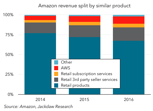
As you can see, Product Sales are by far the largest component, but they’re falling rapidly as a percentage of the total, from 77% in 2014 to 67% in 2016, while the other categories are coming up fast. Here are the growth rates for the last two years for these various components:

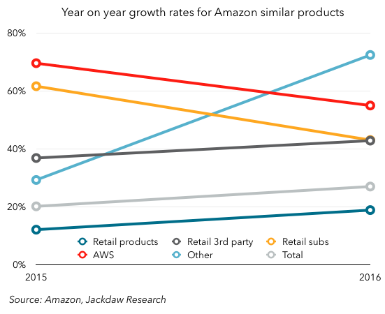
As you can see, the growth rates are all over the map, with the fastest-growing that mysterious Other section, which I suspect is largely driven by Amazon’s small but flourishing ad business. eMarketer estimates that this is already a roughly billion-dollar business for Amazon, so that would make sense, though the growth rate here is much higher than eMarketer projects. Those credit cards must be doing well too.

But outside that, it’s worth noting that third party services are growing much faster than product sales, with retail products (i.e. Amazon’s own direct sales) the slowest growing of any of these categories. Both retail subscriptions and AWS are coming down somewhat in percentage growth terms, but largely as a factor of becoming quite big numbers – in both cases, the dollar growth year on year actually increased. That third party sellers are growing faster than first party is actually a good thing – Amazon’s margins on those services are much higher, because it only reports its cut rather than the gross take as revenue. This growth has been a major driver, alongside AWS, of Amazon’s increasing margins lately.

Deducing Prime subscribers

Let’s focus, though, on that retail subscriptions business, because that’s where Prime revenue sits. We need to make some assumptions about how much of that revenue is actually Prime to start. Morgan Stanley reckons it’s about 90%, and though I was originally tempted to say it was more than that, checking into the size of Audible made me think it’s probably about right. So I’m going to stick with that.

If we want to know subscriber numbers, though, we need to figure out what the average subscriber pays, and that’s a complex proposition because the price of Prime increased by $20 in 2014 in the US, and costs different amounts in each market. If we make reasonable assumptions about the mix of where those Prime subscribers are located (e.g. by using Amazon’s revenue split by country) and then apply the going rates at various times for a Prime subscription, we can arrive at a reasonable average. Mine starts at $76 in 2014 and rises to $81 in 2015 and $82 in 2016, whereas Morgan Stanley’s is at $88 for both 2015 and 2016.

On that basis, then, here’s a reasonable estimate for Prime’s subscriber numbers over the last four years, together with a sanity check in the form of the minimum possible number Amazon might have based on various public statements it’s made:

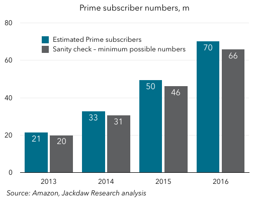
The numbers you end up with are just barely above those minimum numbers provided by Amazon. There’s no way to be 100% sure about my numbers, but they certainly imply that Amazon has been making the biggest possible deal out of its total number ever since that “tens of millions” comment at the end of 2013 (which referred to 21 million subscribers according to my estimate). These numbers would also help explain why Amazon didn’t provide a percentage growth number at the end of 2016 as it did in the previous two years: the percentage likely went down, again as a result of an increasingly large base, not lower subscriber growth – it added 20 million subs in 2016 versus 17 million in 2015.

Prime revenue allocation

One other interesting wrinkle which I’ve wondered about for a long time is the way Amazon allocates revenue between the components of its Prime service, which after all combines free two day shipping with a Netflix-like video subscription and various other benefits. Its financial reporting has always made clear that it allocates these portions of revenue to different buckets – specifically, its Net Product Sales and Net Service Sales categories – even though they all come from the same Prime subscriptions. Understanding this split may seem of purely academic interest, but in fact it’s key to divining the economics of Amazon’s Prime video business.

One interesting thing about the new grouping of revenues Amazon provided in its 10-K is that there is just one portion of revenue allocated differently here from in Amazon’s other reporting, and that’s the shipping component of Prime revenues. In the Net Product/Service Sales split, shipping goes into Product, whereas in the Similar Products split it goes into retail subscriptions. Therefore, if we look at the differences between the amounts reported in the various segments, we can deduce the Prime shipping component, and by implication the portion allocated to everything else (mostly video).

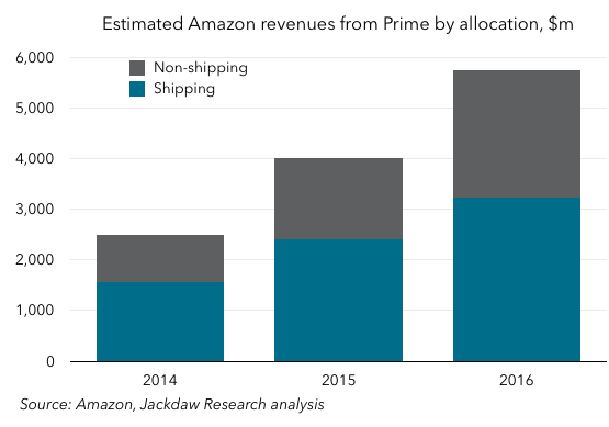
What you can see is that the revenue allocation is shifting quite significantly over time from shipping towards the rest – shipping was 63% or almost two thirds of the total in 2014, but only 56% of the total in 2016, and the actual numbers have both risen considerably. For comparison’s sake, the Prime shipping allocation is around a third of Amazon’s total shipping revenue.

Competing with Netflix on content will be tough at these levels

We can then compare Amazon’s non-shipping revenue (the vast majority of which should probably be seen as video revenue) against Netflix’s global streaming revenue:

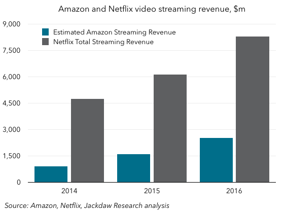
What you see here is that Netflix’s revenue from its streaming business is massively larger, not least because it allocates the full $8-10 per month it collects from its nearly 100 million subscribers  to streaming, whereas even with 70 million subscribers, Amazon only allocates just under half to streaming.

This has significant implications for the viability of the two companies’ investments in original content. Netflix has committed to spending $6 billion in total on content in 2017, which is more than twice Amazon’s entire revenue from streaming video in 2016. To the extent that Amazon wants to be competitive in content, it either needs to lose money on the whole thing as a subsidy for its e-commerce business, or charge (or allocate) a lot more of its total take to streaming video. Interestingly, the standalone monthly Prime Video service Amazon offers comes in at $9, suggesting that without the flywheel benefits of free shipping, it needs to recoup far more like the total real cost of providing the streaming service.

Yet Another Reset for Twitter

Here we are, almost eleven years into Twitter’s history and a little over 18 months into Jack Dorsey’s second term at the company, and Twitter is heading for yet another reset. The company says it’s already been through a reset on its consumer-facing product, and that the changes it’s made are delivering results: positive year on year growth in daily active users, though Twitter still refuses to provide the underlying metric. It now says ad products need to go through a similar reset and re-focusing process. As a result of all this, the company isn’t even providing revenue guidance for Q1.

Here’s a quote from Twitter’s earnings call:

we remain focused on providing improved targeting, measurement and creative for direct response advertisers

Specifically, that’s from Twitter’s Q1 2015 earnings call, almost two years ago. But on today’s call, Anthony Noto said almost exactly the same thing again – some of this stuff has been in the works for over two years, and Twitter still doesn’t seem to be making meaningful progress. Rather, it’s now evaluating its direct response ad products to figure out which are delivering an appropriate return on the resources invested in them, with a view to killing some off.

Why is this all taking so long? It seems Twitter has been unable to focus on more than one big project at once, despite its arguably bloated workforce, and it’s hard to avoid the sense that this is mostly about management. It starts with Jack Dorsey, who is trying to run two public companies at once, but it continues with the next layer of management, where there’s been huge turnover in recent years and where product management seems to have been a particular challenge. It feels as though Dorsey at once wants to own product, because he has the authority of a founder in this area, but doesn’t really have the time to do it properly, which means both that things don’t get done and nominal heads of product get fed up.

The other big problem is that Twitter’s big competitors for direct response advertising – notably Facebook and Google – are just way better at this stuff than they are, and Twitter simply hasn’t made anywhere near enough progress here over the last few years. As a result, Twitter is enormously susceptible to competitive threats – its guidance for Q1 is so broad because there was a meaningful difference in competitive intensity between the beginning and end of January alone. Any company that can’t predict its revenue a quarter out with reasonable confidence because of the competitive environment is really struggling.

In the meantime, ad revenue is actually falling year on year, despite the modest MAU growth and apparent growth in DAUs. US ad ARPUs dropped 8% year on year in Q4, and total US revenue was down 5.3% despite flat MAUs. The supposed increased engagement simply isn’t translating into revenue growth. The revenue growth trend for Twitter as a whole is pretty awful:

In percentage terms, the growth rate has been falling since Q2 2014, but even in pure dollar terms, growth has been slowing for a year. The EBITDA guidance for Q1 suggests a pretty big drop in revenue in the quarter, extending the streak here.

What Twitter’s management said today in their shareholder letter and on the earnings call is that it will simply take time for the increased user growth and engagement to flow through, and that Twitter essentially has to convince advertisers that it’s making progress in getting users engaged. But advertisers don’t spend money because of user growth trends – they spend money because it’s effective, and stop spending where it isn’t. Twitter seems to have a fundamental issue convincing advertisers that money spent on the platform will actually pay off, and I don’t see that changing just because it tweaks some ad formats.

Digesting Snap’s S-1

Snap Inc (maker of Snapchat) finally made its long-awaited S-1 filing public on Thursday evening. I’ve been dying to get my hands on this filing for months, and spent some time diving into it last night and digesting some of the numbers and other information in it. Here’s a quick summary of what I’ve found and some of my conclusions about Snap’s prospects going forward. Below, I’ve embedded a slide deck which shares many of the individual charts in this post and several more – it’s part of the Jackdaw Research Quarterly Decks Service, which offers similar decks on the most important consumer tech companies each quarter to subscribers.

Massive revenue growth

The first thing to note is that Snap is growing extremely fast from a revenue perspective. It showed its first ad in late 2014, and had its first meaningful revenue in 2015 (totaling $59 million), and then passed $400 million in revenue in 2016. The quarterly revenue picture is shown in the chart below.

That’s a very fast ramp, enabled by the fact that Snap held back on monetizing its base for several years following its founding in 2011. Facebook, by contrast, started to monetize the year it launched, and generated $382,000 in revenue in 2004. Its revenue ramp was slower ($9 million in 2005, $48 million in 2006, $153 million in 2007, $272 million in 2008, and $777 million in 2009), but it didn’t hit Snap’s current user scale until 2009. When Facebook turned on revenue generation, it had under 1 million MAUs, whereas when Snap showed its first ad it had 71 million daily active users.

ARPU growth a major enabler

The major driver of this ramp in revenues is rapid growth in average revenue per user (ARPU), as shown in the next chart:

Global ARPU has risen from 5 cents in Q1 2015 to $1.05 in Q4 2016, but the main driver has been revenue from North America, where ARPU was already $2.15 last quarter. The ARPU ramp in other regions has been much slower, with Europe generating just 28 cents per user per quarter in Q4, and the rest of world region just 15 cents. The one dollar ARPU isn’t far off Facebook’s global ARPU in Q1 2012, the last quarter it reported before its IPO, which was $1.21 globally. But its US & Canada ARPU was already up to $2.90 and its European ARPU at $1.40.

Still a very US-centric financial picture

The reality is that Snap’s business is still very US-centric when it comes to generating revenue. North America had 43% of its users, but generated 88% of its revenues in Q4 2016 (over 98% of that coming from the US). That could be seen as an opportunity for Snap to broaden its horizons and put more effort into monetizing Snapchat in other regions, driving up ARPU, but this may also be a sign that Snap simply hasn’t gained the same traction in other regions yet. It increased its sales and marketing headcount by 340% in 2016, so there’s a good chance it’s hiring in these other markets to drive higher ad sales there.

Profits are another story entirely

While Snap’s revenue picture is fairly clear, the bottom line is a lot less healthy – Snap is losing money by the truckload. This may be one of the first companies I’ve seen file for an IPO whose cost of revenue alone outweighs its revenue in the most recent financial year.

Most margins are literally off the charts

It literally makes no sense to include here one of my customary charts showing various margins over time, because both of the biggest ones – operating and net margins – have been at -100% or multiples of it throughout Snap’s reported history (the only time I’ve seen anything like it is when looking at Alphabet’s Other Bets segment). Gross margin is the only one which is anywhere near positive, and was positive in the second half of 2016:

Snap’s cost of revenue is made up of two larger buckets and some smaller ones – hosting costs are by far the largest, and those scale fairly directly with user growth. Snap doesn’t break these hosting costs out in detail, but they grew by $192 million in 2016, and total cost of revenue in 2016 was $452 million, so my guess is that hosting costs were around $300-350 million in 2016. Snap signed a deal in January with Google to extend its use of Google’s cloud infrastructure, which has a minimum revenue commitment of $400m for each of the next five years, so it’s a good bet Snap is expecting to spend at least that much in 2017.

The second largest, albeit much smaller, contributor to cost of revenues is Snap’s revenue share with its publisher partners. When Snap sells ads (which it did for 91% of its ad revenue in 2016), it gives publishers a cut, and this revenue share amounted to $58m in 2016, up from just under $10m in 2015. When partners sell the ads, they give Snap a cut, and it records only this net amount as revenue, so there’s no reported cost of revenue associated with that smaller chunk. The only other notable contributors to cost of revenue are content creation, where expenses rose $13m in 2016, and inventory for Spectacles, which only hit the books in late 2016.

I usually like to include a chart on cost components as a percentage of revenue, but in Snap’s case it makes more sense to show them as a multiple of revenues, as for most of the company’s history that’s what they’ve been. The two charts below show first a zoomed out view over the whole of the reported period and then a slightly shorter-term view excluding total costs and expenses, to make it easier to see what’s happening in detail with some of these expense lines.

Because Snap is so early in its monetization effort, some of its cost components were multiple times its revenues even in late 2015, and its cost of revenue was still almost twice its revenue in Q1 2016. But as the charts above show, there’s been some real progress here, and R&D, Sales & Marketing, and General & Administrative costs are all under half of revenues now and falling. Snap still has a long way to go, though, before it can be profitable: cost of revenue needs to come down considerably as a percentage of revenue, and that means ramping up ARPU to better cover those massive hosting costs. The rest of the costs will continue to come down as a percentage of revenue as Snap scales, so profitability should improve steadily on that front assuming Snap can get back to strong growth (more on this below).

It’s worth remembering that, when Facebook IPO’d in May 2012, it had been net profitable for three years. Meanwhile, Snap’s prospectus says matter of factly, “We have incurred operating losses in the past, expect to incur operating losses in the future, and may never achieve or maintain profitability.” Though that profitability should come in time with scale and rising ARPU, it’s not a certainty. Twitter is another company which had its IPO at a time when it wasn’t profitable but it seemed a continuation of past rapid growth would carry it over the line soon, and yet it still isn’t in the black now (and in fairness, Twitter had a similar though slightly less bleak warning about its own profit prospects in its S-1).

User growth is a mixed bag

Snapchat reports only daily active users, and not monthly active users. That’s actually very sensible, and I always take it as a knock on Twitter that it refuses to give DAU figures – for an app that’s supposed to be a regular daily habit, monthly user numbers are a bit meaningless.

Linear annual growth

Daily active users have grown strongly over Snapchat’s history, as shown in the chart below, which shows the longer-term end of year picture, including some estimates based on milestones Snap provides in the S-1.

The annual picture is incredible – I don’t know when I’ve seen such a straight line for user growth from a base of almost zero (it was roughly a million at the end of 2012, and only a few thousand at the end of Snap’s first year, 2011). The chart below compares this growth to Facebook’s growth over a similar period. It’s worth noting that the Facebook number here is MAUs, whereas Snap’s is DAUs, but the comparison is striking:

I’ve aligned the timescales so that the years when the companies had 1 million users by their respective measures (2012 for Snapchat, and 2004 for Facebook) line up. As you can see, the start and end points are not far off from each other – 1m in the first year, and 161 versus 145 million in the fifth year, but the trajectory in-between is very different. Facebook saw the classic s-curve adoption, while Snap’s has been almost linear.

A much less straight line for quarterly growth

Things get a loss less linear when you look at quarterly growth numbers, as shown below.

There’s something of the s-curve in the first two thirds or so of the chart above, where growth appears to accelerate through late 2015 and early 2016, but it tapers off significantly in late 2016. What happened there depends on who you believe, as there are two possible explanations:

  • Snap’s own explanation is that a number of product improvements in late 2015 and early 2016 accelerated growth and brought forward some of the growth it would have seen later anyway, while in late 2016 it launched a version of its Android app which had some bugs and caused slower growth
  • Third party data suggests that Snapchat began to slow down after Instagram launched its Stories feature, a clone of Snapchat’s own, which drove faster growth at Instagram and sucked usage and growth from Snapchat.

In fairness, Snap does acknowledge strong competition in the second half of 2016, but not Instagram specifically. Which explanation you believe is critically important for your view of Snap’s future prospects: if user growth really did slow down because of the competitive threat from Instagram, that isn’t going away, and in fact will only strengthen as Facebook brings Stories to the News Feed. If Snap can’t defend itself against such competitive threats, and if those threats cause an ongoing stagnation in user growth, it becomes a lot less appealing as an investment. On the other hand, if the issues really were a temporary combination of lumpy growth across the year and some Android glitches, that’s a much less gloomy statement about Snap’s future.

Differences by region

Where things get interesting is when you look at the regional breakdown of DAUs which Snap provides in the S-1 – the first of the charts below shows actual DAUs, while the second shows sequential growth in DAUs, both by region.

As you can see, there was an acceleration in late 2015 and early 2016 as Snap says, but there was also a slowdown in late 2016, though to very different extents in the regions. In North America and Europe, sequential growth in Q3 and Q4 was similar to its growth in the early part of the chart, but in the Rest of World region it dropped down to zero in Q4. Now, these figures are inherently lumpy – though they’re stated in whole millions of DAUs, the underlying numbers could be moving more subtly than these zigzag lines suggest, but there does seem to have been a meaningful slowing in Q3 and Q4, and that is worrying.

Terrible timing for the IPO

We won’t really know whether Snap’s explanation or the external explanation (or some combination of the two) is correct until we see another quarter or two of data from Snap on its user base. If it returns to strong growth in Q1 and Q2 of this year, investors can breathe a sigh of relief, but if it doesn’t, then the worries will continue, If I were a potential investor, I’d be very wary of making big commitments to Snap in a March IPO, before any of those figures are known.

The broader worry with Snap’s data here is that it really only provides DAU numbers as a measure of engagement. That’s better than MAUs, as I said above, but it still doesn’t tell you how engaged users are. This recent article in Bloomberg talks about the ways in which Snapchat fosters “streaks” by users, which drive them to open the app at least once a day, but which don’t necessarily drive meaningful engagement. The only deeper engagement stats Snap does provide relate to time spent and the number of times the app is opened – time spent across its base is 25-30 minutes on average, while the app is opened 18 times on average, with younger users skewing higher and older users skewing lower. But as Snap provides no longitudinal reporting on these data points, we have no idea how they’re trending over time and what that might tell us about real engagement.

For both investors and advertisers, knowing what engagement really looks like is critical, but that data is missing here. Snap badly needs user growth along with rising ARPU if it’s to make progress towards profitability, and at this point the user growth side of the equation is uncertain, though ARPU looks to be on a healthier trajectory. Put another way, the timing of this IPO couldn’t be worse – rather than coming at a time of strong, consistent growth, it comes at the first time in Snap’s history when it’s showing signs of significant weakness.