Category Archives: Earnings

Cord Cutting Continues to Accelerate in Q2 2016

One of the data sets I maintain is a database on the major cable, satellite, and telecoms operators in the US and their pay TV, broadband, and voice subscribers. As such, each quarter, I dig through those numbers and churn out a bunch of charts on how those markets are performing, and one of the posts I do each quarter is a cord-cutting update. Here’s the update for Q2 2016.

TL;DR: Cord-Cutting Continues to Accelerate

This is going to be a longish post, in which I’ll dive into lots of the detail around what’s really happening in the US pay TV market. But the headline here is that cord-cutting continues to accelerate, a trend that’s been fairly consistent for quite some time.

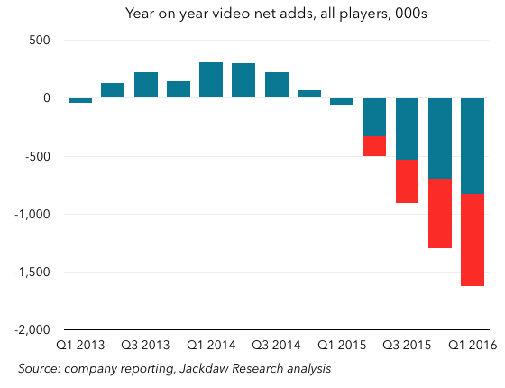
Here’s the money chart, which shows the year on year growth or decline in pay TV subscribers across all the publicly traded players I track:

Q2 2016 Cord Cutting 560px All Public Players

As you can see, the trend is very clear, with a consistent pattern from mid 2014 onwards of worse declines each quarter (except Q4 2015), culminating in this a loss of around 834,000 pay TV subscribers at the end of Q2 2016 compared with the end of Q2 2015. As discussed in more detail below, these numbers include the positive growth Dish has seen from its Sling TV product, which has added around 800,000 subscribers over the past year or so. Without those subs, the picture looks even worse.

Read on for more in-depth analysis of these numbers and the trends behind them. Reporters who would like further comment or anyone who would like to know more about our data offerings can reach Jan Dawson at jan (at) jackdawresearch.com or (408) 744-6244.

Avoiding false trends with a proper methodology

I’ve lost track of how many headlines I’ve seen over the last couple of years which posit that cord cutting is somehow slowing down off the back of a small number of providers’ quarterly results. This poor analysis is usually based on several key mistakes:

  • Focusing on quarterly net adds rather than annual changes – this is problematic because the pay TV industry is inherently very cyclical, historically doing much better in the fourth and first quarters of the year, and doing worse in the late spring and summer months, reported as part of Q2 and Q3. You have to compare the same quarter in subsequent years to see the real trends.
  • Focusing on one or two big players, instead of the whole market. One of the key trends that’s emerged in recent quarters is that the larger and smaller players are seeing quite different trends, so fixating on the large players alone is misleading.
  • Focusing on one set of players, such as the cable companies. Though “cable TV” is often used as a synonym for pay TV in the US, it’s not a useful one when it comes to doing this kind of analysis. Cable, satellite, and telecoms players are seeing divergent trends when it comes to pay TV growth, and you have to look at all sets of players to get the full picture.

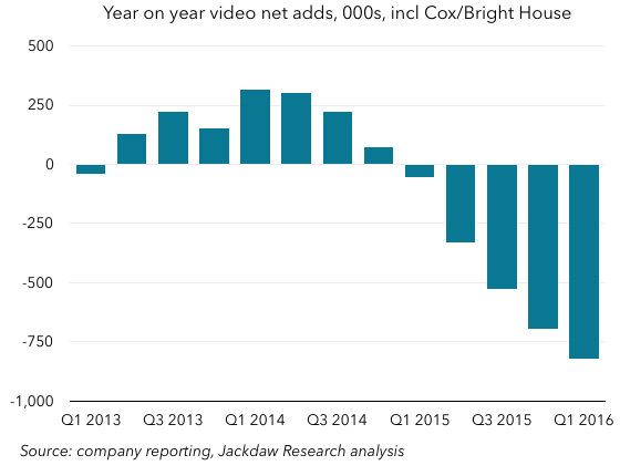
On that basis, then, I focus on year-on-year change in subs, and try to cast the net as wide as possible when it comes to players. My analysis includes all the major publicly traded cable, satellite, and telecoms (CST) providers in the US, of which there are now 17 in my data set, ranging from AT&T/DirecTV at over 25 million subs to Consolidated Communications, with just 112,000. The only major player now missing from this analysis (following the acquisition of Bright House by Charter) is Cox, which has around four million subscribers. In some of the charts below, you’ll see estimates for Cox included.

Trends by player type

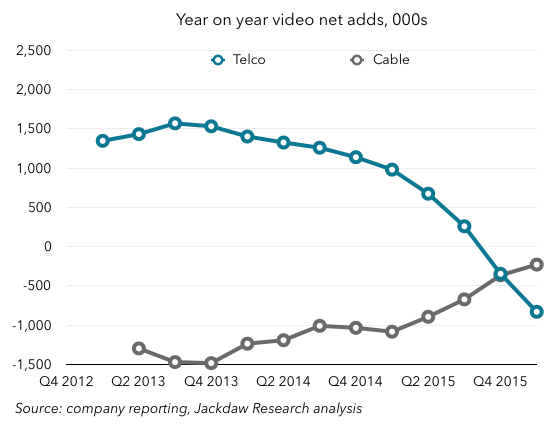
So let’s stark to break down that chart I showed at the beginning, to see what’s happening behind the scenes. First off, here’s a chart that shows the year on year subscriber growth trends by player type: cable, satellite, and telecoms:

Q2 2016 Cord Cutting 560px by player type

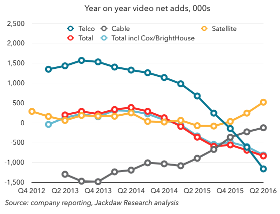
This chart illustrates perfectly why focusing on just cable operators is utterly misleading – they’ve actually been having a better time of things over the past two years, but largely at the expense of the major telcos, who have seen plunging growth during the same period.

A tale of two groups of cable companies

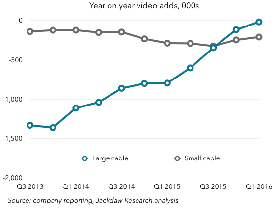
It gets even more interesting when you break cable down into two groups, large and small companies:

Q2 2016 Cord Cutting 560px large and small cable

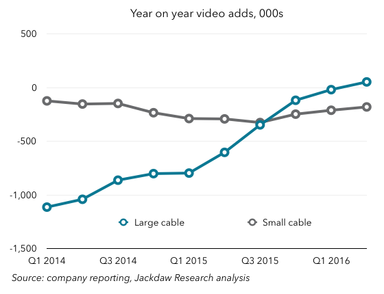
As you can see, what’s really been happening is that the four largest publicly traded cable companies have been doing much better over the last two years, while the smaller ones have if anything been doing worse. A large chunk of that improvement by the large companies comes from Time Warner Cable’s impressive turnaround during 2014 and 2015:

Q2 2016 Cord Cutting 560px cable by company

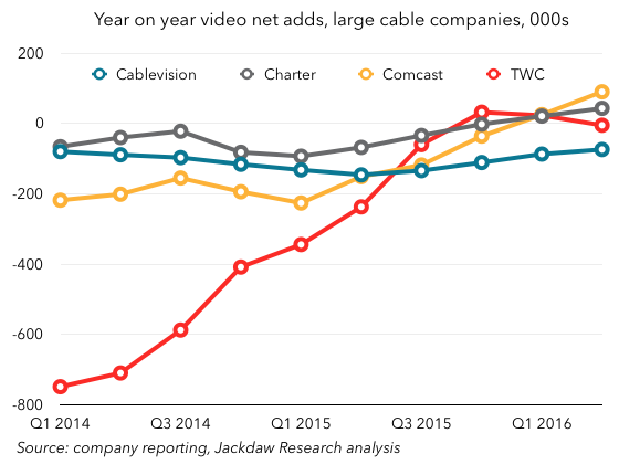
However, Comcast has also had a meaningful improvement over that same period, moving from 200k net losses year on year to positive net adds in the last two quarters. Legacy Charter has also had a slight improvement, while Cablevision has been largely static.

AT&T and Verizon have shifted focus elsewhere

The rest of the market is dominated by two large satellite companies and two large telcos, but the story here is really about the shift in focus away from TV by the telecoms guys. In AT&T’s case, it’s about a shift towards satellite-delivered TV, while in Verizon’s case it’s about slimming down its wireline operations and shifting focus from TV to broadband.

The transformation at AT&T over the last two years has been dramatic. Since the announcement of its plans to acquire DirecTV in May 2014, AT&T has seen plunging net adds in its U-verse TV business, while post-acquisition net adds at DirecTV have been skyrocketing:

Q2 2016 Cord Cutting 560px ATT DirecTV

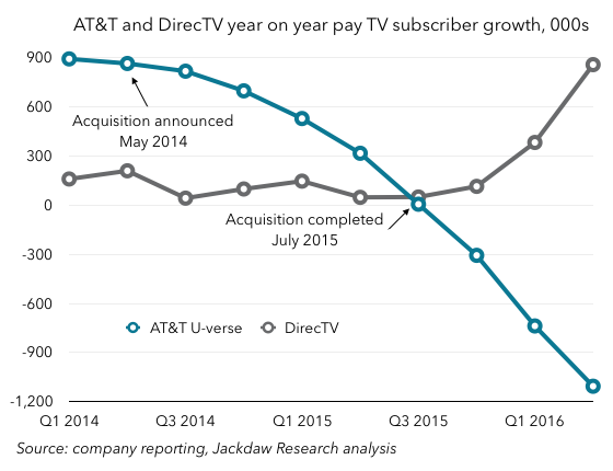
This is part of a conscious strategy at AT&T to shift its TV focus to the platform with better economics, in addition to its cross-selling and bundling of DirecTV and AT&T wireless services. The net impact is still a loss of subscribers across its TV business as a whole – around 250k fewer subs at the end of Q2 2016 than Q2 2015 – but the economics of the subscribers it’s keeping are way better than for the subs it’s losing.

Dish is suffering, despite Sling TV

The other major satellite provider, Dish, is seeing worsening rather than improving trends, despite its ownership of over-the-top TV service Sling TV. It reports Sling TV subscribers as part of its overall pay TV numbers, through they’re markedly different in many of their characteristics, but even so it’s seen subscriber losses increase dramatically this quarter. The chart below shows Dish’s reported subscriber losses in blue, and adds estimated Sling TV subscriber growth in dark gray to show what’s really happening to traditional pay TV subs at Dish:

Q2 2016 Cord cutting 560px Dish and Sling

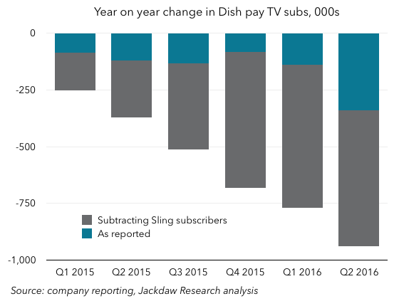
As you can see, the year on year change in traditional pay TV subs at Dish looks a lot worse when you strip out the Sling subscriber growth. The company lost almost a million pay TV subs on this basis over the past year, a number that appears to be rapidly accelerating.

Of course, we’re also including Sling subscribers in our overall industry numbers, so it’s worth looking at how industry growth numbers look when we strip out the same Sling subscribers from the overall pay TV numbers (with the Sling reduction this time shown in red):

Q2 2016 Cord Cutting 560px pay TV plus Sling

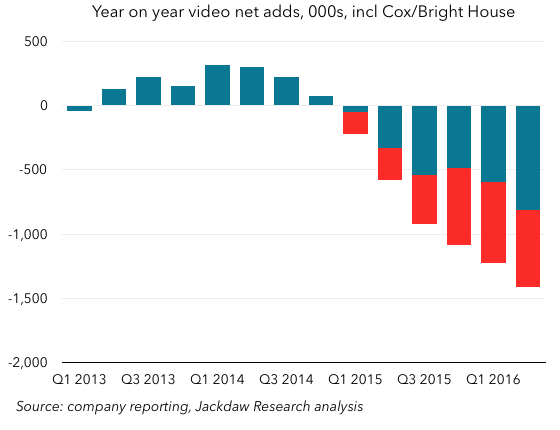
As you can see, the picture here worsens quite a bit too, going from a roughly 800k loss to a 1400k loss over the past year. The trend over time is also even more noticeable and dramatic.

Broadband may be the salvation for some

We’ve focused this analysis on pay TV exclusively, but many of these players also provide broadband services, and these services have grown to the point where they now rival the total installed base for pay TV. Indeed, a number of the larger cable operators now have more broadband subscribers than pay TV subscribers. This is another area where the larger cable operators are outperforming their smaller counterparts, as shown in the chart below:

Q2 2016 Cord Cutting 560px broadband and TV

Besides those smaller cable operators, the other company that will fare worst from cord cutting is Dish, which we’ve already discussed. Though it has a few hundred thousand broadband subscribers, it’s not remotely competitive in this space on a national basis, and as TV subscribership continues to fall, it will struggle to make up the difference in other areas, increasing pressure for a merger or acquisition that will allow it to tap into the broadband market. DirecTV, of course, now has the AT&T U-verse and wireless bases to bundle with.

Recent M&A leaves six large groups in control

Lastly, I want to touch on the recent merger and acquisition activity. We’ve already mentioned AT&T and DirecTV, but there have also been two other bits of consolidation: the creation of the new Charter from the combination of Charter, Time Warner Cable, and Bright House; and the acquisition of Cablevision and Suddenlink by French company Altice. It’s interesting to consider the scale of the groups formed by these various mergers in the context of the rest of the industry – these are now the six largest publicly-traded groups in the US pay TV market:

Q2 2016 Cord Cutting 560px Biggest groups

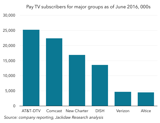
AT&T comes out on top, bolstered enormously by the DirecTV acquisition, while Comcast remains close behind despite not having been involved in the recent mergers (despite its best efforts). The new Charter comes in third, Dish in fourth, and then Verizon and Altice are way behind with a very similar number of subscribers a little under 5 million. After that, in turn, the companies get much smaller, with Frontier next at 1.6 million pay TV subs (including over a million recently acquired from Verizon), with no other publicly traded companies with over a million subs. And of course privately-held Cox is again excluded here, but would come in around the same size as Verizon and Altice.

This is a market increasingly dominated by large players, and that’s a trend that’s likely to continue, with Altice publicly suggesting that it intends to roll up more of the smaller assets. The four largest groups already own 78 million of the roughly 91 million owned by the publicly traded companies we’re tracking here, and the six large groups have 87 million between them. The rest of the market is becoming less and less relevant all the time, and as we’ve already seen has been suffering worse from cord cutting too.

Google’s Increasing Reliance on its Own Sites

After a couple of weeks on vacation, I’m still playing catchup with some of the tech earnings reports that came out while I was gone. Today, I’m tackling an interesting aspect of Alphabet’s earnings, which is the increasing dominance of ad revenue from Google’s own properties versus revenue from third party sites as a proportion of its total ad revenues. The charts I’m using here are largely taken from the Alphabet deck in the Jackdaw Research Quarterly Decks Service, which you can sign up for here. We also discussed Alphabet earnings along with those of other major tech companies on this week’s Beyond Devices Podcast.

Some quick definitions

First off, some quick definitions. Google divides its ad revenue into two categories:

  • Google websites – this includes all revenue from Google’s own websites, including AdWords revenue that is generated on Google.com, advertising revenue generated on YouTube,  and advertising revenue generated from other Google owned and operated properties like Gmail, Finance, Maps, and Google Play.
  • Google Network Members’ websites – this includes AdSense,
    AdExchange, AdMob, All DoubleClick-related revenues including DoubleClick Bid Manager revenues, and Other Network products including AdSense for Domains.

Within the core Google segment, these two divisions plus the “Other” category make up the entirety of revenue, and ad revenue from these two sources makes up 90% of Google segment revenue.

Very different growth rates lead to increasing dominance by Google’s own sites

These two segments have been growing at very different rates over the last several years, with Google’s own site revenue growing much faster than its Network Members’ ad revenues, as shown in the chart below:

Google ad segment growth Q2 2016 560px

Though there have been a couple of brief periods (in 2009-2010 and 2012) when Network revenue grew faster than Google website revenue, the pattern has otherwise been fairly consistent: Google’s revenue from its own sites has grown faster. Over the last three years, the gap has been significant – Google website revenue is up 74% over that period, while Network Members’ revenue is up just 17% over three years. That leads to a business that’s increasingly lopsided in favor of Google’s own sites:

Google ad revenue split Q2 2016 560px

In Q2 2016, Google sites passed 80% of total Google ad revenue for the first time. That’s up from 70% in 2011, and 60% around 2006.

Paid clicks growth is the driver

The reason for this discrepancy becomes abundantly clear when you look at the ad metrics Google provides. Every quarter, it reports growth in the number of paid clicks and the cost-per-click (i.e. price) for both the Google sites business and the Network Members business. These numbers bounce around quite a bit, but I find it’s often helpful to index the numbers to a certain point in the past to see the longer-term trends. The chart below shows these figures indexed to the quarter two years ago, Q2 2014:

Google ad metrics Q2 2016 560px

As you can see, there’s a stark contrast between the two businesses here. Let’s start with the number of paid clicks:

  • Google sites paid clicks are up 61% over two years (the number was 67% last quarter)
  • Network paid clicks are at 98% of where they were two years ago, and this number has been relatively flat over that whole period.

Google says that growth in clicks on its own sites has been driven by a combination of growth in the adoption of YouTube engagement ads, improvements in ad formats and delivery, and expansion of products, advertisers and user bases across all platforms, particularly mobile. There simply aren’t similar drivers for the Network business, which Google obviously doesn’t control as directly, and which is in some ways much more mature.

Looking at the cost per click:

  • Google sites CPC in Q2 2016 was only 76% of the CPC for two years earlier
  • Network CPC was 95% of two years earlier, and again this number has been relatively flat over the period, with modest growth in the first year, followed by slight shrinkage since.

The reason for the falling cost per click on Google’s own sites is largely due to growth in YouTube engagement ads where cost-per-click is lower than on Google’s other platforms, as well as changes in property and device mix, product mix, geographic mix, and ongoing product changes, with a smaller impact from currency exchange rates. Some of the same factors drove the modest recent decline in Network CPC as well.

Traffic Acquisition Costs and margins

This all matters a great deal for a couple of reasons, the second of which we’ll come onto in a moment. But the single most obvious reason is that the economics of ad revenue from Google’s own sites is radically different from the economics for Network sites, and that’s because of how Google pays for traffic. On third-party sites, Google pays out most of the revenue to the site owner, whereas on its own sites it keeps the vast majority of the revenue. Google breaks out the traffic acquisition costs (TAC) for both these segments, and the stark differences are shown in the chart below:

Google TAC by segment Q2 2016 560px

As you can see, in the Network business, Google pays out at a rate very similar to the economics of the major app stores, at about 70% of revenue. For its own sites, however, Google’s TAC is a fraction of that, at around 9% in Q2 2016. These payments go to the sources of traffic to Google’s various websites, principally makers of browsers including Apple’s Safari which feature Google as a default search engine.

Interestingly, Network TAC had come down quite a bit for several years, but has recently spiked back up a little, though it’s been within a range from 67-71% for the last five years. Conversely, Google’s TAC for its own sites has been steadily rising, as its cut of revenues under various placement deals has been shrinking. With competition from Yahoo and Microsoft in particular rising over recent years, Google has had to pay more to retain its prime placement in various browsers.

Regardless of the recent changes, TAC remains far higher for third party sites than for Google’s own, though that’s not to say that this somehow translates directly into margins. Obviously, Google’s other costs for running its own sites are much higher than its cost for running ads on other people’s websites. But I suspect the increasing dominance of Google’s own sites as a source of ad revenue is driving the steady improvement in margins we’ve seen over recent years.

The downside of all this

Let’s turn now to the second reason all this matters. Though I’ve just said that the increasing dominance of Google’s ad revenues by money from its own sites is likely good for margins, there’s a downside here too. The problem with this dominance is that Google has to be responsible for essentially all the growth itself, largely by growing its direct audience and finding ways to sell more ads at higher prices. As we’ve already seen, YouTube has been a huge help here in recent years as monetization has really taken off, but I wonder how sustainable that growth will be over time. Google is already attempting to drive revenue through alternative business models like YouTube Red and other subscriptions, and I suspect we’ll see more of this.

But as long as Google is so heavily dependent on revenue from its own sites, it’s going to have to find new sources of revenue which it owns, which might well drive it to make acquisitions (Twitter, perhaps?) and organic investments in new properties. That may be challenging over time, especially as more and more online activity takes place on mobile devices, where there’s simply less room for ads. Better targeting and more lucrative formats like app install ads should help offset that a bit, but it may still be tough to sustain over time. Though Alphabet and Google’s recent results have been very positive, there is here still the core of a bear case against continued growth along the same lines.

Quick Take on Fitbit Q2 2016 Results

Fitbit released its results for Q2 2016 today, and the market seems to be responding pretty positively in the short term. However, based on the numbers reported today, there’s not a lot of reason for cheer – the positive reaction seems to be at least in part about the company’s forward guidance. Here are some quick thoughts and charts on the numbers for Q2.

Growth continues to be slower

One of the big issues facing Fitbit is slowing growth. The chart below shows both year on year revenue growth and unit shipment growth, and as you can see both have dropped precipitously from its heyday in 2014 and early 2015 in percentage terms. Fitbit Growth Q2 2016Now, neither of those numbers is in negative territory – revenue growth was still almost 50%, while shipment growth was about half that. But both are down considerably over the past, and seem to be flattening out. In pure dollar terms, growth has also been lower than in the past. That’s likely a sign of a maturing market and an increasingly saturated one for Fitbit.

Marketing costs continue to rise faster than revenues

The fact that growth is still ticking over decently is largely a result of rapidly rising sales and marketing spend, which has been climbing faster than revenue for some time now:
Fitbit costs as percentage of revenue quarterlyFitbit costs as a percentage of revenue trailing 4 quartersAs you can see, sales and marketing spend on a trailing 4-quarter basis has risen from 10% of revenue to 20% over the past three years or so. That kind of rise is hard to sustain over time, but it’s probably inevitable as Fitbit has to fight harder and harder for each additional sale.

The other problem is that S&M spending isn’t the only cost category that’s been rising as a percentage of revenue – both R&D spend and general and administrative spend have been rising too. For the last several quarters, Fitbit has been touting the percentage of its employees that work in R&D – the number has now reached 59%, or 863 employees. Though such an investment in innovation is admirable, the combination of these three growing cost categories is squeezing margins. Together with some temporary issues driving up cost of revenue, these various increases are causing margins to drop to almost zero, from operating margins in the 20s and 30s two years ago:

Fitbit margins Q2 2016

The US still dominates

The US still dominates Fitbit’s global revenues, with around three quarters of the total. EMEA is the only other really significant region today, with around 15% of revenue. The APAC region took a dive in Q2, apparently because a major Australian distributor is going out of business, but this just highlights the lack of diversity outside the US. APAC revenues including Australia fell 54%, while APAC revenues excluding Australia apparently grew 98%. Fitbit regional revenues Q2 2016This suggests that Australia absolutely dominates APAC revenues, and that the one distributor in turn dominates Fitbit’s sales there. It needs more diversity geographically as well as among distributors if it’s to continue to grow overall.

The silver lining

If there’s good news, it’s that Fitbit continues to dominate the specialist fitness wearables space. To be sure, the Apple Watch has begun to achieve similar scale at a radically higher price and with a much broader offering, but when it comes to dedicated fitness devices, Fitbit continues to lead the market. And despite the slowdown in its growth, it is still growing. That it’s able to achieve this even as both cheap Chinese alternatives and expensive upgrades from Apple come into the market is a testament to what it’s built. But I continue to believe that Fitbit will struggle to recreate its past combination of very high growth and good margins going forward.

Twitter Q2 2016 Earnings Commentary

Twitter reported its earnings this afternoon, and I’ve been sharing some quick thoughts and charts on Twitter itself, appropriately. I’m a massive Twitter fan and user, and it’s enormously important to my business, but I continue to be somewhat bearish on its potential as a business, as my earlier posts will show. This quarter’s results did little to change that perception.

MAU growth better but not great

There are lots of ways to look at Twitter’s monthly active user numbers, but they all show more or less the same picture:Twitter MAUs Q2 2016Sequential MAU growth Q2 2016Year on year MAU growth Q2 2016The fact is that, no matter how you look at it, there’s progress here, but it’s minimal. A year after taking over at CEO, Jack Dorsey still has precious little to show as far as returning his beloved Twitter to user growth, and that should be unacceptable to investors. Long-term, Twitter has to outgrow its present size and scope, and the company isn’t doing enough to make that happen. This older post outlines my thinking about how best to do this.

Worrying trends in US ARPU

The other worrying thing is that US ARPU seems to have dropped instead of rising last quarter, which shouldn’t be happening given overall trends and past patterns – I’ve included Facebook’s ARPU up to Q1 2016 as a comparison:US ARPU Q2 2016As you can see, both companies typically see a spike in Q4 each year – something that every ad company sees – followed by a drop in Q1, but then a return to growth in Q2. Twitter has seen that pattern in the past, as has Facebook, but not this quarter, when ARPU dropped back to below Q3 2015 levels. I haven’t seen an explanation for that yet, but it’s absolutely not the sort of thing Twitter or its investors should want to see happen right now.

There is some interesting commentary in Twitter’s shareholder letter about its ad rates and how they’re positioned in the market. Though there’s careful and somewhat wishy washy language in there, the biggest challenge is that CPMs are too high, and Twitter isn’t doing enough to justify its price premium. It sounds like it will now work on that, but again it feels like we’re seeing a “coming soon” sign where we should have seen real progress by now. This has been a known issue for months, and yet Twitter hasn’t done enough about it.

Live video and monetization

Lastly, live video, which seems to be Twitter’s big focus from a user perspective. We’ve already seen some trials of the capability recently, and although the concept is good, the UI needs work. But the bigger issue is that, while everyone else investing in live video is doing it for the ability to sell masses of ads users will actually be forced to watch, in most cases Twitter is investing in non-exclusive video where the vast majority of the ad space is sold by others. Can is make enough money from this marginal opportunity to make it worthwhile? Will it be a meaningful contributor to revenue and profits over time? That’s the big question here, and I still don’t feel like we have an answer for it. Meanwhile, the core product experience of Twitter continues to suffer both for existing power users and for the kind of new users Twitter needs to attract. Not good enough, in my opinion.

Apple June 2016 Quarter Chart Review

I’m on vacation this week in Europe, but I took a quick break to cover Apple and Twitter’s earnings this evening before heading to bed. I’ve tweeted quite a few charts tonight, but thought I’d pull some of the key ones together with some commentary for readers. A full deck of quarterly charts will go out to subscribers to the Jackdaw Research Quarterly Decks Service in the next few days as Apple releases its full data in an SEC filing, so look out for that if you’re a subscriber, and sign up here if you’re not.

Note: in this post, as in all my posts, I use calendar quarters for ease of comparisons with other companies and easy intelligibility by those not familiar with quirky fiscal years. As such, the labels and my commentary does not align with Apple’s fiscal calendar.

iPad returns to revenue (but not shipment) growth)

Last quarter, Tim Cook promised that the iPad would have its best year on year “compare” in over two years, which by my calculations meant something better than an 8% decline. Turns out iPad revenues actually returned to positive growth this quarter, though shipments still dropped, thanks to a really strong boost in ASPs:iPad shipments Q2 2016iPad ASPs Q2 2016Screenshot 2016-07-26 22.38.46That iPad ASP growth seems to have been driven by the launch of the iPad Pro, which in turn was likely designed in large part to drive higher ASPs as shipment growth has stalled. In other words, the strategy seems to be working. It’s also interesting that Apple reported that half iPad Pro sales went to people buying them for work, which is another validation of Apple’s strategy, but also points to a big opportunity for Apple, which is selling more devices into the enterprise, both to individual and corporate buyers. That’s something I first talked about in the context of Apple’s IBM deal, but it goes much further than that (as evidenced by subsequent Cisco and SAP deals).

iPhone sales and ASPs down – the iPhone SE effect

Unsurprisingly, iPhone sales were down again, though perhaps not as badly as they seemed to be given the changes in inventory. But the most notable thing was the drop in average selling prices – the opposite of what happened with the iPad in the quarter:iPhone ASPs Q2 2016Just as the positive change in iPad ASPs was due to the successful launch of a new product (the 9.7″ iPad Pro), so is the larger than usual quarterly drop in iPhone ASPs due at least in part to the launch of a new product – the iPhone SE. It’s not all that – there was some impact from the inventory changes, as mentioned on the earnings call – but the magnitude of the drop is an indication that the iPhone SE has also had a successful launch, and has been something of a hit. That’s a good thing, in that these sales have filled something of a hole in iPhone sales in the quarter – which was arguably the purpose – while proving that Apple can tap into a market for iPhones at a lower price point with slightly lower specs and feature functionality.

Apple Watch and Other Products

One last interesting point with regard to a specific product: the Apple Watch. It’s buried in Other Products, but perhaps a better way to look at it is that it now leads the Other Products category, which otherwise features a number of other smaller products. That’s been a double-edged sword for the reporting category over the past 18 months or so, as Apple Watch has first driven higher growth and now is driving negative growth for the category again:Other Products growth Q2 2016This is, to some extent, a temporary anomaly due to the launch of a brand new product and the subsequent (presumed) shift to a different time of year for the follow-up product as the second version of the Apple Watch launches in the fall. But it’s an indication of just how important the Watch is to that Other Products category.

Short-term versus long-term

In concluding, I’m going to link back to my post last quarter, in which I both reviewed the good news and bad news in the results and looked forward to the rest of the year. The point remains the same: with Apple there are two current pictures, which are very different. On the one hand, there’s the short-term picture, characterized by the anniversary of massive growth in iPhone sales driven by the iPhone 6, and also an unusually long lull in the Mac upgrade cycle driven by delays in getting new chips from Intel. That short-term picture hasn’t changed, and is so far fairly predictable.

The bigger question, though, is what happens later this year as some of the unpleasant short-term factors start to go away. As I said last quarter, with the iPad performing better, that’s the first of those positive levers coming into effect, and if that higher ASP trend continues, that will be more grist to the mill. However, the far bigger effect obviously comes from the iPhone, which I still believe might return to revenue growth later this year or early next year. Lastly, the other major product lines – Mac and Apple Watch – have potential to contribute further to that growth. We should finally see new Macs in the fall if not before, which will unleash significant pent-up demand, while new Apple Watches combined with a much more capable watchOS 3 could drive more sales there. In other words, over the long term I remain very bullish about Apple’s prospects, and we could start to see signs of that in the September quarter, but especially in the December quarter and beyond.

Parsing Spotify’s Financials

Spotify recently filed its annual report with regulators in Luxembourg, where the company is registered. The full annual report isn’t available online, but there’s enough data in various articles to put together a reasonable picture of its financials. As the poster child of streaming music (and its largest beneficiary), Spotify’s financials are illustrative of the state of streaming music overall, and so it’s worth looking closely at them to discern trends.

If this topic is of interest, you should also listen to a recent episode of the Beyond Devices Podcast, in which I interviewed Ryan Wright, the CMO of Kobalt, a music startup which is streamlining the process of getting payments from services like Spotify to labels and artists. We discussed Spotify specifically during the episode, and Ryan had an interesting take on the free/paid split. You may also find this column I wrote for Variety on the RIAA’s recent annual report interesting.

Massive growth

We already knew to expect massive revenue growth, given Spotify’s periodic updates on subscriber numbers, but the financials certainly bear this trend out powerfully. The chart below shows annual revenues, and you can clearly see the much bigger jump in 2015, relative to any previous year:Spotify revenue growthThe interesting thing here, of course, is that 2015 is also the year Apple Music launched. Far from putting a dampener on Spotify’s growth, Apple Music seems to have accelerated it, if anything. More likely, the streaming music industry has simply reached a tipping point, and both the Apple Music launch and Spotify’s success in 2015 are symptoms of that common cause.

Worsening losses

With all that growth, and the increasing scale that comes with it, one might expect that Spotify would be inching closer to profitability. However, that wasn’t the case, as it actually went backwards in 2015, in that both operating and net losses grew rather than shrinking (though margins were up slightly):Spotify marginsThe company still loses money, and one of the biggest reasons is that the vast majority of its revenue goes straight to paying the labels for the music it streams. And, instead of that number falling as a percentage of revenues, it’s risen for the last two years:Spotify royalty costs as percent of revenueThat’s problematic, because it means that if Spotify is ever to make money, it has to squeeze its other costs harder to generate a profit. Interestingly, though Spotify has often said that labels get a roughly 70% cut of its revenues from streaming, this contribution is much higher – in the mid 80s. That appears to be because Spotify has a whole set of complex and interrelated agreements with labels to pay minimum amounts regardless of usage, and as such its actual payouts are higher than that standard 70% cut in at least some cases.

The good news is that Spotify’s other cost lines are shrinking as a percentage of revenue, even as they grow in real terms. Personnel costs were just 13% of revenues in 2015, down from 18% three years earlier, but external consulting fees were still 2.5% of revenues in 2015, while advertising and PR made up another 4.5%. Given that Spotify only has about 16 points of gross margin to work with to begin with, it needs to start getting some of these items quite a bit lower to generate profits. The good news is that there have been other individual markets (mostly in Europe) where Spotify has become profitable over time, and so there’s a precedent for profits following scale on a more local level.

Paid versus free streaming

The other interesting aspect of Spotify’s results is the split in its revenue sources, among which paid subscriptions and advertising account for over 99%. The split between those two has remained relatively constant over the last three years, with subscribers generating roughly 90% of revenue, and advertising the other 10%. That’s notable, because Spotify has over two times as many free subscribers as paid subscribers, but those paid subscribers generate nine times as much revenue. To look at it another way, the paid subscribers generate roughly 80 euros a year in revenue each, while the free subscribers generate just $3-4.

This has been a matter of some controversy within the music industry, but in that podcast episode I referred to earlier, we discussed this, and Ryan Wright’s take was that the existence of free streaming is actually important from a perspective of creating a funnel for future paid subscribers. Given that Spotify consistently has around one third paid subscribers, there’s some evidence that this funnel generates the desired results over time, but in the meantime there are many more subscribers generating vastly less revenue. It’s arguably critical both for Spotify and the broader music industry that this conversion of free subscribers continues, and the fact that Spotify reduced its price for family plans today to bring them in line with both Apple and Google is likely another attempt to boost this strategy.

Spotify dominates industry paid streaming revenue

The other interesting thing about this revenue is how it compares to overall industry revenue from both paid and ad-supported streaming. The IFPI is the global body representing the music industry, and its annual reports provide estimates of global revenue from streaming. This year, it broke out paid and ad-supported streaming specifically, and it’s worth comparing Spotify’s figures to those overall industry numbers. In order to compare these figures on a like-for-like basis, I’ve apportioned Spotify’s royalty costs on the same basis as its revenues between paid subscriptions and advertising, and compared those numbers with the IFPI’s industry revenue figures. On that basis, then, let’s look first at Spotify’s paid streaming revenue as a percentage of the IFPI’s industry revenue figure for this category:Spotify as percent of IFPI paid streaming revenueThe obvious conclusion is that Spotify’s growth is not just in line with industry growth but actually represents a significant gain in share of the total paid streaming market. On this basis, it’s clear that Spotify dominates overall paid streaming revenue for the industry (as it does subscriber numbers).

On free streaming, Spotify is the minority

The other interesting comparison is looking at Spotify’s ad-supported streaming revenue versus the number reported this year by the IFPI. The IFPI pegged ad-based streaming revenue at $634 million globally, which translates to 566 Euros based on today’s exchange rate. Spotify’s ad-based royalty payments were of the order of 164 million Euros, which translates to about a third of total industry revenues. In other words, its share of ad-supported streaming is a minority one, far from being dominant as it is in paid streaming. And that, of course, makes perfect sense when you consider YouTube’s role in ad-supported streaming. YouTube is likely far more dominant in usage on the free streaming side than Spotify is on the paid streaming side, but it pays out at a much lower rate, so its share of revenue is not as dramatic as its share of usage.

Useful context for an IPO

These numbers certainly make for interesting reading, and I’d love to get my hands on the full filing, because there are additional numbers in these documents which would be great fodder for additional analysis. However, even just with what I was able to glean from secondary sources, there’s plenty here to put Spotify’s rumored IPO plans in context. The company is growing fast, and dominates the paid streaming market. For investors looking to buy into the streaming trend, this looks like a great bet. Of course, the downside is that the company has yet to generate profits on a global basis, and it doesn’t look any closer to that milestone this year than last year. That’s something investors will want to look at very closely if and when Spotify does file to go public.

Q1 2016 Cord Cutting Update

I gather data on a quarterly basis on the major cable, satellite, and telecoms companies in the US and their reported numbers for pay TV subscribers (as well as broadband and voice subscribers). I package this up into a slide deck for subscribers to the Jackdaw Research Quarterly Decks Service, but it’s also available as a one-off standalone purchase. This post analyzes the data on pay TV subscriptions for Q1 2016.

Cord cutting continues to accelerate

The headline here is that cord cutting continues to accelerate, a trend we’ve seen now for several quarters. As a reminder, in order to really gauge this trend, you can’t look at quarterly adds, because those are highly cyclical, and you have to look at the full set of players in the market, and not just largest, and certainly not just one type of player, such as cable or satellite companies. I’ll provide some more insight into this later in the post. On that basis, then, the chart below shows the year on year growth numbers for the industry, based on all the major public companies in the US and estimates for Cox and Bright House, two of the larger private companies. Pay TV yearly adds incl Cox and Bright House Q1 2016As you can see, the year on year declines that began a year ago in the first quarter of 2015 have grown every quarter since, and are now at over 800k. There’s no doubt at all based on these numbers that cord cutting is happening, and that it’s accelerating. More people are canceling pay TV service from these players than are signing up for service, and the gap between those two numbers is growing every quarter. The rest of this piece talks through additional detail around this trend, in several areas:

  • The additional impact on cable networks of the rise of skinny bundles and over-the-top services
  • The resurgence of cable and the decline in telco TV
  • The huge difference between trends facing larger and smaller pay TV providers.

Skinny bundles and OTT

Of course, cord cutting isn’t the only behavior that’s affecting how many customers subscribe to these services. Two particularly additional trends are the move to “skinny bundles” and the rise of over-the-top alternatives to traditional pay TV. Skinny bundles are a trimmed-down version of pay TV services from traditional providers. Verizon has Custom TV, which is one of the more extreme forms of this trend, while many other pay TV companies have also been providing similar packages with fewer channels. On its quarterly earnings call, Verizon reported that 38% of its new FiOS TV customers in the first quarter signed up for Custom TV packages, which it characterized as lower-revenue but higher margin than its traditional offerings. On the OTT side, perhaps the biggest player is Sling, from DISH. The issue from a reporting perspective is that DISH reports Sling subscribers along with its traditional satellite TV subscribers in its overall totals, without breaking them out. As such, the numbers in the chart above include several hundred thousand Sling subscribers that are generating far less revenue monthly and taking far fewer channels than the traditional pay TV subscriber. If you strip those out of the reporting (as shown by the red bars), the numbers start to look even worse:Cord cutting Q1 2016 with SlingAs you can see, you’re now talking about an annual decline that’s about twice as big, at over 1.6 million rather than 800 thousand. Why is this important? Well, if you’re a cable network, you could be affected just as much by skinny bundles and these smaller OTT bundles as you are by outright cord cutting. This is evident in the numbers reported at least annually by the major cable networks, almost all of which have declined by 2-3 million subscribers year on year in recent quarters. The only exceptions have tended to be newer networks that are still growing from smaller bases, and some of the premium networks like HBO and to a lesser extent Starz.

A cable resurgence

Another important trend we’ve seen over the last year or so is a dramatic change in the trajectories of two major groups of companies within the overall base of pay TV providers in the US. The cable companies have had a resurgence of sorts, while the telcos have faded dramatically in their ability to grow TV subscribers. The chart below compares year on year growth in subs for just these two groups:Cord cutting by cable vs telecomsAs you can see, the telcos regularly added over a million subs a year in 2012 and 2013, but since 2014 things have been heading rapidly downhill and have been increasingly negative for the last two quarters, while the cable companies have been returning closer to flat growth. Hence all those stories you’ve been seeing around earnings time for the last few quarters about the cable companies doing so well in TV sub growth, despite the overall cord cutting trend.

It’s really about large cable companies

In fact, it’s not even just about the cable companies versus the telcos, but about a division even among the cable companies. If you split cable company results by large and small companies, you see quite a disparity again:Cord cutting big vs small cable Q1 2016Here, you can see that the gains have been made almost entirely by the large cable companies, and that the small cable companies (which are even collectively much smaller) have been seeing worsening trends if anything. So it’s really that the large cable companies are making gains, while smaller cable companies and telcos are losing subscribers. The satellite providers are the last group here, and they’ve been seeing a more mixed bag of trends, with AT&T driving a resurgence at DirecTV thanks to bundling and heavy promotional activity, while DISH’s performance has been more mixed, especially if you strip out the Sling results.

Samsung, LG, and Sony Smartphone Roundup

For some reason, Samsung, LG, and Sony all ended up releasing their earnings this morning Asian time. As such, I spent some time earlier today updating all my models and charts, and tweeted out a few of them. There’s a full Samsung deck as part of the Jackdaw Research Quarterly Decks Service, which subscribers have already received, but I thought I’d do a quick roundup of key charts and the trends they represent as they relate to their respective smartphone businesses especially.

Samsung – recovery back on track

At Samsung, the mobile recovery appeared to falter a little last quarter, but is back on track this quarter, in large part thanks to the Galaxy S7 launch. Here are three key charts for Samsung.

First off, year on year growth in the mobile business unit, which turned positive again after briefly dipping below zero last quarter:Screenshot 2016-04-28 11.34.49When it comes to margins, the IT and Mobile business unit did considerably better this quarter as well, with the best margins in almost two years:Screenshot 2016-04-28 11.35.22 And thanks to a combination of that increase at the IM unit as well as slightly weaker operating margins in semiconductors, IM became the biggest contributor to profits again for the first time in two years:Screenshot 2016-04-28 11.35.46To what should we attribute all this? These were the bullet points from Samsung’s management for the quarter as relates to mobile:

Earnings increased QoQ led by improved product mix with S7, and improved profitability of mid to low-end through streamlined line-up

Strong sales of S7 due to enhanced practical features as well as early introduction

Global sales expansion of 2016 A/J series.

The Galaxy S7 was both introduced earlier than the S6 last year, bringing the boost to revenues and margins forward, but it seems so far to be selling better, as it fixed some of the missteps with last year’s model. A pretty decent quarter for Samsung in smartphones overall, albeit still not close to its past glory days.

LG – Challenges Typical to Android Vendors

LG looked for a period in 2013 and 2014 as if it was finally figuring out smartphones – shipments were up, margins were briefly positive, and reviews of its flagship devices were too. But then things started to fall apart, and the trend since then hasn’t been so good:Screenshot 2016-04-28 11.40.32It’s harder to tell what’s going on there with the smartphone shipments line than the margin line, but over time it’s trending consistently downwards, as you can see in this trailing 4-quarter smartphone shipment chart:Screenshot 2016-04-28 11.42.21LG appears to be suffering from much the same malaise as the other mid-tier Android smartphone vendors:

  • Increasingly strong competition at the high end from Apple and from Samsung’s resurgence as the dominant premium Android vendor
  • Significant pressure from Chinese vendors producing increasingly good Android smartphones for far less
  • A hollowing out of the mid-market by the introduction installment plans and the availability of both older flagship devices and budget premium devices from others.

There’s no real end in sight here – LG is failing to turn itself around as Samsung has, and the threat from Chinese vendors is only getting stronger. It needs a new strategy to fix things.

Sony: Fewer, More Expensive, Phones

Speaking of new strategies, Sony’s was evident in its reporting this quarter. Its strategy is now to focus on the premium market only, which will see it sell far fewer phones at a far higher ASP. The chart below shows what’s happened to shipments lately, with both a quarterly and annualized perspective:Screenshot 2016-04-28 11.46.01As you can see, the strategy to sell fewer phones is clearly working – sales dropped off a cliff from Q4 to Q1, and the company hasn’t sold so few phones in many years. What about the other side of the strategy? Well, that seems to be working too – revenue per device sold is up:Screenshot 2016-04-28 11.48.02The problem, though, as you can also see from that chart, is that the higher ASPs aren’t – yet – leading to higher margins. In fact, margins fell this quarter, and that means an even bigger loss per device, given what happened to shipment numbers. It’s likely that the problem here is that it’s very hard to scale down the operation that produces smartphones as quickly as the number of smartphones sold scales down. Certainly, cost of sales should come down fairly rapidly, but all the other general costs of running a smartphone business aren’t as easy to cut, at least not quickly. It remains to be seen whether that other side of the strategy can fall in line too. If not, Sony will have just cut its business in half without seeing any of the margin benefits it should see from focusing on premium devices. It’s also not clear whether anyone can make money selling just 3 million smartphones a quarter.

Apple Earnings: Bad News and Good News

Apple’s earnings for its fiscal second quarter (which I will refer to from here out as Q1 2016, as is my custom) were rocky. As Tim Cook said, it was a challenging quarter. There was bad news not just in iPhone, where Apple had already suggested there would be, but in other areas too. It’s worth enumerating exactly what those sources of bad news are to understand what’s going on at Apple. But there was also some good news in the earnings, which is particularly important when looking at the longer term. This post outlines both, starting with the bad news.

All three major product lines shrinking

Yes, iPhone shipments and revenues dipped year on year for the first time, and that was a major cause of the overall problems. But what compounded it was that Apple’s other two major product lines were shrinking too in the quarter:Year on year growth by product lineThe iPhone decline was new, but the trend line in Mac sales has been worsening consistently over the past year, and has now been below zero for the past two quarters. That’s significant, because for a time the Mac was offsetting shrinkage from the iPad, such that combined revenues from the two were rising or steady. Now that this aggregate number is also in the red, the declining iPhone sales just exacerbate the problem.

iPhone ASPs falling

Besides the stellar growth in iPhone sales the iPhone 6 prompted, it (and the iPhone 6s) also helped drive significantly higher average selling prices. The chart below shows ASPs on a cyclical basis, so you can see the trend over the past several years and where Q1 2016 should have landed, and where it did land:iPhone ASPs 
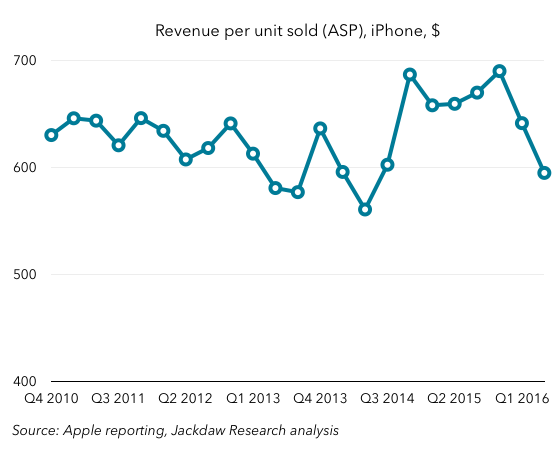
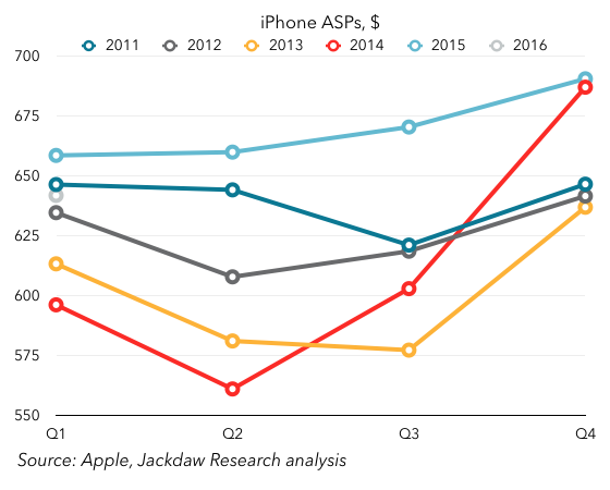
As you can see, at the end of 2014 ASPs dramatically increased as a result of larger, more expensive phones, and higher storage tiers. The 2015 ASPs were above 2014 ASPs for the entire year, but Q1 2016 saw ASPs dip, below the previous year’s number (and below even 2011, which was next highest for Q1). All of this suggests a combination of mix shift toward lower-tier and older iPhones, as well as possible discounting in some markets. Since ASPs have a direct impact on margins, that’s not good news. Worse still, Apple is projecting even lower ASPs in Q2 driven by a combination of inventory changes and sales of the iPhone SE.

Softness in China

China has been a major driver of Apple’s growth over the past couple of years. The relationship with China Mobile, expansion of better cellular networks in China combined with expansion in Apple’s distribution, and then the launch of larger phones all contributed to outsized growth there. Over the last couple of quarters, though, things have changed dramatically:Revenue growth by regionWhereas China accounted for half or more of the company’s revenue growth for several quarters, it’s now accounting for half its year on year shrinkage. One of Apple’s biggest drivers of growth has become a driver of decline. Again, the biggest culprit is iPhone sales and the massive iPhone 6 year, and the underlying decline in Mainland China is much less dramatic than reported results for the Greater China region, which includes Hong Kong. But for the time being, this is more bad news.

What you have overall, between the three major declining product lines, falling iPhone ASPs, and softness in Greater China, is a perfect storm of sorts that’s driving the current problems for Apple. What, then, is the good news in all this?

iPhone decline is temporary and cyclical

As I wrote earlier this week, the most important thing to understand about iPhone growth is that it’s temporary and cyclical. That is, the massive growth Apple experienced over the last 18 months or so was entirely down to the introduction of larger phones, and demand is now simply returning to its prior trajectory. The iPhone shipments number Apple reported was bang on with the projections I shared earlier this week and therefore also absolutely in line with the pre-iPhone 6 trend. That suggests (and Apple’s guidance for next quarter confirms) that iPhone growth should be back on track later this year, at high single digits or low double digits. The iPhone SE will depress margins, especially because it’s going to sell best during the annual trough in high-end sales, but for the same reasons, ASPs should recover by the end of the year when a new flagship phone launches. In the meantime, it should help fill that usual trough in sales a little, boosting sales above where they would otherwise be.

The other thing to bear in mind is that, though the iPhone 6 upgrade cycle was itself something of a one-off, all those who bought phones during that cycle will want to upgrade at some point. What was notable about this down quarter in iPhone sales was that Tim Cook said the last six months were the highest ever for Android switching. That implies that what fell short during that period was upgrades. That, in turn, suggests that when this base of iPhone 6 buyers finally does upgrade in large numbers – likely between 2-3 years from their purchase – we could see another big bump in sales, an aftershock of sorts. The biggest impact would hit in a roughly eighteen month period from this September through the following March, which provides more reason for optimism about longer term iPhone growth.

Signs of iPad recovery

It’s easy to focus on the decline in iPad sales, which has been problematic for Apple over the last several years, especially as the Mac has stopped growing. But the reality is that there are signs of recovery in iPad, albeit not growth just yet. But the rate of year on year decline has been slowing steadily, and on the earnings call Apple took the unusual step of signaling where it thinks they’ll come in next quarter, at least directionally. Here’s the trend line for the past couple of years:iPad year on year growthThat rate of decline has improved for three of the last four quarters. Apple’s guidance for Q2 2016 was that this would be the best year on year compare in two years. That suggests a shrinkage of less than 14% (since Q3 2014 was the previous low within that period, at 14% – I’m assuming the 8% it achieved in Q2 2014 is out of the 2-year window). (Update: I’m told by Jason Snell that it was “over two years” and the transcript confirms that, so the 8% might well be within the window after all). That’s obviously not stellar, but it continues and even improves the trend over the past year or so of slowing declines. As this decline slows, that puts Apple in less of a hole that it has to dig out of.

Reasons to believe the Mac will recover

There isn’t anything in the recent Mac results that provides reasons for optimism – as I said above, the results show a steadily worsening trend in the case of the Mac. However, I believe at least part of the reason for the decline is that as of the end of the quarter, Apple hadn’t updated most of its Mac lineup in a long time. The Macrumors Buyer’s Guide listed the whole lineup as “don’t buy” because of the length of time since the last upgrade. Obviously, the MacBook has since been updated, but the rest of the lineup hasn’t. As with iPhones, the evidence is that new customers aren’t the problem here – Cook made much of the high “new to Mac” numbers this quarter. The issue is once again upgrades, and there we should see better numbers later this year as Apple upgrades the product line with new Intel Skylake chips. The timing of that change is hard to predict, but it should help the Mac revenue growth line turn positive again, helping to offset the smaller iPad decline.

Other new products driving growth

The Apple Watch isn’t broken out in Apple’s results explicitly, but it has contributed meaningfully to the overall revenue line over the past twelve months. The Other Products line where it sits includes both the iPod and accessories, which had been declining fairly significantly, but that segment’s revenues have been growing year on year since the Apple Watch launch. In the first part of this year, that growth is likely to be modest, but once again come the fall things should look better as Apple updates the hardware and drives new sales.

Another interesting new product that’s driving growth is Apple Music, which now has 13 million paying customers. That’s good for a run-rate of a little over $1.5 billion on an annualized basis, and the growth rate (around 25-30k new subscribers per day) should see Apple get close to 20 million by the end of the year, which in turn would drive annualized revenue of $2.3 billion. Given that iTunes Music generated around $4 billion at its peak, and is now generating much less, this new service is on track to begin driving meaningful growth for Apple in the music category again. More broadly, Services continues to be one of the drivers of growth at Apple, driven not just by Apple Music but to a great extent by the App Store too. The good thing about that growth is that it is driven by the growing base rather than sales of new devices, so to the extent that Apple is still adding new iPhone customers, it should continue to grow even as iPhone shipments slow down for a period.

All signs point to a return to growth in the fall

All of this taken together points to another couple of tough quarters for Apple as the perfect storm of declines across its three major product areas, its second most important region, and iPhone ASPs hits home. But it also points to reasons for optimism come the fall, when the iPhone should start to rebound, Mac sales should be stronger, a new Watch should drive sales there, and iPad shrinkage will be lower. The narrative Apple needs to be spinning is less about Services, though those are an important component of future growth, and more about the fact that the current dip in revenues is temporary. There were some references to that in the earnings call yesterday – Tim Cook used the phrase “pause in our growth,” suggesting that he believes this. But of course Apple doesn’t provide guidance beyond a single quarter. That may need to change if it wants to get investors back on board.

The iPhone 6 Blip

On Tuesday, Apple is due to report its results for the March 2016 quarter (Q1 2016 according to the consistent calendar labeling I use for these things on this blog). A major focal point in the earnings report will be iPhone sales, which Apple has already guided will be down year on year. I’ve been contacted by quite a few reporters to ask – in various ways – whether this is bad news for Apple. The thought I’ve tried to articulate in response is that the current quarter is best seen in the context of what you might call the iPhone 6 blip.

What I mean by this is that, if you look at iPhone sales growth over the several years before the introduction of the iPhone 6, there was a fairly clear pattern emerging – one of slowing year on year growth. Growth declined from an average of around 100% in 2011 to around 50% in 2012 to just 15% in 2013, and over the three quarters before the iPhone 6 was introduced, growth rates slowed by roughly 1 to 1.5% quarter on quarter, for an average of 15%. All of this was a sign of the increasing maturity of both the overall smartphone market and the iPhone in particular. Following a rapid expansion into new markets over the years from 2007-2011, Apple was approaching saturation of the available distribution channels, and many of those already in the smartphone market who could afford to buy an iPhone had one or one of its high-end Android competitors. Absent significant switching from Android to iPhone driven by a major change in the addressable market, that’s how things would have likely progressed.

Of course, what happened in late 2014 was that Apple introduced the iPhone 6 and 6 Plus, which did dramatically increase the addressable market for iPhones and drive significant Android switching. The result? A massive increase in the iPhone growth rate, to 46% in Q4 2014, 40% in Q1 2015, and 35% in Q2 2015. For some, this was the new normal for Apple, driving sky-high growth rates in a product that had appeared headed for only modest growth in a saturating smartphone market. Now that the iPhone 6 year is past, however, we’ve seen the first flat year-on-year quarter for the iPhone, and are about to witness the first year on year decline. Hence all the calls from reporters about whether we’re witnessing some sort of crisis.

The reality is that the iPhone 6 line really just caused a blip in the long-term trajectory of the iPhone. It’s impossible to know what iPhone sales would have done absent the introduction of the iPhone 6, but we can at least have a go at projecting sales on the basis of the prior trajectory. Given that growth rates were slowing by roughly 1-1.5% per quarter before the iPhone 6 launch, that provides a good starting point for such an exercise. The chart below shows the actual year on year growth rate (using 51m as a consensus from the professional Apple analysts) and the two projected rates based on 1% and 1.5% quarter on quarter slowing in growth. You can see the blip extremely clearly here:iPhone growth rates actual and projectedNow, if you apply those growth rates to iPhone sales to project what would have happened if Apple had continued as before without the massive bump from the larger iPhone 6 phones, you get this second chart. It shows actual sales (in blue), as well as projected sales using those slowing growth rates in gray and yellow:iPhone sales actual and projectedIt’s a bit hard to tell exactly what’s going on in a chart with so much history, but I’ll zoom in a little bit in the next version, so you can see the last few quarters better:Zoomed actual and forecast iPhone salesIn this chart, you can hopefully see that that consensus point of 51 million falls right between the two projected data points for Q1 2016. In other words, it’s very much in keeping with the long-term trajectory in iPhone sales. The iPhone 6 blip is over, but if iPhone sales land roughly where the analysts expect them to, they’ll be right back on track with where they were headed before the iPhone 6 launched. That’s a big “if” – sales could come in above or below that number, which would suggest either that underlying growth had slowed more dramatically in the past, or that Apple has successfully pushed to a slightly higher long-term growth rate off the back of the iPhone 6 and 6S.

The other big question is what happens in the next few quarters, and whether Apple is able to stay on or above that long-term trend line. Remember that the trend line calls for a 1-1.5% reduction in year on year growth per quarter – on that basis, growth would slow to 6%, 5%, and 4% over the remaining quarters of 2016 with 1% shrinkage, or drop as low as a 1% decline by the end of the year. This is obviously far too precise for a real-world projection, but it gives you some sense of that trajectory if it does continue. It’ll be very interesting to see Apple’s guidance for the June quarter – on the basis of the trajectory, Apple would sell between 39 and 41 million iPhones next quarter. But of course, it’s just launched the iPhone SE, which could change things. Anything below 40 million iPhones (or $40 billion in revenue guidance) is a sign that Apple is dropping below its long-term trajectory, and would be bad news. Anything above that is cause for optimism, at least in the short term.

This, then, is the real answer to the question those reporters have been asking, in the form of another question: Does iPhone growth revert to its long-term trajectory, dip below it, or bounce back above it, in the reported numbers for Q1 and guidance for Q2? The answer to that question tells you what you need to know – at least in the short term – about how you should feel about iPhone sales.