Google today released Android 7, codenamed Nougat. What this means in practical terms is that owners of recent Nexus devices can download and install the new version immediately, while the vast majority of Android device owners have to wait patiently for the update to be available for their device. This seems like a good time to revisit some of the stats around Android version adoption to put all this in context, because the reality is that it’ll likely be almost two years before even 50% of the base has access to the features in Nougat, while Nougat itself will likely never get above 40% penetration of the base.
For earlier posts on this topic, see:
Although those past posts have largely focused on the implications for developers, this time around I want to focus a little more on the implications for users.
Overview of Android version adoption
If you’re reading this, you’re likely familiar with how Android rollouts work, but here’s the process in brief:
- Google finalizes and releases a new version
- Device makers, who have had access to beta versions, work on customizing that final version to run on their various devices, incorporating their own software customizations, user interface elements, and so on
- In the vast majority of cases, that updated software is sent to mobile carriers, who also have to spend time testing and approving the update
- Once the device-specific version is approved by the mobile carrier, it is made available to users of that carrier.
The end result is a very slow rollout of new Android versions, when compared with, for example, Apple software releases, which are instantly available to all users everywhere on day 1, or even Microsoft’s Windows updates, which are available to consumers immediately at launch (although business users likely have to wait for their IT departments to approve and push out updates).
The history of what this process looks like in practice from a user adoption perspective is shown in the chart below:
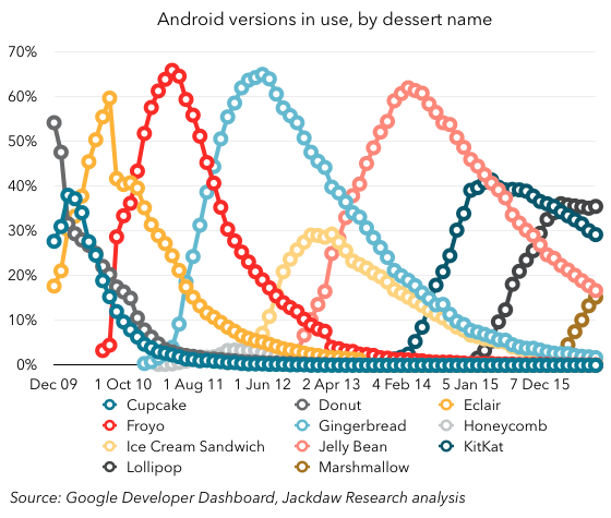
I’ve grouped released into the major dessert-denominated categories so as to simplify things here. As you can see, there’s a clear pattern early on which morphs over time:
- Early on (2009-2011), adoption quickly spikes to rates in the 60-70% range, falling gradually over time
- Over time, the time to hit this milestone lengthens, but peak penetration remains similar (2012-2014)
- More recently, peak penetration drops significantly, to around 40%, while the drop off happens more gradually too.
Let’s drill into all that a bit more. But first, a quick note on the quirks of how these versions have been released in the past. The chart below shows the gap in months between Android version releases, which has varied greatly over time:
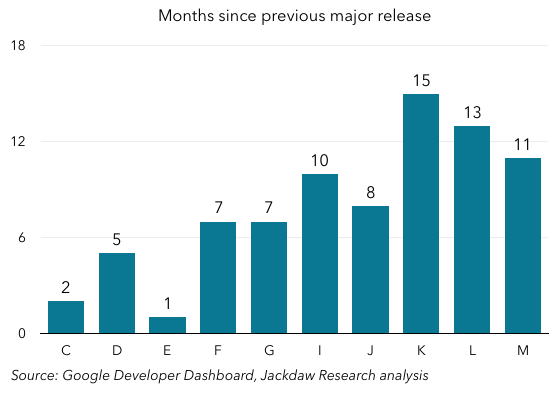 Early on, major new (“dessert”) releases showed up every few months, with the C, D, and E releases following particularly quickly on each others’ heels, while the F-J releases came slightly less quickly, and the most recent releases have occurred a little either side of a year apart. It’s worth noting that the H release, which isn’t in the chart above, was for tablets only, while the I release converged the smartphone and tablet flavors, and also that the K release (KitKat) took a very long time to follow Jelly Bean, which as a result had that much more time to build a substantial base. This will be important context as we look at some of the trends below.
Peak penetration has fallen dramatically
To start with, peak penetration rates – i.e. the maximum penetration of the Android base – have fallen dramatically with recent releases, as shown in the chart below:
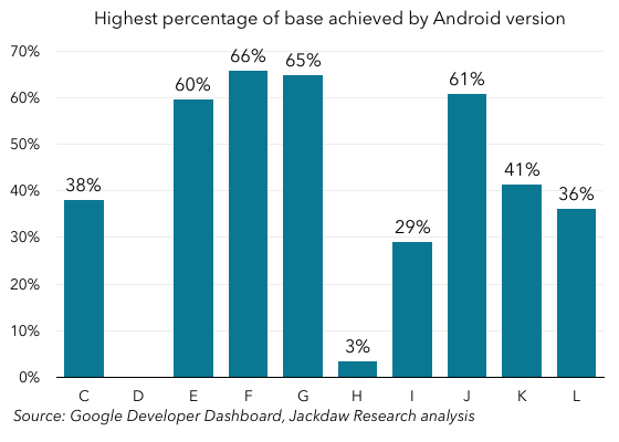 There are a couple of anomalies here, which mostly relate to the quirks of release timing and other details I just referred to. But in general it’s very clear that earlier releases hit peak penetration rates in the 60-70% range, while the two most recent releases have hit maximums of 41% and 36% respectively (Marshmallow hasn’t peaked yet).
Time to peak penetration is long
One of the reasons for the lower peak penetration rates is likely that adoption as a percentage of the base has been that much slower. The time taken to reach peak penetration has lengthened since those early days, despite the fact that peak penetration rates are lower. The chart below illustrates this:
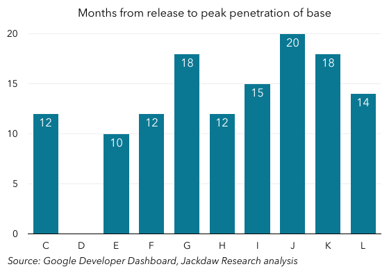
The pattern here is marred by a couple of outlier data points – notably the Gingerbread release, which took an unusually long time to reach peak penetration for an early release, and the Lollipop release, which did so quite quickly. But the trend is generally upward – early releases mostly took 10-12 months to hit their peak rates, while later releases have mostly taken 14-18 months to do so. That means releases often don’t peak until after a new version is released.
This is particularly striking right now, when Nougat is being released, but its predecessor Marshmallow is currently only the third most widespread version of Android, behind the two previous versions. The top version is actually the version from two years ago, while the next most popular version is the one from three years ago.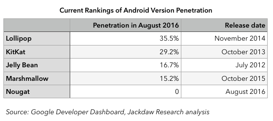
Put another way, the version of Android Google “released” in October last year is currently outranked by the version released in July 2012, as well as the versions released in October 2013 and November 2014. And of course that will be the case for the Nougat version too for the foreseeable future.
The user perspective – 18 months for the average user
As I mentioned up front, I’ve often focused in these analyses on the developer perspective – after all, targeting a base which is fragmented across so many different versions is tough. But Google has addressed that fragmentation at least in part over the last several years, and that path has been well trodden both by me and by others. Today, I instead want to focus on the user perspective – what does all this mean if you’re an Android user?
I think a useful way to think about this is how quickly a majority of Android users can expect to be able to experience the features and functionality in a new version of Android after it’s launched. The chart below shows how long it takes versions of Android to reach 50% penetration of the base from launch. Because recent versions have peaked before hitting 50%, I’ve included the combined total for that version and the subsequent version (which of course also offers those features):
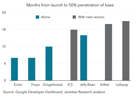
As you can see, from the Eclair to Gingerbread releases, it took a year or less for new versions to reach 50% of the base. But the ICS release took 18 months to reach that milestone together with Jelly Bean, which itself took just a little less time to reach 50% on its own. And the KitKat and Lollipop releases took over 18 months to reach 50% of the base.
In other words, the average Android user can expect to wait over a year and a half (and probably six months from the release of the subsequent version) to be able to use the features in a new version of Android. If you factor in the months from when a new version is demoed on stage and announced at I/O or before, it could easily be two years before many users see these features.
No wonder Google appeared to de-emphasize the core features in the N release of Android at I/O this year. The core features of Android N for smartphones got just 14 minutes of stage time in the nearly 2 hour keynote – compare that to an hour for iOS at WWDC. And that makes sense if most users won’t see those features for two years.
But of course from a developer perspective it also applies to things like the VR features in the new version of Android, which also require new devices. The addressable market for Daydream on Android will be tiny for the foreseeable future – if Nougat adoption follows the path of the two previous releases, it can hope for roughly one-third penetration of the base in two years.
 Why do I bring this up? Well, given Andromeda is also the name of the hybrid OS due to be announced next week by Google, there are some interesting parallels. This past weekend Hiroshi Lockheimer, who owns Android and ChromeOS at Google, tweeted as follows:
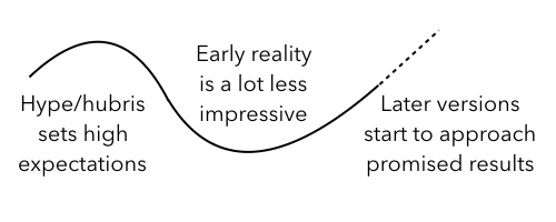 My worry with Lockheimer’s remarks is that, in September 2008, Android wasn’t obviously going to be the hit it has since become. In hindsight, the launch of Android was enormously important, and helped create today’s smartphone market, but at the time the G1 launched it was a clunky and marginal bit of hardware. The concern is that whatever Google announces next week will be received – at least initially – in the same way. Perhaps some will see in it the promise of amazing things to come, but I suspect the initial impact will be marginal, and it will take years to see the true impact. And it’s entirely possible that the impact won’t be nearly as impressive as Google clearly thinks it will be. Although Lockheimer is saying that we’ll look back on October 4th as being a milestone event, he’s saying it ahead of time, and that’s where the hubris comes in. Interestingly, the mythological Andromeda’s personal trajectory fits rather nicely onto that curve above too – her mother’s hubris has her flying high, only to be brought low by Poseidon’s wrath and her parents’ intended sacrifice of her, though eventually she’s rescued by Perseus and things start looking up again. Google’s Andromeda might well go through the same curve too – overhyped up front by company executives, only to fail to meet expectations in its early versions, though perhaps redeemed as the vision plays out over time.