Category Archives: Q4 2014

Thoughts on Twitter’s Q4 2014 earnings

I’ve just sent my Twitter deck to subscribers (screenshot at the bottom of this post). This analysis picks a few of the key charts from that deck. As always, you may want to read my previous posts on Twitter, as a lot of the themes here are ones I’ve touched on before.

As I’ve talked about before in relation to both Twitter and Facebook, there are three main growth drivers for these companies: user growth, increased engagement, and better monetization of that engagement. Twitter’s problem continues to be that only one of these three is going in the right direction:

Twitter growth drivers
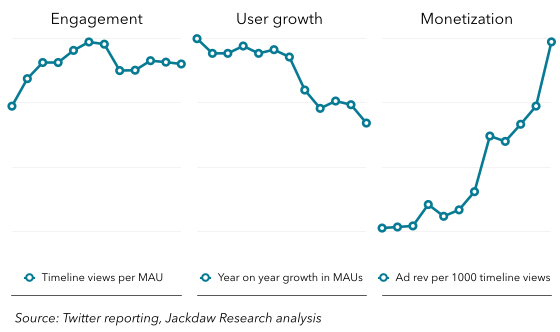
User growth has been slowing significantly over the past two years, and especially over the last few quarters. This quarter the company added just 4 million MAUs (or 8 if you’re charitable and give them back the 4 million additional MAUs they claim they lost to an iOS 8 bug). Even at 8 million, that’s by far the slowest growth in several years. Engagement, meanwhile, as measured by timeline views per MAU, has also been stagnant or falling for several quarters. The only metric moving in the right direction is monetization, and boy is it moving in the right direction! Here’s that chart broken out by itself, with the numbers:

Twitter monetization
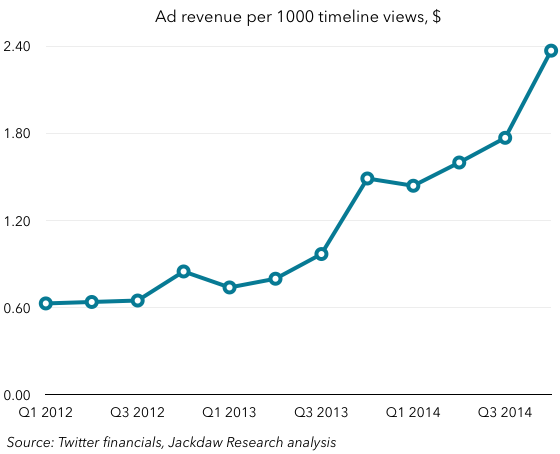
As you can see, the number has risen from 60 cents to almost $2.40 in the last three years, and it’s rising rapidly. In the US, this number is now almost $6 on a quarterly basis. The challenge with this number, though is that it’s unique to Twitter and therefore not comparable to anyone else’s metrics. However, since we know total ad revenue and we also know the number of MAUs, we can do a rough calculation for ad revenue per MAU for Twitter, and then compare it with the equivalent figure for Facebook:Facebook and Twitter ARPU
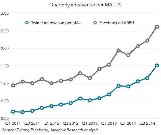
What you can see is that the two lines are following a very similar trajectory, with Facebook quite a bit ahead of Twitter. I think what investors were so heartened about today was that Twitter demonstrated this ability to grow revenues significantly without growing users much at all, which suggests there’s still significant headroom on this ARPU measure. That means that, even if the other two growth drivers are underperforming, Twitter can still get good growth through the one lever that’s performing well. If it can get MAU growth going again as it promised to on today’s call, that will simply have a multiplier effect on that ARPU number, which will be so much the better.

The problem is, of course, that there is a ceiling here at some point – we just don’t know how high it is yet. Google generates between $30 and $50 per user annually in ad revenue from its own properties, so that could be a ceiling. But that’s based largely on one very effective form of advertising: search. There’s no guarantee that Twitter will ever be able to achieve that level of spend. Which brings us back to the question of the logged-out user. What was heartening both on today’s earnings call and in the last couple of weeks of news is that Twitter is finally really making some progress in telling the story of how it will grow this number. Though it refused to spell out the details of the Google agreement, it’s clear that Twitter hopes to drive significantly more traffic to Twitter.com in this way, for example. And then there’s the logged-out homepage it demoed this past week.

Despite all this, my two big questions for Twitter remain the same:

  • How will it monetize all this activity from logged-out users? It’s said very little about this, even on today’s call, and all this usage has to be monetized for it ultimately to do Twitter any good.
  • What are the new metrics by which we should measure Twitter’s progress on its new goals? It hasn’t established a consistent metric for measuring logged-out user activity (the 500m visitor number mentioned on today’s call was unchanged from three months ago). It’s abandoning its timeline views metric for engagement but won’t give us a different one. And ad revenue per 1000 timeline views only measures monetization of logged-in users, so how should we measure progress on monetizing the logged-out user? Twitter continues to try to steer everyone away from the metrics it does provide, but won’t supply metrics that support the new story it’s trying to tell.

Here’s a screenshot of the Twitter deck that went to subscribers earlier this evening:

Twitter deck screenshot

Motorola’s impact on Lenovo

Note: this is part of a series on major tech companies’ earnings in Q4 2014 (click here for previous posts). In this post as elsewhere, I’m using calendar quarters (e.g. Q4 2014) to designate reporting periods, even though Lenovo and certain other companies have fiscal years which use different designations. Q4 2014 in this post and elsewhere refers to the quarter ending December 2014.

Lenovo reported its results yesterday, and although I have not traditionally covered Lenovo in depth here, I wanted to examine something specific: that is, the impact of the Motorola acquisition on Lenovo’s reported numbers. As such, I’m going to highlight a handful of charts here, but I’m also sending a deck on Lenovo with quite a few more charts to subscribers (if you’d like more information or to sign up, click here).

One quick note: the acquisition of Motorola closed in October, but Lenovo also acquired IBM’s server business around the same time. As such, not all the impacts described below are entirely due to the Motorola acquisition, though several are, and I’d estimate the Motorola acquisition had a significantly greater impact than the server business did. Lenovo reported a full quarter of System X (server) results in its reporting, and two months of Motorola results.

Smartphone shipments

The most obvious impact of the Motorola acquisition was a dramatic rise in smartphone shipments reported by Motorola. The chart below shows the trend line, with a very clear bump in Q4:

Lenovo smartphone shipmentsIt’s worth noting, however, that shipments have been growing at Lenovo even before the Motorola acquisition. In my mind, the company has been one of the more successful and stable players in this space over recent years. However, that success has come largely in China, which has dominated shipments in the past. So another impact from the Motorola acquisition is the change in that mix:

Lenovo smartphone shipments China and RoWHopefully you’ll notice two things here. First, and perhaps most obvious, is the spike in rest-of-world shipments in Q4, which rose from under 4 million a quarter to over 14 million. Motorola shipped 10.6 million devices in Q4 alone, so it accounts for the majority of those rest of world shipments. Secondly, you may notice that China shipments actually fell year on year and quarter on quarter. Shipments rose from Q3 to Q4 in 2013, and this dip is fairly significant. It’s quite likely that Lenovo, like Xiaomi, suffered from the impact of Apple’s new iPhones in China in Q4. What’s worth watching is whether this recovers in Q1.

Mobile as a contribution to revenues

Until Q3 2014, Lenovo’s business was dominated by revenues from PCs. PCs contributed nearly 90% of Lenovo’s revenues two years ago, and it’s always stayed above 75%. That business, too, has performed well over recent years, despite the difficulties in the overall market, and so this dominance happened despite the growth in Lenovo’s smartphone and tablet businesses. But with the acquisition of Motorola, Mobile Devices suddenly went from around 15% of its revenues to almost a quarter:Lenovo mobile as percent of revenueThis is helpful for Lenovo particularly because of the overall headwinds in the PC space. PCs have continued to grow for Lenovo, but lessening its dependence on this business while exposing itself to the upside in smartphones is critical for Lenovo’s future growth, and the Motorola acquisition helps significantly with the balance of these two businesses.

Regional impact

We’ve already looked at the impact of Motorola on smartphone shipments outside the US, but the other big impact from this is the share of revenues from different regions. Motorola’s revenue contribution is essentially recorded in the Americas segment, and you can see the impact in this next chart:

Lenovo revenue by regionNote the dramatic growth in the size of that Americas block in Q4 2014 (again, the Motorola acquisition wasn’t the only contributor, as the IBM server business is also US-based). EMEA also grew a little, while China and AP remained fairly steady.

Margin impact

The impact of the two acquisitions can perhaps be most clearly seen in the regional segment margins Lenovo reports. The chart below shows these:

Lenovo margins by regionMargins in China and AP were essentially unaffected by the acquisitions, with AP rapidly catching up with China’s margin levels. But Americas margins dipped into the red for the first time in a long time in Q4, and EMEA margins also dipped somewhat. This is the downside to adding both the new businesses: neither was profitable under its previous owner. With the significant growth in smartphones year on year at Motorola, and efforts to get the Motorola brand back into China, together with various synergies, Lenovo expects Motorola to become profitable within about 18 months of the close of the deal. But in the meantime, Motorola’s results will be something of a drag on overall results.

I’m generally very bullish on Lenovo and the Motorola acquisition. I wrote more about it on Techpinions recently.

Below, I’ve pasted a screenshot of the Lenovo deck which will be going to subscribers shortly.

Lenovo deck overview

Why I’m more bullish on Facebook than Google

This is mostly a Facebook earnings post in disguise – part of my series on major tech companies’ earnings. Google reports this afternoon and it’s my hope to get this out before their results hit the wires. I did a big deck full of charts and comparisons for Facebook for subscribers – sign up or read more about that offering here.

Google and Facebook are the two largest online advertising businesses in the US, and as such face similar market conditions. But they’re coming from very different places, while managing the challenges in very different ways. I maintain that the best way to look at Facebook’s growth potential (and Twitter’s, incidentally) is through three key metrics:

  • User growth: measured in growth in monthly active users (MAUs) year on year
  • Engagement: growth in DAUs as a % of MAUs
  • Monetization: growth in average revenue per user.

The chart below summarizes the state of affairs with regard to Facebook according to these three metrics:

Facebook core growth leversAs you can see, two of the three look very healthy over the longer term, with engagement growing steadily and monetization increasing rapidly. User growth has slowed a little from past rates, but Facebook still adds over 150 million new MAUs every year, and the number’s actually begun to tick up slightly. Engagement stalled a bit this past quarter, as DAUs appeared to plateau at 64%. That was driven by slight declines in Asia and the Rest of World segment, along with flat numbers elsewhere. But it’s a one-quarter phenomenon for now, so we shouldn’t get overly worked up about it. We’ll see what happens next quarter. Engagement is, at any rate, merely a means to an end, as one of two drivers of monetization, which is doing fine. In short, Facebook’s core levers for growth are going well.

At the same time,  this can’t go on forever:

  • Facebook’s user growth can’t keep going at the same rate forever – almost all services eventually start reaching saturation of the addressable market, and with 60% penetration of the total population and 75% penetration of the mobile population in the US and Canada, it’s already bumping up against a ceiling in some regions. Elsewhere, notably in Asia, penetration remains low, but isn’t growing rapidly either.
  • Engagement can’t keep going up forever either – some users will always be occasional rather than regular visitors to Facebook’s properties, and they can only spend so much time on the core Facebook experience in a day.
  • Monetization will start to slow eventually too – both the limits to overall ad spend and increasing competition from other companies in mobile advertising generally and app-install ads specifically will start to eat into Facebook’s growth prospects.

I believe Facebook is aware of all these things, which is why it’s invested in several new businesses, among them WhatsApp and Instagram in the messaging/photo sharing space and Oculus Rift in the interfaces business. It’s also broken Facebook Messenger out as a separate service, which has been controversial but seems to have paid off in spades. Here are the user numbers for the three messaging apps:

Facebook messaging MAUsNone of these is generating significant revenue today, but as Mark Zuckerberg said on yesterday’s earnings call, they all have potential to to do so in future, and Facebook will be very careful about turning the profit spigot on for each of them in the meantime. In other words, Facebook has invested for the future, and has several products waiting in the wings which can start to generate additional revenue (mostly through advertising though potentially through payments or other streams) when they’re needed to shore up overall growth.

Perhaps the most heartening thing about Facebook, though, is that it’s been so clear about two things: the strategy behind these products, and the metrics associated with them. The underlying drivers behind both Facebook’s business today and its business tomorrow are clear for all to see, and we’ve just looked at them. You can draw different conclusions about where those trends might be going longer term, but at least you’re looking at the same data Facebook is looking at as an outsider, and especially as an investor.

This is where Google comes in. I’ve written elsewhere, and especially in a couple of recent pieces on Techpinions, about the fundamental risks to Google’s business in the near term. But I’m more worried than anything else about the fact that Google (a) doesn’t provide good enough transparency into the drivers of its current business, and (b) hasn’t articulated a clear vision for how and when its equivalent investments for the future will pay off. It is neither providing outsiders (including investors) with the understanding they need of how its current business will develop, nor is it telling a compelling story about how its business will evolve over time.

Meanwhile, there are significant headwinds coming up for Google: despite its efforts to shore up its control of Android, it’s arguably in greater danger than ever of losing control over this core platform. Between Chinese OEMs, Amazon and Samsung each customizing the platform to meet their own needs, Cyanogen threatening to take it away, and Microsoft investing in Cyanogen, there are several threats to Google’s ability to continue to control and drive revenue through Android. Internet growth is slowing worldwide, and the new users who come online will have and command far less spending power, while gravitating towards local alternatives and app rather than web models in their usage. Google really doesn’t seem to have an answer for any of these. So far, their earnings are holding up (we’ll see what happens today), but I think it’s only a matter of time before these cracks begin to show.

For those interested, below is a screenshot of the Facebook deck, with some of the metrics described above and many others. Again, click here to find out more or to sign up.Facebook deck overview

Quick thoughts on Microsoft and Amazon in the cloud

At the end of last year, I wrote a piece for Techpinions Insiders about what to expect for Amazon in 2015, as part of a series on major tech companies. As part of that piece, I wrote the following about Amazon’s AWS business:

AWS has been one of Amazon’s big success stories over the last several years, generating higher margins than e-commerce and growing extremely fast. But growth faltered a little in 2014, as competition, from Google and Microsoft in particular, intensified. The basic storage and infrastructure services are becoming rapidly commoditized, with plummeting prices and little real differentiation. As such, both margins and differentiation will move to what these companies build on the basic services; hence Amazon’s launch of Zocalo and other enterprise tools that sit on top of AWS. But here it is going up against Microsoft’s traditional stronghold and Google’s increasingly capable offerings. End user software hasn’t been Amazon’s strong suit, but it’s Microsoft and Google’s bread and butter. I remain skeptical of Amazon’s ability to successfully compete in this area. Meanwhile, others not in the cloud storage business are also building their own competing platforms at this higher layer, including Box, Salesforce and others. If AWS is to become the highly profitable core Amazon has always lacked, it needs to successfully compete at this layer as well as the basic services it has provided historically. It’s not clear to me Amazon will be any more successful at this in 2015 than it was in 2014.

This week, Microsoft reported its earnings for the December quarter, and among other things Satya Nadella said this about Microsoft’s own cloud business in response to a question about cloud margins:

Overall, the shift to the higher layer services is the real driver here, which is obviously Office 365 and its various levels is one factor. The other one is what I talked about in the Enterprise Mobility Suite, that’s really got fantastic momentum in the marketplace because the solution has really come together and is fairly unique, as well as Dynamic CRM.

So these are all got a different profile in terms of margin and they are all now pretty high growth businesses for us. So when you think about our cloud, you got to think about the low-level infrastructure. Even there we now have premium offerings and then we have higher level services. So that aggregate portfolio is what helps us move up the margin curve.

I juxtapose these two quotes – one about Amazon and one about Microsoft – because I think today’s announcement by Amazon of new enterprise email services plays directly into the challenge I described, and which Microsoft seems to be managing much better. It continues to be critical for both companies (and Google) to migrate their way up the cloud stack to the higher-layer services (as both I and Nadella called them), but Microsoft is already there, while Amazon continues to try to compete in a space I’m really not sure they can. We’ll see what AWS results look like tomorrow, but I expect this to be something that comes up on the call.

Thoughts on Apple’s Q4 2014 earnings

Notes: this is part of a series on major tech companies’ Q4 2014 earnings. All past earnings posts can be seen here, and all earnings posts for Q4 2014 can be seen here. For the sake of easy comparisons and transparency, I always use calendar quarters in my analysis. Hence, Q4 2014 in this and every post on this blog means the quarter ending December 2014, even though some companies (Apple included) have fiscal years that end at other times of the year. 

A blowout quarter

The hardest posts to write are often the ones where it’s utterly uncontroversial that the results were astonishingly good, and that was definitely the case with Apple’s record-breaking earnings today. So instead of hashing over the same stuff as everyone else is, I’m going to try to pull out a few possibly overlooked data points. Apple changed its reporting structure in a couple of ways this past quarter, and that gave us one or two new insights while also sadly burying some data points and obscuring others. I’m going to be working through the revised numbers over the next 24 hours or so, and will be issuing my quarterly deck for subscribers once the 10-Q report is out, as that’ll fill in some gaps in the current data. I may well do another post on the earnings at that point too.

ASPs

I tweeted about the iPhone ASPs as follows shortly after the numbers came out:

In some ways, that about sums it up. But of course that chart shows two sets of ASPs, going in dramatically different directions (as I indicated they would in my Techpinions earnings preview post on Monday):

  • iPhone ASPs rose in Q3, but even more dramatically in Q4, largely thanks to two things: the iPhone 6 Plus, which raised the base price of the top-end iPhone model by $100, and the introduction of a 128GB model, which raised the top-end price as well. The combination of these two conspired to lift ASPs $50 above last year’s number.
  • iPad ASPs continue to fall, on a fairly predictable slope, over the last few quarters, enabled conversely by a lowering of the entry price for iPads.

The two charts below show the pricing moves behind those ASP trends:

iPad retail prices iPhone retail pricesAs you can see, the lowest price for iPhones has remained very stable for four years, while the highest possible price has risen $200 since 2010. But the iPad’s lowest selling price has fallen from $500 to $250 during that same period, while the highest price has barely changed. Given the lack of subsidies on the iPad, lower full retail prices translate directly to what consumers actually pay, whereas higher prices on the iPhone side are masked by carrier subsidies and/or installment plans in many cases. All this helps to explain why the iPhone ASP keeps rising while the iPad ASP keeps falling.

Retail’s varying importance in different geographies

Apple giveth and Apple taketh away when it comes to financial reporting. This quarter, Apple took away all visibility over the current quarter’s retail finances, as it rolled retail reporting into regional reporting. However, in so doing, it provided a wonderful insight into past retail performance on a region-by-region basis, something we’ve never had before. I’m curious to see whether it provides any retail-related financials in its 10-Q, but for now we’ll have to make do with this interesting data set. I’ve taken that historical data and generated the following chart, which shows retail revenues as a percentage of total revenues on a regional basis:

Retail as percent of revenuesThere’s obviously a huge variability by region, and this reflects a factor I’ve documented in the past. Here’s the old-style revenue split by region vs. the number of retail stores by region, which highlights the regions which have fewer retail stores than their revenue contribution would suggest:

Retail stores vs revenueAs you can see, the regions with the smallest percentage of revenue from retail are the same as those with the smallest number of retail stores relative to their overall revenue contribution, so this isn’t a big surprise. Japan comes bottom on both metrics. The next question is which of these two factors is the cause and which is the effect, given that there’s clearly a correlation. I suspect there’s some of each, but it’s also clear why Apple is investing so heavily in retail stores in China. It’s also clear why Apple is adding so many more retail stores outside the US than inside it (though that trend reversed a little in the last two quarters).

Growth remarkably diversified by region

One last data point: Apple’s growth this past quarter was amazingly widespread by region. Over the last five quarters Apple’s gone from pretty low overall growth back to roaring growth on a year over year basis. In some of those past quarters, one or two regions carried much of the overall growth, whether Japan for a couple of quarters last year, or China during almost all quarters. But this quarter was notable for just how broad-based that growth was by region, with every region but Japan making a pretty meaningful contribution to overall growth (and Japan suffering from tough comparisons with a very strong quarter a year ago rather than any poor underlying performance):

Year on year rev growth by regionApple provided some numbers around this on the earnings call, citing 22% revenue growth in developed countries, 58% revenue growth in emerging markets as a whole, but 70% revenue growth in China year on year. Unit shipments grew by an astonishing amount in the BRIC countries as a while too – I’m not 100% sure of the number but I believe it was 90%.

Divergent fortunes for Apple and other major phone makers

As I said, I hope to have more top-line analysis later on, but for now I’ll end with this thought: the contrast between Apple’s and most other phone makers’ numbers couldn’t be starker, perhaps most dramatically as it relates to Samsung: record-high shipments at record-high prices, generating record-high profits, just as other vendors are seeing ASPs plunge, shipments stall and and margins squeezed. There’s been so much skepticism for so many years about Apple’s ability to continue to make its unique business model work over the long term, and Apple continues to prove them wrong. I believe with the launch of the Apple Watch in April, HomeKit devices finally starting to ship in significant numbers in the coming months, CarPlay, Apple Pay and who knows what else that might arrive in 2015, Apple is simply reinforcing what’s becoming an incredibly strong, sticky, and growing ecosystem.

My thesis on Microsoft

It’s earnings season and I generally post a particular kind of post when that’s the case, including the Microsoft earnings post I did last night. Typically, I highlight a few key data points and analyze those, without stepping back to do a big-picture view on a company. But sometimes I worry that this leaves readers without a good sense of how I see the company in question and its prospects. So I wanted to do a follow-up post to yesterday’s in which I take a broader view and share my overall thoughts on Microsoft and its prospects. I’ll provide a list of links to previous pieces on Microsoft at the end of this post in case you’re interested in exploring any of this in more detail.

Windows PCs are in a long-term decline

A big part of how you see the future of Microsoft depends on what you think the underlying trend is and will be in Windows PCs, so let’s start there. I see two theories in the market at the moment, and which of these theories you subscribe to very much provides the lens through which you see Microsoft’s results each quarter. One theory is that Windows PCs are on either a stable or growing trajectory over time, and that any quarters in which there is negative growth are the exceptions to that rule. The other theory is that Windows PCs are on a downward trajectory over time, and that positive growth quarters are the exceptions rather than the rule.

For the following reasons, I subscribe to the second theory:

  • PCs as a form factor are now one of several that can be used for the purposes that once required a PC, with tablets and smartphones providing adequate computing power and capability for what many people need
  • PC hardware has reached the point where even those who see a need for a PC don’t perhaps see the need to upgrade it as frequently, because a PC from several years ago is still perfectly adequate, especially if relegated only to those tasks other devices can’t perform effectively
  • Competition is gaining ground, with Chromebooks taking significant share in education and Macs gaining share in the broader PC market, especially among college students and other key groups. As such Windows PCs will be an ever smaller share of total PCs
  • People are choosing platforms other than Windows in new device categories such as smartphones, tablets, wearables, smart TV devices, and so on. As these other platforms increase the degree of integration within their ecosystems, it will be harder for Microsoft to sell Windows PCs that don’t integrate as effectively with Android tablets or iPhones.

For all these reasons, I see a downward trajectory over time in sales of Windows in total, even accounting for the many different form factors Windows runs on. As such, last quarter’s poor performance in Windows sales is much more indicative of the longer-term trend than short-term headwinds. I see Windows 10 slowing the decline a little, but I actually think the free upgrades could stall or postpone new device purchases for some users, which may be counterproductive in the short term. I don’t see Windows 10 solving any of the fundamental challenges I just outlined. Continue reading

Thoughts on Microsoft’s Q4 2014 earnings

Notes: this is part of a series on major tech companies’ Q4 2014 earnings. All past earnings posts can be seen here, and all earnings posts for Q4 2014 can be seen here. For the sake of easy comparisons and transparency, I always use calendar quarters in my analysis. Hence, Q4 2014 in this and every post on this blog means the quarter ending December 2014, even though some companies (Microsoft included) have fiscal years that end at other times of the year. 

As usual, I’m going to run through a handful of charts and provide some analysis in this post. Subscribers to my quarterly company decks service will have received a slide deck with a much larger set of charts – this subscription is $10 per month for individual subscribers, and corporate subscriptions are also available.

The hardware business – some progress, some slippage

One of the themes last quarter was how the hardware business at Microsoft had progressed, and that’s a theme again this quarter. Surface revenues were the highest they’ve ever been in a quarter, crossing the $1 billion mark for the first time, and in addition the gross margins were not only positive for the second time, but significantly so if my calculations are correct:

Surface financials Q4 2014I suspect that, on an operating basis, the Surface line still loses money because of all the marketing spend involved, but I would guess it’s not a million miles away from producing a positive contribution margin at this point, which is enormous progress from the early quarters. I suspect, with almost all the revenue this quarter coming from Surface Pro 3 sales, that ASPs were around $1,000, and that this represents around a million unit shipments, with some accessory spending rounding out the rest. Chances are that’s not much higher than previous quarters.

Lumia sales also hit a milestone this quarter, crossing 10 million for the first time:

Lumia shipments Microsoft also reports non-Lumia phone sales, which dipped below 40 million for the first time in almost 10 years (including the former Nokia devices business). That business is now dropping fast. It’s hard to tell because Microsoft doesn’t provide ASPs for these two product lines, but based on my calculations, I suspect Lumia ASPs dropped from about $140 to closer to $120, reflecting the company’s focus on the low-end market. I continue to question the rationale for pursuing this end of the market, however. Microsoft’s thinking is that if it can capture these users, it can slowly migrate them up to more expensive devices along with Microsoft services, but I suspect that only a very small proportion of the users it’s capturing here will do so. They’re largely attracted by the low price and are also overwhelmingly in low-income demographics, making future revenue prospects poor.

Insight into Windows Phone financials

The “Windows Phone” reporting line has always been a fascinating one at Microsoft, and one I’ve dug into quite a bit in the past in search of nuggets of data. Two new nuggets came this time around, highlighting a couple of interesting points. Here’s my best estimate of the Windows Phone revenue line for the past two years or so, based on various statements in Microsoft’s SEC filings:

Windows Phone revenue Q4 2014What’s interesting here is the extent to which this revenue dropped when Microsoft folded Nokia’s devices unit into the company. Q4 last year saw over $1 billion in revenue reported in this line, but this quarter it was under $400 million. The vast majority of that drop – around 60% – was said to be related to the Nokia acquisition. That, in turn, suggests that Android licensing revenue was less than half of total revenues in this reporting line, contrary to many people’s belief that Microsoft derived more revenue from Android licensing than Windows Phone licensing.

The other interesting tidbit was that Microsoft reported a fall in cost of revenue for the Devices & Consumer Licensing business related to the Nokia acquisition as follows:

D&C Licensing cost of revenue decreased, mainly due to a $224 million decline in traffic acquisition costs, primarily driven by prior year costs associated with our joint strategic initiatives with Nokia.

The only thing I can think of here is that this relates to some combination of Windows Phone and online advertising, since TAC is a metric usually associated with online advertising businesses, and D&C Licensing houses those Windows Phone revenues we just looked at. It seems as though Microsoft may have paid Nokia a fee for the traffic it sent to Bing and other Microsoft online properties, and this was somehow reported in D&C Licensing as a cost related to the Windows Phone revenues. The scale of that fee is pretty significant – $224 million in a single quarter, or almost $1 billion per year, which should improve the margins for the online advertising business significantly.

Online advertising continues to diverge

Speaking of online advertising, the trends there continue to diverge, as they do at other major online advertising companies, between search and display revenues. I’m presenting below the percentage of online advertising revenues that comes from each of these sources, according to my calculations:

Online advertising revenue splitAs you can see, search advertising is now well over 75%, while display advertising is rapidly approaching 15%. I’ve talked before about these businesses, and my conviction that at this point Microsoft should simply pull out of the display advertising business, sacrificing a small amount of revenue but in the process bolstering its claim to be more sensitive to users’ data privacy concerns than Google, and this just reinforces the case. Bing is, at any rate, far more strategically important to Microsoft, especially given the integration with Cortana that’s critical to Windows Phone today and Windows 10 going forward.

Office Consumer transition continues

Another data point I’ve picked up on in the past is the performance of Consumer Office, which comes in two parts: the legacy Office model, and Office 365 Home and Personal. The two continue to move in opposite directions, but with the overall impact of falling revenues from this business:

Consumer Office Q4 2014The red line shows total revenues from these two, which continues to fall year on year as Microsoft goes through this transition. As Microsoft gives away more and more of the core functionality of Office for free in the consumer market, however, this trend will accelerate. One bright point in this area, however, was the bump in Office 365 users this past quarter. I’m not yet sure what to attribute that too, but it’s likely that a combination of Office on the iPad and the new, slightly cheaper, Personal option (launched in Q3 but available for the whole of Q4) both had an impact:

Office 365 subsAs the previous chart shows, the revenue stream associated with these subscribers is still small, but this is the future of Office in the Consumer market, so it’ll be well worth watching what happens to both the subscriber numbers and the revenue associated with them as Microsoft’s changing business model for Office kicks in (especially with the launch of Windows 10 later this year).

Lots more slides in the deck

Again, this is just a sampling of the data I collect and analyze on Microsoft on an ongoing basis. The deck that’s part of the subscription service has the full set, and is available now to subscribers. Sign up here if you’re interested (Paypal and credit card payment options available). A screenshot of the slides in the deck is below:

Screenshot 2015-01-26 20.21.22

Netflix Q4 2014 earnings

I previewed Netflix’s earnings along with three other companies’ earnings in my Techpinions Insiders post earlier this week. I’ll be doing the same for quite a few more companies this coming Monday. If you haven’t signed up yet, you might want to do so. It’s $10 per month or $100 per year to become a Techpinions Insider, and it includes weekly columns from me as well as several other analysts.

Today, I’m kicking off my formal coverage of Q4 2014 earnings with a post on Netflix’s results, which were published this afternoon. I’ve also created a deck with a more extensive set of charts on Netflix’s performance, which is available through this subscription, also for $10 per month. And with that ends the sales pitch. 🙂

I’m generally pretty bullish on Netflix – I think they’ve created a fantastic value proposition that’s clearly become the gold standard for online video services in the US, and they’re now rapidly expanding that model to the rest of the world too. And that’s a good thing, because growth in the US is starting to slow down. Interestingly, the official reason for that slowdown has changed since last quarter, when the company blamed it on the price increase it instituted in May 2014 (this quote comes from this quarter’s shareholder letter):

In October, we judged the leading factor of the similar decline in Q3 y/y net adds to be our May price change. Since then, with additional research, we now think that the decline in y/y net adds would have largely taken place independent of the price change. We’ve found our growth in net adds is strongest in the lower income areas of the US, which would not be the case if there was material price sensitivity. Additionally, we implemented a similar price change in Mexico during Q4, and saw no detectable change in net additions. We think, instead, the reduction in y/y net additions is a natural progression in our large US market as we grow.

Translation: we’re reaching the point in our US growth where there just aren’t as many new subscribers to sign up as there were in the past, and so growth is going to slow down. You can see this effect in the US streaming subscriber growth numbers:

Netflix year on year subs growthAs you can see, US streaming subscriber growth slowed in Q3, and slowed yet again in Q4, and is likely to continue to slow down in subsequent quarters. Whereas the company has been able to count on 6 million new subs per year in the US, it can no longer do so. All of which makes that international growth all the more important, and that’s accelerating rapidly. This quarter was the first time year on year growth internationally eclipsed domestic growth year on year, and that gap will continue to widen.

This expansion, of course, continues to happen at the cost of profitability, since entering new markets is very costly. As I’ve remarked before, Netflix seems to pick up the pace of international expansion every time the overseas business threatens to become profitable, and margins are currently on a downward slope in the international business:

Netflix margins by segmentHowever, that overall line masks two very different businesses: Netflix’s original overseas markets (Canada, Latin America, the UK, Ireland, the Nordic countries and the Netherlands) are now profitable on a contribution basis, but it’s entered so many new markets that those are dragging down overall performance. It’s now in 50 markets overall, and things are going so well that it’s actually planning to accelerate the rate of expansion such that it’ll be largely done by 2017, while staying profitable overall.

Of course, one major cost of both international expansion and continued growth in a saturating US market is marketing. Marketing costs have never been enormous at Netflix in comparison with content costs, but they are a substantial minority of total expenses. And they’ve been rising over time, both domestically and internationally. There are a couple of different ways to measure this and I’ve included both in the full deck of charts, but here’s one measure that I think is meaningful:

Netflix marketing costs per net addAs you can see from that chart, on a trailing four quarter basis, the cost in marketing terms to add a net new paid subscriber has been going up, both in the US and internationally. That cost is still under 10% of revenues in the US, but is over 20% in the rest of the world, reflecting the need to promote awareness of Netflix in many new markets. The good thing, though, is that the cost of revenues (largely driven by content acquisition) continues to shrink as a percentage of revenues, and cost of revenue per paid sub is now lower than revenue per paid sub even internationally:

Netflix international rev and CoR per subThat means that, as Netflix is able to dial back marketing and other non-content-related expenses, and as scale effects kick in, profitability should be eminently achievable. It’s also on track to become the first truly global video business – something that Apple has arguably come closest to so far, but where Netflix will eclipse its reach in the next year or two.

One last thing I wanted to touch on is a rather unique aspect of Netflix and its financials, which is the very predictable and steady progress in US margins. I don’t know of any other company that could make a statement like this (again, from the shareholder letter):

This year we plan to increase US contribution margins from 30% in Q1 to about 32% in Q1 2016 to about 34% in Q1 2017, etc. We’ll re-evaluate the margin progression model again in early 2020 when we hopefully achieve 40% contribution margins.

What other company talks about a specific margin target for five years out? And seems so likely to be able to achieve that given its past performance? Here’s that US streaming margin line again:

Netflix US streaming margin

Again, these and quite a few more charts are in the Netflix deck I’ve just put together for subscribers. Sign up here and you’ll receive it by email within a few hours, and others in the coming weeks and months as they become available. A screenshot of the slides in the deck is below:

Screenshot 2015-01-20 16.57.54