Category Archives: Reviews

MacBook Pro with Touch Bar Review

Note: the version of this post on Medium has larger images and other benefits – I recommend you read it there.

On Thursday morning last week, Apple sent me a review unit of the new MacBook Pro with Touch Bar for testing. I’ve been using it almost non-stop since, to try to put it through its paces and evaluate this latest power laptop from Apple. I’ve only had four days with it, and so this is probably best seen as a set of early impressions rather than a thoroughgoing review, but here are my thoughts on using it so far. I’ll cover quite a few bases here, but my main focus will be on addressing two particular issues which I suspect people will have the most questions about: the Touch Bar and the power of this computer to do heavy duty work.

The model I’m using

First off, here’s the model I’m using:

mbp-2016-specs

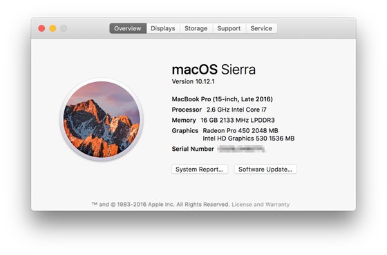
In short, this is the 15-inch version, with 16GB of RAM, but it’s not the highest-end model. There is a version with a 2.9GHz processor and a Radeon Pro 460 graphics card, which would be a good bit more powerful for some tasks than the machine I’m using, though the RAM on that computer is the same.

I’m coming to this experience from using two main Macs over the past couple of years. When I’m at my desk, I’m typically using a 2010-version Mac Pro with 32GB of RAM, a processor with 12 2.66GHz cores, a massive SSD, and a Radeon GPU. When I’m mobile, I’m using a MacBook Air from a couple of years ago, with 4GB of memory and an Intel graphics card. In most respects, at least on paper, this MBP is a big step up on the MBA, but is less powerful than the Mac Pro, with the exception of the graphics card.
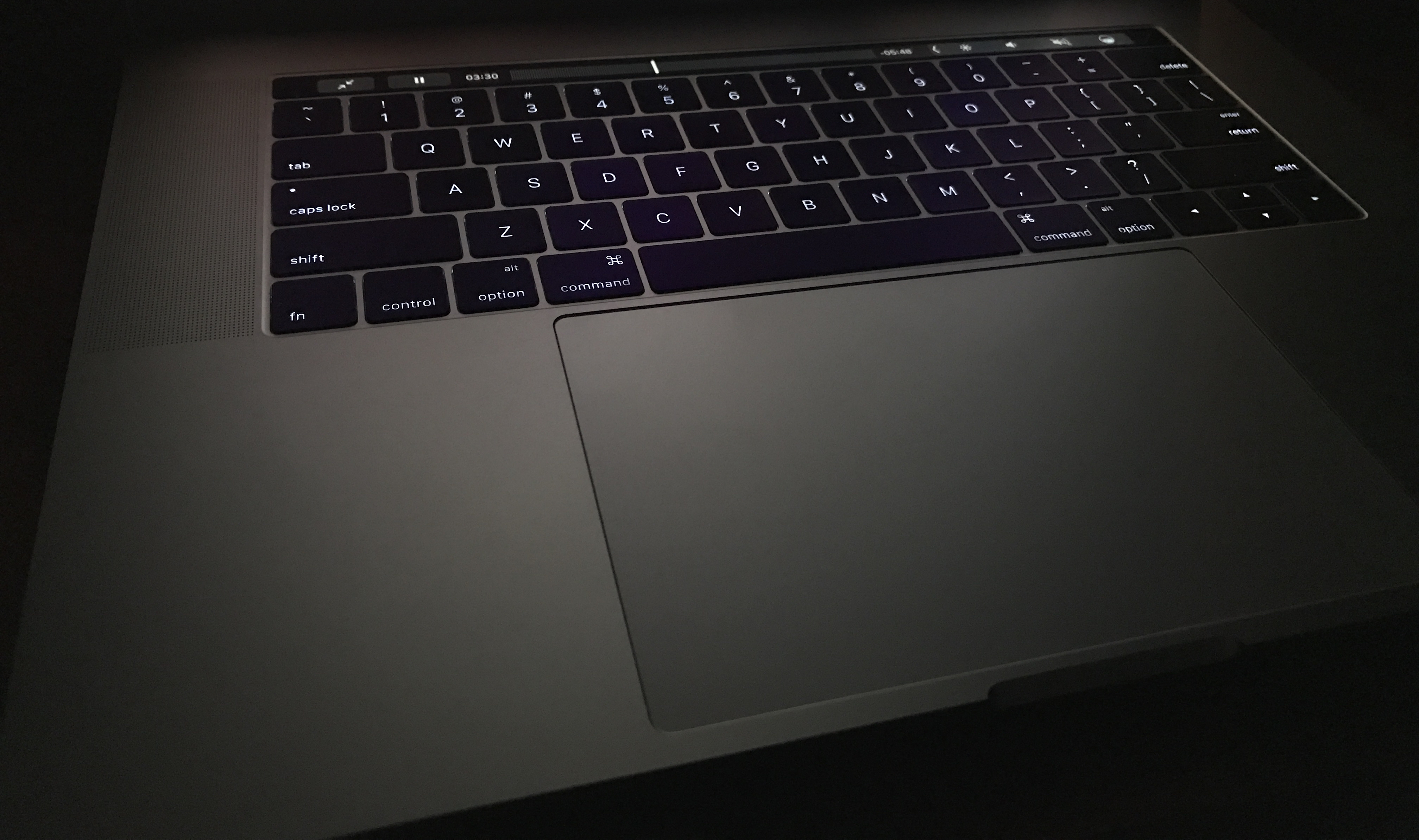
The Touch Bar

So let’s start with the Touch Bar. I had a chance to play around with the Touch Bar a bit at the launch event, and found it intriguing. It was already clear then that this was the kind of feature that could save time and make workflows easier if done right, but that would also come with a learning curve, and my first few days using it more intensively have confirmed both of those perceptions.

An analogy

The best analogy I can think of is learning to touch type. My oldest daughter has recently gone through this process, and I remember going through it when I was about the same age. Before you start learning, you’ve probably got pretty good at the hunt-and-peck method, and may even be quite fast. When you start learning to touch type, a lot of it is about forcing yourself to change your habits, which can be painful. At first, you’re probably slower than before, and the temptation is to go back to doing what you’ve always done, because if feels like you’re going backwards. But over time, as you master the skill, you get faster and faster, and it feels even more natural. You’re also able to stay in the flow much better, watching the screen rather than the keys.

Learning to use the Touch Bar is a lot like that. If you already use a Mac regularly, you likely have pretty well-established workflows, combining mouse or trackpad actions, typing, and keyboard shortcuts. Suddenly, the Touch Bar comes along and gives you new ways of doing some of the things you’ve always done a certain way. A few may replace keyboard shortcuts, but the vast majority will instead be replacements for mouse or trackpad actions. The first step is remembering that these options are now available. The Touch Bar is quite bright enough to see in any lighting conditions, but it’s not intended to be distracting, so although you may be vaguely aware of it in your peripheral vision as you’re looking at the screen, it doesn’t draw your eye. You have to consciously remember to use it, a bit like how you have to consciously remember to use all your fingers when you’re learning to touch type.

At first, your instinct is to just keep doing things the way you’ve always done them. But then you start to realize that the repetitive task you’re doing by moving the mouse cursor away from the object you’re working with to the taskbar or to the Format pane at the side of the window could be accomplished much more easily by just pressing a button in the Touch Bar. You try it and it works great. The next time you do it a little more quickly, and pretty soon it’s a habit. That first couple of times it may take more time than your old method, because you’re having to break the old habit, but you quickly develop a new, more efficient, habit. Your mouse cursor stays by the object you’re working with (or out of the way entirely) and you go on with your work. I’ve been integrating the Touch Bar into some of my workflows over the last few days, and it’s now starting to become natural and I’m getting to the stage where things are faster than they were before.

Below are some samples that show the adaptability of the Touch Bar:

touch-bar-samples-560

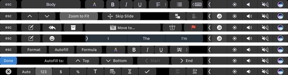
This adaptability is one of the strengths of the Touch Bar — the way it morphs not just between apps but based on the context within each app too. The video below shows several examples in quick succession as I move between apps and between contexts within apps. You’ll see how rapidly it changes as I go through these (there’s no sound on the video):

Most of the buttons are either self-explanatory or familiar enough to be intuitive, but I did find a couple of cases where I simply had no idea what a button meant. Since you can’t hover over these buttons in the way you can an on-screen button, there’s really no way to find out either, which can be tricky.

Ultimately, as I’ve written previously, the Touch Bar represents a different philosophical approach to touch on laptops by Apple compared with Microsoft’s all-touch approach to computers. I’ve used a few Windows laptops with touch, and though there have been times when it was useful, it’s often frustrating – the screen tends to bounce away from you when you jab it with your finger and touch targets are often too small. Apple’s approach keeps the horizontal and vertical planes separate – the vertical plane on a MacBook is purely a display, while the horizontal plane is the one you interact with. This is easier on your hands and arms, and allows you to work more quickly because everything is within easy reach. The trackpads on Apple’s laptops have brought some of the benefits of touch to laptops over the last few years, and the Touch Bar takes this a step further.

Third party support

For now, the Touch Bar is only available in first-party applications on the Mac, and most of Apple’s own apps now support it. However, if you’re a typical Mac user it’s quite likely that you spend a fair amount of time in third-party apps, and that’s certainly the case with me. I spend a lot of my time on the Mac in Tweetbot and Evernote, for example, neither of which support the Touch Bar yet, except for auto-correction when typing, which is universal.

Apple demoed some third party apps with Touch Bar integration at its launch event, and below is a table of those apps whose developers have committed to supporting it so far:

touch-bar-support-560

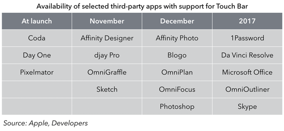
For now, users will be able to take advantage of Touch Bar inside the Apple apps and a handful of others, and that will mean adapting some workflows but not others. The experience here is going to be like the early days of 3D Touch support on the iPhone – it will be nice to have for the apps where it’s available, but there will be a lot of apps where it doesn’t work yet. In some cases, that’s going to push users towards apps that do support the feature, as was the case with 3D Touch. And since support is relatively easy to build, I would guess many developers will get on board quickly once the laptops are out.

Touch ID

Since the Touch ID sensor is part of the Touch Bar strip, it’s worth mentioning that briefly too. For anyone who’s used Touch ID on an iPhone or iPad, the value proposition will be fairly obvious – this is a great way to unlock your device without using a password. To be sure, people probably unlock their laptops many fewer times per day than they do their phones, but it’s still a handy time-saver. I’ve had Apple Watch unlock set up on my MacBook Air for a few weeks, and found that useful, but didn’t feel the need to set it up on this MacBook Pro because Touch ID is actually faster.

But Touch ID goes beyond just unlocking — it can also be used for various other functions where you’d normally enter your system password, including certain app installations and system changes. When it’s available, an indicator shows up in the Touch Bar strip pointing to the sensor, which is handy, because it can’t always be used in place of a password.

Siri

It’s also worth discussing the Siri button that’s part of the Touch Bar too. I’ve been using Sierra on my existing Macs for a couple of months now, but haven’t made much use of Siri, in part because I can never remember which hot key I’ve set to invoke it, and clicking on the on-screen Siri button in the taskbar is too much trouble. Having a dedicated Siri button is definitely making me use Siri more.

Power and performance

On, then, to power and performance. I gave you the specs for the machine I’m testing earlier – it’s not the top of the line model, but given some of the commentary from the professional community and those claiming to speak on their behalf over the last couple of weeks, I wanted to put this side of the MacBook Pro to the test.

Testing

I’m not a regular user of heavy-duty creative apps, but I have used Final Cut Pro fairly extensively in the past, and have an Adobe Creative Cloud subscription which gives me access to other apps like Photoshop, Lightroom, Premiere, and Illustrator, some of which I use occasionally. As a first test, I imported some 4K video shot on my iPhone into the new version of Final Cut Pro and edited it. I checked all the boxes for analysis in the importing process, but it still completed quickly and without slowing down the computer. Both Final Cut and the other apps I had open continued to perform smoothly during the analysis and background tasks. The editing was smooth, and I got to use the new Touch Bar buttons at several points, adding in titles, transitions, and other elements, and then exported the file. Everything was quick and smooth, and the experience was very comparable to what I’m used to on my Mac Pro, which is where I’ve mostly used FCP in the past.

Next, I decided to push things a little harder and shot a longer 4K video while riding my bike. The bike was bumping around all over the place while recording, and as a result there was lots of movement and also rolling shutter issues in the video. I imported this video into Adobe Premiere, and then used the Warp Stabilizer effect to try to smooth out some of those issues. This task took quite a bit longer, but again the computer continued to function just fine while the task was underway, even when I simultaneously opened up Lightroom and imported several hundred RAW images from my DSLR. The fans did spin up during the Premiere background tasks, but I’ve noticed they’re quite a bit quieter on this new MacBook than on past MacBooks I’ve used, which I’d guess is due to the new fan design.

There is no doubt in my mind that this MacBook Pro is perfectly capable of handling heavy duty professional creative work. That’s not to say that a computer with more cores, more RAM, or an upgraded graphics card couldn’t do some of these tasks faster, but many creative professionals will have a stationary machine like a Mac Pro, an iMac, or something else back at their desk and will use the MBP when they’re on the go.

Input from creative professionals

As I mentioned, I’m not a creative professional, but I happen to have married into a family of them, so I checked in with three of my brothers in law who work as video professionals (two as editors and one as a producer). I asked them several questions about the hardware and software they use, their workflows, and attitudes towards these things in their places of work. Both the editors are currently using 5K iMacs with 32GB of RAM, and mostly use Adobe Premiere or Avid for editing (Final Cut Pro has fallen out of favor with the pro video editing crowd since the FCP X release, though at least one of them said that he expected the latest update to win some former users back to the Apple side). This MacBook Pro, which maxes out at 16GB, wouldn’t match the performance of one of those 5K iMacs, but could well be the kind of machine they’d take with them if they were editing or reviewing footage on set. And with the ability to drive two 5K monitors, they could even finish the job when back at the office on the same computer. It wouldn’t perhaps be as fast at some of the background tasks as an iMac or Mac Pro, but it would allow them to do the job just fine, and I think that’s the proper way to see this computer.

Portability

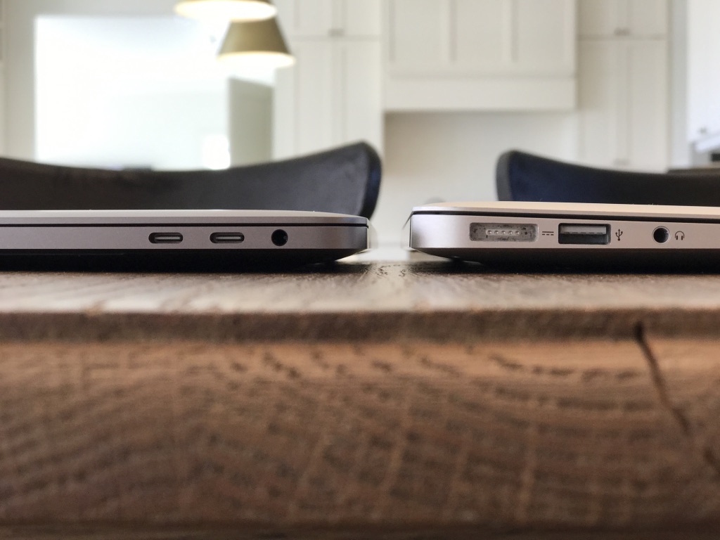
That brings me to the next thing that’s worth talking about, which is portability. The new 13″ MacBook Pro is being positioned as a successor of sorts to the 13″ MacBook Air — it has a similar footprint and weighs about the same, yet is far more powerful. This 15″ MacBook Pro, of course, is larger (and potentially even more powerful), and so obviously not to be seen as a direct replacement for the Air. But as that’s the transition that I’m making personally, it makes sense to make that comparison at least briefly. The MBP is clearly heavier and larger than the MBA, though not by as much as you might think. It weighs a pound more — 4 pounds versus 3 — but the footprint is very similar, and it’s actually thinner than the MBA at its thickest point. And of course it has four times the pixels on the screen. The images below should give you some sense of the size comparison:

unadjustednonraw_thumb_ac unadjustednonraw_thumb_ae unadjustednonraw_thumb_b1 ycz5pp1aq9kej4h6s1bmka_thumb_93

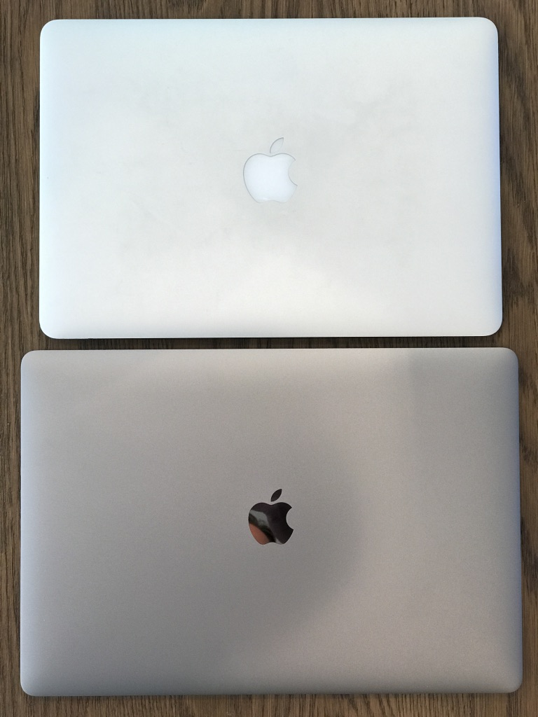
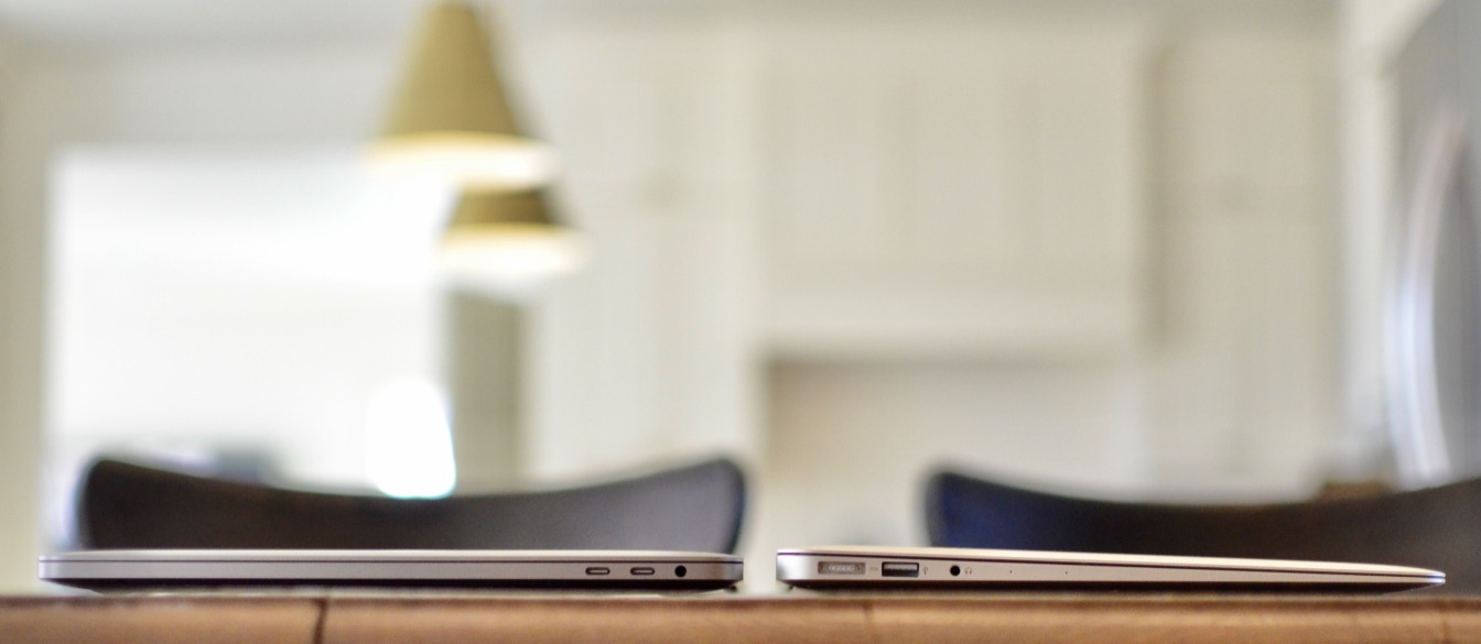
The true comparison, of course, is to the earlier 15″ MacBook Pro, which is roughly half a pound heavier and slightly thicker. I actually have an older 15″ MacBook Pro around as well, from about five or six years ago, and this thing is night and day from a size and weight perspective. Long story short, this is a very portable laptop, less so certainly than the 13″ one, but more so than any other 15″ Apple has ever made, and likely more so than most other 15″ laptops on the market today. And yet it has the power I talked about earlier.

Keyboard, Screen, and Audio

Three other hardware features are worth discussing at least briefly here.

Firstly, the keyboard. This keyboard takes the same approach as the keyboard on the 12″ MacBook, but is a new version which has a different dome switch which allows for more of a springy feel. I haven’t used the MacBook keyboard extensively, but this keyboard has been totally fine for me. I adjusted to it almost immediately, and it feels fine. I have noticed that typing on it is a little noisy, I think because I’m using as much weight as I have used in the past on laptops with more key travel, and so I’m slowly adjusting my weight, which is resulting in a quieter experience.

The screen on this thing is beautiful. Apple now has P3 color on its newest iPhones, iPads, and MacBook Pros, and it’s a really nice improvement. I took some pictures of the Pro next to the Air to try to capture this, but it’s hard to get right in a photograph. However, looking at them side by side, there is both deeper color and a noticeably brighter screen on the Pro. And of course it’s a Retina display too, so the screen looks much sharper too. The combination of the Retina resolution and the brightness and color gamut make it really nice for watching videos. I spent some time over the weekend watching a variety of video on it, and it was one of the nicest displays I’ve ever used for this.

Lastly, the sound. The new MacBook Pro has different speakers, and they’re quite a bit louder than on the MacBook Air. In my office, I have a stereo hooked up to an AirPort Express for AirPlay and play all my music that way, but the new Pro will do fine even on its own for sound volume and quality. I tested with a random iTunes track, as you can hear in the audio clip below. I recorded using an iPhone placed between the two laptops.

The sound quality is noticeably louder and fuller on the MacBook Pro, as I hope you can hear in that sample. Again, this makes it perfect for watching movies in your spare time, as well as for listening to music.

Ports and adapters

Another thing I’ve seen some concern about with this new MacBook is the ports, all four of which are Thunderbolt 3 / USB-C. That’s a new port for me – I’ve never owned a computer with a USB-C port, though two of the smartphones I’ve tested recently (the Google Pixel and LeEco Pro3) have USB-C charging. As a result, I was interested to see how I’d get by with my existing peripherals.

I made a trip to the Apple Store and picked up a few adapters:

  • Two USB-A to USB-C adapters for my USB peripherals
  • A Thunderbolt 2 to Thunderbolt 3 adapter for my Thunderbolt display
  • A USB-C Digital AV Multiport Adapter for another display that uses HDMI.

Of course, all these adapters are discounted until the end of the year, which was nice because cost adds up fast on some of these. All of them worked fine, and I’ve appreciated being able to plug in any of these various peripherals on either side. It’s particularly nice to be able to shift power from side to side based on where the nearest outlet is.

This is a classic Apple situation – removing ports before the world has necessarily moved on, in part as an attempt to move people along. But in this case Apple is particularly far ahead of the market, and so these adapters are a concession to that reality. Some people will already have USB-C or Thunderbolt 3 peripherals such as hard drives, and these will become increasingly common over the next few years. Along with the adapters, Apple sells a variety of LaCie, G-Tech, and Sandisk storage devices and the LG displays, which support USB-C natively.

But for now, we’re going to be using adapters when we use a number of existing peripherals. I already have a pocket full of adapters in my work bag for my MacBook Air, for presenting, using Ethernet cables, and so on, so I’m used to this situation. And as I pointed out on Twitter recently, even if you buy all the adapters Apple recommends as you go through the buying process for a new MacBook Pro, the cost is a tiny fraction of the total (and of course less than full price between now and December 31). I will say that it feels a bit odd with a brand new iPhone and a brand new computer not to be able to plug one into the other out of the box, though I suspect many users no longer plug their iPhones into their computers at all.

Design

This is the first MacBook Pro to be available in Space Gray, and it’s a nice new option (this is the one Apple sent me, and in person it looks darker than in most of the pictures in this post). It’s sleek looking, and smudges and scratches will show up a lot less on this surface than on the bright silver surface of earlier MacBooks. It’s a good looking computer overall too, regardless of the finish. The display takes up much of the vertical plane, with fairly small bezels (one of the ways Apple was able to shrink the footprint), while the horizontal plane looks really good with the addition of the Touch Bar and a larger trackpad.

img_8210

I’ve found that trackpad to be totally fine, by the way — even though it’s consistently under the heels of my hands, I’ve never once accidentally moved the cursor or clicked on anything while typing because of it. I will say that I use the bottom right corner for right clicking and that’s now a long way from the center of the trackpad, which has resulted in some failed right-clicks when I haven’t moved far enough with my fingers. If you tend to use Control-click instead of bottom-right click, then this obviously won’t be an issue. I have also noticed that if the laptop is resting on my lap rather than on a table, there’s something about the angle of my hand on the trackpad that sometimes accidentally right clicks when I’m trying to click in the center of the trackpad, because another part of my hand is resting on the bottom right corner of the trackpad. This happens because the trackpad is really very close to the edge of the computer now on the side closest to you, so that the heel of your hand can easily stray onto the trackpad when resting on the edge.

Miscellaneous glitches

I did have one or two glitches here and there. For the first day and a half I was using the MacBook Pro, it would lose WiFi connectivity when it went to sleep, and fail to reconnect. After a restart, this issue seemed to resolve. Secondly, while I left Adobe Premiere processing video and stepped away for a few minutes, the computer went to sleep, and when I woke it, the whole computer did a hard crash, restarting out of the blue. Lastly, I had an occasion when the computer hung to the extent that I had to restart it.

I’m not used to having these issues regularly on Macs, though I’ve experienced each of them on occasion in the past. It was odd to have these happen in quick succession, and I’m not sure what to ascribe that to – Apple says it hasn’t seen these issues itself in testing. I will say that none of these issues has happened twice, but I’ll be watching for more of this stuff to see if these were just flukes.

Conclusions

This is a really solid new laptop from Apple. I wrote after the launch event that Apple now has the most logical lineup of laptops it’s had in a long time, with a clear progression in terms of power, portability, and price. Even within the new MacBook Pro range, there are size, power, and feature options. But all of these are intended to be pro computers.

That’s not to say they’re all intended to be the only computer someone who uses heavy-duty creative apps needs – the Mac Pro and iMac are there at least in part to meet those needs. But these are computers that the vast majority of people who use a Mac for work would be fine to use as their only machine – that’s certainly the case for me. This 15″ version I’ve been testing is slightly less portable than the 13″ version, but can be significantly more powerful, and could handle pretty much any video or photo editing task you’d want to throw at it. Yes, there are desktops including Apple’s that could perform some of those tasks more quickly, but this laptop is intended for someone who needs portability too, and that’s the point here. Every computing device involves compromises – here, portability has been prioritized over raw power, but not in such a way that makes this computer useless for powerful tasks.

All that would be true even if the Touch Bar didn’t exist, and yet it does. It’s a really nice addition to what’s already a great computer, and once you get some way along the learning curve it really speeds up tasks and makes life easier on your hands. As third party developers embrace it, it’ll be even more universally useful, and I wouldn’t be surprised if we see some developers using the Touch Bar in really innovative ways within their apps. Can you live without it? Absolutely – all of us have until now. But it’s a great addition if you’re in the market for a new laptop.

Two Weeks with the iPad Pro

When the new 9.7″ iPad Pro was released a few weeks ago, Apple was kind enough to send me a review unit, which I’ve been testing since. I thought I’d share some of my thoughts on using this device for the past couple of weeks.

Update: I added a little something on the Apple Pencil – I initially left it out because I simply haven’t used it much, but it’s worth noting that fact in and of itself. The addition is near the end of the review.

Initial impressions

My first experiment was to try a day of working solely with the 9.7″ iPad Pro, and I got through a whole day of fairly varied work without needing to use any other computing device. That surprised me to some extent – other than on the occasional business trip, I hadn’t really ever tried to use an iPad as my sole computer, and I really wasn’t sure how well it would go. That first day turned into several days and eventually two weeks, but even after that first day I immediately knew I also wanted to test the larger iPad Pro, and so I purchased one from the local Apple Store (I’ve since returned it), along with a Surface Pro 4 I acquired for testing too. During that period, I used one or other of the iPads virtually exclusively, with a couple of brief exceptions, and found this barely limited my ability to get done what I wanted to.

The first thing I noticed was that the device felt more intimate and personal – instead of staring at a screen sitting a couple of feet away and using peripheral keyboard and mouse that felt very disconnected from the computer, I was engaging entirely with this screen that was immediately in front of me, including touching it occasionally. That felt very different from my usual computing experience in subtle ways. Obviously you get some of the same feeling from using a laptop, but with the iPad it felt subtly different, and I think part of that is because I’m used to thinking of iPads as devices that you hold. Although a lot of my work was done with the iPad resting on the keyboard case, throughout the day I also picked it up from time to time without the case and used it for catching up on Twitter or reading things, and in the evenings it had the flexibility to be used that way too.

For this reason, I love the new modular approach to cases and covers Apple now has – it used to be that you either had a case that included a cover, just a cover, or some sort of keyboard case. But the new modular cases from Apple allow you to have a case permanently attached to protect the body, and then to swap out the plain cover and the Smart Keyboard case at will. This feels a lot more flexible and means you just always use whatever you need at any particular point in time, whether that’s just the case when you’re reading something, the case and standard cover when moving around, or the Smart Keyboard cover and case when you know you’ll need to type. This flexibility is one of the biggest things that sets the iPad Pro apart from the Surface Pro too – the Surface always feels more like a computer than a more personal device like a tablet, whereas the iPad Pro makes that transition seamlessly without feeling either awkward or as though it’s missing an important appendage.

The other big difference I noticed in switching between the iPad and Surface was that the default state on the Surface is an empty screen – the desktop. You have to actively go looking for something to do in the Start Menu, where there’s little consistency in how items are presented with all the different sizes of live tiles. Apps you install don’t even show up there by default and it takes hunting around and then replacing default apps with the ones you choose to get them accessible. By contrast, on the iPad (as on any iOS device) you’re always presented with a screen full of possibilities in the form of a set of app icons. You can, of course, rearrange these icons and swipe through several pages of them to find the one you want, but ultimately the default state is being presented with lots of things you could do next. This, too, makes the iPad feel like a more personal device than the Surface.

Keyboards

I found the keyboards on both sizes of iPad very usable. I’m typing this review on the smaller of the two keyboards, and I’m able to type more or less as fast as on my Mac or MacBook Air keyboards. I don’t find the lack of key travel a problem at all, and I like the fabric on the surface of the keyboard. The smaller of the two is definitely more space constrained, but I find that I can adjust very quickly when switching between devices, and the fact that the keys are raised and nicely separated is very helpful. My one niggle with the keyboards is that the globe icon key for switching between virtual keyboards (e.g. invoking the emoji keyboard) is at the bottom left corner and as such the other keys are shifted over to the right a little from other Apple keyboards. That has meant I’m often either hitting that key by mistake or hitting the control key when I mean to hit the option key, for example. I’m a big user of keyboard shortcuts on the Mac and I found most of them translated easily to the Smart Keyboard, but this one change has caused more errors than anything else in the keyboard. My other frustration with keyboard shortcuts has been that option-deleting hasn’t worked the same was as in OS X, in that instead of deleting whole words at a time, it only deletes single letters as if the option key weren’t depressed. That’s one of those muscle memory things that’s been hard to adjust to on the iPad, and should be easily fixable through a software update.

Performance

For the tasks I undertook on the iPad Pros, there was never a performance issue that felt related to hardware. The devices are snappy for all sorts of activities, app switching happens quickly and without glitches, and on the few occasions where you do encounter bugs they feel like they’ll be resolved soon. I loved being able to use the familiar command-tab shortcut for app switching, and it even implements in a clever way when you’re in split-screen multitasking mode. My one big frustration about multitasking and split screen use is the way you have to scroll through an endless list of apps to find the one you want to have show up on the right side. Some sort of search function here is critical for anyone with a large number of supported apps installed. The work that MacStories has published this week on iOS 10 includes a much better interface for this scenario, and Apple would do well to implement something like it.

I found that many of the apps I use on a regular basis already support split-screen multitasking, and that interface works particularly well on the larger iPad Pro, where the apps get to run more or less full size from a 9.7″ iPad perspective side by side. I did find that some interfaces looked squashed on the 9.7″ iPad Pro, especially web interfaces that are designed to run full screen on such a device, but many others worked very well, and it made comparisons and copying and pasting between apps very easy. I had to find a workaround for working with two web pages at once, which involved installing the Chrome browser for the second screen – as others have pointed out, it would be nice to have the ability to put two Safari tabs side by side in the split screen view.

Limits to productivity

I mentioned earlier that I was able to accomplish more than I expected on the iPad Pro. But there were a few tasks that I found either too cumbersome, too risky, or simply impossible on the iPad, and for which I switched back to a Mac. I also found that a key element of my workflow was impossible to replicate on the iPad, and this was ultimately the biggest issue for me:

  • Recording and editing podcasts – this is something I do at least twice a week in the case of recording and once a week in the case of editing, and it’s essential that it work well. There are ways now to hook up even powered microphones to the iPad Pro, but you can’t feed two apps at once with that microphone, so it doesn’t work for talking on Skype and recording podcast audio at the same time, as others have mentioned. When it came to editing, the iOS version of GarageBand simply doesn’t supporting importing multiple audio tracks and editing them together, even though I use GarageBand on the Mac usually. For all these reasons, I recorded and edited all podcasts on the Mac during my two-week experiment. I mentioned some of this on Twitter, and was pointed to Ferrite as a possible solution for editing podcasts on the iPad Pro, so there may be workarounds for all this, but it was too much work and too risky to test for a critical podcast recording.
  • Document editing workflow – as I’ve written about elsewhere, my workflow involves using the iWork suite to create and edit files, whether spreadsheets, presentations, or documents. But I use Dropbox for storing and syncing those files across computers and making them available on mobile devices. This works fine on the Mac, which has full support for Dropbox at a system level, but it breaks down on iOS. The problem is that Dropbox isn’t available as a source of files to open within the iWork apps on iOS. You can open files from within the Dropbox app, but this process creates a copy, so you’re not modifying the original in real time, and have to export it back to Dropbox when you’re done editing if you want to update the original. There are several possible solutions to this – use Office instead of iWork because Office has proper Dropbox integration, or use iCloud instead of Dropbox because it’s supported natively in the iWork apps. But I prefer iWork for its ease of use and look and feel, and don’t yet fully trust iCloud for syncing really important documents. So I’m sort of stuck when it comes to my current workflow. If I knew I’d be committing fully to an iPad as my only device, I might feel differently, but for now it means it’s tough to carry over my workflow from other devices, which is something many iPad Pro users are likely to need to do. In addition, there are still detailed functions within iWork which simply aren’t available in the iOS versions, even though feature parity is pretty extensive. I found that a little frustrating too.
  • Working with Apple News – I’ve recently started publishing this blog and our podcast to Apple News, something which comes with its fair share of pros and cons no matter which device you’re using (something we talked about on the podcast recently). But on iOS, the Apple News Publisher online interface at iCloud.com doesn’t work. If you visit iCloud.com on any iOS device (even the larger iPad Pro) you get redirected to the mobile site, which is mostly a holding page, but if you request the desktop site through Safari, you get the full site. However, even then, the Apple News Publisher site clearly isn’t meant to work on iOS, and frequently crashes and has other issues. This means if you want to use Apple News Publisher, you have to find some other way to do it than through the WYSIWYG editor online. It’s a new platform, and so maybe better support for iOS devices will come soon.

The iWork feature parity issue and this Apple News problem are indicative of one of the biggest issues I encountered productivity on the iPad Pro – for all that Apple wants to sell these devices as fully-fledged productivity machines, it’s Apple’s own services and apps that continue to hold it back. It’s frustrating that there are a number of Apple’s own apps which don’t support split-screen multitasking yet either. Ironically, you’d be better off in some ways using the Office suite than iWork on these iPads, and that raises an interesting possibility – that the future of mobile productivity marries Apple devices with Microsoft (or other third party) software.

Quick thoughts on the Apple Pencil

My review unit came with an Apple Pencil, and I was particularly keen to try it out. The reality is, however, that there’s very little that I have ever used a stylus for in the past, and that has less to do with the quality of the styli available and more to do with the way I work. I type much more quickly (and legibly and searchably) than I write by hand, and so I always type when I possibly can. I did take notes for a few hours using the Pencil and iPad in place of a pen and notebook, and found it a really solid experience. I was using Microsoft’s OneNote app, which was mostly fine but frustratingly doesn’t explicitly support the Pencil or the associated palm rejection. I tried using the Surface with its pen later for the same task, and found the tactile feel and the resulting handwriting significantly inferior to the Pencil. That’s a bit surprising given how much longer Microsoft has been doing Surface pens, but the difference was undeniable to my mind.

However, I’m not an artist either, and other than for the novelty value, and the occasional bit of doodling in Pigment just for fun, I find myself using the Pencil very little. I think it makes perfect sense that it’s an optional accessory rather than a bundled feature of the iPad Pro – many users aren’t going to need it. I used it enough to be convinced that it would work well should I need it, but I’m fairly certain that I’ll continue to use it only infrequently. My one frustration was charging – it’s not really practical either to charge the Pencil in the standard way (i.e. plugging it into the iPad) while using the iPad or while charging the iPad. Several times, I wanted to charge both devices at night but couldn’t without using the specialized adapter for the Pencil with its own charging cable. That feels like a mistake (and I’m convinced I’d lose the adapter and/or the Pencil’s cap pretty quickly if I were using it more regularly).

Conclusions

After using the iPad Pro(s) more or less exclusively for two weeks, I can say that (with very few exceptions) I’d be happy to do so again in future. I do like the flexibility of my usual Mac Pro setup, but I got a great deal out of using an iPad instead for  a while, not least a greater sense of focus on the task at hand and that sense of intimacy I mentioned earlier. Were I to find myself in a situation where I had to commit to one of these devices full-time, I’d definitely pick the larger iPad Pro – the increased screen real estate allows multitasking and other features to really thrive, and its similarity to the size of a standard laptop helps too.

The reality is, though, that these devices don’t have to fill that role for me. I have other computers available to me, and for a variety of reasons they’ll continue to be my main ones. As such, the smaller iPad Pro feels like a great fit as more of an occasional device – one to use in the evenings, or when I need to go out for a while but stay productive, or when I’m traveling. I’d almost always resisted only taking an iPad with me on business trips in the past, but could see myself relying solely on an iPad Pro for at least short business trips in future.

iPhone 6S Plus Review

All the major publications which were given review units of the new iPhones ahead of the launch came out last week. I got my review unit last Friday (along with many Apple customers), but since I’ve now been able to spend a few days with it, I wanted to share a few thoughts. I’m going to try very hard not to rehash everything everyone else has said, and also to add a bit more insight in areas I haven’t seen others write about yet. I’m also going to spend a bit more time on the cameras than most of the other reviews – I’m not the world’s greatest photographer, but I do enjoy taking pictures and my phone is by far the camera I use the most to take pictures of my kids, so it has to be good. As such, I’ve spent a good chunk of time over the last few days taking pictures and videos of various things to test the camera specifically and I’ll share some examples below.

The Hardware

The new devices are nominally virtually unchanged on the outside from the previous versions, and that’s certainly the first impression they give too. They are a hair thicker and a tiny bit heavier than their predecessors, but if I hadn’t known that I might well not have noticed. Along with the iPhone 6 Plus I’m using, Apple also sent one of its new leather cases (I have the saddle brown one) and I’ve been using that for the last few days, which has made comparisons between this phone and the iPhone 6 Plus less relevant.

As with previous iPhones, the hardware feels very solid, well balanced, and high quality. Nothing’s changed there. The aluminum and glass are both supposed to be more durable than last year’s, but I can’t think of a way to test either of those that doesn’t involve trying to break the phone, so I haven’t tested either.

The new vibration engine (apparently now one and the same as the taptic engine) is very nice, too – I don’t use vibrating alerts much anymore since I started wearing the Apple Watch, but on the odd occasions when I still get them (mostly for phone calls), they’re more substantial than they used to be. It’s hard to know for sure, but I feel like the phone speaker has got better too – calls sound clearer and louder than before.

3D Touch

3D Touch is arguably the headline feature on the new iPhones, and from the moment I got to use it in person at Apple’s September event I’ve said I thought it was going to be important.

Having now used it for more than just a few minutes in a tightly-controlled demo environment, I have a few additional thoughts:

  • This is a big deal, but for now it’s mostly used by Apple’s own apps and just a handful of third-party apps. That has two implications. One, if you tend to use third-party replacements for key things like Mail, Calendar, and so on, you’ll find 3D Touch a lot less useful, at least for now. Two, that may mean you migrate back to Apple’s own apps in some cases, to make use of this feature. I’m curious to see how quickly most third-party app-makers add support – if I were them, I’d do it quickly, especially the Quick Actions functionality. I suspect this will be like the Apple Watch, in that apps that fail to support it will find users replacing them with ones that do.
  • Especially on the 6S Plus, which is the one I’m testing, 3D Touch makes apps on the top half of your home screen less useful than those on the bottom. Yes, you can use the Reachability feature to bring those higher-up apps within easier reach of your thumb, but that adds friction in the use of a feature that’s all about reducing friction. I haven’t done this yet, but I can see myself rearranging the icons on my main home screen based on which I’m likely to use Quick Actions with.
  • Speaking of which, I’ve always kept the Camera app in the top right of my first home screen, because I do want access to it when the phone is unlocked, but I most often trigger it when the phone is unlocked, and therefore use the camera button on the lower right of the lock screen. However, the introduction of 3D Touch and the much-faster Touch ID sensor (on which more below) means I rarely see the lock screen anymore, and even when I do using that lock-screen camera button is less flexible than the app icon for the camera on the home screen. I wish I could use 3D Touch in some way on the lock screen – that’s something Austin Mann predicted Apple would do, but it didn’t. I suspect that’s because the lock screen is becoming less relevant, but it also means I likely need to put my Camera app icon somewhere closer to the bottom of the screen, and maybe even on my home row.
  • For now, I’ve been using 3D Touch more in apps than on the home screen, and that’s partly because I tend to use third-party apps more than Apple’s own. I‘ve used it most in Instagram and the Photos app, where I’m using it both to view Live Photos and to quickly review recently-taken pictures when I’m still in camera mode. The latter is a really great addition, and I think third party developers will likely come up with lots of cool ideas for using this feature.
  • One thing I think developers should be thinking about is making Quick Actions user-customizable. Instagram, for example, chose to make access to the Direct inbox, Search, and View Activity the three additional Quick Actions beyond the obvious New Post option. If I had my way, I’d probably choose other aspects of the app to get quick access to, and I’m betting I’m not alone in that. Launch Center Pro does a great job of this as a key feature, and I think it’s brilliant (h/t @rjonesy).
  • Related to this, the order in which functions appear in Quick Actions is interesting too – I think we’re accustomed to reading menu-type lists (along with everything else we read) from top to bottom, but depending on where an app sits on your home screen, the menu items may appear in what seems to be reverse order (I think the rule of thumb is that the thing you’re most likely to want to use is closest to the app icon itself, for easy thumb access, but that may mean it’s at the bottom of the list). That means something of a learning curve for users, but is probably also something developers should think about in designing the order of items (and any icons they use alongside the labels).
  • Lastly, I’ve noticed some of the negative side effects of the introduction of 3D Touch. One of the things that’s happened to me several times is tapping on web links without any result. I think what’s happening is that I’m tapping just hard enough to trigger 3D Touch, but not holding it at all, which leaves me in a sort of limbo where I don’t get either the desired result or any visual signal that I’ve accidentally activated 3D Touch either. John Gruber has talked about the problem of trying to delete apps, a function I suspect we’ve all kind of activated by pressing down fairly hard on the screen to trigger the wobbling icons. I’ve had this problem too, and there are several other places where I’ve previously pressed fairly hard for the “long press” but now have to get used to pressing only gently. No doubt the mental and physical adjustments involved will come in time.

Touch ID

I won’t spend lots of time on this, as it’s been well-covered elsewhere, but the Touch ID sensor is dramatically faster now, and frequently completes authentication before the lock screen even pops up fully. That’s wonderful for quick access to functionality, but as others have pointed out (and as I alluded to in the context of the camera above) it does mean the lock screen becomes a lot less useful, unless you trigger the home button with a finger not registered for Touch ID, or use the side button to turn on the phone. Training the Touch ID sensor is also much quicker now – not something you have to do a lot, but I’ve added several fingers to the new phone more or less immediately, whereas it took me a long time to bother doing so on the iPhone 6 Plus because it took more time to do.

Live Photos

My initial reaction to the Live Photos demo was that this reminded me of something out of Harry Potter (it may have helped that my daughter has recently been reading the books and seeing the films for the first time).

Again, I got a brief demo of the feature at the September event, but it’s very different to be working with your own limited skills as a photographer rather than with carefully chosen images pre-installed on a demo phone. I’m glad I read some of the reviews last week ahead of trying to use it, because it meant I was immediately aware that I needed to change my past behavior slightly and hold the phone steady both before and after taking the still image (though the software on the phone now knows to cut off the video if the phone is lowered prematurely). That probably shortened the learning curve somewhat, but it’s still an interesting process to figure out how best to use Live Photos. Apple’s demo photos were an interesting mix of moving objects and people, and I’ve definitely had more luck with the latter than the former in terms of getting compelling Live Photos out of the process.

Below are some examples of Live Photos from the last few days – they’re a mix of objects and people/animals, and you’ll see how variable the results can be. For what it’s worth, sharing these anywhere other than in iOS is still difficult – I connected my phone to my Mac and used QuickTime to record the screen of my iPhone as I used 3D Touch to interact with them, which resulted in this series of 7-second videos you see below. In each case, the video starts with the still image, then shifts to the video, and returns to the still (you may hear background noise from my home office on the audio on some of them – no idea why QuickTime records microphone noise when capturing the iPhone screen).

Overall, I’m really enjoying Live Photos, and there are some interesting things to note:

  • Even when in Live Photo mode, you can capture multiple pictures in quick succession – at first, I was waiting for the yellow Live indicator to disappear before taking the next picture, but I found that it works just fine even when the pictures are taken close together. The video still attaches itself to each picture in the same way, which means you get an interesting effect when scrolling through pictures quickly and playing the Live Photo – you’ll hear almost the same background noise on each, with the beginning and end shifting a fraction of a second each time. This is very clever stuff on Apple’s part.
  • I kind of wish Apple had made these Live Photos auto-play as you scroll through your camera roll (or gave users the option of selecting this) – it would make your camera roll come alive in a completely different way, whereas for now your camera roll looks entirely static until you decide to engage with an individual picture. Maybe it’s the Harry Potter thing again, but I like the idea of these pictures looking alive from the get-go, rather than having to be prodded into action. I’m sure the team at Apple responsible for the feature spent at least some time discussing this decision, and ultimately came down on the side of having them be still by default – perhaps because scrolling through moving photos was too distracting visually, perhaps because of the impact on battery life, or for some other reason. Perhaps it’ll change in time or become a user option.
  • Related to this, the blurry transition between the still and the video isn’t my favorite element here. I can see why the engineers thought it needed a clear visual transition from one mode to the other, but when you’re reviewing a bunch of pictures it’s an unnecessary visual obstacle and delay that adds little once you’re used to how the feature works. At the very least, it feels like it should be quicker.

The Camera

The cameras have always been one of my favorite features of the iPhone, and I continue to find the cameras on the iPhone better than any other smartphone camera out there, at least for general use. The new cameras offer improvements over last year’s, which were already very good (see my review from last year here and this Flickr set for lots of pictures from last year’s phones).

My wife and I went to pick up my kids from her parents’ farm on Saturday, and I had a chance to take some pictures and video while we were there. We then went on a drive up the canyon near our home on Sunday afternoon, and I went on a brief hike with my son this morning too, so I’ve taken pictures and video in a few different settings over the last few days. Overall, I’ve been very impressed by the camera, both for photos and videos.

Below is a panorama I took this morning – it won’t look all that impressive below, because I’ve reduced it to fit here, but if you click on it, it’ll open the full-size image in a new tab or window.

Panorama-downsizedThe full image is over 13,000 by 3,600 pixels, and I think it looks fantastic (not my composition, but the various different levels of light and shade and how they’ve come out so well, while retaining a lot of detail). This is one of the huge strengths of the new cameras – the combination of high resolution and retention of detail, which will allow for much more usable cropping of pictures.

The two images below are a virtually complete crop and a partial crop of the same picture, both of which I’ve edited using Snapseed. I’m including them because of the detail that remains in the cropped version.

Landscape full crop reduced

Landscape crop reduced

I’ve amped up the color in these pics a little, but I’ve included some other unedited shots below so you can get a sense of how these come out of the camera. In both cases, you can click on the picture and it’ll show full-size. For more photos, mostly unedited, see this Flickr set.

As for video, the iPhone continues to have a great slo-mo camera, but of course it now also has 4K video. I haven’t spent a ton of time using this, but one of the most striking things with video on the iPhone 6S Plus is how good the image stabilization is getting. I’m including below a few YouTube embeds which show off this capability – apologies for the slightly dizzying cinematography on some of the videos, but I was trying to test the camera’s ability to adjust to changes in lighting.

4K video – pan across mountain landscape:

This one was shot by one of my kids out the car window while driving on a bumpy, windy road through the canyon – it’s 1080p only:

This is another 1080 rather than 4K video, but it shows off the image stabilization quite well, as well as the quality of the video capture:

Speed

Other than the specific features I’ve reviewed, the one overarching theme with the new iPhone is speed. Touch ID is faster, as I’ve already mentioned, but everything else is noticeably faster too, as a result of the new chip, more RAM, and a variety of other improvements. There’s almost no lag now for a number of tasks which used to take time. And the overwhelming impression you’re left with is that you and your clumsy fingers are now the biggest source of latency for a lot of what you’re doing. I find myself more drawn to Siri and to voice dictation for text entry than before, simply because it now feels like I’m slowing everything down when I type things in.

All part of the pattern

In conclusion, the iPhone 6S range feels like a continuation of the pattern for Apple. In a piece I wrote on Techpinions a while back, I talked about the fact that Apple often builds new features and functionality incrementally over time, and it’s often not clear where a particular feature is heading until several years after its original launch. The iPhone 6Ss feature examples of both the outgrowth of earlier features (e.g. Force Touch on the Watch maturing into 3D Touch on the phone, the Touch ID sensor getting enormously faster), but also likely the beginning of new things that aren’t yet apparent. 3D Touch in particular feels like it’s just getting started, and could spread both to other parts of Apple’s product line and to other parts of iOS (count how many of Apple’s own apps don’t yet support it, for starters). But I’m sure there’s far more here, too, though it will probably only become clear as Apple launches future devices.

A week with the Apple Watch

I’ve now spent a week with a couple of Apple Watches. The first of my pre-orders to arrive was the one I ordered with my wife in mind, a 38mm Sport with a white sport band, which arrived on the 24th itself. The one I ordered for myself arrived this week, and that’s a 42mm Watch with stainless steel case and black sport band. I’ve worn that for the past two days, but wore the other for several days first. I don’t normally do reviews here, and goodness knows there are plenty out there from people who do, so this isn’t a review in the “should you buy it?” sense, but rather a set of observations from my use of the Watch.

This is going to be a significantly longer post than I’m used to writing here, so bear with me, and feel free to skim through using the headings as a guide to what’s in each section. Continue reading

What to look for in the Apple Watch reviews

With the Apple Watch becoming available for pre-order on Friday, it’s likely that we’ll see reviews of the device from a handful of people who’ve been given early access to the Watch at some point this week. I am not among them, but I wanted to share what I’m looking out for in these reviews when they do land, and which I think will make a big difference in how the Watch sells.

Notifications

I wrote a piece about Apple Watch and notifications a few weeks ago, and I think how the Watch handles notifications is critical, both because I think it’s an essential part of Apple’s position around intimate computing, but also because other smartwatches have handled notifications so badly. There are two ways to solve this notification problem:

  • Pass fewer notifications to the wrist – i.e., allow users to filter those notifications they want to receive on their Watch compared with their phone, either by app or ideally even more granularly
  • Deal with notifications better – allow users to manage these notifications more effectively when they do arrive. For example, notifications might arrive more discreetly, the user can dismiss them more easily, and/or the user can act on them effectively on the device. There are early indications that the Watch checks at least two of these boxes.

Battery life

I was tempted to put this first, because I think battery life on the Watch could put a huge damper on the success of the device if it’s not adequate. Given the reports we saw earlier this year, and Apple’s own public statements at the recent event about battery life, it’s still somewhat up in the air whether the broader group of users who now have their hands on the device will find it adequate. It’s clear it won’t last more than a single day for most users, but the question is whether it can effectively get through a whole day, especially for users with lots of notifications and other usage on the device. Related to all this is the experience of having to remove the Watch for charging nightly – does this end up being annoying, or is it something the user quickly gets used to?

Complexity / richness

These are two sides of the same coin. Following the Spring Forward event, a number of reporters worried that the Apple Watch was overly complex. That wasn’t my own experience, but I do think that the Apple Watch does far more at inception than the iPhone did, because it’s launching into a very different world. That could come across in two ways, however: as complexity, or simply as a rich experience. Complexity would manifest itself in user confusion, frustration, a sense of not being able to get things done. Richness would manifest itself in a sense of ease of use paired with a sense that there’s more to be discovered – in other words, the basic experiences work well and intuitively, but there’s more to the device than just those. It’s a tricky balance to strike, and so I’ll be looking out for how the early reviewers evaluate the Watch’s performance on this axis. The how-to videos on Apple’s Watch site suggest that there is a learning curve, but none of the interactions there look overly complex.

New interaction models

Closely tied to that, but also broader, is the introduction of new interaction models, both between the user and the Watch and between users wearing the Watch. The Digital Crown, Force Touch, and Digital Touch are all new on the Watch, and they need to work really well for users to embrace them and for interaction with the Watch to be both pleasant and engaging. But Force Touch is particularly interesting because it’s the only one of these three that’s likely to have applicability beyond the Watch. The new MacBook has a new touchpad which uses a similar concept and haptic feedback to simulate a click, which I found amazingly convincing. But there are also rumors (including new ones today) about future iPhones incorporating similar technology. If Force Touch works well on the Watch, it could be critical to future interactions on the iPhone and iPad as well, so it’s important that it works well.

Third-party Apps

It seems like every time I update my iPhone apps recently there’s a new update for an app that I use which adds Apple Watch compatibility. That’s a good sign, and suggests that there should be a pretty robust group of third-party apps available for the Watch both while reviews are happening and especially at launch. But it’s impossible for me to judge whether any of these apps are any good, and whether they add significantly to the experience I already enjoy with these apps on my phone. I’m curious to see whether there are enough of these apps, and whether they’re good enough to really give reviewers a sense of how much value they’ll add to the Watch. I think third-party apps will be a big part of what makes the Watch compelling, just as they have been for the iPhone and iPad, and so this is another key thing to look out for.

When the novelty wears off

The hardest thing for reviewers to gauge will likely be one of the most important factors in its ultimate success or failure – whether the Watch is compelling enough as an addition to the iPhone that its appeal lasts beyond the initial period when the novelty wears off. I don’t know how long reviewers will have had the Watch by the time they do their reviews, but it may well not be long enough to draw a conclusion on this. The Watch, like the iPad, lacks a single compelling selling point. Rather, I think each user will have to discover their own reasons why wearing one makes sense. I believe that the Watch’s success in the first year will depend heavily on the experience early adopters have with it, and how they communicate about this experience with their friends and family. If they find it compelling, they’ll be able to articulate the value proposition far better (and more convincingly) than any Apple ad or store associate could. And that will be key to Apple’s ability to go beyond the early adopters into the mainstream base of iPhone users.

iPhone 6 and 6 Plus thoughts

As I’ve mentioned before, I don’t do “reviews” of devices as such, because I think others who focus on those full time do a better job, and I’ll add little value. But I do occasionally post some thoughts on the devices I spend time with, and I thought I’d do that with the iPhone 6 and iPhone 6 Plus which I’ve been using since they came out, thanks to two devices on loan from Apple.

First off, I get review units of lots of devices, including many Android devices, and so I’m already very accustomed to the larger sizes, unlike many regular iPhone users (several of my family members and friends included). I noted on Twitter that John Gruber’s response as detailed in his review was probably much closer to those of many regular iPhone users than those of most reviewers. As such, I was rather looking forward to the larger sizes, since the iPhone 5S I use when not testing something else was coming to feel very small in comparison. However, I’ve never been a fan of the really big devices – those with over 5″ screens, so I was curious to see how I’d respond to the 6 Plus. I first spent a week with the iPhone 6, and then a week with the iPhone 6 Plus, and have been back on the iPhone 6 since then.

iPhone 6 – what the iPhone was meant to be

For me, the iPhone 6 is what the iPhone was always meant to be – it’s the perfect instantiation of iOS on a smartphone. Just the right size, with a really great weight and thinness, which makes it fit wonderfully in the hand. I immediately liked it better than all the other iPhones I’ve tried. I’d been using the first and second generation Moto X devices over the previous few weeks, and had really enjoyed both, though the new version seemed a little large for my taste, and the iPhone 6 does a wonderful job of providing a great screen size without an over-large device, a great in-between experience between the two Moto X devices.

iPhone 6 Plus – great too, just not for me

I forced myself to use the iPhone 6 Plus for a week as well. It is enormously bigger than the 6, and feels so in every way – in your hand, in your pocket, wherever. That makes it fantastic for certain things – I found myself willing to read things I normally would have turned to an iPad for, and playing games optimized for the larger screen was great fun too (I discovered several fun new ones including the Box Trolls movie tie-in game, Beach Buggy Racing and FIFA 15).  Interestingly, my wife, who’s currently using an iPhone 5 and has never liked any of the larger Android phones I’ve shown her, immediately thought this might be a good fit for her. Her reasoning was that she runs her whole life (and our kids’ lives) from her phone most of the time, rarely being in a situation where she can use her laptop, so the bigger screen would make that easier.

As for me, I never did completely get used to the larger sized device, and could never get quite comfortable with it. It is better than most of the Androids I’ve used in this size range, in that it’s narrower, so it’s easier to get your hand around. But it’s not for me. I found taking pictures with it one-handed particularly difficult – I just couldn’t get the device to balance properly when using it in that way, something I don’t have a problem with on the iPhone 6. I was glad to go back to the iPhone 6 after my week with the 6 Plus.

But all this just highlights something that’s never been the case before with Apple’s iPhone line: it’s always been obvious which device you should get (and which I should recommend) with the iPhones before, but it’s not obvious anymore. The iPhone 6 Plus is absolutely right for some people, including apparently my wife, while the iPhone 6 is a better fit for others. Just as the iPad Air and iPad Mini are better fits for different people, and just as has always been the case with MacBooks and so on too.

Software

I’ve been running iOS 8 since it first became available to developers on my iPhone 5S, so the software here wasn’t that new. But by the time it was released on the iPhone 6es, I found it to be relatively bug-free, with only occasional issues, mostly triggered by apps that hadn’t been upgraded rather than the OS itself. I’ve enjoyed some of the enhancements and upgrades, including improvements to Siri, Spotlight search and so on. I haven’t yet made use of some of the Continuity and Handoff features although they are working on some iPads also running iOS 8. Calls and messages come through on those, but I simply don’t find myself using those features at all. I’ve been running Yosemite on a Mac Pro for a while, but it doesn’t have Bluetooth LE and so doesn’t support Handoff, and I’m looking forward to trying Handoff on a MacBook Air that does support BLE when Yosemite ships.

Photography

One of the areas where the iPhone has always led is photography, and I’ve found that the improvements here keep the iPhone above and beyond every other device I’ve tested in this department. I haven’t spent inordinate amounts of time deliberately testing the camera but I do take quite a few pictures in the normal course of events. A gallery of photos from the two devices (most of them raw, with a few edited in Snapseed and/or Instagram) can be found on my Flickr page here. I live in Utah, which is a picturesque place (indeed, Apple shot the test footage for the iPhone 6 launch there), so that helps!

Bendgate

One of the first questions almost everyone has asked when they see or hear that I have the iPhone 6 Plus is “does it bend?” This has been true for friends and family members, the teenagers I work with at Church, and a workman who was installing something at our new house this week. “Bendgate” certainly seems to have captured the popular attention and has unfortunately become one of the first things people think about when confronted with the 6 Plus. I doubt it has stopped many people from buying one, but it’s still striking how often it comes up. For my own part, I haven’t seen any sort of bending with the 6 Plus review unit I have. I haven’t tried extremely hard to bend it, but it was in a front jeans pocket for much of the week I tested it, and it simply wasn’t an issue. I suspect it won’t be for all but the unluckiest users either.

Conclusions

In my mind, the iPhone remains the phone to beat. I test lots of devices, and I really enjoy the better Android phones too (I particularly enjoyed the Moto X I tried recently). But the iPhone is my personal device of choice, and the one I always come back to. The one sacrifice lately has been screen size, and one of my other pet peeves (the lack of a swiping keyboard) has also been resolved with iOS 8’s third-party keyboard support. Interestingly, I haven’t used the swiping keyboards much – I’ve found them too error-prone, and found the built-in predictive keyboard to be pretty good. SwiftKey has just updated its app, and it seems better now, so I may try it some more. But overall, the iPhone 6 and 6 Plus just reinforce the iPhone’s place in my mind as the top phone, and especially when it comes to the camera. There really isn’t anything meaningful you can do with an Android phone now that you can’t do on the iPhone 6 or 6 Plus, and that’s really saying something.