Breaking down Microsoft’s business

Note: this is a follow-up to my first post on Microsoft’s recent quarterly earnings, and is part of a series on major tech companies’ earnings for Q2 2014.

Microsoft filed its 10-K for the year ending June 2014 with the SEC on Thursday, and as usual there are lots of extra little bits of information lurking in the document to be teased apart and analyzed. The 10-Q filings are useful too, but the 10-K gives us a really good picture of where Microsoft’s revenues come from in quite some detail beyond its high-level segments. The first part of the analysis below covers this breakdown of Microsoft’s segments by line of business in additional detail, and below that you’ll find some thoughts on other items illuminated by the 10-K. Throughout the analysis, I’ll refer to Microsoft’s fiscal years 2013 (ending June 2013) and 2014 (ending June 2014) as FY 2013 and FY 2014 respectively.

Where does Microsoft’s revenue come from?

The chart below shows where Microsoft’s revenue comes from. You will notice that the individual percentages don’t necessarily add up due to some rounding. Where I have been able to find or derive exact numbers, I’ve left percentages accurate to one decimal place, but where there are estimates involved I’ve rounded to the nearest half-point to avoid giving a sense of false precision. Note that in much of what follows I’m providing estimates rather than reported figures. I’m very confident that my figures are broadly in line, since they’re all based on percentage growth rates and such found in Microsoft’s various filings. But they may be off by a percentage point or two here or there because they are estimates and not directly reported figures.

Microsoft revenue breakdown
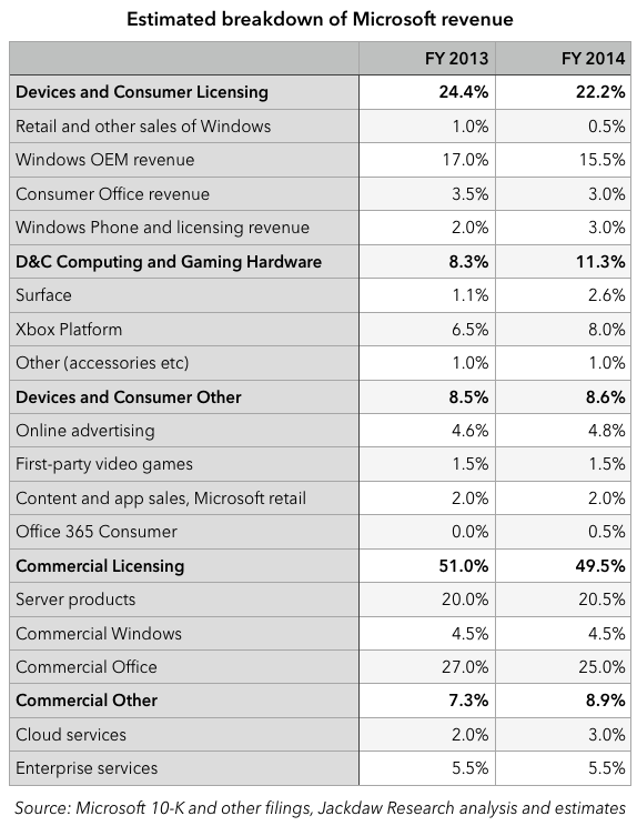
The bolded numbers are Microsoft’s reported segments, so those are actual numbers. I’ve left out the Corporate and Other line because it doesn’t relate directly to actual products and services, but it makes up part of the total of 100%. I’ve left out entirely the new Phone Hardware unit (the former Nokia phone business) because Microsoft only reported results for a single partial quarter in its 10-K so there’s no real run rate to go on here. I’ll come back to that later, though. Continue reading

Thoughts on Twitter earnings for Q2 2014

Note: This is part of a series on major tech companies’ Q2 2014 earnings (e.g. Google here, Microsoft here, Apple here and here, Netflix here, Facebook here and Amazon here). My post about Twitter’s earnings last quarter is here.

Non-logged-in users and “Twitter Everywhere”

I posted yesterday evening about the growth challenge that Twitter faces (and which it shares with Foursquare). Given the focus during today’s earnings call on non-logged-in users, I’d say this is very much at the top of Twitter executives’ minds at the moment too. Let’s dig into that a bit. I was reminded of something I read quite a while ago on Fred Wilson’s blog:

Let’s remember one of the cardinal rules of social media. Out of 100 people, 1% will create the content, 10% will curate the content, and the other 90% will simply consume it.

It occurred to me during today’s earnings call that Twitter is experiencing this in quite a different way from some other services. Facebook and other social networks require you to log in to gain any meaningful benefit from interacting with the service, because Facebook posts are largely private and because the benefit is largely derived from seeing posts from people you know. As such, this 1%/10%/90% split Fred Wilson talks about largely applies to logged in users. But with Twitter, the big difference is that the vast majority of posts are public, and therefore people don’t have to be logged in at all to get value out of the service. So, in fact, the logged-in monthly active users Twitter has reported so far (271 million at the end of June) might represent some mix of the 1% and 10%, while Twitter might very adequately serve the other 90% as non-logged-in users. This is what drove much of Dick Costolo’s prepared remarks during the call: that the real size of Twitter is a multiple of the size it appears to be based on the number of monthly active users (MAUs) it reports.

It turns out that I had forgotten the context in which Fred Wilson quoted those numbers, which was an account of a state of the union address Dick Costolo gave at Twitter HQ in September 2011. During that session, Costolo very much hit on the same theme he returned to on today’s call, and I direct you to Wilson’s post for a recounting of some of the key points. What’s very interesting is that back then Costolo was quoting a 4:1 ratio of total users to logged-in users, or about the same 3x multiple of non-logged-in to logged-in users he quoted on today’s call. What’s surprising is that Costolo doesn’t seem to have talked very much about this in the three years between then and now (if you search for Costolo Logged In Users on Google, you’ll find posts from 2011 and today, but almost nothing in between). But I wouldn’t be at all surprised to see some sort of unique users metric emerge next quarter now that Costolo has provided the strategic rationale for measuring it. The challenge will be monetizing these users going forward, something Twitter doesn’t even attempt to do today.

Downplaying the World Cup while learning lessons

Costolo and the other executives on the call were also very keen to both play up and downplay the impact of the World Cup. On the one hand, they want to play it up as an example of what Twitter can do on an ongoing basis by way of creating topic- and event-driven experiences that are different from the classic Twitter feed. On the other, they were keen to downplay the impact of the World Cup specifically as a factor in driving the strong MAU growth it saw this quarter. On the other hand, they suggested the World Cup did have an effect on engagement, which is definitely illustrated by this stark contrast in sequential MAU growth from Q1 to Q2 (turns out the US still doesn’t care much about soccer):

Sequential growth in MAUs US vs InternationalLook at the difference in Twitter’s key engagement metric from Q1 2014 (no World Cup) to Q2 2014 (World Cup). International engagement rose, while US engagement actually fell. You can see this in the shape of the overall graph for timeline views per MAU, which appeared to improve in Q2 but were largely driven by International growth:

Timeline views per MAUThe big question is to what extent the World Cup experience is replicable for other events and topics, which is clearly Twitter’s plan.  The World Cup is either the most or second-most watched event in the world (sporting or otherwise), and along with the Olympics only happens every four years. Putting a lot of investment into creating  a curated experience around the World Cup clearly makes sense, and its major news bites make for good tweets because they’re short and to the point (Brazil 7, Germany 1 takes considerably fewer than 140 characters).

But how does this experience translate to hundreds of other events and topics Twitter would want to do this for, and to what extent can those experiences be machine- rather than human-curated? Twitter has just 3300 employees – how many of them can it afford to attach to human curation projects for the many other events and topics Twitter might want to recreate the World Cup experience for? And would there be any meaningful return on that investment for most of those events? If the World Cup drove a small increase in engagement for international users, how many events that happen more frequently would it have to bundle together to drive a similar impact?

Data and Licensing is growing faster

Twitter, like Facebook and Google, derives about 90% of its revenue from advertising. However, unlike Facebook, which is deriving an ever-greater proportion of its revenues from advertising, Twitter has actually quietly been going in the opposite direction for the previous two quarters and just took a slightly bigger step in that direction this quarter:

Twitter revenue mixThe reason is that Data and Licensing revenue actually grew as a proportion of total revenue over the last several quarters, and  accounted for 11.1% of revenue in Q2. There wasn’t much detail on the earnings call, but the 42% sequential and 90% year on year increase was put down to a combination of the Gnip acquisition (which closed in April) and revenue from the mobile ad exchange (the former MoPub). Presumably, much of the revenue generated by the MoPub business is actually recorded in the advertising line, but a portion apparently comes from Data and contributed to this growth. In my post on Facebook’s earnings I worried about their increasing reliance on mobile advertising and the paucity of other possible revenue sources in the near term, so I think this secondary revenue stream for Twitter (albeit still small) is important.

Twitter and Foursquare’s shared growth problem

Ahead of Twitter’s earnings tomorrow, I wanted to do a quick take on the problem that both Foursquare and Twitter share when it comes to growth. Foursquare is a privately held company and as such we have very little data to go on as far as how many active users it has or what its revenues might be, but it does report registered users from time to time, so we have something to go on.

The fundamental challenge both businesses face at this point is that their most active users to date likely don’t behave anything like the users they want to capture in the coming years. That is leading both companies to both consider and execute on major changes in the way their services work, which in turn will create challenges for retaining their most active users.

In the case of Foursquare, this has meant splitting its app into two: the classic Foursquare app, which is now a sort of Yelp equivalent, focused on recommendations, and the new Swarm app, which is focused on checkins. This is intended to strip away the checkin focus from the main Foursquare app to make it more appealing to the massive base of potential users who don’t want to signal their location constantly, while still making checkins available in the Swarm app for power users. The response from existing power users hasn’t been great: look at the ratings for Swarm on the App Store, for example: 1.5 stars for all versions of the app, with over 3000 ratings. The complaints fall mostly into these categories:

  • The hassle of splitting the app into two (see also Facebook Messenger)
  • It’s now harder to check in than it used to be, especially if tagging a friend
  • Killing the competition aspect, mayorships and so on.

In short, for these power users, hitherto Foursquare’s biggest advocates, Foursquare has broken the core experience of checking in and competing for mayorships. And some of these users are doing more than just posting reviews on the App Store.

Of course, with those as the two key pillars of the service, Foursquare has just barely reached 50 registered users (the number of monthly active users is likely much smaller, perhaps 10-20% of that). If Foursquare wants to grow beyond its current tiny base of users, it has to expand into new areas, and that means changing the core app experience from one that’s checkin and game-focused to one that’s recommendation-centric. As such, it was the right broad strategy to start to shift the focus of the app away from power-user features and towards these new ones, but the implementation has been poor, and in the process Foursquare has alienated its biggest fans.

Twitter faces to some extent the same problem – power users use lists, hashtag, @mentions, DMs and  Tweetdeck, and follow hundreds of accounts, but most ordinary users don’t. If Twitter is to grow, it has to cater to these new, ordinary users rather than the power users. That means changing the experience so that it’s not so overwhelming, and doesn’t have such a steep learning curve. Ideally, a new user would sign up, check a few boxes, and instantly have a feed that’s relevant and interesting, without having to do all the work of hand-crafting a list of accounts to follow. There’s talk this week of filtering feeds à la Facebook, and there have been multiple rumors in recent months about moving tags and @mentions out of the 140 characters, in part perhaps to remove some of the jargon from the stream and make it more user-friendly.

But in all this, Twitter faces the same risks that have plagued Foursquare since its repositioning. It needs to learn from Foursquare’s mistakes and preserve the core experience that its power users love while creating a new version of itself for mainstream users. That’s a tough balance to strike, because it’s almost like maintaining two products at once, with two separate user experiences. But Twitter, to an extent that’s not even true for Foursquare, needs its power users to continue to create the content for which its mainstream users will come to it.

Foursquare isn’t by any means beyond salvation, but it does need to quickly fix the Swarm app and with it the power user experience, if it’s to grow in the way it needs to, especially since its future revenue is likely as dependent on the data its users generate as it is on monetizing users or even merchants. Twitter is at an earlier stage and still has a chance to get this transition right.

The challenges faced by these two businesses highlight the less challenging experience of creating mainstream experiences from the outset: neither Facebook nor Google have had to dramatically reinvent their core products since they were first invented. Their original product is their current product, though both are considerably richer than they once were. But they haven’t had to make the same niche-to-mainstream conversion as Twitter and Foursquare will. There’s a good lesson there for both startups and investors: it is possible to scale a niche business so that it becomes mainstream, but at some point you have to make a significant transition, and it can be a make-or-break moment in the history of a startup.

Thoughts on Amazon earnings for Q2 2014

Note: This is part of a series on major tech companies’ Q2 2014 earnings (e.g. Google here, Microsoft here, Apple here and here, Netflix here and Facebook here). My post about Amazon’s earnings last quarter is here.

AWS in trouble

Much has been said already about the fact that Amazon Web Services (AWS) seemed to do poorly this quarter, compared with previous quarters. We don’t know exactly how it did, because this is one of the many things Amazon doesn’t report directly, but the best proxy we have is the Other category, especially in North America, so here’s that number:

Amazon Other revenues for North America - quarterlyAs you can see, after lots of quarters of good growth, revenues suddenly dipped in the second quarter over the first quarter, which they’ve never done before, and year on year growth dropped from over 60% in most recent quarters to 38.4%. Bear in mind, too, that there are other components to this Other bucket, including advertising, which is an increasingly important (and rapidly growing) segment for Amazon. That may well mean that AWS revenues performed even more poorly than the Other segment as a whole.

Margins – what’s really going on

Continue reading

Thoughts on Facebook earnings for Q2 2014

Note: This is part of a series on major tech companies’ Q2 2014 earnings (e.g. Google here, Microsoft here, Apple here and here, Netflix here). My post about Facebook’s earnings last quarter is here.

Given that I covered a lot of elements of Facebook’s business last time around, I thought I’d try to take a slightly different tack this time. Firstly, look at this dramatic transformation in Facebook’s desktop versus mobile business, in three charts:

Facebook ad revenues by device

That’s a good chart for getting a handle on just how dramatic the rise of mobile has been at Facebook, both as a percentage of revenues and as a dollar amount. But have a look at this one too:Facebook ad revenue by device - 4-quarter

Continue reading

Thoughts on Apple’s earnings for Q2 2014

I did a quick piece on the iPad specifically, already, so go read that if you’re so inclined and then come back and read this deeper dive on calendar Q2 earnings. The full set of posts for consumer tech companies’ Q2 earnings is here, and will continue to be updated with new posts as they arrive.

iTunes divergence continues

I’ve talked before about the divergence in trends within iTunes revenues, and it continued this quarter. Apple doesn’t report these numbers directly, but it’s possible to calculate them based on the numbers it does share. Here’s how the iTunes, Software and Services segment splits between its three constituent parts:

iTunes Software and Services splitThe App Stores continue to grow very rapidly, and note that the line in the chart above only reflects Apple’s net revenues from App sales – the gross revenue from App sales is over three times as high, at $4 billion this past quarter alone. Meanwhile, content sales continue to fall as music consumption in particular shifts to subscription and free streaming options. What’s impressive is that Software and Services is holding up so well despite the shift to pricing OS upgrades and iWork at zero. This is likely driven by iCloud, AppleCare and Google search revenues, offset somewhat by software declines, but it’s impressive that it’s the largest of the three sub-segments, at least for now. But it’s entirely possible that Apple will generate more net revenue from apps than content next quarter, and that app revenue will pass Software and Services revenue within a year.

It’s also worth looking at Apple’s app revenue in the context of Google’s, since we now know a little more about that following I/O. Here’s an updated chart showing my estimates for app revenue at both companies, incorporating Q2 data: Continue reading

Thoughts on Microsoft earnings for Q2 2014 – first take

In contrast to other quarters, in the fourth quarter Microsoft doesn’t release its in-depth SEC filing immediately. Since that’s where many of the juiciest bits of data land, we have limited information to go on so far. But I wanted to do a quick first-take on Microsoft’s earnings based on what we do know. Once the 10-K is out I will likely do a follow-up post on the additional detail. This is part of a series on Q2 2014 earnings – you can see the full set here.

Margins – Microsoft’s past versus its present

I wanted to start out with a quick look at Microsoft’s margins. These days it only gives us gross margins at the detailed segment level, so we’ll have to be satisfied with those. The chart below shows gross margins for the new set of segments, including the former Nokia devices business:

Microsoft gross margins by segment

The data point for the former Nokia business is the brown circle hiding behind the last dark gray D&C C&G hardware circle, and it’s fitting in some ways that the margins for the two consumer hardware businesses should be so close to each other, at under 5%. By contrast, the two licensing businesses also have very similar gross margins, at over 90%. In the middle we have the nascent businesses: D&C Other and Commercial Other, which include all manner of products from enterprise cloud services to Bing. The contrast between hardware and licensing couldn’t be more stark: one makes enormous gross margins, and the other barely scrapes a profit. And yet that traditional licensing business is the past for Microsoft, while its other segments represent the future. It’s no wonder Nadella isn’t keen on first-party hardware for its own sake: it barely makes any money. But by the standards of the legacy Windows and Office businesses which make up the bulk of the licensing segments, Microsoft’s fastest-growing businesses are much less profitable too. They are becoming more profitable over time, with the help of scale, but they will never generate the same kind of margins as licensed software, which has almost zero incremental cost. Continue reading

Why iPad shipments aren’t growing, but might start again soon

As with last quarter’s Apple earnings call, there has been lots of handwringing about why iPad shipments aren’t growing this quarter.  I’ve done a fair amount of thinking about this, and did some analysis as part of the recent Apple profile my clients received. I thought I’d share some of that thinking here, and expand on it a bit. A fuller review of Apple’s earnings will be coming shortly.

Update: In-depth review of Apple’s earnings is up here now.

Shipments versus the base

First, it’s important to be clear about one very important thing: the difference between iPad shipments and the iPad base. Stagnant or even shrinking shipments don’t mean the base is shrinking, and in fact it’s likely growing at a decent rate. Here’s my estimate of the iPad installed base over time:iPad installed base over timeYou’ll see that it’s been growing at a fairly steady clip, and that it’s reached about 180 million. Naturally, I’ve made some assumptions about how long people hang on to their iPads based on various data sources, so it’s not 100% accurate, but it’s likely a good guess at what’s been happening. So the first thing to note is that the number of people who have iPads is growing, not flat or shrinking, even if shipments are stagnant or falling slightly. Continue reading

Thoughts on Netflix earnings for Q2 2014

I’m continuing my look at consumer tech companies’ earnings with a quick review of Netflix’s results released today. The whole series is available here, and last quarter’s analysis is here.

DVD by mail: Netflix’s dial-up business

Netflix has three products, with very different characteristics: domestic streaming, domestic DVD by mail, and international streaming. Domestic DVD is to Netflix what the dial-up business is to AOL, which is to say it’s a legacy business in which the company is no longer investing, and which therefore has very steady fixed costs and essentially zero sales and marketing cost. As such, it’s very profitable:

Netflix domestic DVD financials per subscriberNetflix generates a very predictable $10 or so per month from these subscribers, and half of that is profit. That’s a really great business to be in, and it helps to fund and offset the other parts of Netflix’s business.

International streaming: tantalizingly close to profitability

Continue reading

Thoughts on Google earnings for Q2 2014

Last quarter, I did a series of posts on big consumer tech companies’ earnings. You can see the full series here. I’m kicking off my thoughts on Q2 earnings with Google, which reported this afternoon. Last quarter’s post on Google is here, and I’ll revisit some of the themes from last time, along with some new ones.

Ad metrics – more detail highlights different trajectories

As promised, Google provided a little more detail on its key ad metrics: growth in the number of paid clicks, and the price per click. Previously, it’s only provided growth numbers for the ad business as a whole, but this time around it broke the metrics down by Google’s own websites (Sites) and third parties (Network). What Google actually reports is quarter on quarter and year on year growth rates, which are all over the place, and so hard to read. I find it makes things a lot more interesting to pick a point in time and then index results back to that point using the sequential quarterly growth rates, as shown in the charts below.

The first chart shows the aggregate rate, which Google has reported for a long time, and I’ve indexed it to Q2 2011, as that’s when the price per click started to fall, a pattern that has essentially continued ever since, although prices have started to flatten in the last couple of quarters:

Google aggregate ad metrics Q2 2014Now, here’s the same indexed approach using the splits Google provided for the first time today. It only provided a few quarters of history, unfortunately, so there’s less context here:
Continue reading