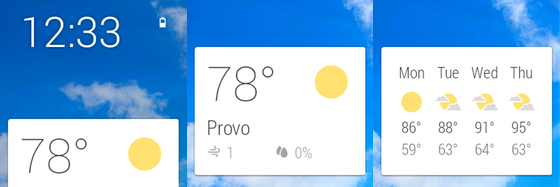
I’ve been testing three of Motorola’s new devices for the last several days: the new Moto X and Moto G smartphones, and the Moto 360 smartwatch. I don’t do traditional reviews – there are plenty of sites out there that do those well – but I thought I’d share some of my thoughts about these devices, briefly, but also about what they can teach us more broadly, and tech Samsung specifically.
Moto X
Last year’s version of the Moto X was already a very good device in a number of ways, and this year’s version fixes several problems: the price/performance ratio feels a lot better, the materials and build make for a more premium experience, and the camera is a lot more competitive. I’ve been using the Moto X as my main phone for the last few days, and I’ve really enjoyed it. The camera still isn’t as good as the iPhone camera, or arguably the Galaxy S5 camera, especially in low light. And the digital shutter mechanism still frustrates me by taking pictures when I’m trying to change the focus point. But it’s an awful lot better, and I’ve taken some nice pictures with it, including this one:
 In short, the Moto X is much better on the things it was bad at. But it’s also got even better at the things its predecessor was good at – namely the little software customizations that added significantly to the stock Android experience without taking it over, adding huge numbers of visual customizations and tweaks, or overloading the device with gimmicks and widgets. What Motorola has done really well in these devices is creating in its software elements that significantly add value to Android without feeling like they’re trying to replace it. They’re done in such a way that they feel like they are – or should be – part of the core OS, both visually and in terms of their functionality and integration into the OS itself. Unless you’ve used stock Android, it would be hard to see where Android itself ends and Motorola’s enhancements to it begin.
In many respects, this is just the sort of thing Samsung should have been working on over the last few years, to set its handsets apart against the flood of other Android phones. Instead, it’s focused on gimmicks – features that are eye-catching and make for good demos, but that don’t really make life easier or improve upon the core Android experience. If Google were keeping Motorola, I would say these features should slowly work their way back into the core Android experience as Motorola invents new ones. Under Lenovo, I wonder to what extent these innovations will continue and to what extent Lenovo will embrace them at a corporate level and build them into its other devices too. If it’s smart, it will realize what it’s getting here and fully embrace it. Continue reading
