AT&T recently restructured its reporting segments to reflect the fact that it now has all its business-focused activities in a single division – AT&T Business Solutions. This division includes its business-focused mobile activities, while a separate division – Consumer Mobility – houses its consumer-focused (and wholesale) mobile activities. In an admirable bit of transparency, AT&T is actually providing both overall results for the same combined AT&T Mobility business that used to exist, but also some breakdowns for both Business Mobility and Consumer Mobility separately. This provides some interesting opportunities to see the differences between these two businesses, and I’ve spent some time over the last couple of days dissecting these two segments.
A business in two halves
First of all, let’s look at how the business splits between Business and Consumer Mobility. The first chart below shows the revenue split between the two, while the second shows the subscriber base split:

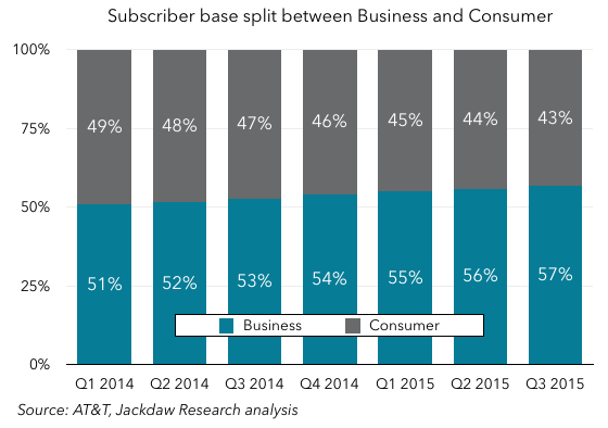 As you can see from that revenue chart, this is a business split almost exactly in two, with the division between the two right around 50/50 depending on the quarter. However, as the subscriber base chart shows, the balance in subscriber numbers is shifting rapidly towards the Business side, which had 57% of AT&T Mobility subscribers in Q3, up from just 51% in Q1 2014. We can also logically conclude – and I’ll expand on this below – that Business Mobility has lower revenue per user than Consumer Mobility.
ARPUs are very different by business
Sadly, AT&T doesn’t give us a detailed split of average revenue per user by segment, but it does give us some numbers directly, and also gives us enough other information to derive others. The chart below shows average revenue per user for a variety of the sub-segments in the new reporting structure:
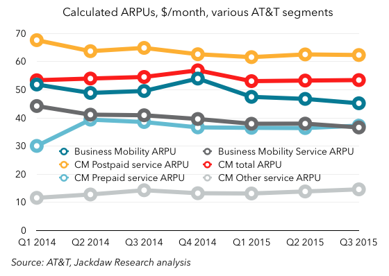 As you can see, the highest ARPU is that associated with postpaid subscribers on the Consumer Mobility side, at a little over $60 per month per subscriber, while the lowest ARPU belongs to the “Other Service” line on the Consumer Mobility side. That Other Services line is mostly made up of wholesale subscribers, such as those belonging to MVNOs using the AT&T network, so it’s not surprising that they should be low, since AT&T just gets a small percentage of retail revenues.
However, there are also some other interesting things to note:
- These numbers give us our first real insight into prepaid ARPU at AT&T in several years. AT&T has been referring to prepaid ARPUs here and there in investor briefings recently, but hasn’t given a regular figure. But it’s now clear that prepaid ARPU is around $37, and jumped quite significantly when Cricket came on board, something that only fully hit results in Q2 2014.
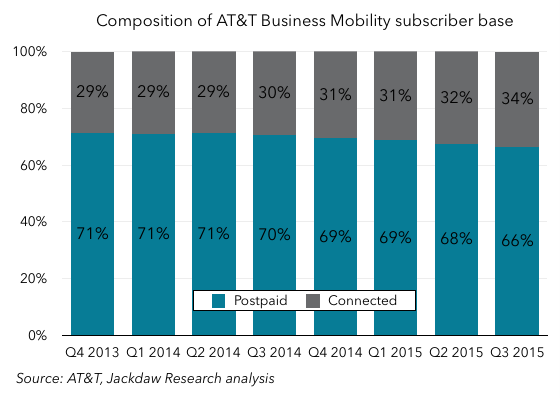
- Business Mobility ARPU is lower than total Consumer Mobility ARPU, by a few dollars, and Consumer Mobility postpaid ARPU is higher than total postpaid ARPU for AT&T, both of which suggest that Business Mobility generates lower ARPUs for the same services than Consumer Mobility. That is, in fact, the case, since business customers often get discounts not available to consumers. Overall Business Mobility ARPU is also lower because of the large number of Connected Devices subs in the Business base, which tend to have much lower ARPUs, as you can see in the chart below:
Churn rates are lower in business than consumer
Another big difference between the two segments is churn rates. Here are the overall churn rates for Business Mobility and Consumer Mobility: 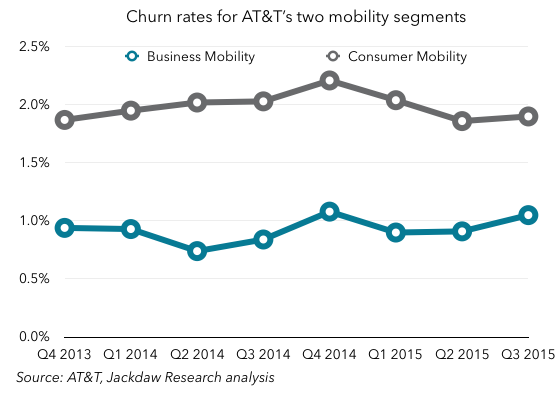 This shouldn’t surprise us, since:
- Business Mobility includes Connected Devices, which often have very long lifecycles and therefore very low churn on a monthly basis
- Consumer Mobility includes prepaid, which has always had higher churn than postpaid.
However, even when you compare Consumer Mobility postpaid churn alone to total postpaid churn for AT&T, you can see a difference of around 15 basis points:
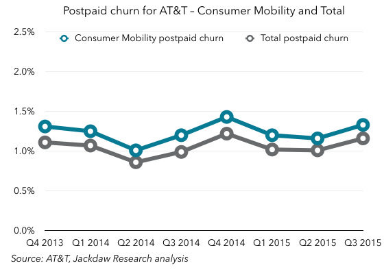 This also isn’t that surprising – the more lines associated with an account (whether as part of family plans or business contracts), the lower churn tends to be, because it’s more of an upheaval to move several lines (which may have different contract end dates) than to move one.
Business Mobility is one of Consumer Mobility’s largest sources of churn
One of the most interesting things about the two subscriber bases is that Business Mobility is actually taking over quite a few subscribers from Consumer Mobility each quarter. The chart below shows postpaid subscribers for both segments: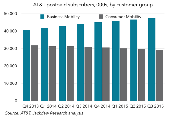 This, along with the rapid growth in Connected Devices, helps to explain why Business Mobility is growing as a proportion of the total, but why is Consumer Mobility’s postpaid base shrinking so rapidly, while Business Mobility is growing quickly? At first, I wondered if this was a sign of some underlying problem in the consumer business, but it turns out it’s something rather different. This quote comes from an additional 8-K filing AT&T filed this quarter alongside its results announcement:
Our business wireless offerings allow for individual subscribers to purchase wireless services through employer-sponsored plans for a reduced price. The migration of these subscribers to the ABS segment negatively impacted consumer postpaid subscriber and service revenues growth.
Now, I don’t believe AT&T actually counts these subscribers as either churn or net adds on either side, when they’re merely transitioned from one segment to the other. But in addition to this internal churn, there is still a fairly stark difference in the postpaid net adds between the two segments: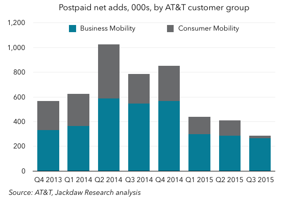 As you can see, Business Mobility seems to have far higher net adds than Consumer Mobility, which shrank to almost zero in Q3 2015. That’s a bit of a worrying sign for AT&T, and something we’ll want to keep an eye on going forward.
Which business is more favorable for AT&T?
The ultimate question is which of these two roughly equally-sized businesses is better for AT&T. In other words, is it a good thing that AT&T is seeing some subscribers transition over from Consumer to Business? Well, one thing we haven’t looked at yet is margins, which AT&T doesn’t report directly for Business Mobility, but which we can derive based on the figures it does provide for both AT&T Mobility as a whole and the Consumer Mobility segments:
 Business Mobility margins are actually a little lower than Consumer Mobility margins, by an average of roughly 2-3 percentage points most quarters. That likely reflects the lower ARPUs related to the heavier discounting that takes place on the business side. But of course, offsetting both the lower ARPUs and the slightly lower margins is the benefit of lower churn, which should help AT&T on the business side over time. The good news is that, thanks to cost cuts and efficiency gains AT&T has made recently, both sides of the business are seeing rising margins.
What we’re getting here is a unique insight into a division that’s normally totally opaque – none of the other US carriers provide this kind of split in their reporting. It would be fascinating to see a similar split for the others – T-Mobile has never really gone after the enterprise business until recently, while the other two carriers have definitely pursued it more aggressively. I suspect AT&T has the largest enterprise mobility business of the big four, but I’d love to see these details for the other carriers too.
