Category Archives: Q2 2016

Google’s Increasing Reliance on its Own Sites

After a couple of weeks on vacation, I’m still playing catchup with some of the tech earnings reports that came out while I was gone. Today, I’m tackling an interesting aspect of Alphabet’s earnings, which is the increasing dominance of ad revenue from Google’s own properties versus revenue from third party sites as a proportion of its total ad revenues. The charts I’m using here are largely taken from the Alphabet deck in the Jackdaw Research Quarterly Decks Service, which you can sign up for here. We also discussed Alphabet earnings along with those of other major tech companies on this week’s Beyond Devices Podcast.

Some quick definitions

First off, some quick definitions. Google divides its ad revenue into two categories:

  • Google websites – this includes all revenue from Google’s own websites, including AdWords revenue that is generated on Google.com, advertising revenue generated on YouTube,  and advertising revenue generated from other Google owned and operated properties like Gmail, Finance, Maps, and Google Play.
  • Google Network Members’ websites – this includes AdSense,
    AdExchange, AdMob, All DoubleClick-related revenues including DoubleClick Bid Manager revenues, and Other Network products including AdSense for Domains.

Within the core Google segment, these two divisions plus the “Other” category make up the entirety of revenue, and ad revenue from these two sources makes up 90% of Google segment revenue.

Very different growth rates lead to increasing dominance by Google’s own sites

These two segments have been growing at very different rates over the last several years, with Google’s own site revenue growing much faster than its Network Members’ ad revenues, as shown in the chart below:

Google ad segment growth Q2 2016 560px

Though there have been a couple of brief periods (in 2009-2010 and 2012) when Network revenue grew faster than Google website revenue, the pattern has otherwise been fairly consistent: Google’s revenue from its own sites has grown faster. Over the last three years, the gap has been significant – Google website revenue is up 74% over that period, while Network Members’ revenue is up just 17% over three years. That leads to a business that’s increasingly lopsided in favor of Google’s own sites:

Google ad revenue split Q2 2016 560px

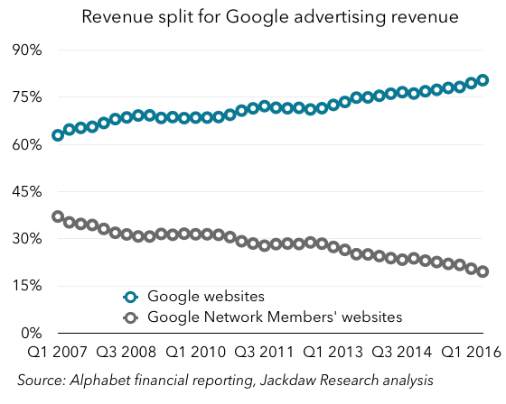
In Q2 2016, Google sites passed 80% of total Google ad revenue for the first time. That’s up from 70% in 2011, and 60% around 2006.

Paid clicks growth is the driver

The reason for this discrepancy becomes abundantly clear when you look at the ad metrics Google provides. Every quarter, it reports growth in the number of paid clicks and the cost-per-click (i.e. price) for both the Google sites business and the Network Members business. These numbers bounce around quite a bit, but I find it’s often helpful to index the numbers to a certain point in the past to see the longer-term trends. The chart below shows these figures indexed to the quarter two years ago, Q2 2014:

Google ad metrics Q2 2016 560px

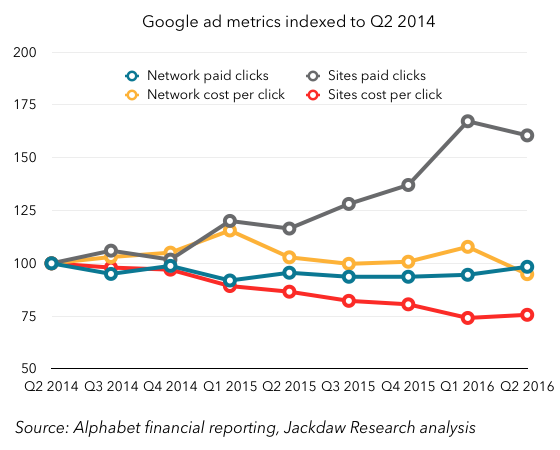
As you can see, there’s a stark contrast between the two businesses here. Let’s start with the number of paid clicks:

  • Google sites paid clicks are up 61% over two years (the number was 67% last quarter)
  • Network paid clicks are at 98% of where they were two years ago, and this number has been relatively flat over that whole period.

Google says that growth in clicks on its own sites has been driven by a combination of growth in the adoption of YouTube engagement ads, improvements in ad formats and delivery, and expansion of products, advertisers and user bases across all platforms, particularly mobile. There simply aren’t similar drivers for the Network business, which Google obviously doesn’t control as directly, and which is in some ways much more mature.

Looking at the cost per click:

  • Google sites CPC in Q2 2016 was only 76% of the CPC for two years earlier
  • Network CPC was 95% of two years earlier, and again this number has been relatively flat over the period, with modest growth in the first year, followed by slight shrinkage since.

The reason for the falling cost per click on Google’s own sites is largely due to growth in YouTube engagement ads where cost-per-click is lower than on Google’s other platforms, as well as changes in property and device mix, product mix, geographic mix, and ongoing product changes, with a smaller impact from currency exchange rates. Some of the same factors drove the modest recent decline in Network CPC as well.

Traffic Acquisition Costs and margins

This all matters a great deal for a couple of reasons, the second of which we’ll come onto in a moment. But the single most obvious reason is that the economics of ad revenue from Google’s own sites is radically different from the economics for Network sites, and that’s because of how Google pays for traffic. On third-party sites, Google pays out most of the revenue to the site owner, whereas on its own sites it keeps the vast majority of the revenue. Google breaks out the traffic acquisition costs (TAC) for both these segments, and the stark differences are shown in the chart below:

Google TAC by segment Q2 2016 560px

As you can see, in the Network business, Google pays out at a rate very similar to the economics of the major app stores, at about 70% of revenue. For its own sites, however, Google’s TAC is a fraction of that, at around 9% in Q2 2016. These payments go to the sources of traffic to Google’s various websites, principally makers of browsers including Apple’s Safari which feature Google as a default search engine.

Interestingly, Network TAC had come down quite a bit for several years, but has recently spiked back up a little, though it’s been within a range from 67-71% for the last five years. Conversely, Google’s TAC for its own sites has been steadily rising, as its cut of revenues under various placement deals has been shrinking. With competition from Yahoo and Microsoft in particular rising over recent years, Google has had to pay more to retain its prime placement in various browsers.

Regardless of the recent changes, TAC remains far higher for third party sites than for Google’s own, though that’s not to say that this somehow translates directly into margins. Obviously, Google’s other costs for running its own sites are much higher than its cost for running ads on other people’s websites. But I suspect the increasing dominance of Google’s own sites as a source of ad revenue is driving the steady improvement in margins we’ve seen over recent years.

The downside of all this

Let’s turn now to the second reason all this matters. Though I’ve just said that the increasing dominance of Google’s ad revenues by money from its own sites is likely good for margins, there’s a downside here too. The problem with this dominance is that Google has to be responsible for essentially all the growth itself, largely by growing its direct audience and finding ways to sell more ads at higher prices. As we’ve already seen, YouTube has been a huge help here in recent years as monetization has really taken off, but I wonder how sustainable that growth will be over time. Google is already attempting to drive revenue through alternative business models like YouTube Red and other subscriptions, and I suspect we’ll see more of this.

But as long as Google is so heavily dependent on revenue from its own sites, it’s going to have to find new sources of revenue which it owns, which might well drive it to make acquisitions (Twitter, perhaps?) and organic investments in new properties. That may be challenging over time, especially as more and more online activity takes place on mobile devices, where there’s simply less room for ads. Better targeting and more lucrative formats like app install ads should help offset that a bit, but it may still be tough to sustain over time. Though Alphabet and Google’s recent results have been very positive, there is here still the core of a bear case against continued growth along the same lines.

Quick Take on Fitbit Q2 2016 Results

Fitbit released its results for Q2 2016 today, and the market seems to be responding pretty positively in the short term. However, based on the numbers reported today, there’s not a lot of reason for cheer – the positive reaction seems to be at least in part about the company’s forward guidance. Here are some quick thoughts and charts on the numbers for Q2.

Growth continues to be slower

One of the big issues facing Fitbit is slowing growth. The chart below shows both year on year revenue growth and unit shipment growth, and as you can see both have dropped precipitously from its heyday in 2014 and early 2015 in percentage terms. Fitbit Growth Q2 2016Now, neither of those numbers is in negative territory – revenue growth was still almost 50%, while shipment growth was about half that. But both are down considerably over the past, and seem to be flattening out. In pure dollar terms, growth has also been lower than in the past. That’s likely a sign of a maturing market and an increasingly saturated one for Fitbit.

Marketing costs continue to rise faster than revenues

The fact that growth is still ticking over decently is largely a result of rapidly rising sales and marketing spend, which has been climbing faster than revenue for some time now:
Fitbit costs as percentage of revenue quarterlyFitbit costs as a percentage of revenue trailing 4 quartersAs you can see, sales and marketing spend on a trailing 4-quarter basis has risen from 10% of revenue to 20% over the past three years or so. That kind of rise is hard to sustain over time, but it’s probably inevitable as Fitbit has to fight harder and harder for each additional sale.

The other problem is that S&M spending isn’t the only cost category that’s been rising as a percentage of revenue – both R&D spend and general and administrative spend have been rising too. For the last several quarters, Fitbit has been touting the percentage of its employees that work in R&D – the number has now reached 59%, or 863 employees. Though such an investment in innovation is admirable, the combination of these three growing cost categories is squeezing margins. Together with some temporary issues driving up cost of revenue, these various increases are causing margins to drop to almost zero, from operating margins in the 20s and 30s two years ago:

Fitbit margins Q2 2016

The US still dominates

The US still dominates Fitbit’s global revenues, with around three quarters of the total. EMEA is the only other really significant region today, with around 15% of revenue. The APAC region took a dive in Q2, apparently because a major Australian distributor is going out of business, but this just highlights the lack of diversity outside the US. APAC revenues including Australia fell 54%, while APAC revenues excluding Australia apparently grew 98%. Fitbit regional revenues Q2 2016This suggests that Australia absolutely dominates APAC revenues, and that the one distributor in turn dominates Fitbit’s sales there. It needs more diversity geographically as well as among distributors if it’s to continue to grow overall.

The silver lining

If there’s good news, it’s that Fitbit continues to dominate the specialist fitness wearables space. To be sure, the Apple Watch has begun to achieve similar scale at a radically higher price and with a much broader offering, but when it comes to dedicated fitness devices, Fitbit continues to lead the market. And despite the slowdown in its growth, it is still growing. That it’s able to achieve this even as both cheap Chinese alternatives and expensive upgrades from Apple come into the market is a testament to what it’s built. But I continue to believe that Fitbit will struggle to recreate its past combination of very high growth and good margins going forward.

Twitter Q2 2016 Earnings Commentary

Twitter reported its earnings this afternoon, and I’ve been sharing some quick thoughts and charts on Twitter itself, appropriately. I’m a massive Twitter fan and user, and it’s enormously important to my business, but I continue to be somewhat bearish on its potential as a business, as my earlier posts will show. This quarter’s results did little to change that perception.

MAU growth better but not great

There are lots of ways to look at Twitter’s monthly active user numbers, but they all show more or less the same picture:Twitter MAUs Q2 2016Sequential MAU growth Q2 2016Year on year MAU growth Q2 2016The fact is that, no matter how you look at it, there’s progress here, but it’s minimal. A year after taking over at CEO, Jack Dorsey still has precious little to show as far as returning his beloved Twitter to user growth, and that should be unacceptable to investors. Long-term, Twitter has to outgrow its present size and scope, and the company isn’t doing enough to make that happen. This older post outlines my thinking about how best to do this.

Worrying trends in US ARPU

The other worrying thing is that US ARPU seems to have dropped instead of rising last quarter, which shouldn’t be happening given overall trends and past patterns – I’ve included Facebook’s ARPU up to Q1 2016 as a comparison:US ARPU Q2 2016As you can see, both companies typically see a spike in Q4 each year – something that every ad company sees – followed by a drop in Q1, but then a return to growth in Q2. Twitter has seen that pattern in the past, as has Facebook, but not this quarter, when ARPU dropped back to below Q3 2015 levels. I haven’t seen an explanation for that yet, but it’s absolutely not the sort of thing Twitter or its investors should want to see happen right now.

There is some interesting commentary in Twitter’s shareholder letter about its ad rates and how they’re positioned in the market. Though there’s careful and somewhat wishy washy language in there, the biggest challenge is that CPMs are too high, and Twitter isn’t doing enough to justify its price premium. It sounds like it will now work on that, but again it feels like we’re seeing a “coming soon” sign where we should have seen real progress by now. This has been a known issue for months, and yet Twitter hasn’t done enough about it.

Live video and monetization

Lastly, live video, which seems to be Twitter’s big focus from a user perspective. We’ve already seen some trials of the capability recently, and although the concept is good, the UI needs work. But the bigger issue is that, while everyone else investing in live video is doing it for the ability to sell masses of ads users will actually be forced to watch, in most cases Twitter is investing in non-exclusive video where the vast majority of the ad space is sold by others. Can is make enough money from this marginal opportunity to make it worthwhile? Will it be a meaningful contributor to revenue and profits over time? That’s the big question here, and I still don’t feel like we have an answer for it. Meanwhile, the core product experience of Twitter continues to suffer both for existing power users and for the kind of new users Twitter needs to attract. Not good enough, in my opinion.

Apple June 2016 Quarter Chart Review

I’m on vacation this week in Europe, but I took a quick break to cover Apple and Twitter’s earnings this evening before heading to bed. I’ve tweeted quite a few charts tonight, but thought I’d pull some of the key ones together with some commentary for readers. A full deck of quarterly charts will go out to subscribers to the Jackdaw Research Quarterly Decks Service in the next few days as Apple releases its full data in an SEC filing, so look out for that if you’re a subscriber, and sign up here if you’re not.

Note: in this post, as in all my posts, I use calendar quarters for ease of comparisons with other companies and easy intelligibility by those not familiar with quirky fiscal years. As such, the labels and my commentary does not align with Apple’s fiscal calendar.

iPad returns to revenue (but not shipment) growth)

Last quarter, Tim Cook promised that the iPad would have its best year on year “compare” in over two years, which by my calculations meant something better than an 8% decline. Turns out iPad revenues actually returned to positive growth this quarter, though shipments still dropped, thanks to a really strong boost in ASPs:iPad shipments Q2 2016iPad ASPs Q2 2016Screenshot 2016-07-26 22.38.46That iPad ASP growth seems to have been driven by the launch of the iPad Pro, which in turn was likely designed in large part to drive higher ASPs as shipment growth has stalled. In other words, the strategy seems to be working. It’s also interesting that Apple reported that half iPad Pro sales went to people buying them for work, which is another validation of Apple’s strategy, but also points to a big opportunity for Apple, which is selling more devices into the enterprise, both to individual and corporate buyers. That’s something I first talked about in the context of Apple’s IBM deal, but it goes much further than that (as evidenced by subsequent Cisco and SAP deals).

iPhone sales and ASPs down – the iPhone SE effect

Unsurprisingly, iPhone sales were down again, though perhaps not as badly as they seemed to be given the changes in inventory. But the most notable thing was the drop in average selling prices – the opposite of what happened with the iPad in the quarter:iPhone ASPs Q2 2016Just as the positive change in iPad ASPs was due to the successful launch of a new product (the 9.7″ iPad Pro), so is the larger than usual quarterly drop in iPhone ASPs due at least in part to the launch of a new product – the iPhone SE. It’s not all that – there was some impact from the inventory changes, as mentioned on the earnings call – but the magnitude of the drop is an indication that the iPhone SE has also had a successful launch, and has been something of a hit. That’s a good thing, in that these sales have filled something of a hole in iPhone sales in the quarter – which was arguably the purpose – while proving that Apple can tap into a market for iPhones at a lower price point with slightly lower specs and feature functionality.

Apple Watch and Other Products

One last interesting point with regard to a specific product: the Apple Watch. It’s buried in Other Products, but perhaps a better way to look at it is that it now leads the Other Products category, which otherwise features a number of other smaller products. That’s been a double-edged sword for the reporting category over the past 18 months or so, as Apple Watch has first driven higher growth and now is driving negative growth for the category again:Other Products growth Q2 2016This is, to some extent, a temporary anomaly due to the launch of a brand new product and the subsequent (presumed) shift to a different time of year for the follow-up product as the second version of the Apple Watch launches in the fall. But it’s an indication of just how important the Watch is to that Other Products category.

Short-term versus long-term

In concluding, I’m going to link back to my post last quarter, in which I both reviewed the good news and bad news in the results and looked forward to the rest of the year. The point remains the same: with Apple there are two current pictures, which are very different. On the one hand, there’s the short-term picture, characterized by the anniversary of massive growth in iPhone sales driven by the iPhone 6, and also an unusually long lull in the Mac upgrade cycle driven by delays in getting new chips from Intel. That short-term picture hasn’t changed, and is so far fairly predictable.

The bigger question, though, is what happens later this year as some of the unpleasant short-term factors start to go away. As I said last quarter, with the iPad performing better, that’s the first of those positive levers coming into effect, and if that higher ASP trend continues, that will be more grist to the mill. However, the far bigger effect obviously comes from the iPhone, which I still believe might return to revenue growth later this year or early next year. Lastly, the other major product lines – Mac and Apple Watch – have potential to contribute further to that growth. We should finally see new Macs in the fall if not before, which will unleash significant pent-up demand, while new Apple Watches combined with a much more capable watchOS 3 could drive more sales there. In other words, over the long term I remain very bullish about Apple’s prospects, and we could start to see signs of that in the September quarter, but especially in the December quarter and beyond.