Category Archives: Q3 2015

Diving into AT&T’s Consumer and Business Mobility businesses

AT&T recently restructured its reporting segments to reflect the fact that it now has all its business-focused activities in a single division – AT&T Business Solutions. This division includes its business-focused mobile activities, while a separate division – Consumer Mobility – houses its consumer-focused (and wholesale) mobile activities. In an admirable bit of transparency, AT&T is actually providing both overall results for the same combined AT&T Mobility business that used to exist, but also some breakdowns for both Business Mobility and Consumer Mobility separately. This provides some interesting opportunities to see the differences between these two businesses, and I’ve spent some time over the last couple of days dissecting these two segments.

A business in two halves

First of all, let’s look at how the business splits between Business and Consumer Mobility. The first chart below shows the revenue split between the two, while the second shows the subscriber base split:

Business Consumer revenue splitBusiness Consumer base split
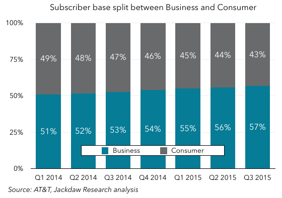
As you can see from that revenue chart, this is a business split almost exactly in two, with the division between the two right around 50/50 depending on the quarter. However, as the subscriber base chart shows, the balance in subscriber numbers is shifting rapidly towards the Business side, which had 57% of AT&T Mobility subscribers in Q3, up from just 51% in Q1 2014. We can also logically conclude – and I’ll expand on this below – that Business Mobility has lower revenue per user than Consumer Mobility.

ARPUs are very different by business

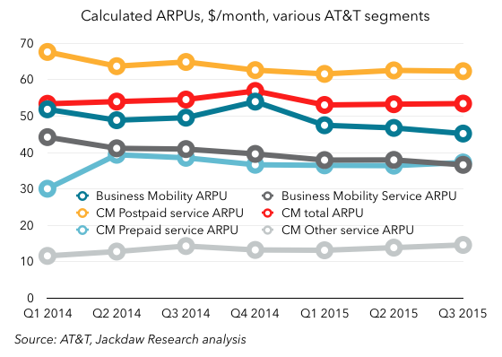
Sadly, AT&T doesn’t give us a detailed split of average revenue per user by segment, but it does give us some numbers directly, and also gives us enough other information to derive others. The chart below shows average revenue per user for a variety of the sub-segments in the new reporting structure:
Churn for various businessesAs you can see, the highest ARPU is that associated with postpaid subscribers on the Consumer Mobility side, at a little over $60 per month per subscriber, while the lowest ARPU belongs to the “Other Service” line on the Consumer Mobility side. That Other Services line is mostly made up of wholesale subscribers, such as those belonging to MVNOs using the AT&T network, so it’s not surprising that they should be low, since AT&T just gets a small percentage of retail revenues.

However, there are also some other interesting things to note:

  • These numbers give us our first real insight into prepaid ARPU at AT&T in several years. AT&T has been referring to prepaid ARPUs here and there in investor briefings recently, but hasn’t given a regular figure. But it’s now clear that prepaid ARPU is around $37, and jumped quite significantly when Cricket came on board, something that only fully hit results in Q2 2014.
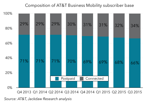
  • Business Mobility ARPU is lower than total Consumer Mobility ARPU, by a few dollars, and Consumer Mobility postpaid ARPU is higher than total postpaid ARPU for AT&T, both of which suggest that Business Mobility generates lower ARPUs for the same services than Consumer Mobility. That is, in fact, the case, since business customers often get discounts not available to consumers. Overall Business Mobility ARPU is also lower because of the large number of Connected Devices subs in the Business base, which tend to have much lower ARPUs, as you can see in the chart below:

Business Mobility base composition

Churn rates are lower in business than consumer

Another big difference between the two segments is churn rates. Here are the overall churn rates for Business Mobility and Consumer Mobility: Churn for business and consumer
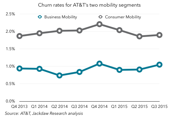
This shouldn’t surprise us, since:

  • Business Mobility includes Connected Devices, which often have very long lifecycles and therefore very low churn on a monthly basis
  • Consumer Mobility includes prepaid, which has always had higher churn than postpaid.

However, even when you compare Consumer Mobility postpaid churn alone to total postpaid churn for AT&T, you can see a difference of around 15 basis points: 
Postpaid churn consumer and totalThis also isn’t that surprising – the more lines associated with an account (whether as part of family plans or business contracts), the lower churn tends to be, because it’s more of an upheaval to move several lines (which may have different contract end dates) than to move one. 

Business Mobility is one of Consumer Mobility’s largest sources of churn

One of the most interesting things about the two subscriber bases is that Business Mobility is actually taking over quite a few subscribers from Consumer Mobility each quarter. The chart below shows postpaid subscribers for both segments:Postpaid subs by segmentThis, along with the rapid growth in Connected Devices, helps to explain why Business Mobility is growing as a proportion of the total, but why is Consumer Mobility’s postpaid base shrinking so rapidly, while Business Mobility is growing quickly? At first, I wondered if this was a sign of some underlying problem in the consumer business, but it turns out it’s something rather different. This quote comes from an additional 8-K filing AT&T filed this quarter alongside its results announcement:

Our business wireless offerings allow for individual subscribers to purchase wireless services through employer-sponsored plans for a reduced price. The migration of these subscribers to the ABS segment negatively impacted consumer postpaid subscriber and service revenues growth.

Now, I don’t believe AT&T actually counts these subscribers as either churn or net adds on either side, when they’re merely transitioned from one segment to the other. But in addition to this internal churn, there is still a fairly stark difference in the postpaid net adds between the two segments:Postpaid net adds business and consumer
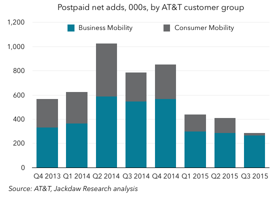
As you can see, Business Mobility seems to have far higher net adds than Consumer Mobility, which shrank to almost zero in Q3 2015. That’s a bit of a worrying sign for AT&T, and something we’ll want to keep an eye on going forward.

Which business is more favorable for AT&T?

The ultimate question is which of these two roughly equally-sized businesses is better for AT&T. In other words, is it a good thing that AT&T is seeing some subscribers transition over from Consumer to Business? Well, one thing we haven’t looked at yet is margins, which AT&T doesn’t report directly for Business Mobility, but which we can derive based on the figures it does provide for both AT&T Mobility as a whole and the Consumer Mobility segments:

Margins consumer and businessBusiness Mobility margins are actually a little lower than Consumer Mobility margins, by an average of roughly 2-3 percentage points most quarters. That likely reflects the lower ARPUs related to the heavier discounting that takes place on the business side. But of course, offsetting both the lower ARPUs and the slightly lower margins is the benefit of lower churn, which should help AT&T on the business side over time. The good news is that, thanks to cost cuts and efficiency gains AT&T has made recently, both sides of the business are seeing rising margins.

What we’re getting here is a unique insight into a division that’s normally totally opaque – none of the other US carriers provide this kind of split in their reporting. It would be fascinating to see a similar split for the others – T-Mobile has never really gone after the enterprise business until recently, while the other two carriers have definitely pursued it more aggressively. I suspect AT&T has the largest enterprise mobility business of the big four, but I’d love to see these details for the other carriers too.

Cord-cutting Update Q3 2015

I wrote a post last quarter about cord-cutting and the numbers I collect on pay TV subscribers in the US, and with all the major pay TV providers now having reported their results, I thought I’d do a quick update, especially since I’m seeing some misguided and misleading stuff out there based on others’ estimates. To be clear: cord-cutting is now a very real phenomenon, and it appears to be accelerating. A focus on single quarter results, especially on a sequential rather than year-on-year basis, can easily muddy the waters. But looking at the long-term trends makes the underlying pattern very clear.

Note: the charts and analysis here are based on the data I gather for my clients at Jackdaw Research, and a deck with lots more charts based on this data is part of the Jackdaw Research Quarterly Decks Service. You can learn more about that service and sign up here. The Q3 deck is available now to subscribers and can also be purchased on a one-off basis for $10 by clicking here. The deck from a year ago, which is similar in content, is available on Slideshare.

The three mistakes observers make

There are three fundamental mistakes people trying to measure cord-cutting frequently make:

  • They focus solely on quarterly trends, in what’s an extremely cyclical industry. Comparing this quarter’s net adds to last quarter’s tells you nothing about the underlying trends, because every calendar quarter has its own regular pattern. Ignore those patterns, or look at quarter-on-quarter trends rather than year-on-year trends, and you’ll get things totally wrong.
  • They focus only on some categories of players, such as the cable companies alone, or just the cable and satellite companies. There are three major sets of players in the US pay TV industry: cable operators, satellite operators, and telecoms operators. Ignore any one of these, or focus just on one – however large – and you’ll again come away with the wrong picture. For the last few quarters in particular, telecoms TV net adds have fallen quite a bit – leave those out of the picture, and you get a very distorted view.
  • They focus purely on the larger players. It’s very easy to focus on the largest publicly-traded pay TV providers – they’re by far the largest and  most impactful in industry terms. But even if these players serve the majority of the market, they by no means serve all of it, and in the last couple of years many of the losses have come among these smaller players. Ignoring those losses again risks distorting the picture.

A balanced view of cord-cutting

With that out of the way, I present here what’s as balanced a view as is possible to provide of what’s really going on. It’s very hard to build a truly complete picture, but if you want a representative picture, you have to include all three categories of players, and at least the largest of the smaller players too, while focusing on year on year trends. My post last quarter outlined the players I cover and the definitions I use, so I refer to you to that post if you’d like more context.

First, here’s the view of year on year video net adds for all the publicly-traded players whose reported results I track:Year on year video net adds all public playersAs you can see, the trend is consistent over the last five quarters – from almost 400k net adds in Q2 2014, the number has fallen each quarter, dropping into negative territory in Q2 2015 for the first time, and almost doubling in Q3, with almost 500k net losses among this group of pay TV providers.

The two bigger players we’re missing here are Cox and Bright House, neither of which is publicly-traded. Based on past reporting and estimates, I’ve estimated their results for Q3 2015, and adding them into the mix makes the picture look even worse:Year on year video net adds including Cox and Bright HouseLosses are now just above 500k for the quarter, and the first negative quarter (though it’s invisible in the chart) was actually Q1, when these providers lost 2k subs, according to my estimates. However, again, it was Q1 2014 that was the high point.

The dynamics between player groups are changing

Of course, underlying these dynamics is a set of different trends affecting different players. One of the reasons why some of the early commentary this quarter got things so wrong was an undue focus on the good results from some of the big cable companies. In fact, the cable companies have done better this quarter, but only because two of the big telcos – Verizon and AT&T – have dialed back their efforts in selling their TV offerings. The chart below shows year on year video net adds for these different groups of players (with cable excluding Cox and Bright House):Year on year video net adds by groupAs you can see, the cable recovery which began in late 2013 has coincided pretty much exactly with the telco slump that began around the same time. Telco adds year on year have dropped from around 1.5 million to just a couple of hundred thousand. This quarter, AT&T de-emphasized selling U-verse and actually lost subscribers for the second quarter in a row. Verizon is still gaining subscribers, but so slowly that it’s penetration rate in its addressable markets has actually begun to shrink. The satellite providers largely cancel each other out most quarters, such that their performance impacts overall market performance fairly little, but those slowing adds at the telcos are more than offsetting the slightly smaller losses at the cable companies.

A trend likely to accelerate

Hidden within these results is the fact that DISH now has its own over-the-top streaming video service, which is a potential substitute for some of these pay TV services. Sling TV subscribers are reported within DISH’s total base of subs, such that we can’t see the dynamics between the two, but others have estimated that without Sling DISH would have seen a significant drop in subscribers over the last couple of quarters. And of course Sling isn’t the only company providing these services – whether it’s indirect substitutes like Netflix and Hulu or direct substitutes like Sling, Sony’s Vue, and whatever Apple might eventually announce, a big part of the reason for the cord-cutting that’s now very evident in the market is the availability of substitutes. To date, DISH is the only one of these companies that has a competing product within its own walls, and that may turn out to be a smart strategy. But whether these companies eat their own lunch or lose share to others, it’s increasingly clear that cord-cutting is real, and accelerating.

Amazon’s exploding workforce

One of the things that struck me the most about Amazon’s earnings last quarter was the rate at which it’s hiring, as that rate has always been high, but accelerated significantly this past quarter. Below, I’m going to share a few key charts to illustrate this trend.

These charts are taken from the slide deck for Amazon I put together each quarter as part of the Jackdaw Research Quarterly Decks Service, a subscription service which provides slides on financial and operating metrics on some major consumer technology companies each quarter. I’ll post a screenshot of the slides in the Amazon deck, which went out to subscribers last night, at the bottom of this post. Any reporters reading this can contact me directly to receive copies of this and other decks from the service.

The first chart is the total number of Amazon employees, which includes both full-time and part-time employees, but excludes contractors and temporary personnel, of which Amazon hires many each holiday season:Amazon employeesYou can see the broad upward trend, but hopefully you can also see the spike this past quarter, which was significantly higher than in previous quarters. To put it in context, let’s look at another couple of charts. The first shows year on year net employee growth and the second shows quarter-on-quarter growth:Year on year net employee growthQuarter on quarter employee growthAs you can see, in both cases the growth this quarter was well above the historical trend. So what happened? Well, Amazon’s management was asked about this on the call and this was the answer, from Brian Olsavsky, the CFO (as reported by Seeking Alpha):

Headcount was up 49% year-over-year, which is higher than Q2 – we saw in Q2. This is going to be primarily in our ops area. If you exclude ops-related employees, our headcount’s growing actually slower than our FX neutral growth rate of 30%. So, what’s going on in ops is we’ve added 14 net fulfillment centers this year, bringing the total to 123 globally. We’ve added four sort centers in the U.S., bringing U.S. footprint to 23. We’re staffing earlier in those locations, we’re in good shape for the holidays and ready to go.

The other issue is there, the other reason is that we are also doing a lot of conversion of temp workers to full-time workers purposefully. There is a metric employment of full-time hires. So it is a little bit higher due to that program.

The bold text there is mine, because it highlights the major drivers here:

  • Amazon is building large numbers of new fulfillment centers
  • It’s getting those fulfillment centers staffed up to full levels earlier, especially in preparation from the holiday season
  • It’s also converting a higher number of the temporary workers it hires to permanent workers.

All this is particularly interesting in light of the recent New York Times story on Amazon’s working conditions (mostly in office jobs), because this is an unprecedented hiring spree at Amazon, but it’s almost all going into “ops” – or fulfillment and other blue-collar jobs. Indeed, this is reflected in Amazon’s rapidly falling revenue per employee:Amazon four quarter rev per employeeWhereas five years ago Amazon generated over a million dollars per employee, today, it generates less than half that, at $555,000 per employee in Q3 2015, and falling fast. Both the sheer number of employees Amazon has, and the nature of those employees, continues to be one of the biggest differences between Amazon and its business model and all the other big consumer technology companies it competes with. Amazon added 72,900 employees over the last 12 months, which is around 80% of Apple’s total workforce, for comparison’s sake.

Here’s that screenshot of the Amazon slide deck from the Jackdaw Research Quarterly Decks service:Amazon deck screenshot

Quick thoughts on Square’s Q3 2015 numbers

Payments company Square filed an amended S1 with the SEC on Monday, with financial and operating metrics for Q3 2015. I previously talked about Square’s original IPO filing on Techpinions a couple of weeks ago, and today I’m just going to focus on a couple of elements of the new numbers. If you’re not familiar with Square, I suggest you take a quick read through that earlier piece as it will be helpful context for what’s below.

The charts here are taken from more in-depth analysis I do as part of the Jackdaw Research Quarterly Decks Service, a subscription service which provides slides on financial and operating metrics on some major consumer technology companies each quarter. I’ll post a screenshot of the slides in the Square deck, which went out to subscribers last night, at the bottom of this post. Any reporters reading this can contact me directly to receive copies of this and other decks from the service.

As a quick into, here’s Square’s revenue line by product:Square revenue breakdownAs you can see, revenue growth is pretty healthy, primarily driven by core transaction volumes, but helped also by a newer category called Software and Data Products. This is where Square Capital, Square’s cash advance business, sits, along with a couple of SaaS businesses it’s acquired and launched.

Importantly, Square’s gross margins from these different businesses are very varied, as the chart below shows:Square margins by product
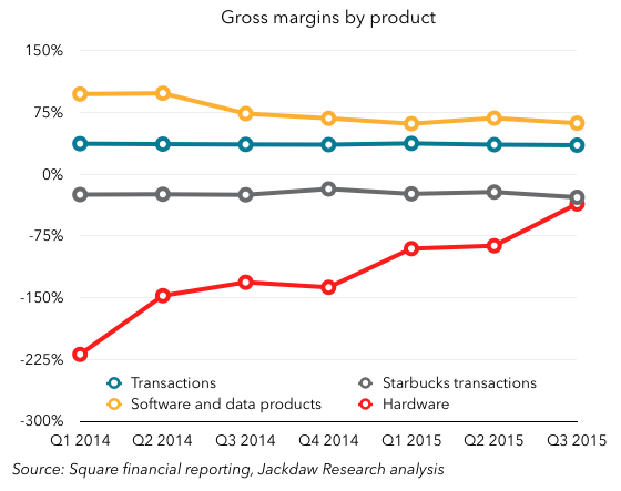
Software and Data Products have had by far the highest margins of all, although they’ve come down as Square has begun to incur costs of revenue around these businesses, which started out at almost 100% margins, with almost no costs. However, the Hardware business has historically been run at a loss, as Square essentially gave away many of its hardware products for free, although it’s now moving to a sell-at-cost model for some of its newer products. Lastly, you can see the huge discrepancy between the gross margins on Starbucks transactions, which have been consistently negative (around 20-30%), and all other transactions, which are very consistent at 35%.

Where things get really interesting is when you look at Starbucks transactions, which are fairly consistent in both revenue and gross profit dollars for now, in comparison to Software and Data Products. Square small segmentsThe latter is now just large enough to effectively cancel out the Starbucks gross loss, and at the current rate of growth it should fairly quickly outweigh it, which should help substantially with overall margins going forward. The ending of the Starbucks relationship (formalized this week with an announcement that Starbucks will indeed be going with another vendor going forward) combined with the growth of the Software and Data Products business are arguably the two keys to Square’s journey to future profitability.

A screenshot of the full set of slides from the Square quarterly deck I sent to subscribers yesterday is below:Square deck screenshot