Here I’m going to be keeping a running tally on numbers reported by the major US wireless providers as they report their results for the current quarter. You can see a similar tracker for US cable, satellite and telecoms providers here. Here are the metrics tracked below:
- Subscribers
- Revenue
- Operating margins
- EBITDA margins
- Capital intensity
- Net adds
- ARPU
- Churn
- Smartphone data.
Now that all the big five providers have reported, I’ve updated the charts to reflect the full set of results. A blog post with analysis of what this all means is now available here.
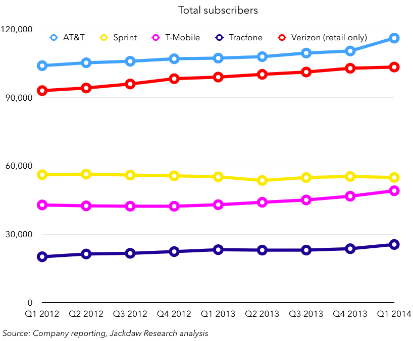
Total subscribers
The chart below shows total subscriber numbers for the four major operators:
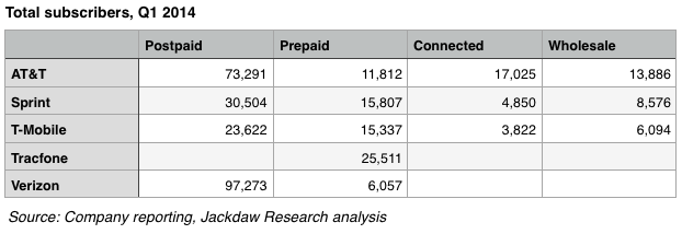
The chart below shows the breakdown of subscribers between the various categories. Note that Verizon only reports retail subscribers and doesn’t provide figures for either connected devices or wholesale/reseller connections. A data table follows the chart. I’ve included Q4 2013 data first for comparability.


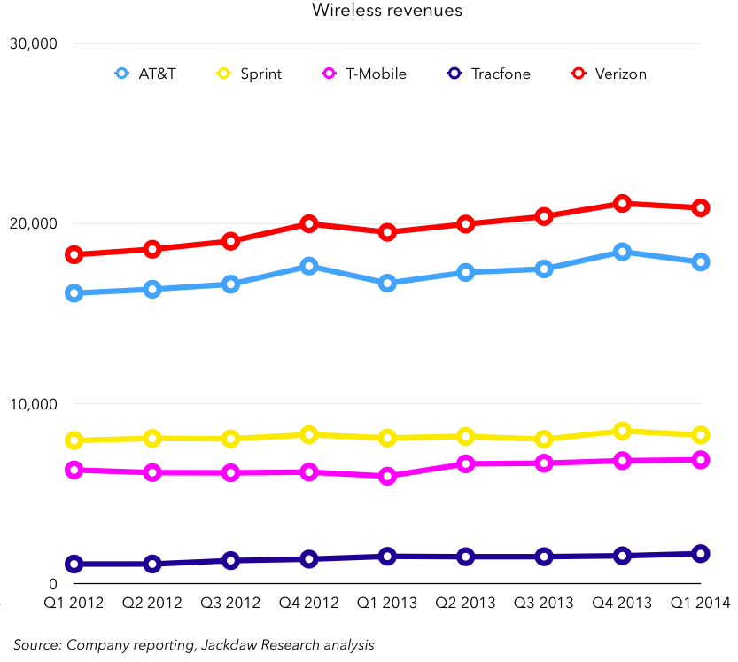
Revenue
The chart below shows revenues (in $ millions) for the five major operators on a quarterly basis.
Operating margins
The chart below shows wireless operating margins for the five major operators on a quarterly basis. Note, some results from Sprint and T-Mobile have been cut off so as not to distort the chart – T-Mobile’s operating margin in Q3 2012 was -155%, and Sprint’s operating margin in Q2 2013 was -10%.

EBITDA margins
The chart below shows EBITDA margins for the four major operators on a quarterly basis. 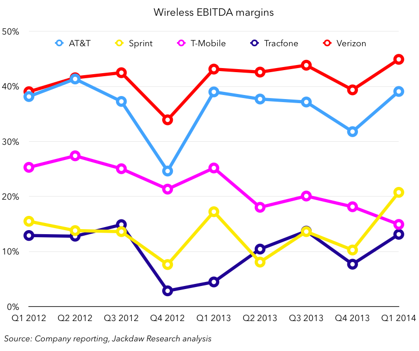
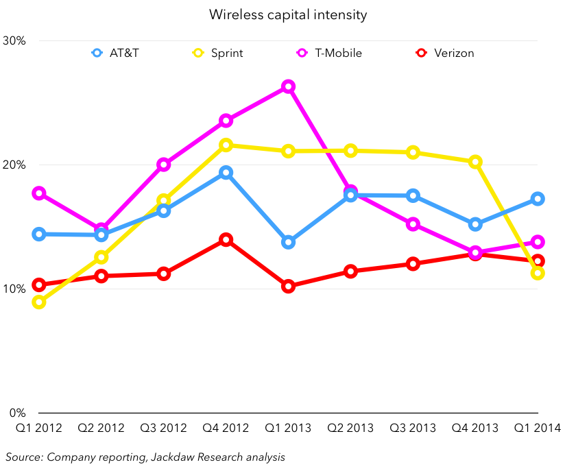
Capital intensity
The chart below shows wireless capital intensity – i.e. wireless capital expenditures as a percentage of wireless revenues. Note that Tracfone does not report capex (and has very low capex anyway as an MVNO, in contrast to the network operators).
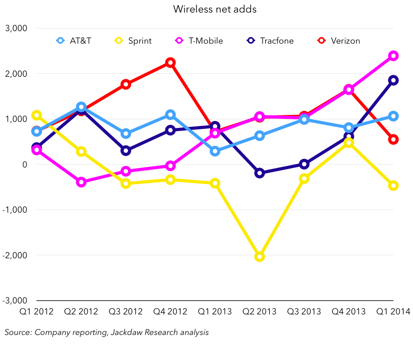
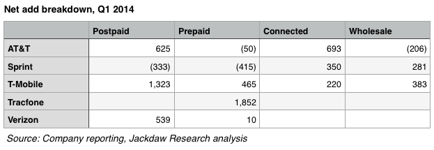
Net adds
The chart below shows net customer additions for the four major operators on a quarterly basis.
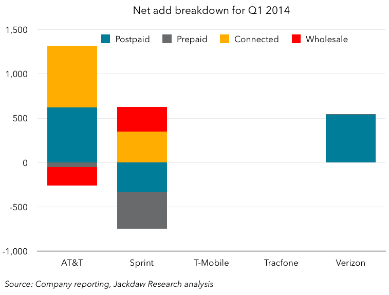
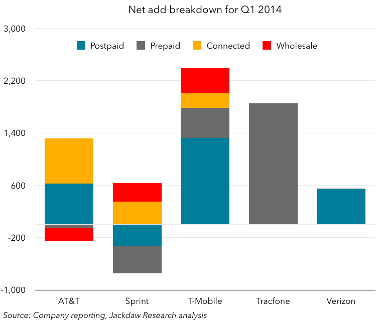
The charts and tables below show a breakdown of net adds by customer type, with Q4 2013 first as a reference point, and Q1 2014 below:
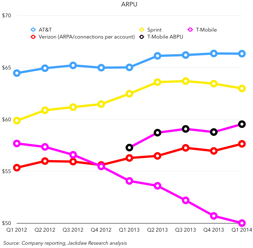
ARPU
The chart below shows postpaid ARPU for the four major operators (Tracfone only has prepaid subscribers, and several of the large network operators no longer report prepaid ARPU). Note that Verizon no longer reports ARPU, but instead Average Revenue per Account (ARPA), but it also reports number of connections per account, which allows us to calculate average revenue per connection, which is more comparable. This is the number show in the chart below for Verizon.
During the quarter, we’ve started to see the first signs of how carriers will start to change reporting due to the shift in subsidy models for handsets. T-Mobile’s reported ARPU is falling rapidly (see the magenta line below) but it’s just started reporting ABPU (average billings per user) as well, which includes equipment revenue. I’ve included both in the chart below.
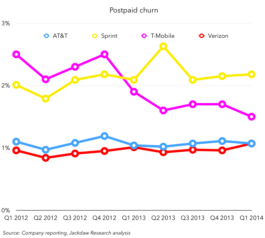
Churn
The chart below shows postpaid churn rates for the four major operators.
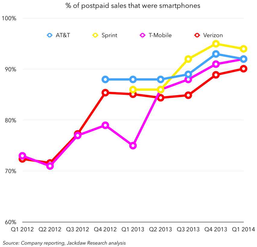
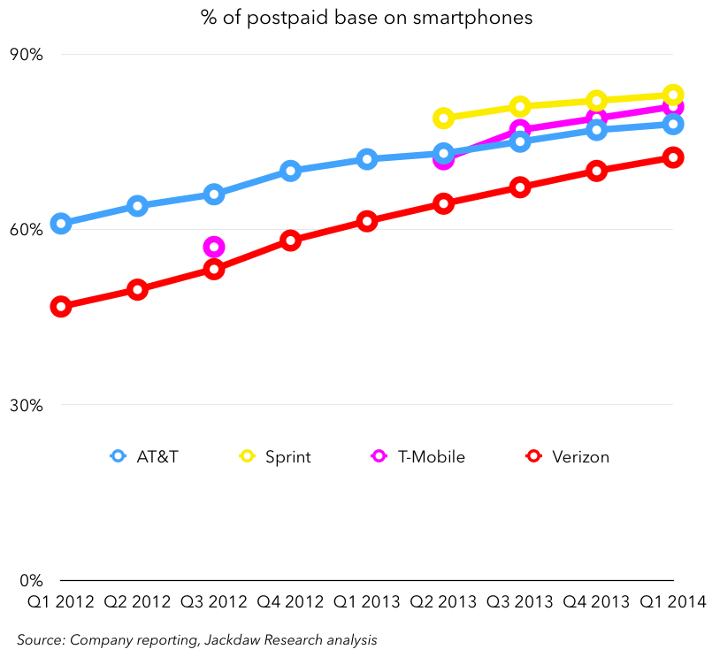
Smartphone data
The major carriers now report an assortment of data related to the sales, penetration and upgrades related to smartphones among their base of customers. This data is shown below in several charts, as reported by the companies. Note that the reporting by the companies themselves is sporadic and inconsistent, hence the patchiness of the data shown below:
 Note in the next chart that T-Mobile and Sprint reported identical results for the last two quarters, so TMO’s line is hiding behind Sprint’s in the chart below. AT&T unfortunately stopped reporting this number in the current quarter.

Pingback: US Wireless market analysis Q1 2014 | Beyond Devices()
Pingback: Mobile roundup: The Apple/Samsung smartphone war, switching from deskphones, wireless carriers by the numbers, and smartphone material tradeoffs | GSG Telco()
Pingback: Mobile roundup: The Apple/Samsung smartphone war, switching from deskphones, wireless carriers by the numbers, and smartphone material tradeoffs — Global Nerdy()