I’ve been using an Android Wear device – the Samsung Galaxy Live – since I picked it up at I/O last week. I’ve tried a number of other smartwatches before now, and it’s interesting to see the differences. As it’s currently constituted, I see three flaws with Google Wear, two of which seem to be pretty fundamental, and one of which should be fixed soon:
Cards are a bad UI for small screens
Cards make a ton of sense on smartphones and tablets and on the web, where they provide useful visual separation between discrete chunks of information, and they work well on Twitter.com, in Google Now on smartphones, and elsewhere. But on a space-constrained screen they really don’t work because they’re a terribly inefficient use of screen real estate. There are several different layers of information in Android Wear, as shown in this triptych: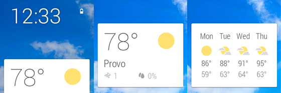
The first screen is what you see before you interact with a card – the card stays in the bottom half, and takes up just a third of the screen. The amount of information presented is extremely limited. If I then interact with the card, I get the middle screen, which is slightly richer but still takes up only half the pixels on the display. If I then swipe, I get even more information as shown on the right. But the card still only takes up half the screen. Compare this with the Galaxy Gear 2, which (though not a paragon of great UI) uses the whole screen to display notifications. This is a minor annoyance with the weather card from Google Now, but it’s really annoying when a notification comes in about a new email, and just a tiny amount of the email shows by default – I almost always have to tap on the small card to make it big enough to have a real sense of what it’s about. The “glanceability” factor just isn’t there.
The cards UI, with its limited use of the screen space, and the rest given over to a background that really adds nothing, is just not a good fit for such a small screen. It’s a great example of the problem with applying a single design language, essentially without modifications, to multiple form factors. It’s a problem that Microsoft has struggled with too in the form of Windows 8, and one that Apple so far seems to have managed to avoid in providing useful integration between iOS and OS X without taking things too far.