Category Archives: iOS

Digesting Apple’s new App Store numbers

Note: Following something of a hiatus in late 2015 after the birth of our fourth child, I’m hoping to get back to a more regular publishing schedule here as we kick off 2016. Here’s my first post for the new year, which will hopefully be the first of many. You can see all previous posts on Apple from this site listed here.

Apple today released its customary end of year / holiday period App Store numbers in a press release. By themselves, these numbers are impressive, but it’s important to put them in context to really understand their significance. Today, I’ll share a few charts and other related numbers to evaluate the new numbers and their real meaning.

A quick word on sources

It’s important to note briefly before we start that App Store numbers are one of many data points Apple reports selectively and indirectly. We get these occasional milestone announcements at year end and in keynotes, but between those we’re left to extrapolate and interpolate based on other sources, including Apple’s financial reporting, which has historically provided some direct and indirect guidance on App Store sales. So please bear in mind that while some of the numbers below are based on announcements like today’s, many of them are based on these estimates, extrapolations, and interpolations. I believe they’re accurate, but I want readers to understand they’re not direct from the source.

Today’s numbers

Today’s numbers, in brief, were as follows:

  • “In the two weeks ending January 3, customers spent over $1.1 billion on apps and in-app purchases”
  • “January 1, 2016 marked the biggest day in App Store history with customers spending over $144 million. It broke the previous single-day record set just a week earlier on Christmas Day.”
  • Customers spent “over $20 billion” on the App Store in 2015
  • The App Store has now paid out “nearly $40 billion” to developers since it launched in 2008, and over a third of that was paid out in the past year.

There were also some numbers about jobs and job creation, but those won’t be the focus of this post.

Putting the numbers in context

So let’s put those in context. Focusing just on the numbers Apple has reported directly, here’s the picture on the cumulative payments to developers, ending with today’s “nearly $40 billion” (which I’ve pegged at $39 billion):Cumulative payments to devs as reported
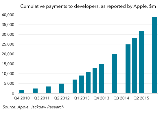
Using my estimates for the periods not directly reported, we get this smoother and less patchy version, which also goes back to the inception of the App Store in 2008:Cumulative dev payments estimated
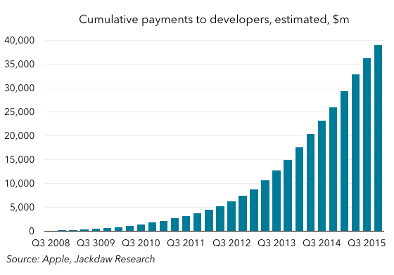
As you can see, it’s a lovely curve, with what appears to be accelerating growth. In fact, we can look at that growth more easily by charting trailing four-quarter payments instead, as follows:Four quarter dev payments estimatedWhat you see here is that the growth has been fairly steady for the last few years, since about 2013, with the occasional bump here and there. Apple’s annual run-rate for payments to developers is now around $14 billion, which translates into the “over $20 billion” customer spend number in today’s press release. That’s an enormous revenue number for something which is effectively a feature in Apple’s platform.

Longer-term patterns

If you look again at that last chart, though, you’ll see that the early history is less consistent. There are some ups and downs in the early years, though they’re a little hard to make out in that chart because of the sheer scale of payments in the later years. One way to dive deeper into this and to look at the longer-term trends is to use another set of numbers – the base of iOS devices in use – to put these figures in context. Here, again, we have to make certain assumptions about the size of that base, but we have enough data points to be reasonably confident there too.

The chart below shows the average annual revenue per iOS device in use since the inception of the App Store:Four quarter revenue per iOS device estimated
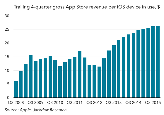
What you see in the chart is a series of different eras in the history of the App Store in which the trends were quite distinctive. In the early going, spend quickly leveled off at around $15 per year per iOS device, and it then began to falter a little. Apple introduced in-app purchases as a new feature in late 2009, and that seems to have sparked a slight renaissance in 2010, along with the launch of the iPad and some higher-priced apps which launched for that platform. However, by 2012, this number was back in decline, likely as the base of iOS devices diversified beyond early adopters and into new markets with lower spending power. In fact, that is the trend you’d expect to see over time, as existing users make do largely with apps they already own, and as new users in new geographies join the base.

However, what you actually see is that, starting around late 2012, the number starts rising significantly, eventually leveling off again at around $25, significantly higher than in the early years of the App Store. What drove this growth? I mentioned already that in-app purchases launched in late 2009, but it wasn’t until late 2012 that Candy Crush Saga launched. Of course, one app didn’t change the trajectory of the whole App Store, but this app exemplifies a new business model that’s become increasing prevalent – even dominant – in the App Store, and in App Store revenues. Many others have followed a similar path to monetization since then, and I suspect it’s the rise of in-app purchases in games that’s driven that growth since late 2012. I’ve written about the rise of these games, and some of the unpleasant economics associated with them, elsewhere, but there’s no doubt they’ve had a significant impact on the App Store and its revenue composition.

There’s no doubt that games in general, and those featuring in-app purchases in particular, are a major driver for the App Store growth Apple trumpets on a regular basis. The two big questions that arise out of all of this are whether Apple wants to continue to rely so heavily on a model that has unsavory characteristics, and whether in focusing on this dominant category it’s neglecting other business models in the App Store. That latter topic is something we’ve discussed a couple of times recently on the Beyond Devices podcast, most notably in Episode 24.

Operating system user bases

Related: two previous posts on the patterns in Android adoption rates (December 2013, March 2014), a post contrasting iOS and Android adoption patterns, and a post from last month on iOS 9 adoption.

Both Apple and Google have just updated their mobile OS user stats, while Microsoft shared a new number for Windows 10 adoption at its event this week, giving us a rare opportunity to make some comparisons between these major operating systems at a single point in time. We now have the following stats straight from the sources:

  • The stats provided by both Apple and Google on their developer sites with regard to the user distribution across their mobile operating systems (Android and iOS)
  • The 110 million Windows 10 number provided by Microsoft this week
  • The 1.4 billion total active Android user base number provided by Google at its event last week
  • Total Windows users of around 1.5 billion, as reported by Microsoft several times at recent events.

In addition, there are various third party sources for additional data, including NetMarketShare and its estimate of the usage of other versions of Windows. Lastly, I have estimated that there are roughly 500 million iPhones in use now, and around 775 million iOS devices in use in total (including iPads and iPod Touches).

If we take all these data sets together, it’s possible to arrive at a reasonably good estimate for the actual global user bases of major operating system versions at the present time. The chart below shows the result of this analysis:User bases all iOSThere are several things worth noting here:

  • Each company has one entry in the top three, with Microsoft first, Google second, and Apple third.
  • However, only one of these entrants is the latest version of that company’s operating system (iOS 9), while the other two are the third most recent versions (Windows 7 and Android KitKat).
  • Google has three of the top six operating systems, none of which is its latest operating system (Marshmallow, released this past week). Even its second most recent version (Lollipop), now available for a year, is only the third most adopted version after KitKat and Jelly Bean.
  • Both iOS 9 and iOS 8 and the three most used versions of Android beat out every version of Windows but Windows 7.
  • The most recent versions of the three companies’ major operating systems are used by a little over 400 million (iOS 9), 110 million (Windows 10), and a negligible number (Android Marshmallow) respectively.
  • The second most recent versions are used by around 330 million (Android Lollipop), around 250 million (iOS 8), and around 200 million (Windows 8) respectively.

There are lots more data points to tease out here, but to my mind it’s a striking illustration of the differences in the size and adoption rates of these three major operating systems.

Two additional thoughts

Just for interest, I’m including a couple of additional thoughts below.

First off, here’s the same chart, but with iOS reduced to just the iPhone base. The order changes a fair amount, but iOS 8 and iOS 9 still make a good showing:

User bases based on iPhone onlyLastly, I wanted to revisit my post from a couple of weeks ago about the initial adoption of iOS 9, especially as it relates to Mixpanel’s data. In that post, I showed how Mixpanel’s iOS adoption data tends to be pretty close to Apple’s own data except for the month or so after a new version of iOS ships, when it tends to skew way lower than Apple’s own data. Now that we’re a few weeks on from the initial launch, and Apple has released the second set of iOS adoption data since the launch, I wanted to revisit that pattern. Interestingly, the very same pattern is playing out again – despite the initial significant discrepancy, Mixpanel’s data is now once again very close to Apple’s own:Mixpanel iOS data October 2015

iOS 9 adoption and Mixpanel

Related: Apple Topic Page, and a previous post on iOS and Android adoption patterns, as well as two earlier posts (1, 2) on Android versions in use.

Last week, following the release of iOS 9 by Apple, Mixpanel (along with other analytics firms) began releasing data relating to the pace of adoption of iOS 9. That data suggested that iOS 9 was being adopted more rapidly than iOS 8, and also that it had reached around 30% by the end of the day on Saturday. Then, this morning, Apple issued a press release about the new iPhones, but in passing noted that iOS 9 was now on more than 50% of devices, based on data from Saturday, September 19th. That’s a fairly sizable discrepancy, and it made me want to dig into the numbers to understand what was going  on.

Note: I’ve reached out to both Mixpanel and Apple about this, and I will update this post as warranted once I hear back from them. As of right now, the analysis below doesn’t include any additional information from them beyond what they’ve put out publicly.

A word on methodologies

It’s worth starting with a quick statement of methodologies. Apple’s goal is to give developers a sense of the operating system versions their target audience is using, and so is based on devices hitting the iOS App Store (Google, incidentally, does the same thing). It generally seems to pick a specific single day, usually a Monday, and measures which versions of iOS those devices hitting the App Store are using.

Mixpanel, on the other hand, provides analytics to app developers to help them understand engagement around their apps, but in the process also collects lots of data on which operating systems the users of those apps are running. As with any analytics software of this kind, the picture will always be incomplete, but the bigger the base of devices, the more likely it is to be representative, and Mixpanel’s is fairly big at this point.

Mixpanel is generally very close from October to August

With that note on methodologies as context, the first thing to note is that Mixpanel is generally very good at approximating Apple’s own numbers for iOS adoption, even though their methodologies are different. For the period from October 2014 to August 2015, Mixpanel’s numbers generally tracked within about 4% of Apple’s own numbers for iOS 7 and iOS 8 adoption. Interestingly, Mixpanel tends to estimate higher usage for the latest version and lower usage for previous versions than Apple.

September seems to be more of a problem

However, even though Mixpanel’s data tracks closely to Apple’s for most of the year, it tends to be quite a bit off the mark in September, immediately after the release of new iOS versions, at least for the last two years. The chart below shows the difference between Apple and Mixpanel’s adoption rates for iOS 7, 8, and 9. Negative numbers mean that Mixpanel’s rate is lower than Apple’s, while positive percentages mean Mixpanel’s numbers are higher.Mixpanel and Apple iOS adoption rate differencesThe chart shows several things that are worth noting:

  • As I mentioned, the margin of “error” (I’ll explain the quote marks later) is generally under 5%, though as you can see it grows steadily from late October 2014 to September 2015
  • However, the discrepancy between the two figures is much more significant for two dates – September 21, 2014, and September 19, 2015 – which happen to be the dates immediately after the launches of the new versions for the last two years. In both cases, Mixpanel’s adoption rate for the new version of iOS was far lower than Apple’s, in contrast to the usual pattern during the year.
  • The discrepancy quickly shrank last year – by early October the two numbers were very close again. We don’t know yet what will happen this year, of course.

What explains the September discrepancy?

I’ve carefully avoided describing Mixpanel’s data as faulty above – I did use the term margin of error once, but carefully put “error” in quotation marks. And that’s because even Apple’s own numbers aren’t necessarily accurate in reflecting the devices actually in use. For the sake of developers, knowing what mix of devices hit the App Store is of course actually more important and relevant than knowing the total mix of devices out there. But it’s not necessarily an accurate picture of what people are using across the broad base of devices. Mixpanel’s data may actually be more representative of the actual base of devices in use, but there’s no way to know for sure; ultimately, it is also measuring something other than true adoption rates across the base.

So, having framed this as a discrepancy or difference rather than an error, what explains why the numbers are so close from October to August, and yet so far apart immediately after a new iOS version launches? Here are a few possibilities:

  • Apple’s numbers, which reflect App Store visits, are unduly skewed early on by the influx of recent updaters looking for apps that take advantage of new features – e.g. content blockers, multitasking, and in-app search in iOS 9. Once the initial rush has subsided, App Store visitors return to looking more like the overall base. Since we don’t have detailed day-by-day data from Apple, it’s hard to tell how quickly this effect wears off, but I suspect it may be a big part of the answer.
  • It’s possible that Apple’s numbers, which are global in nature, are more representative of true trends than Mixpanel’s, which may skew towards (or away from) particular countries. As a result, if users in China or other major markets which Mixpanel may not track as closely update iOS more quickly, Apple’s numbers might capture that whereas Mixpanel’s wouldn’t. As download rates catch up in other regions, the discrepancy would work its way through over time. I don’t know enough about Mixpanel’s data to know how much of an issue this is, but it might be a secondary factor.
  • Apple’s regular iOS adoption data is usually captured on a Monday, whereas its post-launch data for the last two years was captured at the weekend (a Sunday last year, and a Saturday this year). It’s possible that the mix of devices in use – and especially those hitting the App Store – on the weekend is different from those in use on a Monday, but this is unlikely to account for much of the discrepancy, especially since the Mixpanel data was collected on the same day.

Another thing that’s worth noting is that other sources of iOS adoption data tend to agree more with Mixpanel at this point than with Apple’s numbers – both Fiksu and David Smith’s Audiobook app data tend to suggest adoption closer to Mixpanel’s than Apple’s, for example. So, either all these methods suffer from the same “problem” or Apple’s data is actually unrepresentative of the true base of devices out there, especially in these first few weeks. Until I hear more from either company, it’s going to be hard to know which is the case. But it’s certainly worth viewing Mixpanel’s data (and any other third-party data) in this context in the future, especially when it comes to the period immediately after a new version of iOS comes out.

Apple’s Playbook

One of the most interesting slides at yesterday’s Apple event was one that Tim Cook used in the context of introducing the new Apple TV:Apple PlaybookWhat I found striking about this slide was that it was a great summation of Apple’s playbook for its tightly integrated approach to hardware and software:

  • Powerful Hardware
  • Modern OS
  • New User Experience
  • Developer Tools
  • App Store.

This playbook was first introduced with the iPhone, although arguably it wasn’t fully fleshed out until 2008, when the developer tools and App Store elements arrived. This approach was then applied again both to the iPod Touch when that launched, and when the iPad launched in early 2010, using the same “modern OS” – now called iOS. Later in 2010, Apple began applying some of these elements back to the Mac (announcing these changes at an event called “Back to the Mac”), starting with the Mac App Store, and continuing since then with a variety of elements borrowed from iOS.

With this as background, it’s no surprise that Apple felt bound to include an App Store in the first version of the Apple Watch, but out of an abundance of caution and a sense of urgency, it was a diluted version of the App Store concept. Only with the launch of WatchOS 2 this month will Apple fully embrace its own playbook for devices when it comes to the Apple Watch. And as of yesterday, we now know that Apple is applying this same playbook to the Apple TV too, something that’s seemed inevitable for quite some time now.

With the release of WatchOS and the announcement of the new Apple TV, Apple now has the same strategy for hardware and operating systems for every element of its portfolio for the first time. The question now becomes which new categories Apple might apply this strategy to in future, and one obvious possibility is cars. Look at that list of bullet points that make up the Apple playbook – is there any element of this that doesn’t apply to cars?

The other thing that’s interesting about all this is that this strategy puts developers at the heart of Apple’s formula for success. Three of the bullet points are about what Apple brings to the table for end users – the hardware, the software, and the user experience these two elements tightly integrated create. The fourth and fifth bullet points are about what Apple provides for developers – the tools to create the apps, and the channel to get these apps in front of customers and make money from them. I think this is a reflection of a genuine understanding on Apple’s part that its devices would be far less meaningful without these third party apps.

Given what’s happening now with Apple Watch and Apple TV, I’m expecting to see a ton of innovation from developers in creating new experiences that are hard to imagine today. We’re about to see the same sort of flourishing of new apps and business models around these devices that we’ve already seen around the iPhone and iPad. And that in turn will reinforce the value of these devices for end users, while creating significant new revenue opportunities for developers.

Contrasting iOS and Android adoption patterns

I’ve done two previous posts (here and here) on Google’s Android developer dashboard stats, and I was surprised to find it’s been just over a year since my last one. I may still do a deeper dive revisiting some of the points from those previous posts, but this time around I wanted to do something different – contrast Android and iOS adoption patterns. Google has published data on Android version adoption for quite some time now, but Apple’s only been doing it for the last couple of years, so we have less data. But we still have enough from both platforms that we can draw some interesting conclusions.

iOS adoption – huge initial ramp plus slow conversion

The pattern for iOS adoption is very clear – a massive initial ramp in adoption in the first few days and weeks, followed by a steady conversion over time. The chart below shows the share of the base on each version in the first 24 months from launch:

iOS adoptionAs you can see, by the time the first month is over, more than 50% of the base is already on the new version, and it ramps to around 90-95% by a year later, just before the next version launches. At that point, it immediately drops to 25-30% as the new version takes over, and slowly dwindles from there down to under 10% after two years. There are differences in adoption rates for the various versions shown – as has been reported, iOS 8 has seen a slower initial adoption rate than iOS 7, though it’s now over 75%. Correspondingly, the share of iOS 7 has fallen slightly more slowly than iOS 6 did, though the gap in both cases has closed a bit recently. Continue reading

Apple resurgent – thoughts on WWDC

Today’s WWDC keynote was a sign of a renewed swagger on the part of Apple, whose executives seemed to relish the deluge of new product announcements they unleashed on developers and on their customers. In the process Apple established or strengthened its competitive positioning against two major foes – Microsoft and Google – while opening itself up in unparalleled ways to developers. Today’s announcements may come to be seen in the same way as Steve Jobs’ original launch of Mac OS X, in that it lays the groundwork in several areas for years of future Apple products.

The demotion of Google continues

Two years ago at WWDC, Apple removed erstwhile close partner Google from the iPhone in two significant areas: as the backend provider for the Maps app, and in the form of the pre-installed YouTube app. But Google’s last major bastion on iOS is its position as the default search engine in Safari, and it’s much harder to remove there. In the sense of typing a query into a search box or address bar in a browser, hitting enter and being presented with a screen of blue links, Google is unrivaled, and Apple knows that. But it has slowly been inserting itself between the user and that search box over the last couple of years, and today’s keynote provided further evidence of Apple’s pre-empting of the Google search on both iOS and OS X devices.

Apple’s more subtle disruption of the user-Google relationship began with the launch of Siri, which began to address some users’ queries without an explicit search, and which uses Wikipedia, Wolfram Alpha and Bing, but not Google, as underlying search providers. And it has continued since then, as more third party services have been layered into Siri, pre-empting the Google search for movie listings, restaurant reservations and sports scores. Today’s keynote added Spotlight search to the list of places where users will now find answers to their queries without the classic search box experience, thus further inserting Apple between users and Google.

This is potentially significant for Google, for which the US continues to be easily its single biggest and most lucrative market, and for which mobile is increasingly important. To the extent that iPhone users, which make over 40% of US smartphone users, start using Apple and its tightly integrated third party services instead of Google, for search, that’s pretty bad news. That isn’t, of course, why Apple is taking these steps, but it’s an unpleasant side effect for Google. And a great way for Apple to participate in the search business without having to match Google in the page-of-blue-links business.

A device for every need, not one device for every need

Continue reading