Apple June 2016 Quarter Chart Review

I’m on vacation this week in Europe, but I took a quick break to cover Apple and Twitter’s earnings this evening before heading to bed. I’ve tweeted quite a few charts tonight, but thought I’d pull some of the key ones together with some commentary for readers. A full deck of quarterly charts will go out to subscribers to the Jackdaw Research Quarterly Decks Service in the next few days as Apple releases its full data in an SEC filing, so look out for that if you’re a subscriber, and sign up here if you’re not.

Note: in this post, as in all my posts, I use calendar quarters for ease of comparisons with other companies and easy intelligibility by those not familiar with quirky fiscal years. As such, the labels and my commentary does not align with Apple’s fiscal calendar.

iPad returns to revenue (but not shipment) growth)

Last quarter, Tim Cook promised that the iPad would have its best year on year “compare” in over two years, which by my calculations meant something better than an 8% decline. Turns out iPad revenues actually returned to positive growth this quarter, though shipments still dropped, thanks to a really strong boost in ASPs:iPad shipments Q2 2016iPad ASPs Q2 2016Screenshot 2016-07-26 22.38.46
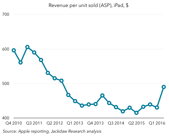
That iPad ASP growth seems to have been driven by the launch of the iPad Pro, which in turn was likely designed in large part to drive higher ASPs as shipment growth has stalled. In other words, the strategy seems to be working. It’s also interesting that Apple reported that half iPad Pro sales went to people buying them for work, which is another validation of Apple’s strategy, but also points to a big opportunity for Apple, which is selling more devices into the enterprise, both to individual and corporate buyers. That’s something I first talked about in the context of Apple’s IBM deal, but it goes much further than that (as evidenced by subsequent Cisco and SAP deals).

iPhone sales and ASPs down – the iPhone SE effect

Unsurprisingly, iPhone sales were down again, though perhaps not as badly as they seemed to be given the changes in inventory. But the most notable thing was the drop in average selling prices – the opposite of what happened with the iPad in the quarter:iPhone ASPs Q2 2016
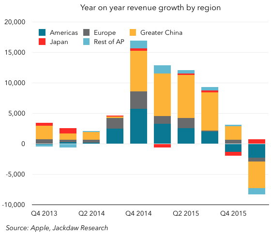
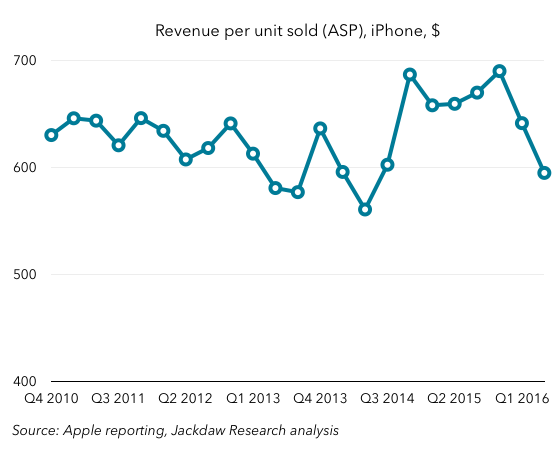
Just as the positive change in iPad ASPs was due to the successful launch of a new product (the 9.7″ iPad Pro), so is the larger than usual quarterly drop in iPhone ASPs due at least in part to the launch of a new product – the iPhone SE. It’s not all that – there was some impact from the inventory changes, as mentioned on the earnings call – but the magnitude of the drop is an indication that the iPhone SE has also had a successful launch, and has been something of a hit. That’s a good thing, in that these sales have filled something of a hole in iPhone sales in the quarter – which was arguably the purpose – while proving that Apple can tap into a market for iPhones at a lower price point with slightly lower specs and feature functionality.

Apple Watch and Other Products

One last interesting point with regard to a specific product: the Apple Watch. It’s buried in Other Products, but perhaps a better way to look at it is that it now leads the Other Products category, which otherwise features a number of other smaller products. That’s been a double-edged sword for the reporting category over the past 18 months or so, as Apple Watch has first driven higher growth and now is driving negative growth for the category again:Other Products growth Q2 2016
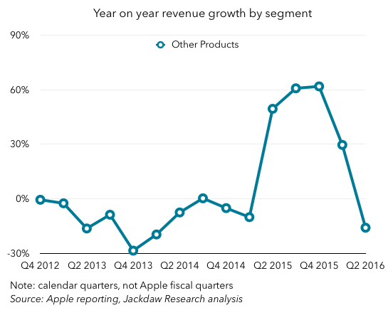
This is, to some extent, a temporary anomaly due to the launch of a brand new product and the subsequent (presumed) shift to a different time of year for the follow-up product as the second version of the Apple Watch launches in the fall. But it’s an indication of just how important the Watch is to that Other Products category.

Short-term versus long-term

In concluding, I’m going to link back to my post last quarter, in which I both reviewed the good news and bad news in the results and looked forward to the rest of the year. The point remains the same: with Apple there are two current pictures, which are very different. On the one hand, there’s the short-term picture, characterized by the anniversary of massive growth in iPhone sales driven by the iPhone 6, and also an unusually long lull in the Mac upgrade cycle driven by delays in getting new chips from Intel. That short-term picture hasn’t changed, and is so far fairly predictable.

The bigger question, though, is what happens later this year as some of the unpleasant short-term factors start to go away. As I said last quarter, with the iPad performing better, that’s the first of those positive levers coming into effect, and if that higher ASP trend continues, that will be more grist to the mill. However, the far bigger effect obviously comes from the iPhone, which I still believe might return to revenue growth later this year or early next year. Lastly, the other major product lines – Mac and Apple Watch – have potential to contribute further to that growth. We should finally see new Macs in the fall if not before, which will unleash significant pent-up demand, while new Apple Watches combined with a much more capable watchOS 3 could drive more sales there. In other words, over the long term I remain very bullish about Apple’s prospects, and we could start to see signs of that in the September quarter, but especially in the December quarter and beyond.

Why the Tesla Autopilot Crash Matters

We talked about this a little on a recent episode of the Beyond Devices Podcast, but I wanted to write down some thoughts as well. The fatal crash involving a Tesla running the Autopilot mode has already sparked lots of news articles, handwringing, an NHTSA investigation, and possibly even an SEC investigation, as well as several defensive tweets and blog posts from Tesla and Elon Musk. But as is so often the case, it feels like there’s not enough nuance on either side. The issues here are complex, and I want to address two specific ones here, one about Tesla’s statistical defense, and one about the danger of a narrative developing about autonomous driving.

Sample size problems

First off, there are the statistics that Elon Musk and Tesla have used to defend Tesla’s Autopilot mode. The one they’ve cited most frequently is that Tesla vehicles had driven 130 million miles before there was a fatal crash, while the US national rate is around 94 million miles per fatality. On paper, that makes Teslas look really good, but it’s a fairly fundamental statistical error to take those numbers at face value.

Most importantly, the sample size for Teslas is much too small. A simple thought experiment will suffice here:

  • The day before the fatal accident, Tesla’s rate was zero per 130 million miles, infinitely superior to the national rate
  • The day after the accident, the rate was one per 130 million miles, somewhat better than the national rate
  • If there had been another accident the day after, the rate would have been one per 65 million miles, worse than the national rate.

There wasn’t another accident the day after, but in such a small sample size, and given standard probabilities, there might easily have been, or there might not have been another for months or years. The point is that the sample size is far too small to derive any kind of statistical average at this point with any real rigor. Consider that Tesla has racked up 130 million miles, while those NHTSA stats are based on over 3 trillion miles traveled by car in the US in 2014.

Driving conditions

The other issue with these statistics is that the NHTSA numbers are for all driving under all conditions and on all roads in the US in 2014. The Tesla figures, by contrast, are only for those conditions where Autopilot can be activated, which in many cases is going to be restricted to freeways and other larger roads. The problem with that is that fatal car accidents aren’t evenly distributed across all road types and conditions – they disproportionately happen on certain road types including rural roads, where something like Autopilot is less likely to be used. It’s frustratingly difficult to find good statistics on this breakdown, but I suspect Tesla’s stats benefit from the fact that Autopilot is used in scenarios that are generally lower risk.

It’s the narrative that matters

So far, I’ve dealt solely with the statistics, but I want to turn to what’s actually the bigger issue here, which is the narrative. The power of narratives is something I’ve written about elsewhere, and it’s a theme I often find myself returning to, because it’s very powerful and often underestimated. The problem with the Tesla Autopilot crash is that it challenges the narrative about autonomous vehicles being safer than human driving. That’s not because it proves they’re less safe – if you take Tesla’s numbers at face value, which I see many people doing, they appear to show the opposite.

But the simple fact of such a crash featuring prominently in the news is something that will stick in many people’s minds and affect their perceptions of autonomous driving. And here I think Tesla has done itself a disfavor, by over-selling their feature. The very name Autopilot connotes something very different from and far beyond what the feature actually promises to do. Tesla has been at pains to point out since the crash that its own detailed descriptions of the feature indicate drivers should keep their hands on the wheel and stay alert and attentive, ready to take over at any moment should the need arise. But the Autopilot branding doesn’t connote that at all.

The secondary problem is that such a feature will inherently lull people into a sense of ease and less focus as they drive. What’s the point of the feature unless it frees up the driver in some way, and once they’re freed up, aren’t they almost guaranteed to want to do other things with their time while in the car? There have been news reports about people using their phones more while using Autopilot, and there were suggestions that the driver of the car involved in the fatal crash might have been watching a movie on a portable DVD player.  There’s a paradox here, where on the one hand the driver is freed up for other activities because the car takes over, and on the other they’re supposed to stay focused and not take advantage of that increased freedom.

This is the risk of Tesla’s incremental approach to autonomous driving. In general, I think there are significant advantages to this approach, which helps to build driver trust over time on an incremental basis. But the downside here is that the vehicle isn’t really capable of fully taking over yet, and yet lulls drivers into a sense that it is. That, in turn, helps to feed that negative narrative about self-driving cars in general and Teslas in particular. Tesla and Musk need to tread more carefully in both their branding of these features and their response to these tragedies if they want to avoid that narrative taking hold.

The State of Siri

The question I’ve been asked the most in the last couple of weeks by reporters as we get ready for Apple’s Developer Conference is whether Apple’s Siri personal assistant is behind its competitors, and whether it can catch up. The answer is more complicated than just a yes or a no, and having some context for next week’s announcements is really important to evaluating them properly when the time comes.

Comparing Apples with Apples

First off, many of the comparisons I’m seeing made at the moment are comparing apples with oranges (no pun intended). What I mean by that is that we’re at a particular point in the calendar where we’re comparing everyone else’s products (and in many cases announcements of products that aren’t yet available) from 2016 to Apple’s versions from 2015. Since Apple only makes major changes to Siri and its software in general once a year, we’re still looking at last year’s versions ahead of WWDC next week, but all the other major consumer tech companies have already held their developer events this year, and thus shown their hands.

Adding more to the “unfairness” of the comparison, in many cases competing products aren’t actually available yet, and won’t be for months. So evaluating Apple’s position in digital assistants (and artificial intelligence more broadly) today makes a lot less sense than it will this time next week, when we know what Siri will look like in the second half of 2016. If past patterns continue, it seems likely that at least some of the new features will be available to developers  almost immediately, to participants in Apple’s iOS beta program shortly after, and to everyone with an iPhone in September.

Three components to digital assistants

Even though people talk about voice-based assistants in a unitary fashion, there are really three main components to these products, and if you really want to evaluate an individual example, you have break it into these constituent parts. Those three parts are:

  • Voice recognition – turning sounds into individual words
  • Natural language processing – turning collections of words into phrases and sentences with specific meanings
  • Serving up responses from a cloud service.

An effective digital assistant needs to be good at all three of these things in order to do the overall job well. First, it has to recognize the words accurately, then it has to properly identify the meaning of the set of words the user says, and then it has to serve up a response based on the set of things it’s capable of doing.

Siri is competitive but not a leader today

For today, Apple’s Siri is decent but not stellar on the first two points. In both cases, Google’s voice search and Amazon’s Echo device do a better job of both recognizing individual words and ascribing meaning to phrases and sentences. The gap isn’t huge, but it’s noticeable, while Microsoft’s Cortana generally performs roughly on par with Siri in my experience. On the third point, Siri has expanded the range of tasks it can perform, but it’s still limited mostly to things Apple’s services can perform with a handful of third party services feeding in data on particular topics. Google’s voice search can pull in a little more third party data and has a much wider range of first party data to pull from, while Amazon’s Alexa assistant has an open API that’s resulted in connections to many third party services, though a large number are from tiny companies you’ve never heard of. Cortana is, again, roughly on par with Siri here.

On balance, then, Siri is roughly in the same ballpark as competitors, but lags slightly behind in all three of the key areas versus both Google and Amazon. Though it’s not available yet, Google has also announced the next generation of its digital assistant, called simply “the Google assistant”, which will be able to respond to text as well as voice queries and engage in conversations with users. This is capability Cortana has already, but others including Siri don’t. It should roll out over the next few months to users, but it’s hard to evaluate how effective it will be based on keynote demos alone.

Where Apple might go next week

Returning to my first point, as of right now we’re comparing the 2016 versions of others’ products to the 2015 versions of Apple’s, so the question becomes how Apple might move Siri forward at WWDC and close the gap in these various areas. Across those three areas, the most likely changes are:

  • Voice recognition – Apple has been continually improving its voice recognition, and although we’ve seen the least concrete rumors ahead of time in this area, I would expect it to talk up further improvements at WWDC
  • Natural language processing – Apple has acquired a variety of companies with expertise in artificial intelligence recently, and among them is VocalIQ, which specializes in conversational voice interactions. I would expect significant improvements in natural language processing including multi-step conversations to be announced at WWDC, which should move Apple forward in a big way in this area
  • Responses – the biggest thing holding Siri back right now is its lack of third party integrations, and especially the inability for developers to make functionality in their apps available to Siri. Were that to change at WWDC – which it seems likely to do with a Siri API – that would again dramatically improve the utility of Apple’s voice assistant.

I’ve so far focused mostly on the voice aspects of these digital assistants, but Apple also added other elements last year, and might continue to build on them this year. In 2015, it introduced the Proactive elements of Siri, which serve up contacts, apps, news, and other content proactively through notifications and in the Spotlight pane in iOS. The main area I’d like to see it adding more functionality this year is in text interactions with Siri, which could potentially happen either in the standard Siri interface or through iMessage, such that Siri would appear as just another contact you could exchange text messages with. Apple could even open up iMessage as a platform for bots and conversational user interfaces from third parties, which would help Apple keep pace with announcements from Facebook, Microsoft, and Google in this area.

The other thing that’s worth bearing in mind is that these digital assistants are only useful when they’re available. Amazon’s Echo device does very well where it’s present, but its biggest weakness is that Amazon has only sold around three million devices, and its Alexa assistant isn’t available on phones, the devices we carry everywhere with us. Google’s assistant is pervasive, available both on Android and iPhone, on the web, and elsewhere, while Siri is available on most of Apple’s devices in some form (with the exception of the Mac). Cortana is available on PCs running recent versions of Windows, but its availability on phones does little to help since there are so few Windows phones in use. If Apple extends Siri to the Mac at this year’s WWDC, another credible rumor, then it will make it even more ubiquitous in the lives of those committed to the Apple ecosystem.

Changing the narrative

What Apple’s faced with as it heads into WWDC is a growing narrative which suggests it’s falling behind in both AI generally and the realm of digital assistants specifically. As I’ve already said, given the quirks of the calendar, Apple has naturally been silent as others have revealed their 2016 plans, and so this comparison is partly unfair. But Apple has a chance during its developer conference to demonstrate that it’s committed to not just keeping up but establishing leadership in these areas. By Monday afternoon, we’ll be in a much better position to judge whether it’s been successful in changing the narrative.

Parsing Spotify’s Financials

Spotify recently filed its annual report with regulators in Luxembourg, where the company is registered. The full annual report isn’t available online, but there’s enough data in various articles to put together a reasonable picture of its financials. As the poster child of streaming music (and its largest beneficiary), Spotify’s financials are illustrative of the state of streaming music overall, and so it’s worth looking closely at them to discern trends.

If this topic is of interest, you should also listen to a recent episode of the Beyond Devices Podcast, in which I interviewed Ryan Wright, the CMO of Kobalt, a music startup which is streamlining the process of getting payments from services like Spotify to labels and artists. We discussed Spotify specifically during the episode, and Ryan had an interesting take on the free/paid split. You may also find this column I wrote for Variety on the RIAA’s recent annual report interesting.

Massive growth

We already knew to expect massive revenue growth, given Spotify’s periodic updates on subscriber numbers, but the financials certainly bear this trend out powerfully. The chart below shows annual revenues, and you can clearly see the much bigger jump in 2015, relative to any previous year:Spotify revenue growthThe interesting thing here, of course, is that 2015 is also the year Apple Music launched. Far from putting a dampener on Spotify’s growth, Apple Music seems to have accelerated it, if anything. More likely, the streaming music industry has simply reached a tipping point, and both the Apple Music launch and Spotify’s success in 2015 are symptoms of that common cause.

Worsening losses

With all that growth, and the increasing scale that comes with it, one might expect that Spotify would be inching closer to profitability. However, that wasn’t the case, as it actually went backwards in 2015, in that both operating and net losses grew rather than shrinking (though margins were up slightly):Spotify marginsThe company still loses money, and one of the biggest reasons is that the vast majority of its revenue goes straight to paying the labels for the music it streams. And, instead of that number falling as a percentage of revenues, it’s risen for the last two years:Spotify royalty costs as percent of revenueThat’s problematic, because it means that if Spotify is ever to make money, it has to squeeze its other costs harder to generate a profit. Interestingly, though Spotify has often said that labels get a roughly 70% cut of its revenues from streaming, this contribution is much higher – in the mid 80s. That appears to be because Spotify has a whole set of complex and interrelated agreements with labels to pay minimum amounts regardless of usage, and as such its actual payouts are higher than that standard 70% cut in at least some cases.

The good news is that Spotify’s other cost lines are shrinking as a percentage of revenue, even as they grow in real terms. Personnel costs were just 13% of revenues in 2015, down from 18% three years earlier, but external consulting fees were still 2.5% of revenues in 2015, while advertising and PR made up another 4.5%. Given that Spotify only has about 16 points of gross margin to work with to begin with, it needs to start getting some of these items quite a bit lower to generate profits. The good news is that there have been other individual markets (mostly in Europe) where Spotify has become profitable over time, and so there’s a precedent for profits following scale on a more local level.

Paid versus free streaming

The other interesting aspect of Spotify’s results is the split in its revenue sources, among which paid subscriptions and advertising account for over 99%. The split between those two has remained relatively constant over the last three years, with subscribers generating roughly 90% of revenue, and advertising the other 10%. That’s notable, because Spotify has over two times as many free subscribers as paid subscribers, but those paid subscribers generate nine times as much revenue. To look at it another way, the paid subscribers generate roughly 80 euros a year in revenue each, while the free subscribers generate just $3-4.

This has been a matter of some controversy within the music industry, but in that podcast episode I referred to earlier, we discussed this, and Ryan Wright’s take was that the existence of free streaming is actually important from a perspective of creating a funnel for future paid subscribers. Given that Spotify consistently has around one third paid subscribers, there’s some evidence that this funnel generates the desired results over time, but in the meantime there are many more subscribers generating vastly less revenue. It’s arguably critical both for Spotify and the broader music industry that this conversion of free subscribers continues, and the fact that Spotify reduced its price for family plans today to bring them in line with both Apple and Google is likely another attempt to boost this strategy.

Spotify dominates industry paid streaming revenue

The other interesting thing about this revenue is how it compares to overall industry revenue from both paid and ad-supported streaming. The IFPI is the global body representing the music industry, and its annual reports provide estimates of global revenue from streaming. This year, it broke out paid and ad-supported streaming specifically, and it’s worth comparing Spotify’s figures to those overall industry numbers. In order to compare these figures on a like-for-like basis, I’ve apportioned Spotify’s royalty costs on the same basis as its revenues between paid subscriptions and advertising, and compared those numbers with the IFPI’s industry revenue figures. On that basis, then, let’s look first at Spotify’s paid streaming revenue as a percentage of the IFPI’s industry revenue figure for this category:Spotify as percent of IFPI paid streaming revenueThe obvious conclusion is that Spotify’s growth is not just in line with industry growth but actually represents a significant gain in share of the total paid streaming market. On this basis, it’s clear that Spotify dominates overall paid streaming revenue for the industry (as it does subscriber numbers).

On free streaming, Spotify is the minority

The other interesting comparison is looking at Spotify’s ad-supported streaming revenue versus the number reported this year by the IFPI. The IFPI pegged ad-based streaming revenue at $634 million globally, which translates to 566 Euros based on today’s exchange rate. Spotify’s ad-based royalty payments were of the order of 164 million Euros, which translates to about a third of total industry revenues. In other words, its share of ad-supported streaming is a minority one, far from being dominant as it is in paid streaming. And that, of course, makes perfect sense when you consider YouTube’s role in ad-supported streaming. YouTube is likely far more dominant in usage on the free streaming side than Spotify is on the paid streaming side, but it pays out at a much lower rate, so its share of revenue is not as dramatic as its share of usage.

Useful context for an IPO

These numbers certainly make for interesting reading, and I’d love to get my hands on the full filing, because there are additional numbers in these documents which would be great fodder for additional analysis. However, even just with what I was able to glean from secondary sources, there’s plenty here to put Spotify’s rumored IPO plans in context. The company is growing fast, and dominates the paid streaming market. For investors looking to buy into the streaming trend, this looks like a great bet. Of course, the downside is that the company has yet to generate profits on a global basis, and it doesn’t look any closer to that milestone this year than last year. That’s something investors will want to look at very closely if and when Spotify does file to go public.

Q1 2016 Cord Cutting Update

I gather data on a quarterly basis on the major cable, satellite, and telecoms companies in the US and their reported numbers for pay TV subscribers (as well as broadband and voice subscribers). I package this up into a slide deck for subscribers to the Jackdaw Research Quarterly Decks Service, but it’s also available as a one-off standalone purchase. This post analyzes the data on pay TV subscriptions for Q1 2016.

Cord cutting continues to accelerate

The headline here is that cord cutting continues to accelerate, a trend we’ve seen now for several quarters. As a reminder, in order to really gauge this trend, you can’t look at quarterly adds, because those are highly cyclical, and you have to look at the full set of players in the market, and not just largest, and certainly not just one type of player, such as cable or satellite companies. I’ll provide some more insight into this later in the post. On that basis, then, the chart below shows the year on year growth numbers for the industry, based on all the major public companies in the US and estimates for Cox and Bright House, two of the larger private companies. Pay TV yearly adds incl Cox and Bright House Q1 2016As you can see, the year on year declines that began a year ago in the first quarter of 2015 have grown every quarter since, and are now at over 800k. There’s no doubt at all based on these numbers that cord cutting is happening, and that it’s accelerating. More people are canceling pay TV service from these players than are signing up for service, and the gap between those two numbers is growing every quarter. The rest of this piece talks through additional detail around this trend, in several areas:

  • The additional impact on cable networks of the rise of skinny bundles and over-the-top services
  • The resurgence of cable and the decline in telco TV
  • The huge difference between trends facing larger and smaller pay TV providers.

Skinny bundles and OTT

Of course, cord cutting isn’t the only behavior that’s affecting how many customers subscribe to these services. Two particularly additional trends are the move to “skinny bundles” and the rise of over-the-top alternatives to traditional pay TV. Skinny bundles are a trimmed-down version of pay TV services from traditional providers. Verizon has Custom TV, which is one of the more extreme forms of this trend, while many other pay TV companies have also been providing similar packages with fewer channels. On its quarterly earnings call, Verizon reported that 38% of its new FiOS TV customers in the first quarter signed up for Custom TV packages, which it characterized as lower-revenue but higher margin than its traditional offerings. On the OTT side, perhaps the biggest player is Sling, from DISH. The issue from a reporting perspective is that DISH reports Sling subscribers along with its traditional satellite TV subscribers in its overall totals, without breaking them out. As such, the numbers in the chart above include several hundred thousand Sling subscribers that are generating far less revenue monthly and taking far fewer channels than the traditional pay TV subscriber. If you strip those out of the reporting (as shown by the red bars), the numbers start to look even worse:Cord cutting Q1 2016 with SlingAs you can see, you’re now talking about an annual decline that’s about twice as big, at over 1.6 million rather than 800 thousand. Why is this important? Well, if you’re a cable network, you could be affected just as much by skinny bundles and these smaller OTT bundles as you are by outright cord cutting. This is evident in the numbers reported at least annually by the major cable networks, almost all of which have declined by 2-3 million subscribers year on year in recent quarters. The only exceptions have tended to be newer networks that are still growing from smaller bases, and some of the premium networks like HBO and to a lesser extent Starz.

A cable resurgence

Another important trend we’ve seen over the last year or so is a dramatic change in the trajectories of two major groups of companies within the overall base of pay TV providers in the US. The cable companies have had a resurgence of sorts, while the telcos have faded dramatically in their ability to grow TV subscribers. The chart below compares year on year growth in subs for just these two groups:Cord cutting by cable vs telecomsAs you can see, the telcos regularly added over a million subs a year in 2012 and 2013, but since 2014 things have been heading rapidly downhill and have been increasingly negative for the last two quarters, while the cable companies have been returning closer to flat growth. Hence all those stories you’ve been seeing around earnings time for the last few quarters about the cable companies doing so well in TV sub growth, despite the overall cord cutting trend.

It’s really about large cable companies

In fact, it’s not even just about the cable companies versus the telcos, but about a division even among the cable companies. If you split cable company results by large and small companies, you see quite a disparity again:Cord cutting big vs small cable Q1 2016Here, you can see that the gains have been made almost entirely by the large cable companies, and that the small cable companies (which are even collectively much smaller) have been seeing worsening trends if anything. So it’s really that the large cable companies are making gains, while smaller cable companies and telcos are losing subscribers. The satellite providers are the last group here, and they’ve been seeing a more mixed bag of trends, with AT&T driving a resurgence at DirecTV thanks to bundling and heavy promotional activity, while DISH’s performance has been more mixed, especially if you strip out the Sling results.

Samsung, LG, and Sony Smartphone Roundup

For some reason, Samsung, LG, and Sony all ended up releasing their earnings this morning Asian time. As such, I spent some time earlier today updating all my models and charts, and tweeted out a few of them. There’s a full Samsung deck as part of the Jackdaw Research Quarterly Decks Service, which subscribers have already received, but I thought I’d do a quick roundup of key charts and the trends they represent as they relate to their respective smartphone businesses especially.

Samsung – recovery back on track

At Samsung, the mobile recovery appeared to falter a little last quarter, but is back on track this quarter, in large part thanks to the Galaxy S7 launch. Here are three key charts for Samsung.

First off, year on year growth in the mobile business unit, which turned positive again after briefly dipping below zero last quarter:Screenshot 2016-04-28 11.34.49When it comes to margins, the IT and Mobile business unit did considerably better this quarter as well, with the best margins in almost two years:Screenshot 2016-04-28 11.35.22 And thanks to a combination of that increase at the IM unit as well as slightly weaker operating margins in semiconductors, IM became the biggest contributor to profits again for the first time in two years:Screenshot 2016-04-28 11.35.46To what should we attribute all this? These were the bullet points from Samsung’s management for the quarter as relates to mobile:

Earnings increased QoQ led by improved product mix with S7, and improved profitability of mid to low-end through streamlined line-up

Strong sales of S7 due to enhanced practical features as well as early introduction

Global sales expansion of 2016 A/J series.

The Galaxy S7 was both introduced earlier than the S6 last year, bringing the boost to revenues and margins forward, but it seems so far to be selling better, as it fixed some of the missteps with last year’s model. A pretty decent quarter for Samsung in smartphones overall, albeit still not close to its past glory days.

LG – Challenges Typical to Android Vendors

LG looked for a period in 2013 and 2014 as if it was finally figuring out smartphones – shipments were up, margins were briefly positive, and reviews of its flagship devices were too. But then things started to fall apart, and the trend since then hasn’t been so good:Screenshot 2016-04-28 11.40.32It’s harder to tell what’s going on there with the smartphone shipments line than the margin line, but over time it’s trending consistently downwards, as you can see in this trailing 4-quarter smartphone shipment chart:Screenshot 2016-04-28 11.42.21LG appears to be suffering from much the same malaise as the other mid-tier Android smartphone vendors:

  • Increasingly strong competition at the high end from Apple and from Samsung’s resurgence as the dominant premium Android vendor
  • Significant pressure from Chinese vendors producing increasingly good Android smartphones for far less
  • A hollowing out of the mid-market by the introduction installment plans and the availability of both older flagship devices and budget premium devices from others.

There’s no real end in sight here – LG is failing to turn itself around as Samsung has, and the threat from Chinese vendors is only getting stronger. It needs a new strategy to fix things.

Sony: Fewer, More Expensive, Phones

Speaking of new strategies, Sony’s was evident in its reporting this quarter. Its strategy is now to focus on the premium market only, which will see it sell far fewer phones at a far higher ASP. The chart below shows what’s happened to shipments lately, with both a quarterly and annualized perspective:Screenshot 2016-04-28 11.46.01As you can see, the strategy to sell fewer phones is clearly working – sales dropped off a cliff from Q4 to Q1, and the company hasn’t sold so few phones in many years. What about the other side of the strategy? Well, that seems to be working too – revenue per device sold is up:Screenshot 2016-04-28 11.48.02The problem, though, as you can also see from that chart, is that the higher ASPs aren’t – yet – leading to higher margins. In fact, margins fell this quarter, and that means an even bigger loss per device, given what happened to shipment numbers. It’s likely that the problem here is that it’s very hard to scale down the operation that produces smartphones as quickly as the number of smartphones sold scales down. Certainly, cost of sales should come down fairly rapidly, but all the other general costs of running a smartphone business aren’t as easy to cut, at least not quickly. It remains to be seen whether that other side of the strategy can fall in line too. If not, Sony will have just cut its business in half without seeing any of the margin benefits it should see from focusing on premium devices. It’s also not clear whether anyone can make money selling just 3 million smartphones a quarter.

Apple Earnings: Bad News and Good News

Apple’s earnings for its fiscal second quarter (which I will refer to from here out as Q1 2016, as is my custom) were rocky. As Tim Cook said, it was a challenging quarter. There was bad news not just in iPhone, where Apple had already suggested there would be, but in other areas too. It’s worth enumerating exactly what those sources of bad news are to understand what’s going on at Apple. But there was also some good news in the earnings, which is particularly important when looking at the longer term. This post outlines both, starting with the bad news.

All three major product lines shrinking

Yes, iPhone shipments and revenues dipped year on year for the first time, and that was a major cause of the overall problems. But what compounded it was that Apple’s other two major product lines were shrinking too in the quarter:Year on year growth by product lineThe iPhone decline was new, but the trend line in Mac sales has been worsening consistently over the past year, and has now been below zero for the past two quarters. That’s significant, because for a time the Mac was offsetting shrinkage from the iPad, such that combined revenues from the two were rising or steady. Now that this aggregate number is also in the red, the declining iPhone sales just exacerbate the problem.

iPhone ASPs falling

Besides the stellar growth in iPhone sales the iPhone 6 prompted, it (and the iPhone 6s) also helped drive significantly higher average selling prices. The chart below shows ASPs on a cyclical basis, so you can see the trend over the past several years and where Q1 2016 should have landed, and where it did land:iPhone ASPs 
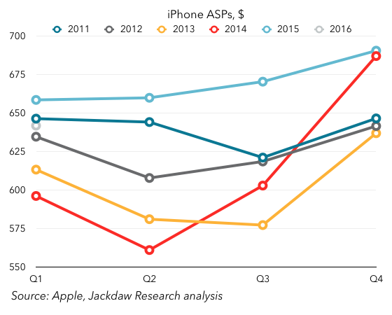
As you can see, at the end of 2014 ASPs dramatically increased as a result of larger, more expensive phones, and higher storage tiers. The 2015 ASPs were above 2014 ASPs for the entire year, but Q1 2016 saw ASPs dip, below the previous year’s number (and below even 2011, which was next highest for Q1). All of this suggests a combination of mix shift toward lower-tier and older iPhones, as well as possible discounting in some markets. Since ASPs have a direct impact on margins, that’s not good news. Worse still, Apple is projecting even lower ASPs in Q2 driven by a combination of inventory changes and sales of the iPhone SE.

Softness in China

China has been a major driver of Apple’s growth over the past couple of years. The relationship with China Mobile, expansion of better cellular networks in China combined with expansion in Apple’s distribution, and then the launch of larger phones all contributed to outsized growth there. Over the last couple of quarters, though, things have changed dramatically:Revenue growth by regionWhereas China accounted for half or more of the company’s revenue growth for several quarters, it’s now accounting for half its year on year shrinkage. One of Apple’s biggest drivers of growth has become a driver of decline. Again, the biggest culprit is iPhone sales and the massive iPhone 6 year, and the underlying decline in Mainland China is much less dramatic than reported results for the Greater China region, which includes Hong Kong. But for the time being, this is more bad news.

What you have overall, between the three major declining product lines, falling iPhone ASPs, and softness in Greater China, is a perfect storm of sorts that’s driving the current problems for Apple. What, then, is the good news in all this?

iPhone decline is temporary and cyclical

As I wrote earlier this week, the most important thing to understand about iPhone growth is that it’s temporary and cyclical. That is, the massive growth Apple experienced over the last 18 months or so was entirely down to the introduction of larger phones, and demand is now simply returning to its prior trajectory. The iPhone shipments number Apple reported was bang on with the projections I shared earlier this week and therefore also absolutely in line with the pre-iPhone 6 trend. That suggests (and Apple’s guidance for next quarter confirms) that iPhone growth should be back on track later this year, at high single digits or low double digits. The iPhone SE will depress margins, especially because it’s going to sell best during the annual trough in high-end sales, but for the same reasons, ASPs should recover by the end of the year when a new flagship phone launches. In the meantime, it should help fill that usual trough in sales a little, boosting sales above where they would otherwise be.

The other thing to bear in mind is that, though the iPhone 6 upgrade cycle was itself something of a one-off, all those who bought phones during that cycle will want to upgrade at some point. What was notable about this down quarter in iPhone sales was that Tim Cook said the last six months were the highest ever for Android switching. That implies that what fell short during that period was upgrades. That, in turn, suggests that when this base of iPhone 6 buyers finally does upgrade in large numbers – likely between 2-3 years from their purchase – we could see another big bump in sales, an aftershock of sorts. The biggest impact would hit in a roughly eighteen month period from this September through the following March, which provides more reason for optimism about longer term iPhone growth.

Signs of iPad recovery

It’s easy to focus on the decline in iPad sales, which has been problematic for Apple over the last several years, especially as the Mac has stopped growing. But the reality is that there are signs of recovery in iPad, albeit not growth just yet. But the rate of year on year decline has been slowing steadily, and on the earnings call Apple took the unusual step of signaling where it thinks they’ll come in next quarter, at least directionally. Here’s the trend line for the past couple of years:iPad year on year growthThat rate of decline has improved for three of the last four quarters. Apple’s guidance for Q2 2016 was that this would be the best year on year compare in two years. That suggests a shrinkage of less than 14% (since Q3 2014 was the previous low within that period, at 14% – I’m assuming the 8% it achieved in Q2 2014 is out of the 2-year window). (Update: I’m told by Jason Snell that it was “over two years” and the transcript confirms that, so the 8% might well be within the window after all). That’s obviously not stellar, but it continues and even improves the trend over the past year or so of slowing declines. As this decline slows, that puts Apple in less of a hole that it has to dig out of.

Reasons to believe the Mac will recover

There isn’t anything in the recent Mac results that provides reasons for optimism – as I said above, the results show a steadily worsening trend in the case of the Mac. However, I believe at least part of the reason for the decline is that as of the end of the quarter, Apple hadn’t updated most of its Mac lineup in a long time. The Macrumors Buyer’s Guide listed the whole lineup as “don’t buy” because of the length of time since the last upgrade. Obviously, the MacBook has since been updated, but the rest of the lineup hasn’t. As with iPhones, the evidence is that new customers aren’t the problem here – Cook made much of the high “new to Mac” numbers this quarter. The issue is once again upgrades, and there we should see better numbers later this year as Apple upgrades the product line with new Intel Skylake chips. The timing of that change is hard to predict, but it should help the Mac revenue growth line turn positive again, helping to offset the smaller iPad decline.

Other new products driving growth

The Apple Watch isn’t broken out in Apple’s results explicitly, but it has contributed meaningfully to the overall revenue line over the past twelve months. The Other Products line where it sits includes both the iPod and accessories, which had been declining fairly significantly, but that segment’s revenues have been growing year on year since the Apple Watch launch. In the first part of this year, that growth is likely to be modest, but once again come the fall things should look better as Apple updates the hardware and drives new sales.

Another interesting new product that’s driving growth is Apple Music, which now has 13 million paying customers. That’s good for a run-rate of a little over $1.5 billion on an annualized basis, and the growth rate (around 25-30k new subscribers per day) should see Apple get close to 20 million by the end of the year, which in turn would drive annualized revenue of $2.3 billion. Given that iTunes Music generated around $4 billion at its peak, and is now generating much less, this new service is on track to begin driving meaningful growth for Apple in the music category again. More broadly, Services continues to be one of the drivers of growth at Apple, driven not just by Apple Music but to a great extent by the App Store too. The good thing about that growth is that it is driven by the growing base rather than sales of new devices, so to the extent that Apple is still adding new iPhone customers, it should continue to grow even as iPhone shipments slow down for a period.

All signs point to a return to growth in the fall

All of this taken together points to another couple of tough quarters for Apple as the perfect storm of declines across its three major product areas, its second most important region, and iPhone ASPs hits home. But it also points to reasons for optimism come the fall, when the iPhone should start to rebound, Mac sales should be stronger, a new Watch should drive sales there, and iPad shrinkage will be lower. The narrative Apple needs to be spinning is less about Services, though those are an important component of future growth, and more about the fact that the current dip in revenues is temporary. There were some references to that in the earnings call yesterday – Tim Cook used the phrase “pause in our growth,” suggesting that he believes this. But of course Apple doesn’t provide guidance beyond a single quarter. That may need to change if it wants to get investors back on board.

The iPhone 6 Blip

On Tuesday, Apple is due to report its results for the March 2016 quarter (Q1 2016 according to the consistent calendar labeling I use for these things on this blog). A major focal point in the earnings report will be iPhone sales, which Apple has already guided will be down year on year. I’ve been contacted by quite a few reporters to ask – in various ways – whether this is bad news for Apple. The thought I’ve tried to articulate in response is that the current quarter is best seen in the context of what you might call the iPhone 6 blip.

What I mean by this is that, if you look at iPhone sales growth over the several years before the introduction of the iPhone 6, there was a fairly clear pattern emerging – one of slowing year on year growth. Growth declined from an average of around 100% in 2011 to around 50% in 2012 to just 15% in 2013, and over the three quarters before the iPhone 6 was introduced, growth rates slowed by roughly 1 to 1.5% quarter on quarter, for an average of 15%. All of this was a sign of the increasing maturity of both the overall smartphone market and the iPhone in particular. Following a rapid expansion into new markets over the years from 2007-2011, Apple was approaching saturation of the available distribution channels, and many of those already in the smartphone market who could afford to buy an iPhone had one or one of its high-end Android competitors. Absent significant switching from Android to iPhone driven by a major change in the addressable market, that’s how things would have likely progressed.

Of course, what happened in late 2014 was that Apple introduced the iPhone 6 and 6 Plus, which did dramatically increase the addressable market for iPhones and drive significant Android switching. The result? A massive increase in the iPhone growth rate, to 46% in Q4 2014, 40% in Q1 2015, and 35% in Q2 2015. For some, this was the new normal for Apple, driving sky-high growth rates in a product that had appeared headed for only modest growth in a saturating smartphone market. Now that the iPhone 6 year is past, however, we’ve seen the first flat year-on-year quarter for the iPhone, and are about to witness the first year on year decline. Hence all the calls from reporters about whether we’re witnessing some sort of crisis.

The reality is that the iPhone 6 line really just caused a blip in the long-term trajectory of the iPhone. It’s impossible to know what iPhone sales would have done absent the introduction of the iPhone 6, but we can at least have a go at projecting sales on the basis of the prior trajectory. Given that growth rates were slowing by roughly 1-1.5% per quarter before the iPhone 6 launch, that provides a good starting point for such an exercise. The chart below shows the actual year on year growth rate (using 51m as a consensus from the professional Apple analysts) and the two projected rates based on 1% and 1.5% quarter on quarter slowing in growth. You can see the blip extremely clearly here:iPhone growth rates actual and projectedNow, if you apply those growth rates to iPhone sales to project what would have happened if Apple had continued as before without the massive bump from the larger iPhone 6 phones, you get this second chart. It shows actual sales (in blue), as well as projected sales using those slowing growth rates in gray and yellow:iPhone sales actual and projectedIt’s a bit hard to tell exactly what’s going on in a chart with so much history, but I’ll zoom in a little bit in the next version, so you can see the last few quarters better:Zoomed actual and forecast iPhone salesIn this chart, you can hopefully see that that consensus point of 51 million falls right between the two projected data points for Q1 2016. In other words, it’s very much in keeping with the long-term trajectory in iPhone sales. The iPhone 6 blip is over, but if iPhone sales land roughly where the analysts expect them to, they’ll be right back on track with where they were headed before the iPhone 6 launched. That’s a big “if” – sales could come in above or below that number, which would suggest either that underlying growth had slowed more dramatically in the past, or that Apple has successfully pushed to a slightly higher long-term growth rate off the back of the iPhone 6 and 6S.

The other big question is what happens in the next few quarters, and whether Apple is able to stay on or above that long-term trend line. Remember that the trend line calls for a 1-1.5% reduction in year on year growth per quarter – on that basis, growth would slow to 6%, 5%, and 4% over the remaining quarters of 2016 with 1% shrinkage, or drop as low as a 1% decline by the end of the year. This is obviously far too precise for a real-world projection, but it gives you some sense of that trajectory if it does continue. It’ll be very interesting to see Apple’s guidance for the June quarter – on the basis of the trajectory, Apple would sell between 39 and 41 million iPhones next quarter. But of course, it’s just launched the iPhone SE, which could change things. Anything below 40 million iPhones (or $40 billion in revenue guidance) is a sign that Apple is dropping below its long-term trajectory, and would be bad news. Anything above that is cause for optimism, at least in the short term.

This, then, is the real answer to the question those reporters have been asking, in the form of another question: Does iPhone growth revert to its long-term trajectory, dip below it, or bounce back above it, in the reported numbers for Q1 and guidance for Q2? The answer to that question tells you what you need to know – at least in the short term – about how you should feel about iPhone sales.

EU Android follow-up

I wanted to post a quick update to my post earlier in the week about the EU’s Android antitrust action, to cover a specific topic in a bit more depth, namely the issue of the EU’s narrow definition of the relevant market. We also discussed the EU’s action against Google in depth this week on the Beyond Devices podcast.

As I said in that earlier piece:

The key to the EU’s finding that Google has dominant market share is a narrow definition of the relevant market here. Instead of treating mobile operating systems as a whole (or even smartphone operating systems) as the relevant market, the Commission has chosen to use “licensable operating systems” as the basis for its determination that Google has dominant market share.

The basis for the EU’s action is that it has to determine three things:

  • the definition of the market in which Android operates
  • a determination that Google’s share of that market is dominant
  • a finding that Google seeks to abuse that dominant position.

The definition of the market is therefore the first item on the list, and an important one. As I mentioned earlier in the week, the EU deliberately narrowed that definition so as to make Google seem more dominant. To illustrate this, the chart below shows Android’s market share as it is normally measured (as a share of smartphone sales) and as the EU would measure it (as a share of sales of devices based on licensed operating systems) in the five major European markets, as estimated by Kantar Worldpanel:Kantar Android market shareAs you can see, by eliminating iOS (and to a far smaller extent BlackBerry and other operating systems) from the equation, the EU quickly raises majority but not dominant market shares into market shares close to or above 90%, which is the figure it cites in its documents this week. In the UK, the difference between the two numbers is enormous – traditional market share is just over half, but share of licensable operating systems is 85%. There’s a certain logic to the EU’s actions given its focus on the relationship between Google and its OEMs, but it’s also very convenient for reaching the conclusion it wants to.

Two Weeks with the iPad Pro

When the new 9.7″ iPad Pro was released a few weeks ago, Apple was kind enough to send me a review unit, which I’ve been testing since. I thought I’d share some of my thoughts on using this device for the past couple of weeks.

Update: I added a little something on the Apple Pencil – I initially left it out because I simply haven’t used it much, but it’s worth noting that fact in and of itself. The addition is near the end of the review.

Initial impressions

My first experiment was to try a day of working solely with the 9.7″ iPad Pro, and I got through a whole day of fairly varied work without needing to use any other computing device. That surprised me to some extent – other than on the occasional business trip, I hadn’t really ever tried to use an iPad as my sole computer, and I really wasn’t sure how well it would go. That first day turned into several days and eventually two weeks, but even after that first day I immediately knew I also wanted to test the larger iPad Pro, and so I purchased one from the local Apple Store (I’ve since returned it), along with a Surface Pro 4 I acquired for testing too. During that period, I used one or other of the iPads virtually exclusively, with a couple of brief exceptions, and found this barely limited my ability to get done what I wanted to.

The first thing I noticed was that the device felt more intimate and personal – instead of staring at a screen sitting a couple of feet away and using peripheral keyboard and mouse that felt very disconnected from the computer, I was engaging entirely with this screen that was immediately in front of me, including touching it occasionally. That felt very different from my usual computing experience in subtle ways. Obviously you get some of the same feeling from using a laptop, but with the iPad it felt subtly different, and I think part of that is because I’m used to thinking of iPads as devices that you hold. Although a lot of my work was done with the iPad resting on the keyboard case, throughout the day I also picked it up from time to time without the case and used it for catching up on Twitter or reading things, and in the evenings it had the flexibility to be used that way too.

For this reason, I love the new modular approach to cases and covers Apple now has – it used to be that you either had a case that included a cover, just a cover, or some sort of keyboard case. But the new modular cases from Apple allow you to have a case permanently attached to protect the body, and then to swap out the plain cover and the Smart Keyboard case at will. This feels a lot more flexible and means you just always use whatever you need at any particular point in time, whether that’s just the case when you’re reading something, the case and standard cover when moving around, or the Smart Keyboard cover and case when you know you’ll need to type. This flexibility is one of the biggest things that sets the iPad Pro apart from the Surface Pro too – the Surface always feels more like a computer than a more personal device like a tablet, whereas the iPad Pro makes that transition seamlessly without feeling either awkward or as though it’s missing an important appendage.

The other big difference I noticed in switching between the iPad and Surface was that the default state on the Surface is an empty screen – the desktop. You have to actively go looking for something to do in the Start Menu, where there’s little consistency in how items are presented with all the different sizes of live tiles. Apps you install don’t even show up there by default and it takes hunting around and then replacing default apps with the ones you choose to get them accessible. By contrast, on the iPad (as on any iOS device) you’re always presented with a screen full of possibilities in the form of a set of app icons. You can, of course, rearrange these icons and swipe through several pages of them to find the one you want, but ultimately the default state is being presented with lots of things you could do next. This, too, makes the iPad feel like a more personal device than the Surface.

Keyboards

I found the keyboards on both sizes of iPad very usable. I’m typing this review on the smaller of the two keyboards, and I’m able to type more or less as fast as on my Mac or MacBook Air keyboards. I don’t find the lack of key travel a problem at all, and I like the fabric on the surface of the keyboard. The smaller of the two is definitely more space constrained, but I find that I can adjust very quickly when switching between devices, and the fact that the keys are raised and nicely separated is very helpful. My one niggle with the keyboards is that the globe icon key for switching between virtual keyboards (e.g. invoking the emoji keyboard) is at the bottom left corner and as such the other keys are shifted over to the right a little from other Apple keyboards. That has meant I’m often either hitting that key by mistake or hitting the control key when I mean to hit the option key, for example. I’m a big user of keyboard shortcuts on the Mac and I found most of them translated easily to the Smart Keyboard, but this one change has caused more errors than anything else in the keyboard. My other frustration with keyboard shortcuts has been that option-deleting hasn’t worked the same was as in OS X, in that instead of deleting whole words at a time, it only deletes single letters as if the option key weren’t depressed. That’s one of those muscle memory things that’s been hard to adjust to on the iPad, and should be easily fixable through a software update.

Performance

For the tasks I undertook on the iPad Pros, there was never a performance issue that felt related to hardware. The devices are snappy for all sorts of activities, app switching happens quickly and without glitches, and on the few occasions where you do encounter bugs they feel like they’ll be resolved soon. I loved being able to use the familiar command-tab shortcut for app switching, and it even implements in a clever way when you’re in split-screen multitasking mode. My one big frustration about multitasking and split screen use is the way you have to scroll through an endless list of apps to find the one you want to have show up on the right side. Some sort of search function here is critical for anyone with a large number of supported apps installed. The work that MacStories has published this week on iOS 10 includes a much better interface for this scenario, and Apple would do well to implement something like it.

I found that many of the apps I use on a regular basis already support split-screen multitasking, and that interface works particularly well on the larger iPad Pro, where the apps get to run more or less full size from a 9.7″ iPad perspective side by side. I did find that some interfaces looked squashed on the 9.7″ iPad Pro, especially web interfaces that are designed to run full screen on such a device, but many others worked very well, and it made comparisons and copying and pasting between apps very easy. I had to find a workaround for working with two web pages at once, which involved installing the Chrome browser for the second screen – as others have pointed out, it would be nice to have the ability to put two Safari tabs side by side in the split screen view.

Limits to productivity

I mentioned earlier that I was able to accomplish more than I expected on the iPad Pro. But there were a few tasks that I found either too cumbersome, too risky, or simply impossible on the iPad, and for which I switched back to a Mac. I also found that a key element of my workflow was impossible to replicate on the iPad, and this was ultimately the biggest issue for me:

  • Recording and editing podcasts – this is something I do at least twice a week in the case of recording and once a week in the case of editing, and it’s essential that it work well. There are ways now to hook up even powered microphones to the iPad Pro, but you can’t feed two apps at once with that microphone, so it doesn’t work for talking on Skype and recording podcast audio at the same time, as others have mentioned. When it came to editing, the iOS version of GarageBand simply doesn’t supporting importing multiple audio tracks and editing them together, even though I use GarageBand on the Mac usually. For all these reasons, I recorded and edited all podcasts on the Mac during my two-week experiment. I mentioned some of this on Twitter, and was pointed to Ferrite as a possible solution for editing podcasts on the iPad Pro, so there may be workarounds for all this, but it was too much work and too risky to test for a critical podcast recording.
  • Document editing workflow – as I’ve written about elsewhere, my workflow involves using the iWork suite to create and edit files, whether spreadsheets, presentations, or documents. But I use Dropbox for storing and syncing those files across computers and making them available on mobile devices. This works fine on the Mac, which has full support for Dropbox at a system level, but it breaks down on iOS. The problem is that Dropbox isn’t available as a source of files to open within the iWork apps on iOS. You can open files from within the Dropbox app, but this process creates a copy, so you’re not modifying the original in real time, and have to export it back to Dropbox when you’re done editing if you want to update the original. There are several possible solutions to this – use Office instead of iWork because Office has proper Dropbox integration, or use iCloud instead of Dropbox because it’s supported natively in the iWork apps. But I prefer iWork for its ease of use and look and feel, and don’t yet fully trust iCloud for syncing really important documents. So I’m sort of stuck when it comes to my current workflow. If I knew I’d be committing fully to an iPad as my only device, I might feel differently, but for now it means it’s tough to carry over my workflow from other devices, which is something many iPad Pro users are likely to need to do. In addition, there are still detailed functions within iWork which simply aren’t available in the iOS versions, even though feature parity is pretty extensive. I found that a little frustrating too.
  • Working with Apple News – I’ve recently started publishing this blog and our podcast to Apple News, something which comes with its fair share of pros and cons no matter which device you’re using (something we talked about on the podcast recently). But on iOS, the Apple News Publisher online interface at iCloud.com doesn’t work. If you visit iCloud.com on any iOS device (even the larger iPad Pro) you get redirected to the mobile site, which is mostly a holding page, but if you request the desktop site through Safari, you get the full site. However, even then, the Apple News Publisher site clearly isn’t meant to work on iOS, and frequently crashes and has other issues. This means if you want to use Apple News Publisher, you have to find some other way to do it than through the WYSIWYG editor online. It’s a new platform, and so maybe better support for iOS devices will come soon.

The iWork feature parity issue and this Apple News problem are indicative of one of the biggest issues I encountered productivity on the iPad Pro – for all that Apple wants to sell these devices as fully-fledged productivity machines, it’s Apple’s own services and apps that continue to hold it back. It’s frustrating that there are a number of Apple’s own apps which don’t support split-screen multitasking yet either. Ironically, you’d be better off in some ways using the Office suite than iWork on these iPads, and that raises an interesting possibility – that the future of mobile productivity marries Apple devices with Microsoft (or other third party) software.

Quick thoughts on the Apple Pencil

My review unit came with an Apple Pencil, and I was particularly keen to try it out. The reality is, however, that there’s very little that I have ever used a stylus for in the past, and that has less to do with the quality of the styli available and more to do with the way I work. I type much more quickly (and legibly and searchably) than I write by hand, and so I always type when I possibly can. I did take notes for a few hours using the Pencil and iPad in place of a pen and notebook, and found it a really solid experience. I was using Microsoft’s OneNote app, which was mostly fine but frustratingly doesn’t explicitly support the Pencil or the associated palm rejection. I tried using the Surface with its pen later for the same task, and found the tactile feel and the resulting handwriting significantly inferior to the Pencil. That’s a bit surprising given how much longer Microsoft has been doing Surface pens, but the difference was undeniable to my mind.

However, I’m not an artist either, and other than for the novelty value, and the occasional bit of doodling in Pigment just for fun, I find myself using the Pencil very little. I think it makes perfect sense that it’s an optional accessory rather than a bundled feature of the iPad Pro – many users aren’t going to need it. I used it enough to be convinced that it would work well should I need it, but I’m fairly certain that I’ll continue to use it only infrequently. My one frustration was charging – it’s not really practical either to charge the Pencil in the standard way (i.e. plugging it into the iPad) while using the iPad or while charging the iPad. Several times, I wanted to charge both devices at night but couldn’t without using the specialized adapter for the Pencil with its own charging cable. That feels like a mistake (and I’m convinced I’d lose the adapter and/or the Pencil’s cap pretty quickly if I were using it more regularly).

Conclusions

After using the iPad Pro(s) more or less exclusively for two weeks, I can say that (with very few exceptions) I’d be happy to do so again in future. I do like the flexibility of my usual Mac Pro setup, but I got a great deal out of using an iPad instead for  a while, not least a greater sense of focus on the task at hand and that sense of intimacy I mentioned earlier. Were I to find myself in a situation where I had to commit to one of these devices full-time, I’d definitely pick the larger iPad Pro – the increased screen real estate allows multitasking and other features to really thrive, and its similarity to the size of a standard laptop helps too.

The reality is, though, that these devices don’t have to fill that role for me. I have other computers available to me, and for a variety of reasons they’ll continue to be my main ones. As such, the smaller iPad Pro feels like a great fit as more of an occasional device – one to use in the evenings, or when I need to go out for a while but stay productive, or when I’m traveling. I’d almost always resisted only taking an iPad with me on business trips in the past, but could see myself relying solely on an iPad Pro for at least short business trips in future.