Amazon’s exploding workforce

One of the things that struck me the most about Amazon’s earnings last quarter was the rate at which it’s hiring, as that rate has always been high, but accelerated significantly this past quarter. Below, I’m going to share a few key charts to illustrate this trend.

These charts are taken from the slide deck for Amazon I put together each quarter as part of the Jackdaw Research Quarterly Decks Service, a subscription service which provides slides on financial and operating metrics on some major consumer technology companies each quarter. I’ll post a screenshot of the slides in the Amazon deck, which went out to subscribers last night, at the bottom of this post. Any reporters reading this can contact me directly to receive copies of this and other decks from the service.

The first chart is the total number of Amazon employees, which includes both full-time and part-time employees, but excludes contractors and temporary personnel, of which Amazon hires many each holiday season:Amazon employees
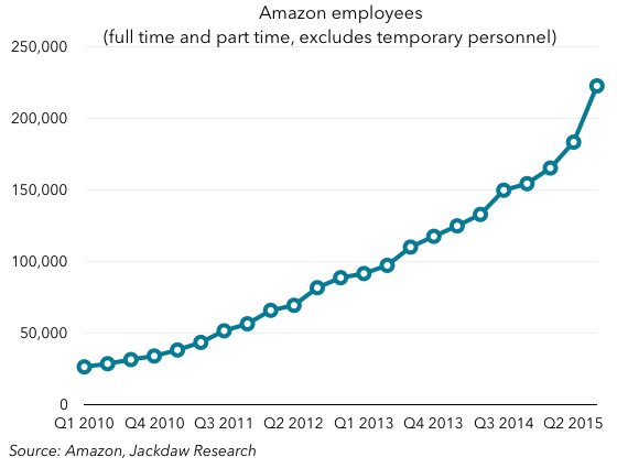
You can see the broad upward trend, but hopefully you can also see the spike this past quarter, which was significantly higher than in previous quarters. To put it in context, let’s look at another couple of charts. The first shows year on year net employee growth and the second shows quarter-on-quarter growth:Year on year net employee growthQuarter on quarter employee growth
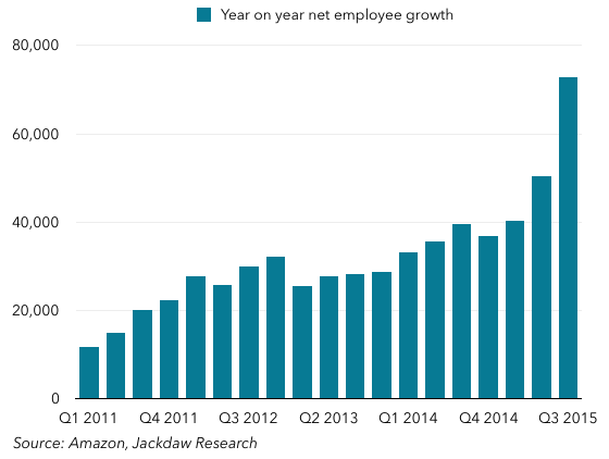
As you can see, in both cases the growth this quarter was well above the historical trend. So what happened? Well, Amazon’s management was asked about this on the call and this was the answer, from Brian Olsavsky, the CFO (as reported by Seeking Alpha):

Headcount was up 49% year-over-year, which is higher than Q2 – we saw in Q2. This is going to be primarily in our ops area. If you exclude ops-related employees, our headcount’s growing actually slower than our FX neutral growth rate of 30%. So, what’s going on in ops is we’ve added 14 net fulfillment centers this year, bringing the total to 123 globally. We’ve added four sort centers in the U.S., bringing U.S. footprint to 23. We’re staffing earlier in those locations, we’re in good shape for the holidays and ready to go.

The other issue is there, the other reason is that we are also doing a lot of conversion of temp workers to full-time workers purposefully. There is a metric employment of full-time hires. So it is a little bit higher due to that program.

The bold text there is mine, because it highlights the major drivers here:

  • Amazon is building large numbers of new fulfillment centers
  • It’s getting those fulfillment centers staffed up to full levels earlier, especially in preparation from the holiday season
  • It’s also converting a higher number of the temporary workers it hires to permanent workers.

All this is particularly interesting in light of the recent New York Times story on Amazon’s working conditions (mostly in office jobs), because this is an unprecedented hiring spree at Amazon, but it’s almost all going into “ops” – or fulfillment and other blue-collar jobs. Indeed, this is reflected in Amazon’s rapidly falling revenue per employee:Amazon four quarter rev per employeeWhereas five years ago Amazon generated over a million dollars per employee, today, it generates less than half that, at $555,000 per employee in Q3 2015, and falling fast. Both the sheer number of employees Amazon has, and the nature of those employees, continues to be one of the biggest differences between Amazon and its business model and all the other big consumer technology companies it competes with. Amazon added 72,900 employees over the last 12 months, which is around 80% of Apple’s total workforce, for comparison’s sake.

Here’s that screenshot of the Amazon slide deck from the Jackdaw Research Quarterly Decks service:Amazon deck screenshot

Quick thoughts on Square’s Q3 2015 numbers

Payments company Square filed an amended S1 with the SEC on Monday, with financial and operating metrics for Q3 2015. I previously talked about Square’s original IPO filing on Techpinions a couple of weeks ago, and today I’m just going to focus on a couple of elements of the new numbers. If you’re not familiar with Square, I suggest you take a quick read through that earlier piece as it will be helpful context for what’s below.

The charts here are taken from more in-depth analysis I do as part of the Jackdaw Research Quarterly Decks Service, a subscription service which provides slides on financial and operating metrics on some major consumer technology companies each quarter. I’ll post a screenshot of the slides in the Square deck, which went out to subscribers last night, at the bottom of this post. Any reporters reading this can contact me directly to receive copies of this and other decks from the service.

As a quick into, here’s Square’s revenue line by product:Square revenue breakdownAs you can see, revenue growth is pretty healthy, primarily driven by core transaction volumes, but helped also by a newer category called Software and Data Products. This is where Square Capital, Square’s cash advance business, sits, along with a couple of SaaS businesses it’s acquired and launched.

Importantly, Square’s gross margins from these different businesses are very varied, as the chart below shows:Square margins by product
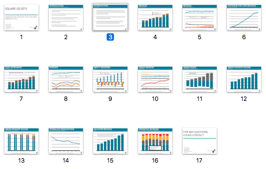
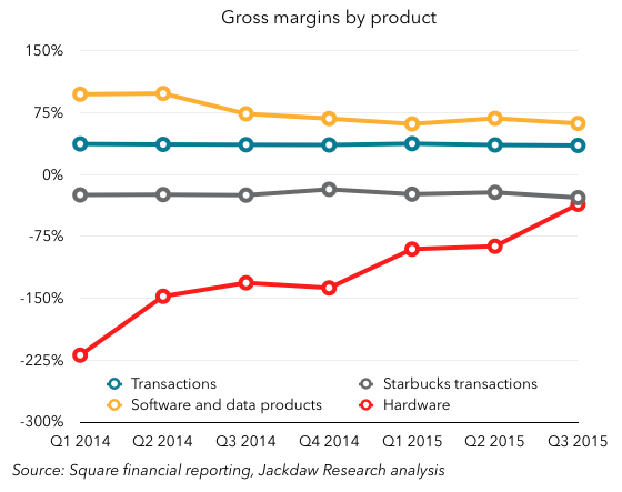
Software and Data Products have had by far the highest margins of all, although they’ve come down as Square has begun to incur costs of revenue around these businesses, which started out at almost 100% margins, with almost no costs. However, the Hardware business has historically been run at a loss, as Square essentially gave away many of its hardware products for free, although it’s now moving to a sell-at-cost model for some of its newer products. Lastly, you can see the huge discrepancy between the gross margins on Starbucks transactions, which have been consistently negative (around 20-30%), and all other transactions, which are very consistent at 35%.

Where things get really interesting is when you look at Starbucks transactions, which are fairly consistent in both revenue and gross profit dollars for now, in comparison to Software and Data Products. Square small segmentsThe latter is now just large enough to effectively cancel out the Starbucks gross loss, and at the current rate of growth it should fairly quickly outweigh it, which should help substantially with overall margins going forward. The ending of the Starbucks relationship (formalized this week with an announcement that Starbucks will indeed be going with another vendor going forward) combined with the growth of the Software and Data Products business are arguably the two keys to Square’s journey to future profitability.

A screenshot of the full set of slides from the Square quarterly deck I sent to subscribers yesterday is below:Square deck screenshot

Apple Music survey results

Related: Apple topic page, all Apple Music posts.

The three-month anniversary of the launch of Apple Music passed at the end of September, which means many of the early trial users have been faced with the decision of whether to become paying customers or to cancel the service. As such, I though it was a good time to run some surveys to ascertain who’s using Apple Music, why, and how. The full results of the two surveys I ran in early October, along with detailed methodologies, can be found in a new Jackdaw Research report, which you can download for free here.

In this post, I’m going to focus on just one of the two surveys (which was run through the MicroHero survey app), and specifically address several theories I had put forward in an April Techpinions column. Those theories were:

  1. Apple’s service, like all other paid music, would be most popular among older demographic segments
  2. Discovery would be an important element of the service, and as such those who thought discovery was important would likely gravitate toward the service in higher numbers than those who didn’t
  3. The integration of users’ owned music libraries was likely to be a key feature too, and as such Apple Music would do well among people who valued this feature.

The MicroHero survey had 500 respondents, which is good for a margin of error of about 4 percentage points, but I’m not claiming that the specific percentages I’ll share below are necessarily representative of the general population. As such, you should focus on the trends and patterns shown below rather than the specific percentages.

 Age patterns

With regard to the age breakdown, there were two interesting findings: younger users were more likely to have tried Apple Music than older users, but older users were more likely to have become paying customers when their trials ended. The charts below illustrate these two findings:MicroHero trial signup by ageFirst off, as you can see, the older users were, the less likely they were to have tried Apple Music – rates were about twice as high for the youngest age group as for the oldest, with some ups and downs in-between. This shouldn’t be surprising, as younger users are typically more tech-savvy, more aware of new trends, are bigger users of music streaming services in general, and so on.

However, when looking at those who did trial Apple Music, older users were far more likely than younger users to have converted their trials to paid subscriptions:MicroHero sub status by ageAs you can see, the percentages here are virtually reversed, with the under 35 age group canceling at roughly the same rate as the 35+ age group became paying subscribers. Again, this shouldn’t be too surprising, even though it’s a reversal of the age pattern for trials. Older listeners have always spent more on music than younger listeners, who tend to have less disposable income and more time on their hands, often giving them a higher tolerance for the disadvantages associated with free music (whether bootleg concert tapes, recording songs off the radio, or listening to music with frequent ad interruptions, depending on the era).

The importance of discovery

One of the early questions in both surveys asked respondents to rank various features of music streaming services in order of importance. Discovering new music wasn’t the top-rated feature, but for those respondents that did rank discovery as highly important, the rate of conversion to paid Apple Music subscriptions was higher than the average. The chart below shows how this group compared to the overall base of respondents on their conversion to paid subscriptions:MicroHero Discovery conversionAs you can see, the rate of conversion for those who prioritized discovery was similar to the rate of conversion for the 35+ age group we saw above, and significantly higher than the average. This is a great validation of Apple’s strategy to promote discovery as an important feature of Apple Music, which seems to have paid off well.

Owned music integration less important than expected

Conversely, users who said the integration of their own music into a music service was very important didn’t appear to favor paid subscriptions at a different rate from the rest of the respondents, contrary to my theory from April. However, when I asked respondents who had decided to become paid subscribers why they did so, integration of their own music was something over 50% of them said was a significant factor. Below are the results for this question from the second survey, which was run through Qualtrics:Qualtrics features likedAs you can see, two other features actually ranked higher than the integration of owned music – the integration of Apple Music within iOS (through features such as Siri), and discovering new music. As such, my hunch that owned music integration would be important was borne out somewhat, but not as strongly as my theories about age and discovery.

These and quite a few other findings are outlined in more detail in the report, which features 23 charts in total, relating not just to Apple Music in particular but music consumption habits in general. Again, you can download the report for free here.

Operating system user bases

Related: two previous posts on the patterns in Android adoption rates (December 2013, March 2014), a post contrasting iOS and Android adoption patterns, and a post from last month on iOS 9 adoption.

Both Apple and Google have just updated their mobile OS user stats, while Microsoft shared a new number for Windows 10 adoption at its event this week, giving us a rare opportunity to make some comparisons between these major operating systems at a single point in time. We now have the following stats straight from the sources:

  • The stats provided by both Apple and Google on their developer sites with regard to the user distribution across their mobile operating systems (Android and iOS)
  • The 110 million Windows 10 number provided by Microsoft this week
  • The 1.4 billion total active Android user base number provided by Google at its event last week
  • Total Windows users of around 1.5 billion, as reported by Microsoft several times at recent events.

In addition, there are various third party sources for additional data, including NetMarketShare and its estimate of the usage of other versions of Windows. Lastly, I have estimated that there are roughly 500 million iPhones in use now, and around 775 million iOS devices in use in total (including iPads and iPod Touches).

If we take all these data sets together, it’s possible to arrive at a reasonably good estimate for the actual global user bases of major operating system versions at the present time. The chart below shows the result of this analysis:User bases all iOSThere are several things worth noting here:

  • Each company has one entry in the top three, with Microsoft first, Google second, and Apple third.
  • However, only one of these entrants is the latest version of that company’s operating system (iOS 9), while the other two are the third most recent versions (Windows 7 and Android KitKat).
  • Google has three of the top six operating systems, none of which is its latest operating system (Marshmallow, released this past week). Even its second most recent version (Lollipop), now available for a year, is only the third most adopted version after KitKat and Jelly Bean.
  • Both iOS 9 and iOS 8 and the three most used versions of Android beat out every version of Windows but Windows 7.
  • The most recent versions of the three companies’ major operating systems are used by a little over 400 million (iOS 9), 110 million (Windows 10), and a negligible number (Android Marshmallow) respectively.
  • The second most recent versions are used by around 330 million (Android Lollipop), around 250 million (iOS 8), and around 200 million (Windows 8) respectively.

There are lots more data points to tease out here, but to my mind it’s a striking illustration of the differences in the size and adoption rates of these three major operating systems.

Two additional thoughts

Just for interest, I’m including a couple of additional thoughts below.

First off, here’s the same chart, but with iOS reduced to just the iPhone base. The order changes a fair amount, but iOS 8 and iOS 9 still make a good showing:

User bases based on iPhone onlyLastly, I wanted to revisit my post from a couple of weeks ago about the initial adoption of iOS 9, especially as it relates to Mixpanel’s data. In that post, I showed how Mixpanel’s iOS adoption data tends to be pretty close to Apple’s own data except for the month or so after a new version of iOS ships, when it tends to skew way lower than Apple’s own data. Now that we’re a few weeks on from the initial launch, and Apple has released the second set of iOS adoption data since the launch, I wanted to revisit that pattern. Interestingly, the very same pattern is playing out again – despite the initial significant discrepancy, Mixpanel’s data is now once again very close to Apple’s own:Mixpanel iOS data October 2015

The two Twitters

Related: Twitter topic page, with links to all my earlier Twitter posts.

With the launch of Twitter’s Project Lightning and the Moments feature this week, Twitter is reinforcing an important point about Twitter and its future: there isn’t one Twitter, but two. Moments is part of one Twitter, while almost everyone writing about is part of the other, and as such many of those people seem baffled by it.

Twitter 1: Power users and broadcasters

The first Twitter is made up of what you might call power users and broadcasters. That is, these are people who use Twitter a great deal, and most of them have likely spent significant effort doing the following things:

  • Carefully choosing accounts to follow
  • Building up a following
  • Regularly tweeting themselves
  • Engaging with other Twitter users through @replies, DMs, retweets and so on.

Twitter 2: Casual users

The second Twitter is made up of what we might call casual users – people who are trying Twitter on for size, dipping in and out occasionally, or perhaps signing up for a specific short-term purpose with no intention of engaging long-term. These users make up a fairly substantial portion of Twitter’s current audience, but also more importantly the vast majority of the users it has lost over time (who in turn make up the majority of those who have ever tried Twitter). Many of these users have likely never spent significant time   doing those four things I talked about above, and aren’t likely to.

Moments is for Twitter 2

The key thing about Moments is that it’s for Twitter 2, not Twitter 1. And yet the vast majority of the people writing about it are Twitter 1 people – power users and broadcasters. And I’m seeing all these people complaining on Twitter that they don’t find Moments useful, that it isn’t customized based on the accounts they’re already following, and so on. And that completely misses the point.

Just over a year ago, I wrote a piece called “Twitter’s channel model is broken” in which I argued that:

Twitter is effectively an a la carte TV service with hundreds of millions of channels on offer. The burden is on the user to choose individual accounts to follow, which can be an overwhelming experience.

I went on to say:

…live TV only works because you just have to turn on the TV and something is there. If you don’t like it, you change the channel. But on Twitter today, there’s literally nothing on until you explicitly tell the service what you’re interested in, and if you don’t like it, it’s a lot of work to change channels, because you effectively have to create each channel yourself in a very manual and labor-intensive fashion. It works fine once you’ve created a channel you’re happy with, but I suspect many users never reach this point and thus don’t use the service often or abandon it altogether.

Moments as it works today is the implementation of the model that I talked about here. The whole point is that it doesn’t require any training, just like turning on the TV doesn’t require any training – something will be there, and if you don’t like it you can change the channel. Moments provides these channels which can be instantly available the moment someone signs up for the service. If I were Twitter, I would probably allow people to skip the signup process entirely, at least temporarily, but perhaps that will come in time.

I have no doubt that Moments will get better over time and that it will eventually become more customized and curated based on your existing interests. But the whole point for now is to create an easily-consumable product that doesn’t require any work up front. And that’s going to be the key to Twitter’s growth going forward, because Twitter 2 is where all the growth is. Reducing friction in setup and use of the service for these users is therefore a critical element in Twitter’s future success.

Feeding Twitter 1

The big risk is that Twitter will focus so much on Twitter 2 that it fails to feed Twitter 1. Twitter 1 is the most vocal Twitter, and essentially all the influencers – whether celebrities, power users, or reporters – are in Twitter 1. Ignoring Twitter 1 as the company focuses on Twitter 2 would be a huge mistake, especially because so much of the content consumed by Twitter 2 is provided by Twitter 1. There’s a symbiotic relationship here, and one that Twitter has to be very careful not to disrupt.

Two Twitters

The problem is that Twitter has another goal it’s trying to achieve: monetization. Twitter’s monetization strategy involves serving up ads, which in turn requires that people use Twitter’s own apps or its website to consume those ads. And yet Twitter 1 disproportionately uses third party clients like Tweetbot and Twitterrific. Because of Twitter’s insistence on monetization through advertising, and its general discouragement of clients that replicate the core Twitter experience, it’s started withholding some important features from the API it makes available to third party clients. My own Twitter client of choice is Tweetbot, which just received a big overhaul with lots of cool new features, but which is unable to show group DMs or the recently released Polls feature. If I only ever use Tweetbot, I am simply never aware that I have group DMs (several of which I’ve missed as a result), and tweets with polls just look rather empty because there’s no indication that there is anything other than the text there.

At this point, Twitter has an important decision to make: should it begin to make some concessions in order to feed Twitter 1? There are signs that it’s starting to do so, as some Verified users are no longer seeing ads in the Twitter client. This is an interesting example of recognizing the value that Twitter 1’s most influential users have, and granting some favors in return. Shutting off ads might cause some power users to use the first-party client again, but if Twitter is forgoing revenue from these users anyway, why not let them use the clients they want, and give the makers of those clients access to the new functionality too through APIs? The third party clients are limited already by the caps Twitter put on user growth a while back, so there’s little danger here of mass adoption of new clients.

The fact is, Twitter needs to do more to publicly acknowledge and respond to this increasing bifurcation between the two Twitters if it’s to avoid the core experience becoming unusable for both groups as it seeks to bridge the gap between them. Releasing a true power-user client of its own (not the buggy mess that is Tweetdeck) or re-embracing third party clients would be an important step in this direction.

Every device is a compromise, part 2

In May last year, when Microsoft unveiled the Surface Pro 3, I wrote a piece about the new device but also about the way it was unveiled, titled, “Surface Pro 3, like every other device, is a compromise.” In that piece, I wrote about Microsoft’s insistence that the Surface Pro 3 was a no-compromise device, when in fact all devices represent compromises of one sort or another. I went on to say:

The biggest change in Microsoft’s Surface strategy over the last several years has been the locus of the compromise it’s still inevitably making. The first Surfaces were intended to be good tablets first and good laptops second (and ended up being neither). But with the Surface Pro 3, Microsoft has created a competitive laptop first, and a compromised tablet second. But it’s still pretending that there’s no compromise, and that is why the Surface line will continue to perform poorly. At some point, Microsoft has to stop pretending that a single device can meet all needs and start optimizing for different use cases with different devices, just like every other manufacturer.

Fast-forward to today, and we got the next version of the Surface Pro, the Surface Pro 4. And we saw two of the same phrases from that first event repeated: “no compromise” and “the tablet that can replace your laptop. So far, so predictable.

But then, immediately after the SP4 was introduced, we were shown the Surface Book. Which is a laptop. And Panos Panay, the presenter, started out by talking about all the things a laptop does that the Surface Pro does poorly – a better typing experience, a bigger screen, and so on. This was one of the most bizarre juxtapositions I’ve ever seen at a tech event. After 30 minutes of talking about how the Surface Pro 4 could replace your laptop with no compromises, the very same presenter offered up a laptop which was clearly better, because it didn’t make certain of those compromises.

Taking a step back for a minute, both products look really promising. I’ll withhold final judgment until I get to use these devices (or at least until others I trust have done so and shared their opinions). But this “no compromise” nonsense continues to do a massive disservice to Microsoft and to its customers. As I said in that earlier piece, every device involves a compromise. That compromise might involve features, functionality, look and feel, size, weight, price, or any number of other elements. But every device does involve compromises. And instead of pretending that it doesn’t, Microsoft needs to embrace what’s distinctive and best about each of the devices it offers. However, when you look at the Surface Pro 4 and Surface Book side by side, you start to realize that the Surface Book is really just the concept of the Surface Pro taken to its logical conclusion – thin, light, with a detachable keyboard and pen.

Is there anything that the SP4 does better than the Surface Book? Yes, it’s slightly smaller, and quite a bit lighter than the Surface Book if the keyboard is attached. To my mind, the only benefit to the SP4 is that it’s cheaper – in other words, it’s an inferior but more affordable version of the Surface Book. By the end of the Surface Book demos, I saw people asking on Twitter, “why does Microsoft even need the Surface Pro 4?” and as far as I can tell, the answer is “because the Surface Book starts at $1499”.

One quick comment on OEMs. Unlike the Surface, with which Microsoft said it was creating a new category, and therefore has somewhat been able to skirt around the fact that Microsoft is now competing with its partners, the Surface Book was not burdened with any qualifiers. It was simply positioned as the best, the thinnest, the most powerful Windows 10 laptop. Period. If I’m one of Microsoft’s OEM partners, I’m betting I’m not very happy about that at all. However, those OEMs have only themselves to blame if Microsoft, which has zero experience in making laptops, is able to produce a more compelling computer than the OEMs that have had decades of experience. What does it say about Microsoft’s OEM partners that Microsoft has been able to do this to them, and that it’s willing to do so? The one saving grace is that the vast majority of Windows PCs are sold at well under $1500, and so this really isn’t targeted at the core of the Windows PC market. But it’s still a finger in the eye of the Windows OEMs.

Lastly, this parting thought. Satya Nadella took the stage at the end of the event and gave the kind of speech he’s given at almost every event Microsoft has had since he took over as CEO – big picture themes, Microsoft’s mission statement, and so on. I’m a fan of Nadella, but this speech felt like so much waffle after what was a really compelling set of device introductions. All the energy seemed to go out of the event when he took the stage. The other thing that happened was that, as he mentioned them, I suddenly remembered that Microsoft had introduced a new Band and the Lumia 950 devices earlier in the event. I had almost completely forgotten those by the time the Surface stuff was over with. They were so completely overshadowed by what came after, and for all Panos Panay’s attempts at enthusiasm about the Lumias, it was very clear that he had inherited those products and his true loves were the Surface products. I might still write about the Lumias separately at some point, but for now I see little in them that’s going to transform the fortunes of Windows Phone or Microsoft’s phone hardware business.