Last quarter, I provided an overview of trends among the major US wireless providers in Q1 2014, and I’m repeating that analysis here for Q2 2014. A short preview including some analysis has been available on FierceWireless for the past week. I’m now providing additional analysis (below) and a detailed set of slides on Slideshare (also embedded below). Last quarter’s analysis is here, and a recent post on Sprint and T-Mobile, which provides further analysis is here.
This analysis covers five providers: AT&T, Sprint, T-Mobile, Tracfone and Verizon Wireless. Four of these are the largest carriers in the US market, and Tracfone is the fifth-largest provider, though not a carrier but an MVNO. There are other MVNOs in the US market, but none of them comes close to Tracfone in scale, and that’s why it’s included in this analysis. It’s also the largest prepaid provider in the US by some margin. These five providers between them make up the vast majority of the US market, especially since the acquisitions of Leap Wireless and MetroPCS in the last couple of years by AT&T and T-Mobile.
A tale of two markets
In many ways, the US wireless market is in fact still two separate markets, with AT&T and Verizon in one half, and the other players operating in the other. This is evident in total subscribers and revenues, margins, churn rates and other metrics, with AT&T and Verizon either larger or performing significantly better than the rest of the players. Here, for example, is a chart showing total subscribers for the five players: And here is a chart showing EBITDA margins:
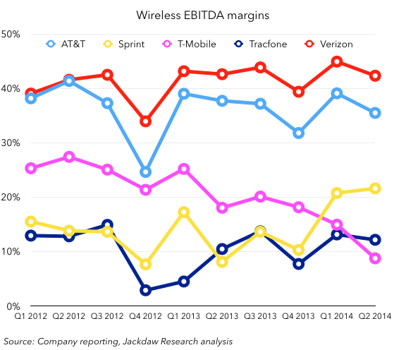 These carriers’ relative scale and profitability are related, as I’ve discussed previously, and most recently in last week’s post on Sprint and T-Mobile. This is perhaps the most important fact to understand about the US market, and one that isn’t likely to change anytime soon, as the gulf between the two largest players is far too great for any of the smaller players to bridge in the near future, at least organically.
A varied mix of subscribers in the base
There’s a pretty varied mix of subscribers in the base at each of the five major providers, as shown in the chart below (note that Verizon doesn’t report anything other than retail subscribers, so its wholesale and connected devices subscribers are not shown):
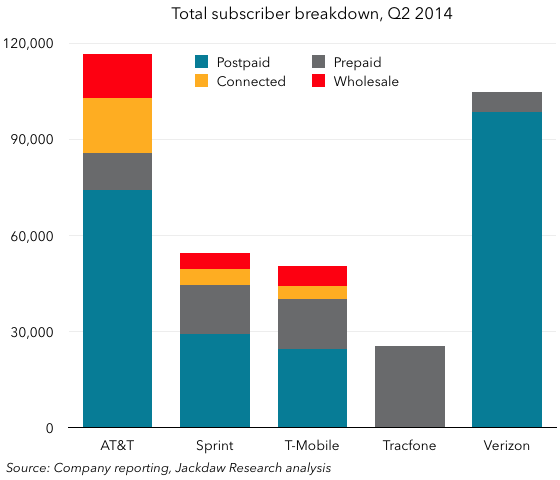 AT&T leads in overall subscribers, at least without Verizon’s wholesale and connected subs. Verizon is by some margin the largest postpaid carrier, and has relatively few prepaid subscribers. Tracfone on the other hand is the smallest of the five in total, but the largest prepaid provider. AT&T has the largest number of both connected devices and wholesale subscribers. Each carrier’s mix of subscribers is pretty different, with the exception of Sprint and T-Mobile, which have fairly similar bases in both composition and size.
To understand growth, look at gains and losses
The industry tends to focus on net subscriber additions as its main subscriber growth metric, but of course behind net adds sit two other important numbers, which each have a significant effect on overall net adds: gross adds and subscriber losses. The net adds picture looks like this over the last couple of years:
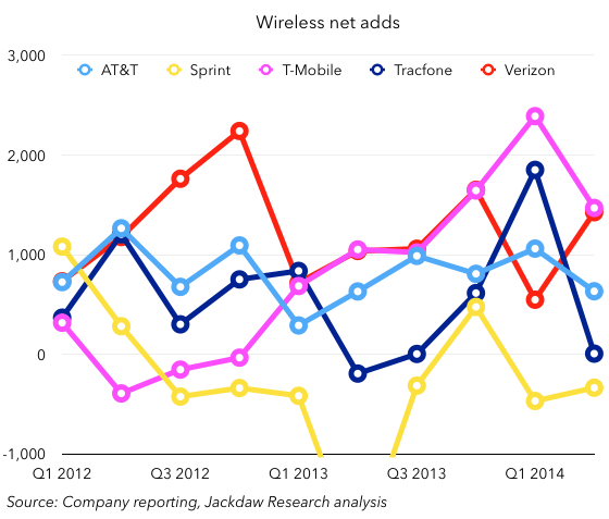 What this chart shows is that, after being the worst carrier among the five for some time, T-Mobile has shot up over the period of about a year to roughly equal Verizon Wireless as the provider with the highest net adds. The two have mirrored each other very closely for several quarters now, with only last quarter as an unfortunate anomaly for Verizon, though it’s quickly recovered. But there’s more to this story, as we’ll see below, if we look at gross adds and losses in postpaid. Few carriers now report either of these metrics directly, but they do provide net add and churn figures, which allow us to estimate gross adds and losses fairly accurately for the postpaid segment. This first chart shows postpaid gross adds for the four major postpaid carriers:
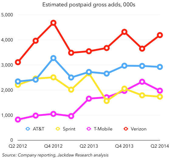 What this picture shows clearly is that T-Mobile isn’t winning simply on the basis of adding more subscribers in total – in fact, it’s well behind Verizon and AT&T on this metric, and only just ahead of Sprint. So what explains its strong performance? Better churn, as shown in this chart illustrating subscriber defections:
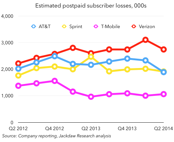 T-Mobile loses by far the fewest postpaid subscribers of any of the big four carriers, at around one million per quarter pretty consistently over the last year. Verizon, conversely, loses the most, but makes up for it with big gross adds. Sprint’s problem, on the other hand, is that it loses subscribers at about the same rate as AT&T, but has a base half the size, so these subscribers represent a far greater percentage of its base.
Postpaid subscribers, of course, don’t tell the whole story, as the chart below shows; just as each carrier’s base is different, their net add mix is different too:
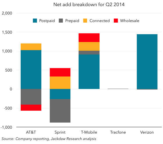 Verizon’s net gains are almost all postpaid, with tiny prepaid losses. But T-Mobile’s very similar overall net adds are made up of a much more diverse mix, with connected devices and wholesale each making up a couple of hundred thousand, and prepaid a smaller number. AT&T, on the other hand, saw losses in prepaid and wholesale while gaining connected devices subs. And Sprint’s wholesale and connected bases grew, while both categories of retail subs shrank.
T-Mobile leading net adds, but only barely ahead of Verizon. Actually, tracking Verizon very closely (though of course Verizon’s number is retail only), with exception of Q1. Big achievement for TMO – is it sustainable? Behind that, of course, very different gross add/net add numbers. Also, different breakdown in net adds itself – Verizon all retail, 90%+ postpaid. T-Mobile much more of a mix than it’s seen before, with first significant contribution from tablets, but also decent connected and wholesale numbers.
AT&T in transition
Of all the carriers in this group, AT&T is going through the biggest transition at present, with a very aggressive shift towards Mobile Share plans at 10GB and higher driving both positive and negative changes in key metrics. The background is that over the past few months, AT&T has aggressively approached existing customers on traditional plans, and offered to effectively remove the subsidy cost from their service plans if they switch to Mobile Share plans with allowances of 10GB or higher. For customers in the middle of a contract, this has the effect of reducing the total monthly payment even though they end up with a larger data allowance. As such, this has been an attractive proposition for customers, who appear to have switched in large numbers. There were several results from this move:
- AT&T’s postpaid churn dropped to unheard-of levels, besting Verizon for the first time in years, at 0.86% per month.
- It moved about 18% of its base off the traditional subsidy model in a single quarter. Seventeen million subscribers are now on a “pre-Next” plan, paying Next-level service plans but without the device payments, of which some 90% will likely migrate to installment billing the next time their contract is up.
- ARPU began to fall sharply, as shown in the chart below, as AT&T removed the subsidy cost for these pre-Next customers without replacing it with an installment billing plan. With just seven million customers on Next plans so far, a much smaller number is paying for a device in installments yet, and so overall revenues and ARPU were dented.
Here are several ARPU metrics for AT&T over the last few quarters:
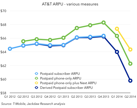 Postpaid subscriber ARPU is a metric AT&T has reported in the past but now no longer reports, and is shown by the light blue line. However, using postpaid service revenue and subscriber figures AT&T does provide allows us to calculate it pretty accurately, as shown in the dark blue line. The green line represents postpaid phone-only ARPU, which AT&T has begun reporting, and which is slightly higher than total postpaid ARPU because it excludes tablets, which have lower ARPU. Lastly, the yellow line represents postpaid phone-only ARPU plus Next billings, i.e. installment device payments. This is the best representation of AT&T’s total revenue per postpaid phone customer going forward. But for now it’s still falling, because of all those “pre-Next” customers paying Next-like service plans but not yet paying for their own devices. Over the next few quarters, as pre-Next subscribers come up for renewal and switch in large numbers to Next plans, this ARPU curve should start to flatten and then go back up, but until then both revenues and ARPU will appear to be trending alarmingly downwards.
Installment billing impact seems to be muted
There’s been lots of debate about the impact of the shift to installment billing, and AT&T’s falling ARPU is arguably one result, though as we’ve already discussed it’s temporary in nature. The bigger question for many people is what it will do to device sales. So far, though, the answer seems to be that it will be pretty minimal. Here’s the number of smartphones sold per quarter, and below that the percentage of the base upgrading in each quarter:

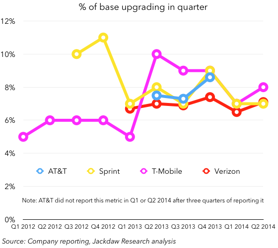 There doesn’t seem to be any clear upward or downward trend in either of these metrics at any of the carriers (note that we ought to focus on year on year comparisons rather than sequential ones because there’s high seasonality in smartphone sales). T-Mobile is about the only carrier that seems to have seen a significant shift either way, but it sold more smartphones while seeing a smaller percentage of its postpaid base upgrading in the quarter, so it’s a mixed bag. Most likely, its higher number of smartphones sold is a function of its higher gross adds rather than its shift to installment billing. Each of the other carriers seems to have seen fairly stable results. As such, any device vendor hoping for a big bump from the shift to installment billing will be disappointed so far, though they may be relieved to know that customers paying for their own devices doesn’t seem to have dampened spending either.
Interestingly, all four carriers have over 70% of their postpaid base on smartphones, with over 90% of sales to these customers in the quarter being smartphones. Verizon is the laggard here, reflecting its relatively conservative (and older) base, with Sprint out in front and Sprint and AT&T in the middle (these charts along with many others are in the slide deck).
Tablets are doing better with carriers than overall
One other interesting device-related tidbit is that tablet sales are actually doing pretty well among the carriers, even as they seem to be faltering overall:
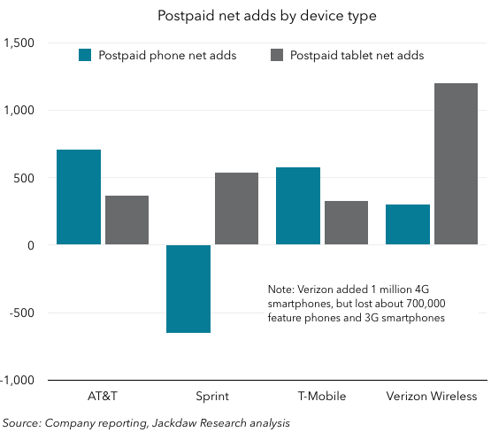 Both Sprint and Verizon saw stronger postpaid tablet net adds than phone net adds, while T-Mobile saw its first good tablet net adds in the quarter and AT&T added a few hundred thousand too. It appears that, even as overall tablet growth slows, tablets with cellular connections are being bought and attached to carrier networks in pretty healthy numbers. It’s likely that this is in part due to the heavy discounts and promotions which certain vendors such as Samsung and LG are offering along with smartphone purchases. Incidentally, Verizon’s phone net adds were low again in Q2, though not as bad as in Q1, when it sustained heavy feature phone losses to the competition without making it up on smartphones. This quarter, it rebounded nicely in smartphones but still lost lots of 3G smartphones and feature phones, leading to only a small gain in postpaid phone subs.