Following Microsoft’s earnings is always interesting, because like any other company it releases many of the key data points in its press release, but to a greater extent than others it releases lots more little details in its regular quarterly SEC filings. And once a year, the 10-K provides an additional set of very interesting data. As such, I often hold off on writing analysis of Microsoft’s earnings until all these details are out. This piece builds on past pieces on Microsoft’s earnings, in some of which I’ve laid out the methodology I use for calculating some of the revenue numbers for individual businesses. Last year’s deep dive following the release of the 10-K is here.
Note: here as elsewhere on this blog, I use calendar quarters rather than companies’ fiscal quarters in my commentary and in charts. The only exceptions in this piece are specific references to Microsoft’s fiscal years (denoted as FY 2015 etc.)
Because this is a longer post, I’ve provided some links to specific sections below:
Employee numbers paint a stark picture of the Nokia acquisition
I’ll start with some of the stuff that Microsoft only reveals once a year in the 10-K, and that’s employee numbers and a product-level breakdown of external revenues.
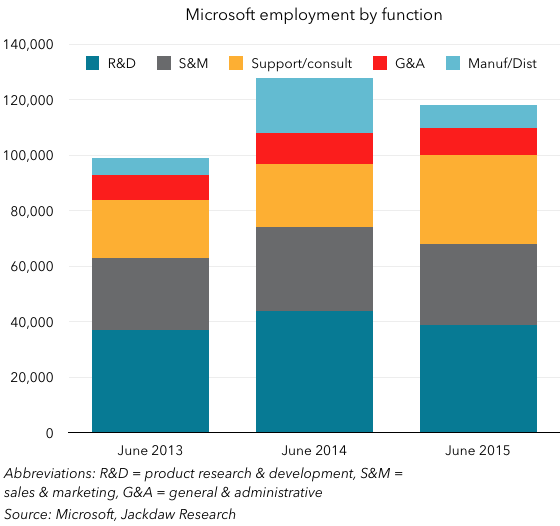
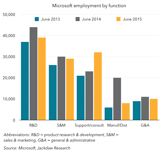
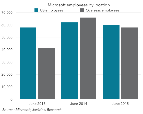
From an employee perspective, the overall number is always interesting by itself, but this time around I found the categorization of the workforce particularly interesting. The three charts below show this split both by job function and by geography.
This first chart gives you some sense of the overall numbers as well as how they break down. As you can see, the workforce two years ago was just under 100k, but a year later it was almost 130k. What happened? The acquisition of Nokia’s devices business (NDS) is the main answer. But of course, since the acquisition Microsoft has pared back that workforce quite a bit. As I wrote in my piece on the Nokia impairment a few weeks ago:
By the time it’s done with the layoffs announced today, Microsoft will also have jettisoned around 80% of the employees associated with the Nokia acquisition. It took on around 25,000 (down from the 32,000 originally anticipated) when the acquisition closed, but laid of around half three months later, in July last year. Now, a year later, it’s losing another 7-8,000, taking the remainder down to just 5,000, or 20% of those originally brought on board.
Some 25,000 of that 29,000 bump from June 2013 to June 2014 was Nokia-related, but by June 2015 the number was back down to 118,000, or 10k lower, but that’s the net impact after hiring in other areas. The most dramatic impact from a job function perspective was manufacturing and distribution, which is shown in light blue at the top of the columns below, and is broken out separately in the second chart below. It’s also worth noting the strong growth in the Product Support and Consulting category during the last two years – this is organic hiring to support some of Microsoft’s newer businesses, and it’s accelerating rapidly. The third chart shows a geographic breakdown, and there too you can see the dramatic impact of the Nokia acquisition on overseas employees (up 25,000 exactly from 2013 to 2014) and subsequent loss of 8,000 of those employees a year later.
 Product revenue breakdowns
I always do quite a bit of reading between the lines every quarter to establish estimated figures for various product lines, but once a year Microsoft gives us a breakdown of “external revenues” from major product lines. This is about the only way to build a complete picture of products like Windows and Office, which are otherwise spread through Microsoft’s various reported segments. The chart below shows this breakdown on a stacked basis: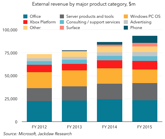 As you can see, reported revenues have grown strongly for each of the last few years. However, these aren’t pro forma figures: the acquisition of NDS isn’t factored into past years’ revenues, so both in FY 2014 and in FY 2015 Microsoft got an artificial bump from NDS (in 2014 only for a very short period since the acquisition closed late in the year, and in 2015 for a full year’s worth of revenues). If you compare 2015 to 2014, you can see that Surface and Phone by themselves accounted for essentially all the growth in that period. Strip out the Phone business alone and revenue would have been roughly flat. But underneath that, there’s actually a lot going on too, as the year on year growth rates below show:
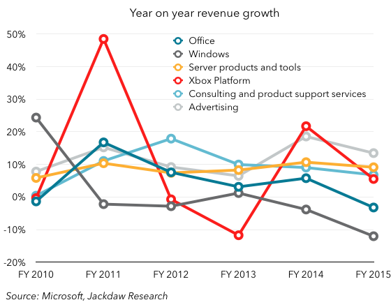 Xbox is easily the spikiest of these revenue sources, rising and falling with new product releases as you can see in 2011 and 2014. Windows has seen the most dramatic fall, from strong growth in 2010 to flat growth the next few years and now negative growth (in part, but not entirely, due to currency effects). Office, too, has seen a steady decline and shrank this past year. Server Tools and Products and Consulting and Support services are the most consistent growth drivers for Microsoft at this point, while Advertising has also contributed strong growth most quarters (and the rate of growth will increase with the disposition of the display advertising business). What’s interesting to me, though, is the paucity of information about the sale of the display ad business to AOL – the only references to it label it as outsourcing of the business to AOL and AppNexus, but there’s no discussion of the impact on revenues going forward or anything else. My past calculations – shared in that earlier post linked to above – suggest that this business was worth just under a billion dollars a year, so it’s not nothing. The omission of any discussion of this impact in the 10-K feels odd.
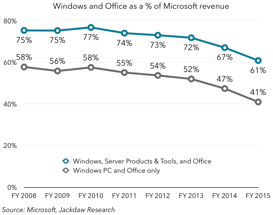
As a result of all this, the two historical mainstays of Microsoft’s business – Office and Windows – make up an ever smaller proportion of the company’s revenues. If you take the PC version of Windows alone, that and Office now account for just 41% of Microsoft’s revenues, while adding in Server Products and Tools brings the total up to 61%. Obviously, the addition of NDS is a big reason for the drop off the last two quarters, but as we saw above Windows and Office are also shrinking in their own right.
 Lastly, it’s interesting to note that Microsoft did indeed hit a milestone I had predicted they would this time last year: international revenues have now eclipsed domestic revenues for the first time in Microsoft’s history, at least on an annual basis, though the transition probably happened sometime in the second half of FY 2014.

Cloud revenue, AWS, and growing margins
Last quarter, when Amazon first broke out AWS revenue separately, I wrote a piece comparing Microsoft and Amazon’s respective cloud revenue buckets, and provided all kinds of caveats about the limits to the comparability of these two businesses. Here, then, is an update based on information in the 10-K: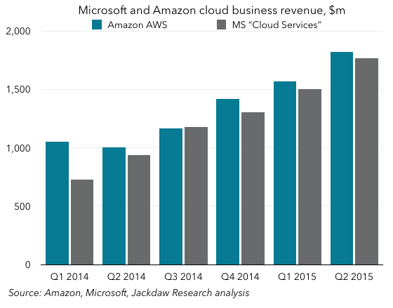 Essentially, the pattern from last quarter continued – AWS remained just a little ahead of Microsoft’s “Cloud Services” reporting line this quarter, and for the last four quarters was just ahead at a hair under $6 billion, compared to just under $5.8 billion for Microsoft. Interestingly, though cloud services are not one of the product lines Microsoft breaks out in the numbers I analyzed above, they are broken out just below that, rounded to $5.8 billion, and Microsoft says they’re reported in several of those segments that are reported.
Unfortunately, unlike Amazon, Microsoft provides no good sense of how profitable this business is. The only small hints are references to data center spending sprinkled throughout the 10-K. They include this interesting snippet in a description of Microsoft’s main drivers of expenses:
Our most significant expenses are related to compensating employees, designing, manufacturing, marketing, and selling our products and services, datacenter costs in support of our cloud-based services, and income taxes. (emphasis added)
Further along in the 10-K, we get another mention of data center costs, which apparently rose by $396 million in FY 2015. Given that cloud services revenues rose by $3 billion in the same period, that’s almost nothing. Obviously, data center costs aren’t the only expenses associated with cloud revenue, but they have to be one of the largest. In FY 2014, by contrast, data center costs rose by $575 million, while revenue rose by $1.5 billion, so the return on that investment is increasing significantly. Gross margin in the bigger segment that commercial cloud services are part of (Commercial Other) rose significantly – by $2.3 billion or 126% – in FY 2015, much of which was due to Office 365 growth at enterprises, as well as growth in Azure. Total cost of revenue in this same broader segment only grew $946 million, or 17%, so it’s clear that Microsoft is hitting its stride in terms of achieving economies of scale and higher margins, though it’s still elusive exactly what level those margins have now reached.
A broader look at margins
If we take a step back and look at that larger segment, Commercial Other, we can see that gross margins are rising steadily, and are now above all the other non-software categories at this point:
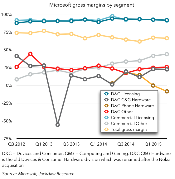 Licensing continues to have the highest gross margin – cost of sales are tiny compared to revenues in that business since the incremental cost of an additional sale is close to zero. But Commercial Other, composed primarily of cloud services and enterprise services, is becoming increasingly profitable, and with its growth is also becoming an increasingly important contributor to overall margins. It’s at around 9% of gross margins now, up from under 2% at the beginning of 2013, and growing fast. Commercial licensing continues to account for the lion’s share of gross margins, at 64.5%, while consumer licensing accounts for 20% or so. Note, however, the margins in the phone hardware business, which were never great to begin with, but have fallen steeply the last two quarters and are now negative. Remember, too, that these are gross margins, so operating margins in this business are likely substantially lower still. Computer and gaming hardware (Xbox, Surface, and a few other things) is becoming increasingly profitable at a gross margin level, however, helping to justify the continued investment in two products many people consider non-core to Microsoft’s business.
Consumer Office 365 revenue growth is slowing
For the last several quarters, Microsoft’s additions of consumer Office 365 subscribers have been pretty strong: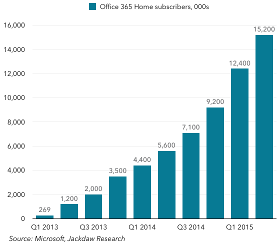 However, the worrying thing is that the revenue from these subscribers seems to be stagnating. This isn’t a number Microsoft reports directly, but it does provide enough data points to allow us to estimate it with reasonable accuracy, and the trend isn’t good:
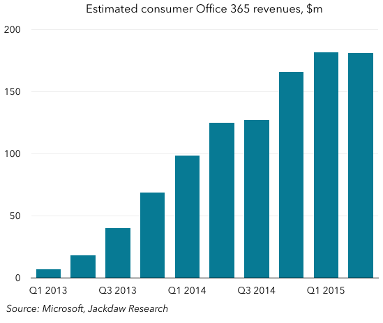 What’s interesting is that the lines in these two charts track quite closely in their shape for the fist five or six quarters, but they then begin to diverge. So what changed? Well, two main things, I think: Microsoft introduced the Personal (single user) version of Office 365, at $70 versus $100 per year for the multi-device standard version; and secondly, Microsoft has been doing lots of free trials and other deals which either heavily discount or entirely remove the fees for some subscribers for a certain period (often as much as a year). I suspect that both have had an impact, but the rate at which growth has dropped off suggests that the free trials in particular are eating into growth substantially. What I’d really like to see from Microsoft is a paid subscriber number (much as Netflix reports in its financials), which would give a much truer picture of both real subscribers and revenue per paid subscriber. The big problem here, of course, is that Office 365 consumer revenues need to grow to offset the rapid decline in legacy Office sales to consumers, but with no growth, the overall consumer Office revenue line is now declining rapidly too – it dropped 17% in FY 2015. Some of this is because of the way revenue is recognized on Office 365, but that’s certainly not the entire impact, as revenue per subscriber appears to have dropped from around $100 per year to closer to $50 over the past year or so.
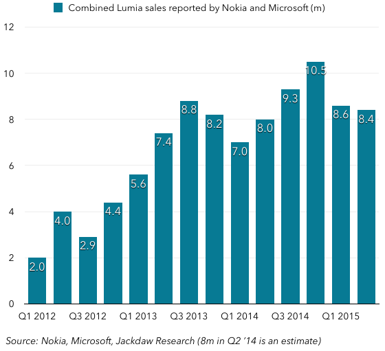
Lastly, I just wanted to cover quickly sales of Microsoft’s three main first-party hardware categories – Surface, Lumia phones, and non-Lumia phones. The first two are actually going fairly well, posting year on year increases in sales several quarters running: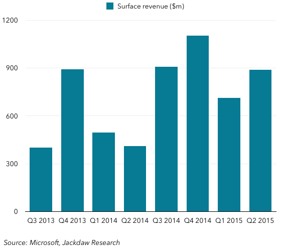
 However, non-Lumia phone sales (feature phones) have fallen off a cliff these last few quarters, and as I wrote previously, I suspect the impairment and restructuring of the phone business was at least as much about this business as the smartphone side:
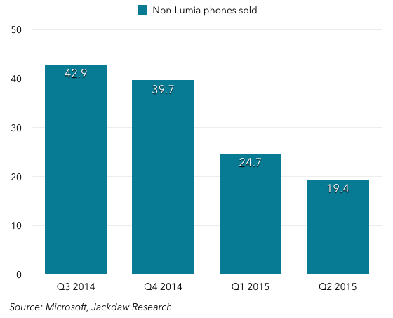 I continue to believe that the launch of Windows 10 on phones, and the flagship(s) Microsoft will launch later this year, will be the last big test for Windows on phones, and whether Microsoft can indeed make a go of this business.
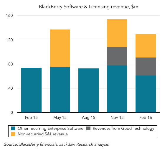 As you can see, the portion of revenue that comes from recurring sources has remained roughly flat over that entire period, far from doubling. The company touted 106% growth in Software and Services revenue in Q4 and 113% for the entire fiscal year, but as the chart shows that growth was entirely made up by a combination of non-recurring revenue and revenue from the Good business, while the underlying business grew very little.
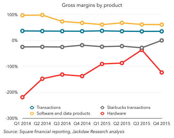
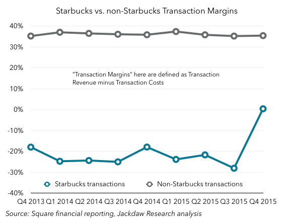
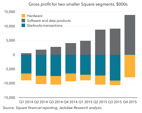


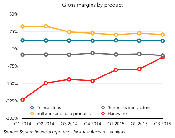 Software and Data Products have had by far the highest margins of all, although they’ve come down as Square has begun to incur costs of revenue around these businesses, which started out at almost 100% margins, with almost no costs. However, the Hardware business has historically been run at a loss, as Square essentially gave away many of its hardware products for free, although it’s now moving to a sell-at-cost model for some of its newer products. Lastly, you can see the huge discrepancy between the gross margins on Starbucks transactions, which have been consistently negative (around 20-30%), and all other transactions, which are very consistent at 35%.